Pebble has been something of a pioneer in the smartwatch space, becoming a Kickstarter darling in 2012 and following through with what was arguably the first successful wearable. But with heavy hitters Apple, Google and Samsung now leading in the space, is there still room for the crowdfunded underdog? Let's take a look, as Gizmag reviews the new Pebble Time.
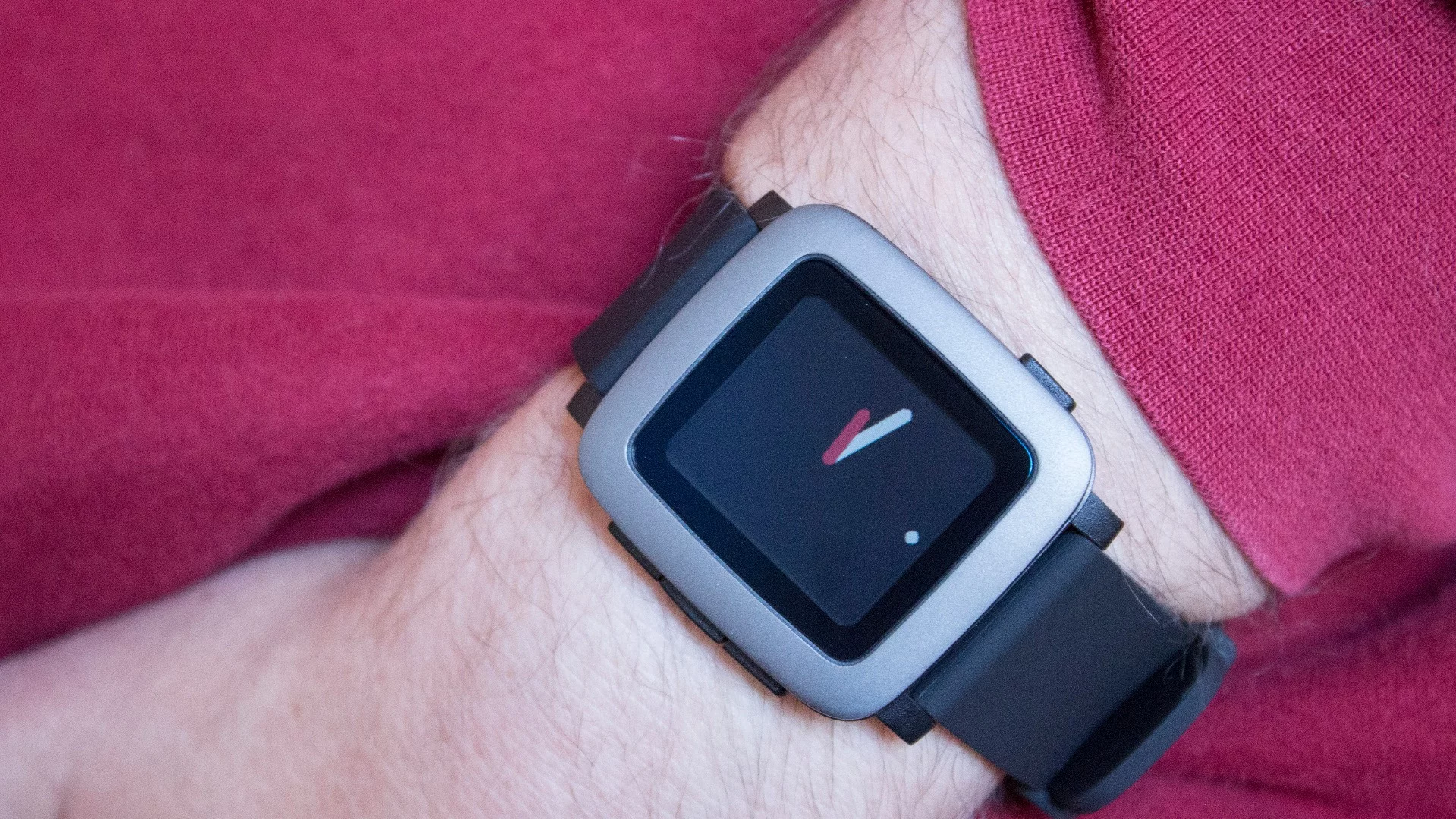
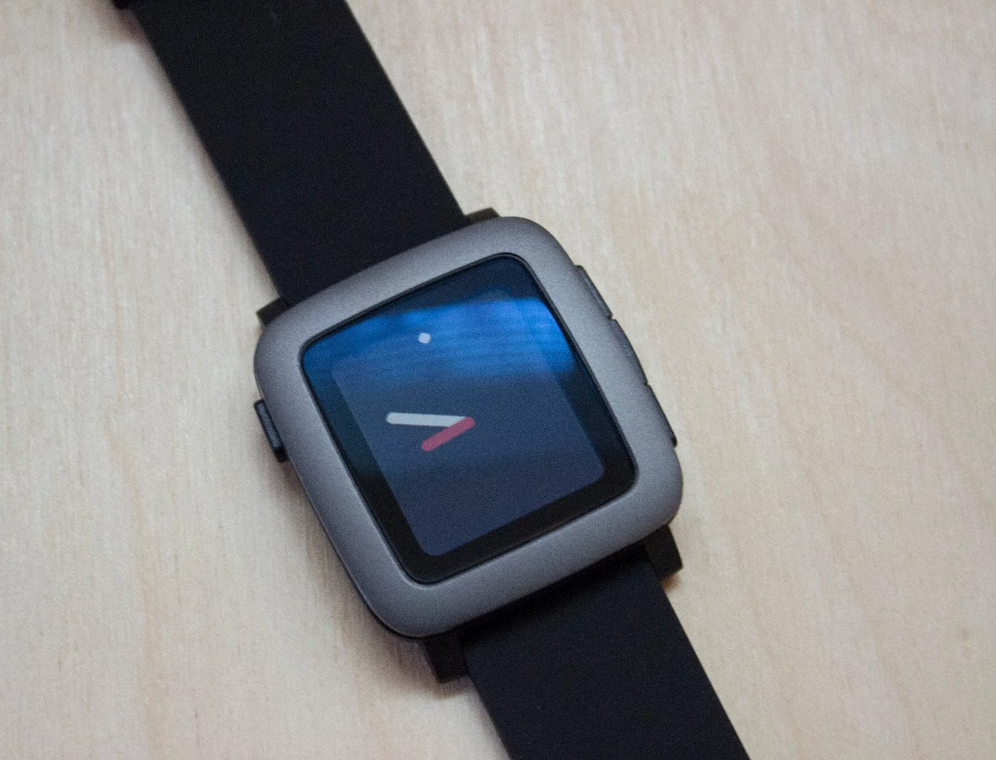
Pebble Time is a simpler kind of smartwatch. It's the first Pebble with a color screen, but it still isn't touch-based – instead using the same four-button combo we saw on older Pebbles. And while some its rivals are trying to drive into a fashion/tech intersection, where they could almost be mistaken for standard timekeeping ("dumb?") watches, Pebble still looks very much like, well, a smartwatch.
Pebble Time seems to be more about serving the customers who bought more than one million Pebble Watches than it is trying to expand its customer base. It's less like a rival to the Apple Watch or LG Watch Urbane, and more like a better version of those older Pebbles.

Like the original Pebble, Time has a minimal focus. Apps are tiny (in terms of simple interface and required storage), nothing is too graphic-intensive and the watch's design leans towards simple, clean lines. You get the sense that Pebble thinks other companies are trying too hard to make the smartwatch something that it isn't. In Pebble's world, perhaps, a wrist computer is a case that the company cracked years ago, and it now only needs – at most – small refinements.
In a way, this approach makes sense. The Apple's and Samsung's of the world can throw oodles of complex interfaces and smartphone-like features into their watches, but the fact remains that you can do most of these things better by simply pulling your phone out of your pocket. How important is it to "innovate" a product that depends on people being too lazy to reach into their pockets and tap on a candy bar-sized gizmo?
From this point of view, Pebble Time plays its part well. It isn't reaching for the stars, but what it does, it does well.

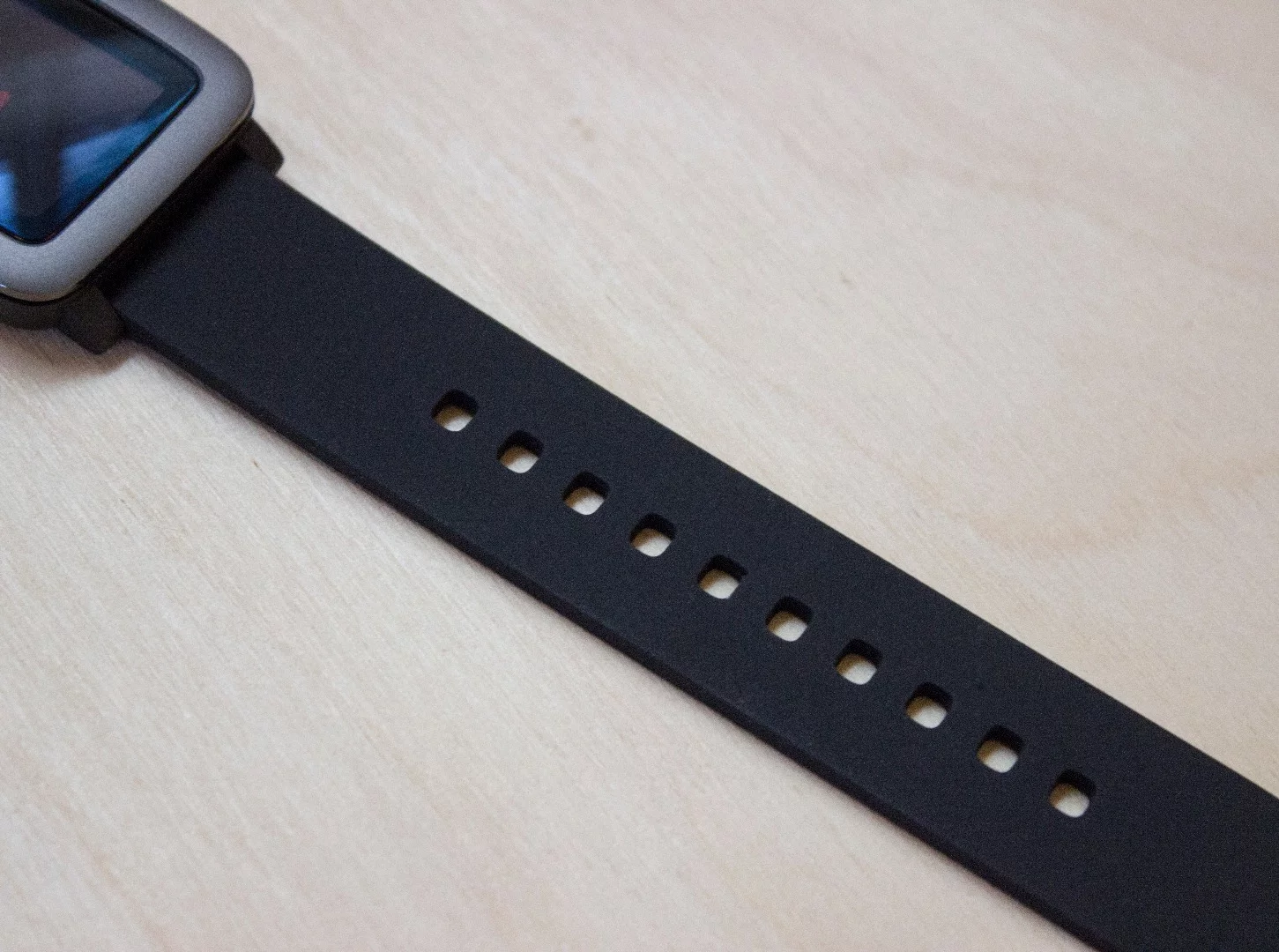
We weren't enamored with its design at first – with wide bezels that remind us of the Nook Color tablet – but it's grown on us. It's smaller than most smartwatches, and the thick lines of its front face match its modernly-styled software UI. And though its band feels cheap (it's nearly identical to the flimsy band found on the original LG G Watch), at least you can replace it with a standard 22 mm strap.
No matter what the big companies try to tell us smartwatches are for, we think they're still best for notifications. And Pebble does that job very well. Unlike some Android Wear watches, that have too subtle alerts, Pebble Time emits a satisfying buzz that you aren't likely to miss. Alerts are easy to read, with visuals matching the app it's coming from. Paired with an Android phone, we're even able to archive Gmail messages from the watch. And though we prefer swiping through messages on touchscreen watches, tapping Pebble's side button to scroll through longer text is still a perfectly acceptable alternative.
Pebble Time is the first Pebble watch to carry a microphone, letting you finally respond to messages with voice. Dictation works well – not quite as fast as Android Wear, but close enough – and is pleasantly accurate. One annoyance, though, is that you can only respond to messages you just received. You can't create a new dictated message (at least not without a third-party app's help) and you can't respond by voice to messages from earlier in the day.

Speaking of "earlier in the day," Pebble's new software has a new time-based UI that lets you scroll through upcoming and recent calendar events, by pressing the up and down buttons from the main watch face. If you use your phone's calendar app frequently, filling your schedule with meetings, events and other plans, this could be incredibly handy for you. If you're like me, though, and prefer to store meeting details in places like Evernote, then you probably won't get much use out of the past/future-based UI.
One thing Pebble Time won't do, at least natively, is let you set reminders – something both Android Wear and the Apple Watch do well. We also didn't receive incoming Google Now reminders from a paired Galaxy S6.
We'd put reminders second on the list of things a smartwatch excels at, so that's a big strike against Pebble Time. You can use third-party apps to help out on that front, but without support for your paired phone's native reminders, it's a disappointing omission.

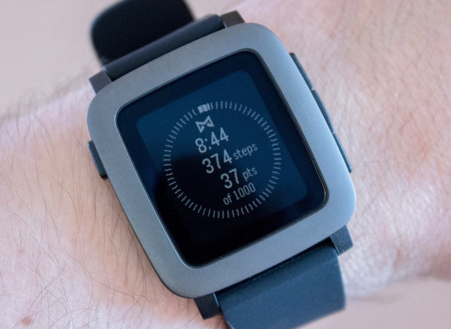
Another missing piece is native, always-on fitness tracking. There are plenty of third-party apps that will track your steps, but Pebble's store doesn't make it clear which continue to track in the background and which require you to use the app as your watch face to always track. Misfit appears to do a good job with that, but it would have been nice to see fitness tracking more native and straightforward.
Like with reminders, both Android Wear and Apple Watch have managed our expectations here, and Pebble isn't keeping up.
Battery life remains one of Pebble's biggest strengths. All of the touchscreen-based smartwatches require charging every night (or, at the very best, every other night). But Pebble can last up to a week on a single charge. We typically charged our review unit after several days, and you may want to do that too to be safe, but its impressive battery life continues to make Pebble the Kindle e-reader of wearables.
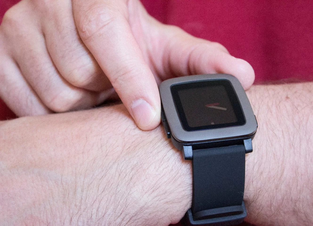
We're of two minds about Pebble Time. On one hand, it fills some of the most basic smartwatch needs, with a straightforward UI that doesn't scream too loudly or try too hard. But on the other, it's missing core features like reminders and 100 percent native fitness tracking.
Similarly, Pebble Time falls into a 'tweener price point that doesn't quite fit its barebones, budget theme. Kickstarter backers got it for as little as $159, but the upcoming retail version (which is the same product minus some etching on the back) will cost $200. That's the same price as the Asus ZenWatch – a device that does much more – and more expensive than some recent sale prices we've seen for the round-faced Moto 360.
If Pebble Time cost $100, or maybe even $150, it could be a no-brainer as the best budget smartwatch you can buy. But at $200 it's bumping into too many smartwatches with higher-end builds that simply do more. None of those watches, though, support the iPhone, so perhaps Pebble – which supports both iPhones and Android phones – is relying on only being "budget" compared to the expensive Apple Watch (which starts at $350).
We reviewed the Kickstarter version of Pebble Time, which is now in backers' hands. You can pre-order the retail version now from Best Buy.
Product page: Pebble


