After a build time of only three years and a budget of US$1 billion, the new Terminal 3 Building at Shenzhen Bao’an International Airport, designed by Massimiliano and Doriana Fuksas, makes a dramatic architectural statement. This is the first airport project for the Rome-based architects and one intended to launch them into the frontline of high-design transport terminals.
The building runs 1.5 km (5,000 ft) in length, covering an internal area of half a million square meters (5.4 million sq ft). But its most striking achievement may be its unusual form, which the architects liken to a "manta ray," and its textured "double" skin.
As the home to the country’s fourth largest airport, and one that requires a visa for entry by foreign visitors, Shenzhen seems an unlikely site for such an eye-catching building. However, the project wears the sculptural design with the confidence of a major international hub, a sign of the city's growing prominence within China, but also of the country's continuing penchant for large-scale, high-profile architecture commissions,

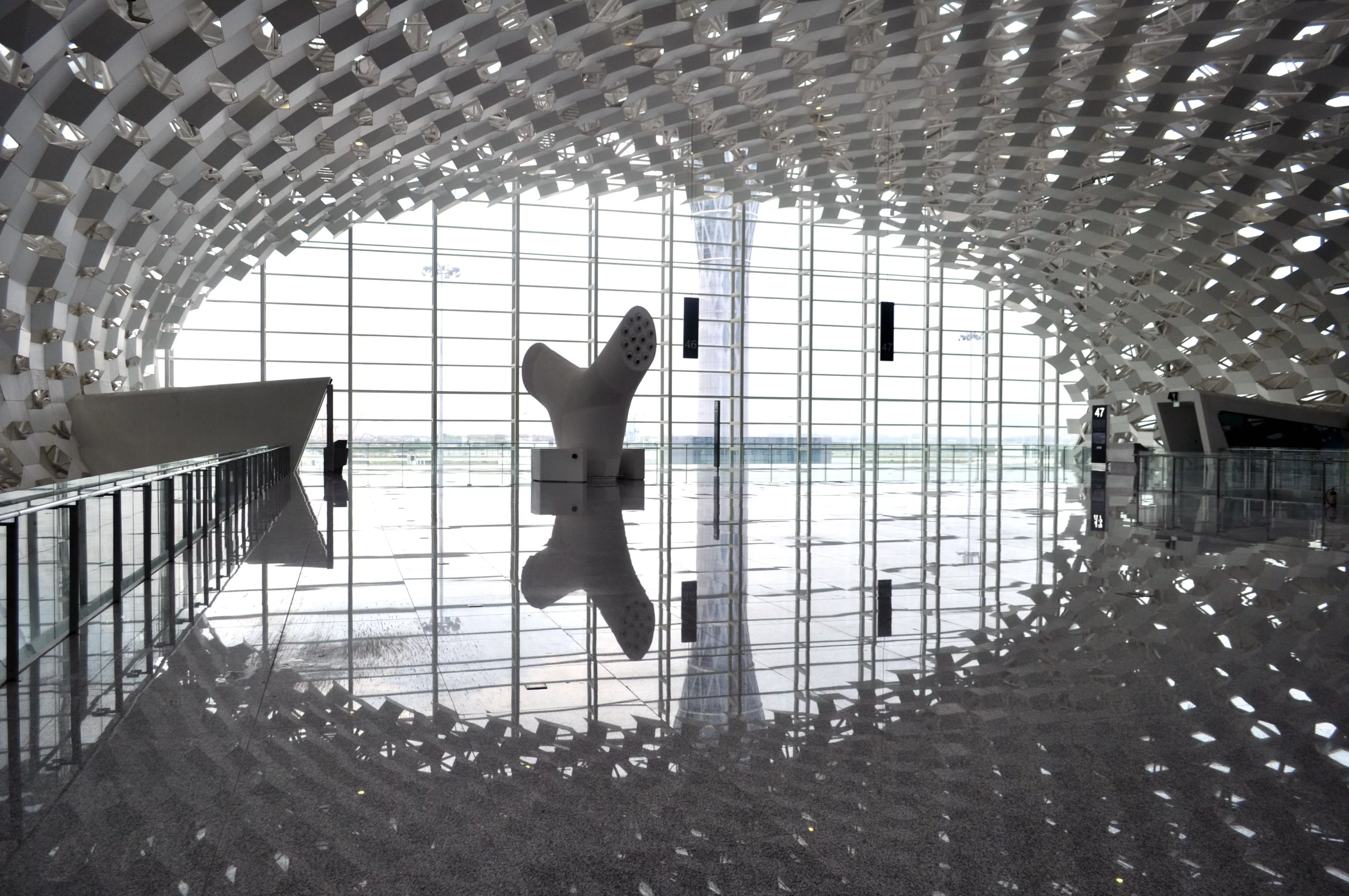
The new Terminal 3 at Shenzhen is indeed a grand project for the region. It extends the airport's capacity to 45 million passengers per year and creates the largest single public building to date in an area that is not exactly on the radar of most popular tourist destinations. It boasts a three-level concourse, and roof spans of 80 m (262 ft), all of which are wrapped in a double-layer skin of brilliant white perforated by "honeycomb-shaped" (hexagonal) metal and glass panels.

These allow natural light to filter through, an unusual condition for a large airport terminal and one that creates a dappled light effect inside. As the concourse has three levels, with some full-height voids, natural light reaches from the top to the bottom floors. There is also a grand harmony of design in internal details, such as the stylized white tree-shaped forms (which serve as air-conditioning vents and check-in islands) and the stainless steel gates (at security and check-in), which also bear the honeycomb pattern.

The interior is as gleaming and futuristic as the 300,000 sq m (3.2 million sq ft)-façade. White conical support columns rise to the roof on a "cathedral-like" scale. Adding to its textural quality, the ceiling also curves and undulates rather dramatically inside. It’s a direct challenge to the usual airport weariness, and gives the impression of being surrounded by an immaculate webbing.
The architects used the honeycomb motif not just in the ceiling but throughout the building, in the retail "boxes," and in 3D imprints in the walls of the public spaces. So the patterning is ever-present and the great volumes are not left hollow, but will be animated continually by light and shadow, as well as by the thrum of human activity.

The vast interiors, the architects say, emphasize the theme of "fluidity … the idea of movement and the idea of pause." This means that, in addition to designing a visually stimulating environment, they focused on the practicalities of processing times, walking distances, ease of orientation and crowding. But these necessities aside, it's easy to see an edgy sci-fi film being set in and around the sleek, organic elements.
The client, Shenzhen Airport Group, is said to be so pleased with the results that it is taking steps to try to copyright the design. Studio Fuksas are working on two further phases of development on the airport, due for completion in 2025 and 2035.
Source: Studio Fuksas


