The prestigious American Institute of Architects (AIA) has declared the winners of its annual Interior Architecture Awards, which celebrate the finest interior design by US-licensed firms. This year's selection includes a Google office, a museum extension, and an accessible renovation of a modernist office building.
There are a total of seven winners this year and each is based in the United States. As was the case last year, AIA's five-member jury selected the projects based on "design achievement, including sense of place and purpose, ecology and environmental sustainability and history."
Read on for each of the winners of this year's AIA Interior Architecture Awards and be sure to head to the gallery for more photos of the winners.
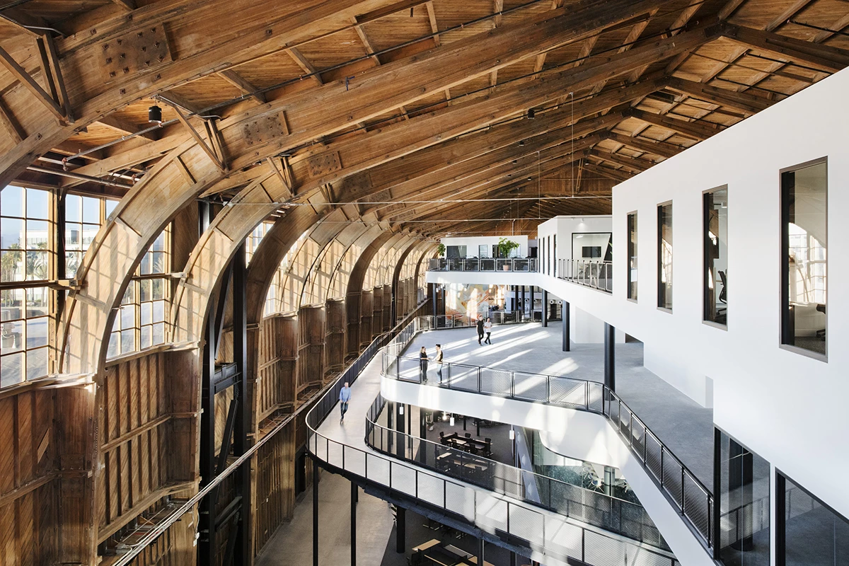
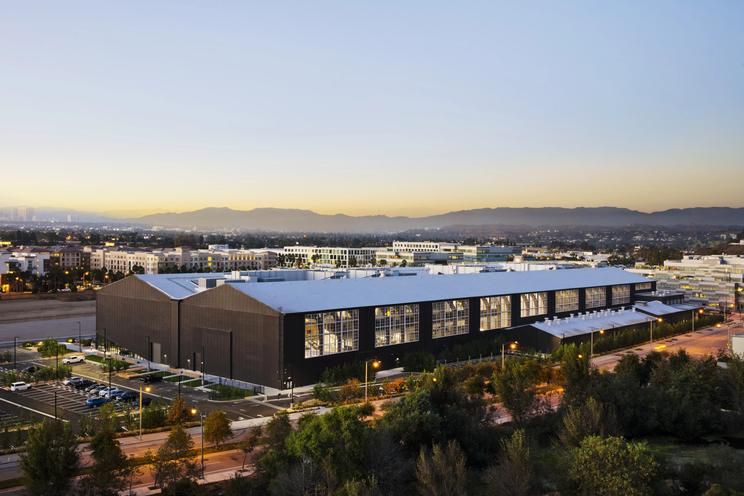
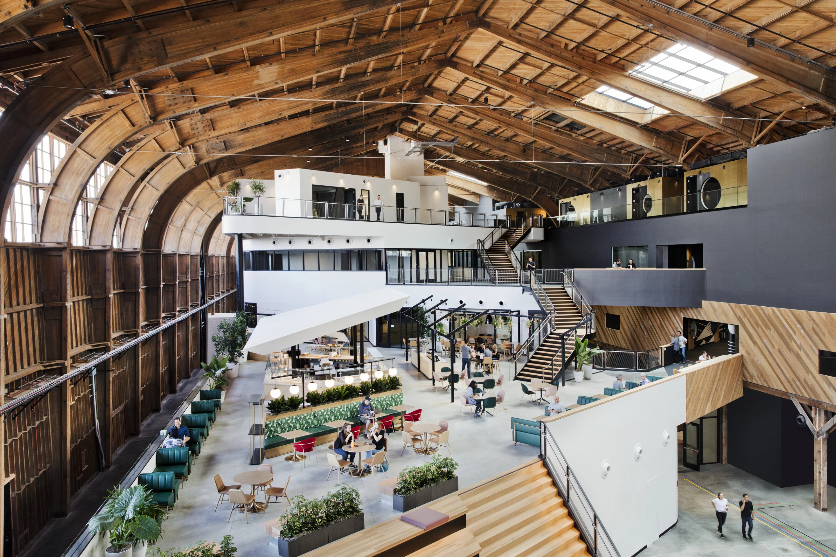
The Google Spruce Goose Hangar is located in Los Angeles and was designed by ZGF Architects. As its name suggests, the office itself is actually based within a massive restored wooden hangar that was once home to the famous "Spruce Goose," or Hughes H-4 Hercules prototype flying boat by Howard Hughes.
The firm preserved the original glulam (glued laminated timber) arches and wood sidings, while the building's central spine was carefully dismantled and rebuilt using noncombustible materials. The office's interior is arranged either side of the spine and spread over four floors. Its layout was designed to maximize natural light inside and to encourage employee interaction.

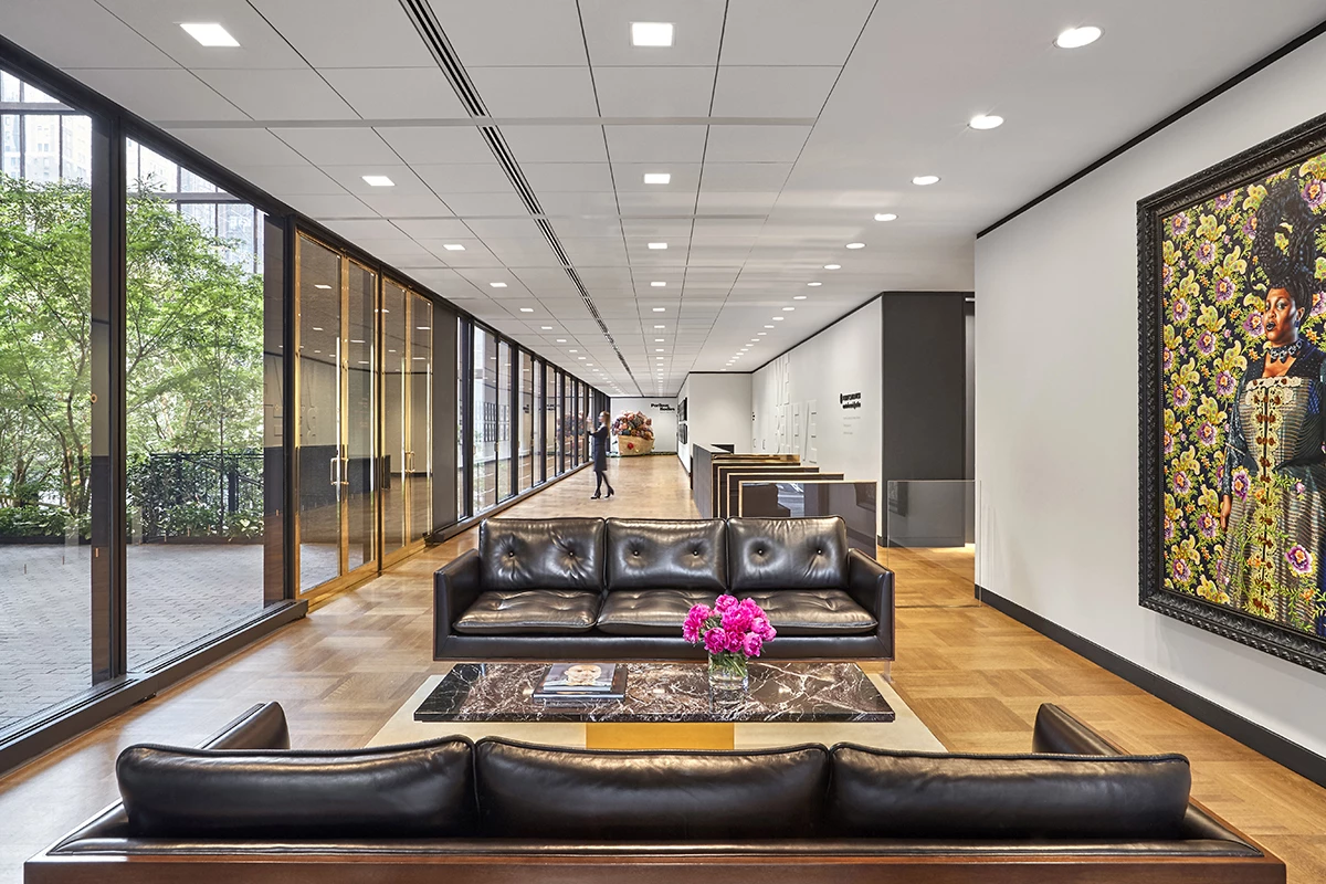
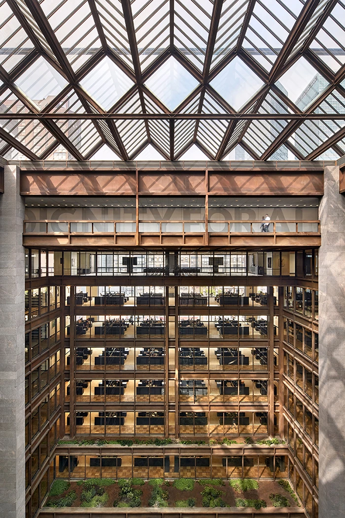
The Ford Foundation Center for Social Justice (formerly named the Ford Foundation Building) is an influential modernist Manhattan office building completed in the 1960s that was originally designed by Kevin Roche.
What started out as a simple update to help it meet NYC's fire code, ended up with Gensler carrying out an extensive renovation over two years. In a nod to transparency, its light-filled atrium has been made available to anyone and offers views of the interior from the street, while wheelchair access has also been improved. Additionally, the building's pre-existing garden has been turned into a touch and smell garden for the sight-impaired.
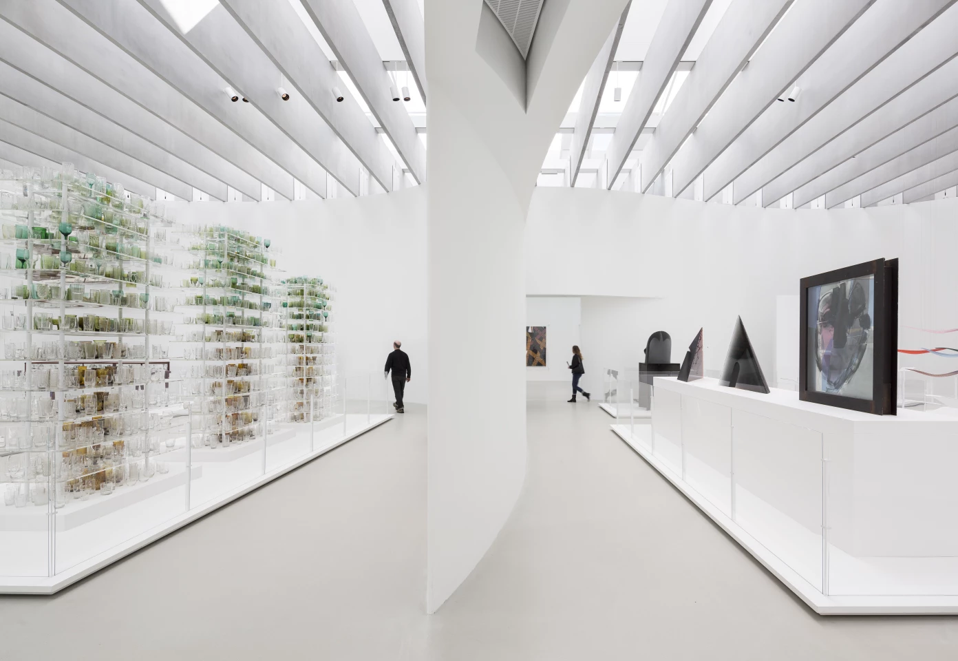
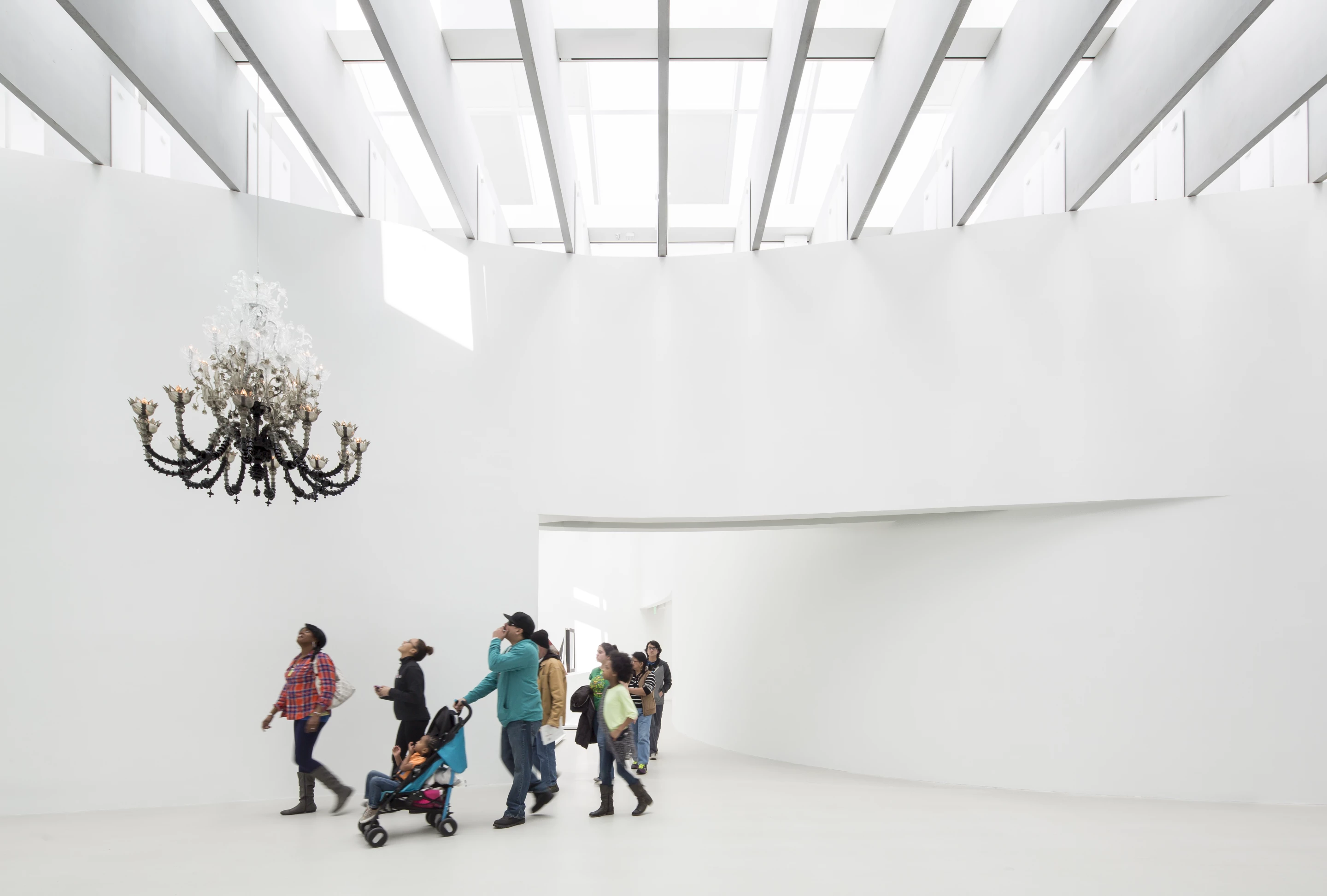
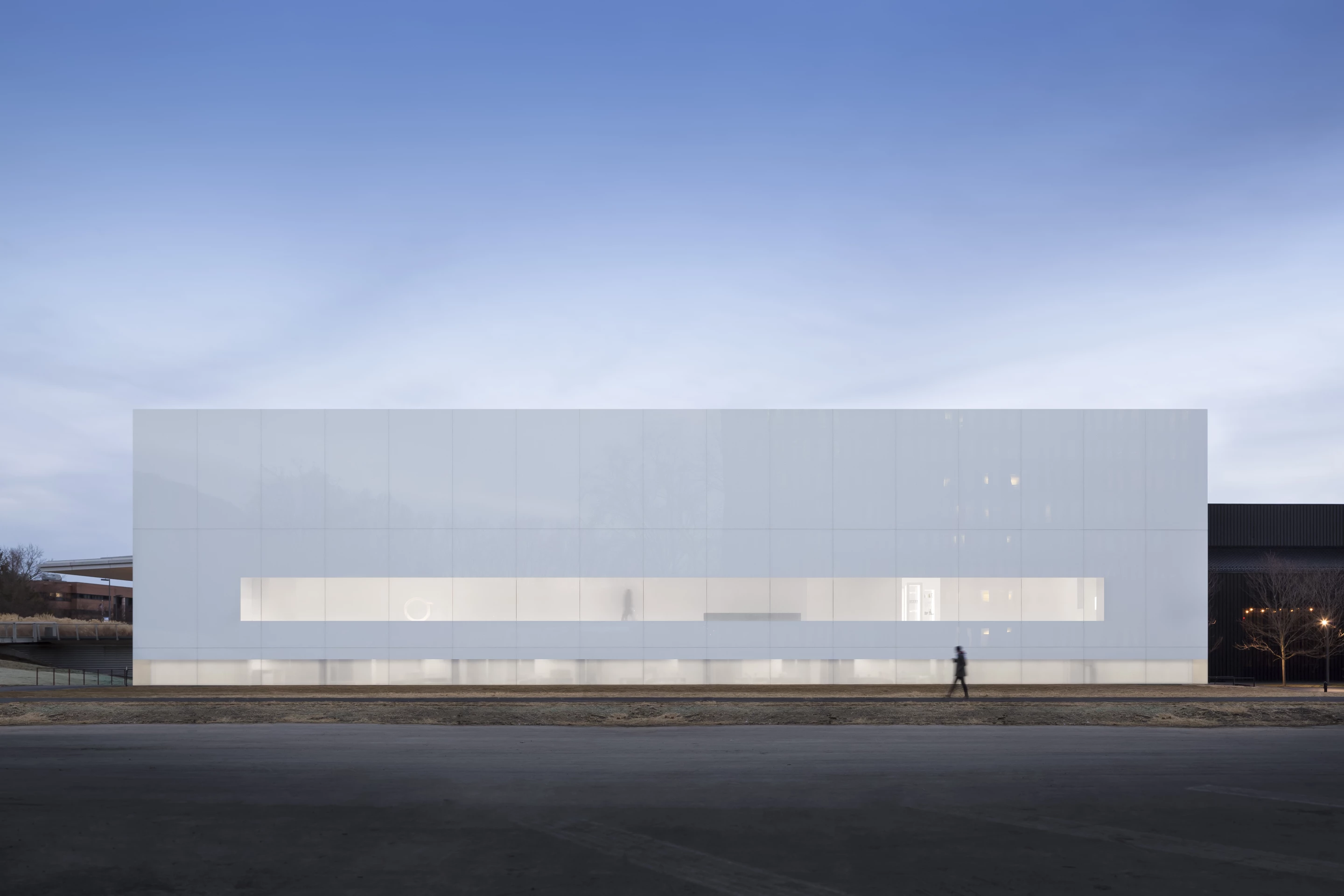
New York's Corning Museum of Glass hosts over 3,000 years of glass works, from the ancient to the modern. A new extension by Thomas Phifer and Partners adds 26,000 sq ft (2,415 sq m) of exhibition space. In addition, the extension provides new offices for museum staff, a community space, a retail space, and a hot glass workshop for demonstrations.
Most important is a new gallery showcasing the museum's collection of contemporary works. This is illuminated by natural light that enters via insulated skylights and fritted windows. According to AIA's judges, the daylight and white decor create an uplifting area of the museum.
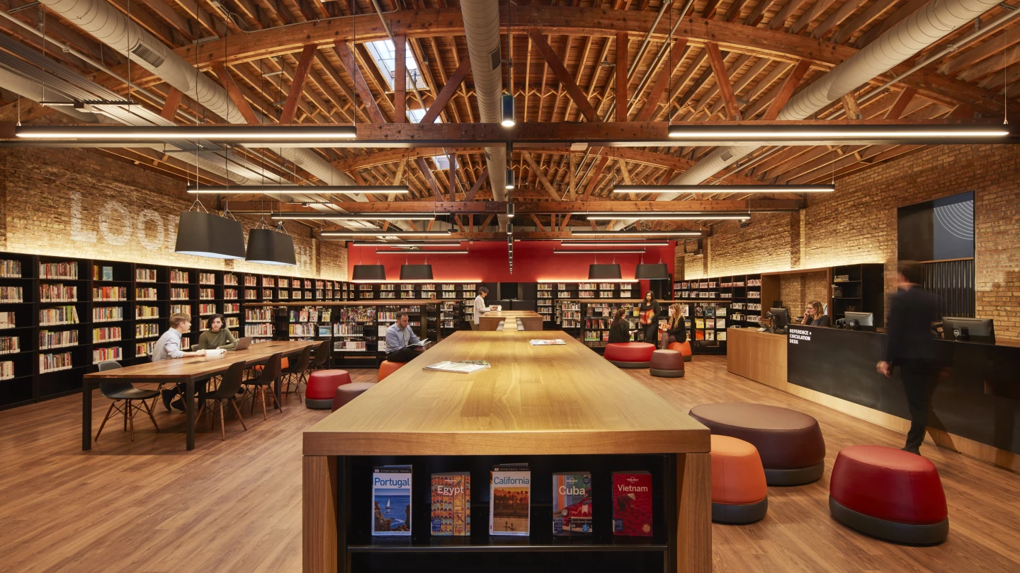
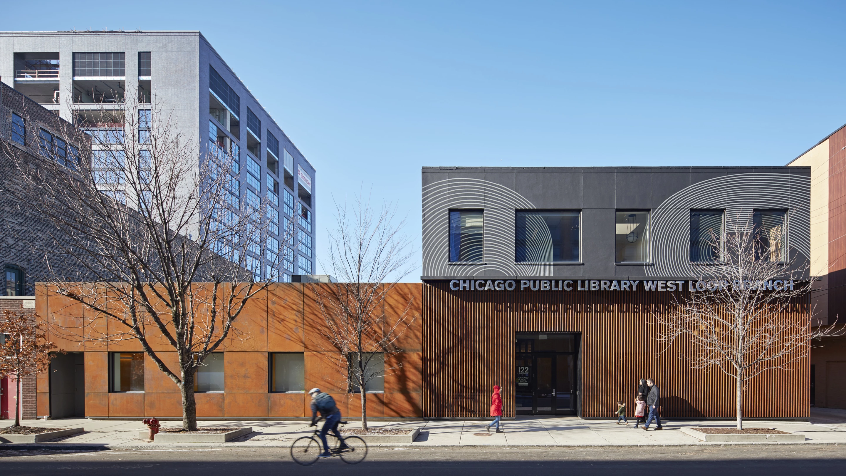
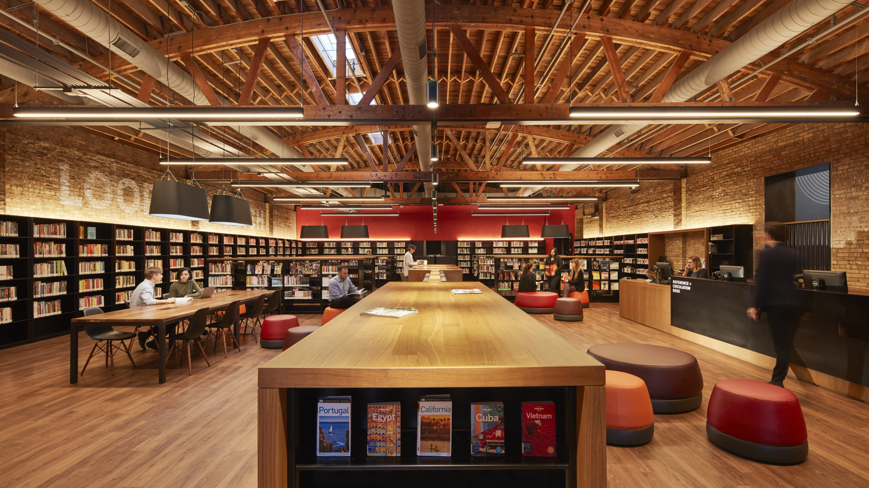
Designed by Skidmore, Owings & Merrill, the Chicago Public Library West Loop branch involved turning former television studios into a new cultural and social center.
The buildings were donated to Chicago by a developer to help spur redevelopment of the area they are located in. SOM preserved the industrial character of the buildings and maintained many original interior elements, like bow-truss ceilings and skylights, lending it a loft-like atmosphere. Unnecessary walls were also removed throughout to create larger unified spaces.
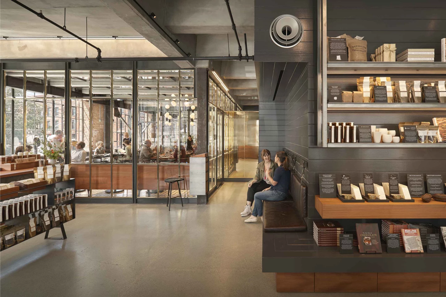
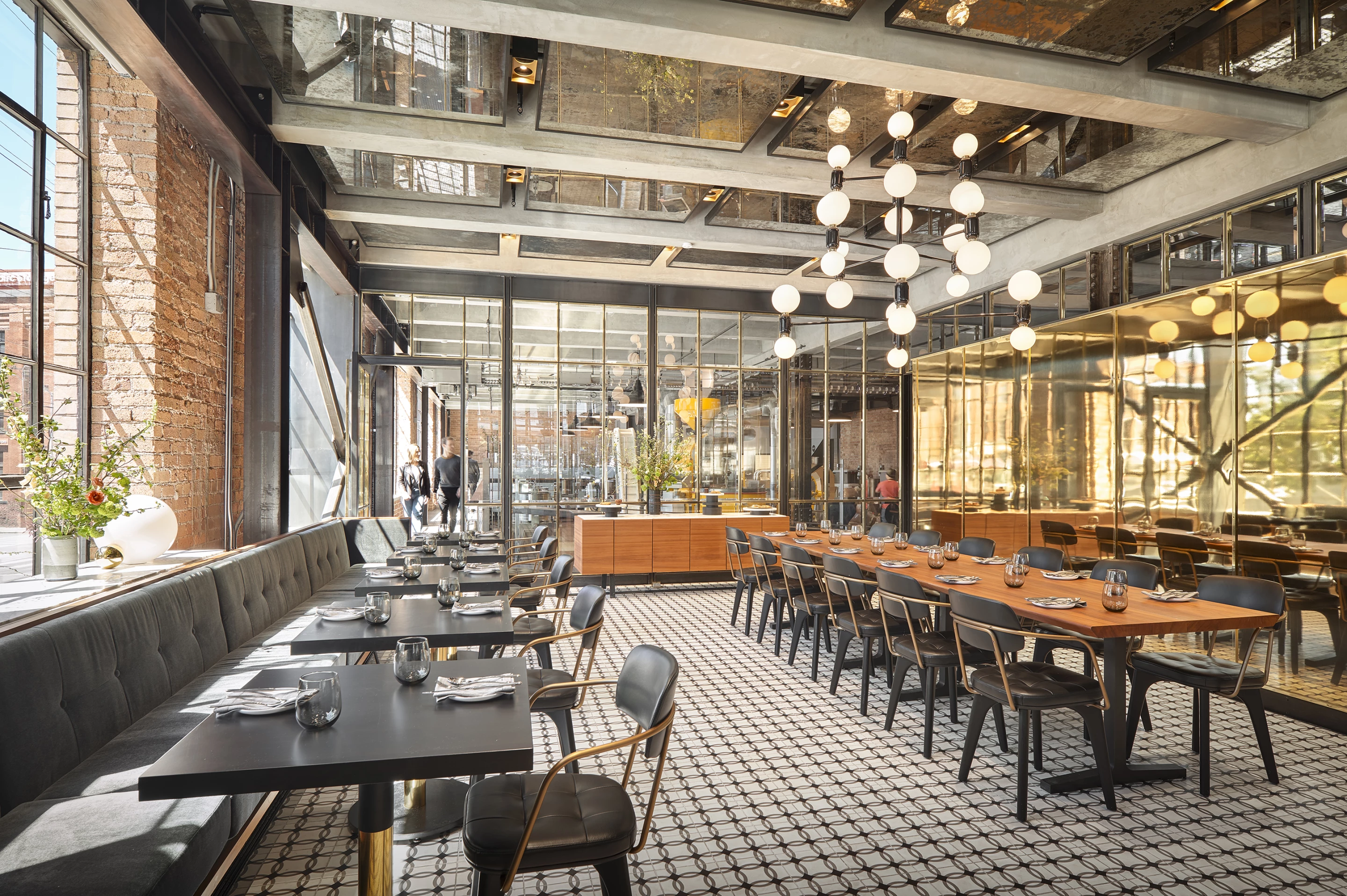
The Dandelion Chocolate Factory is Gensler's second win. Serving as a new home for the San Francisco-based craft chocolate company, it's located in a previously vacant century-old industrial warehouse.
It includes a production space, a cafe, a tasting station, and a retail area. The team maintained many elements of the former warehouse and opted for finishes and details like brush-painted wood siding, handmade tiles, and redwood millwork to help preserve its character.
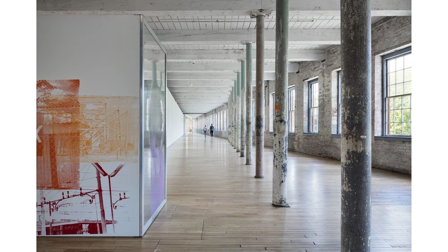
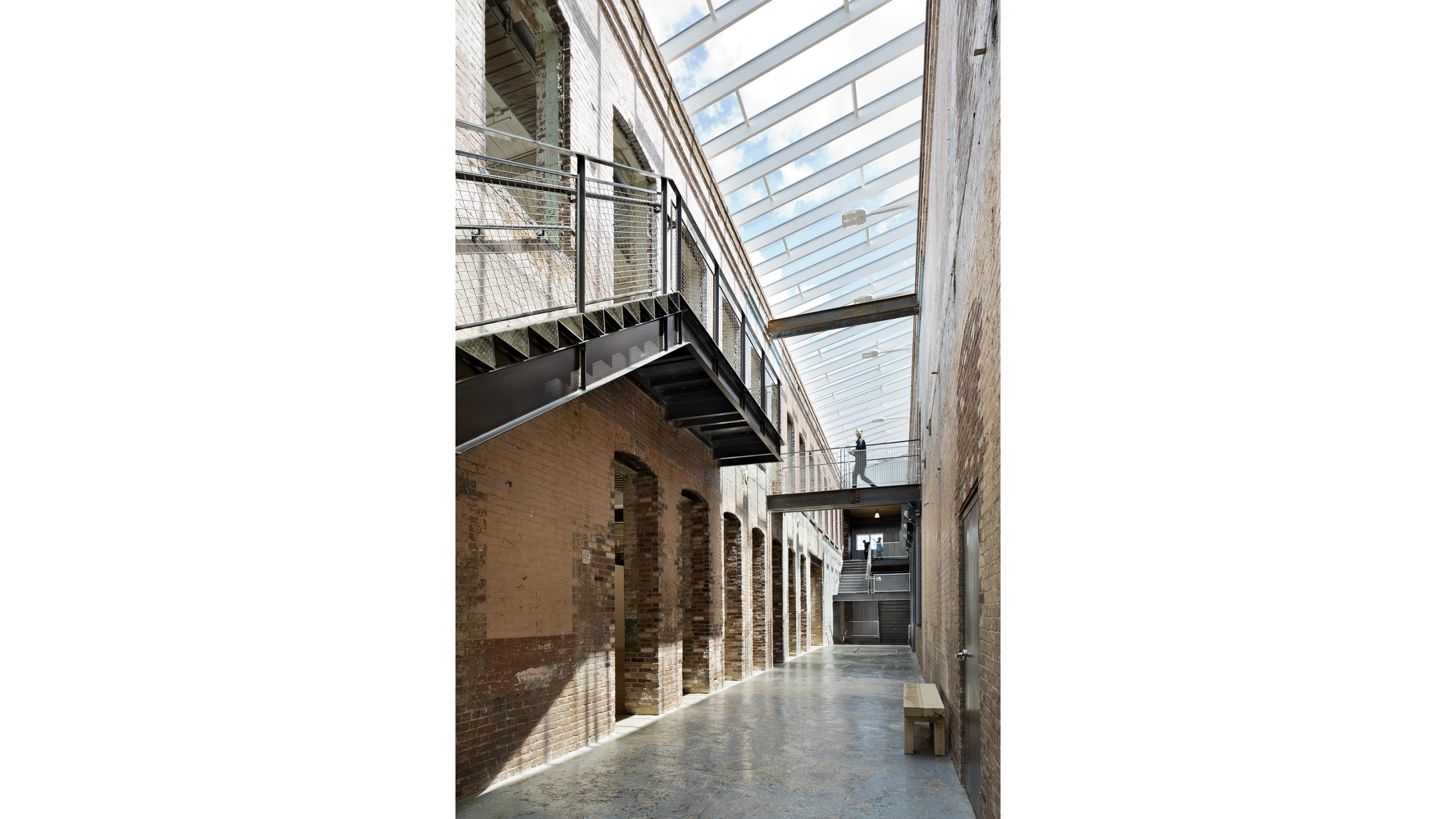
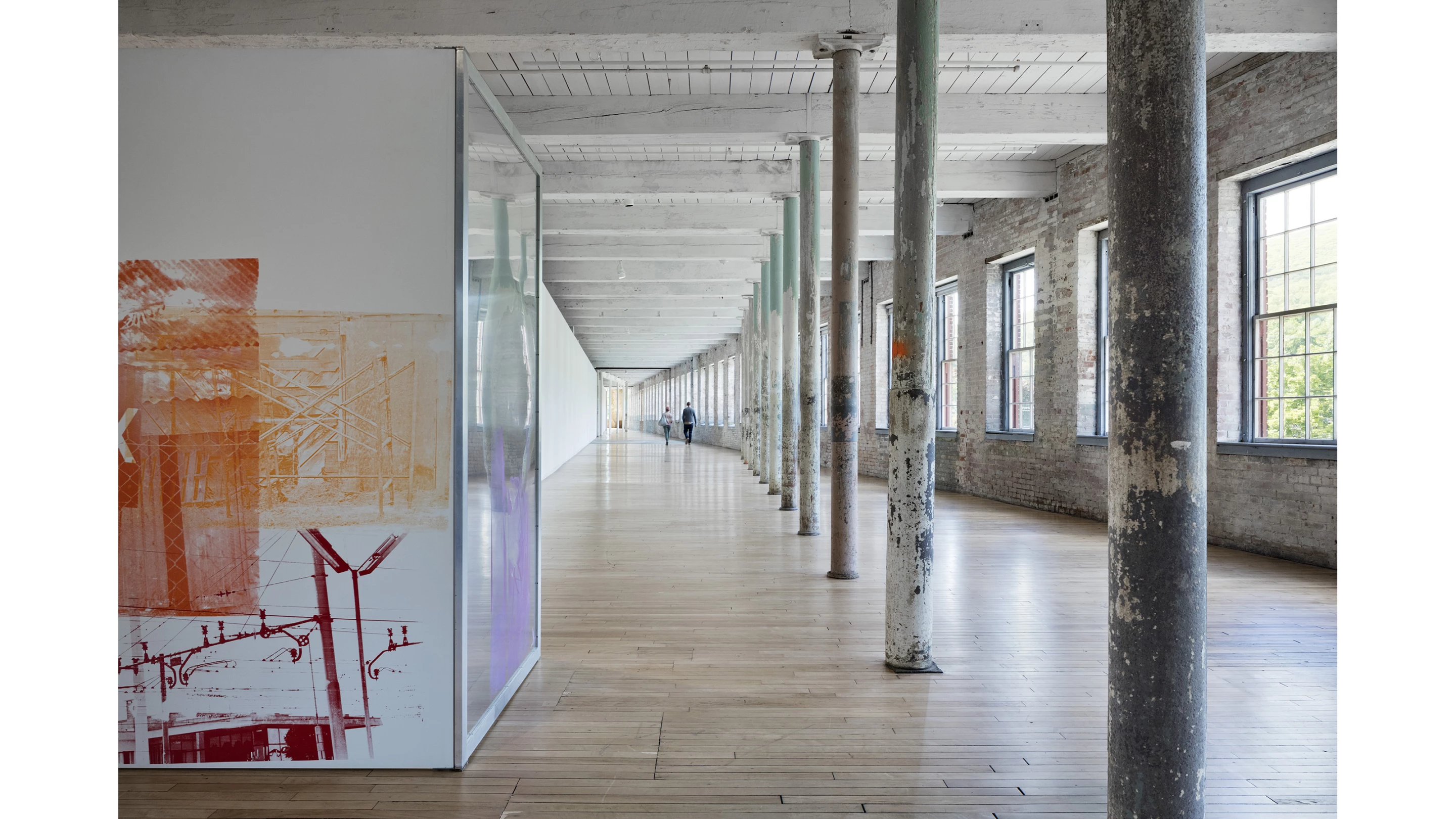
Bruner/Cott Architects' work on the MASS MoCA (Massachusetts Museum of Contemporary Art) Building is the third and final phase of a plan to transform a 28-building factory campus that closed back in the 1980s into a home for contemporary visual art.
The interiors of existing mill structures were used to create new art galleries and the firm added eye-catching additions like a glass roof alongside worn-looking columns and unpainted brick to masterfully blend old and new.
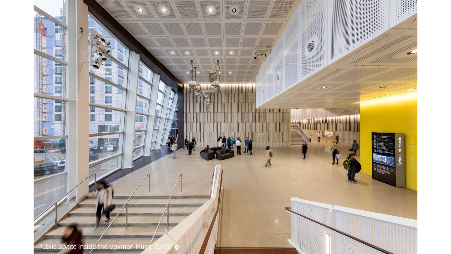
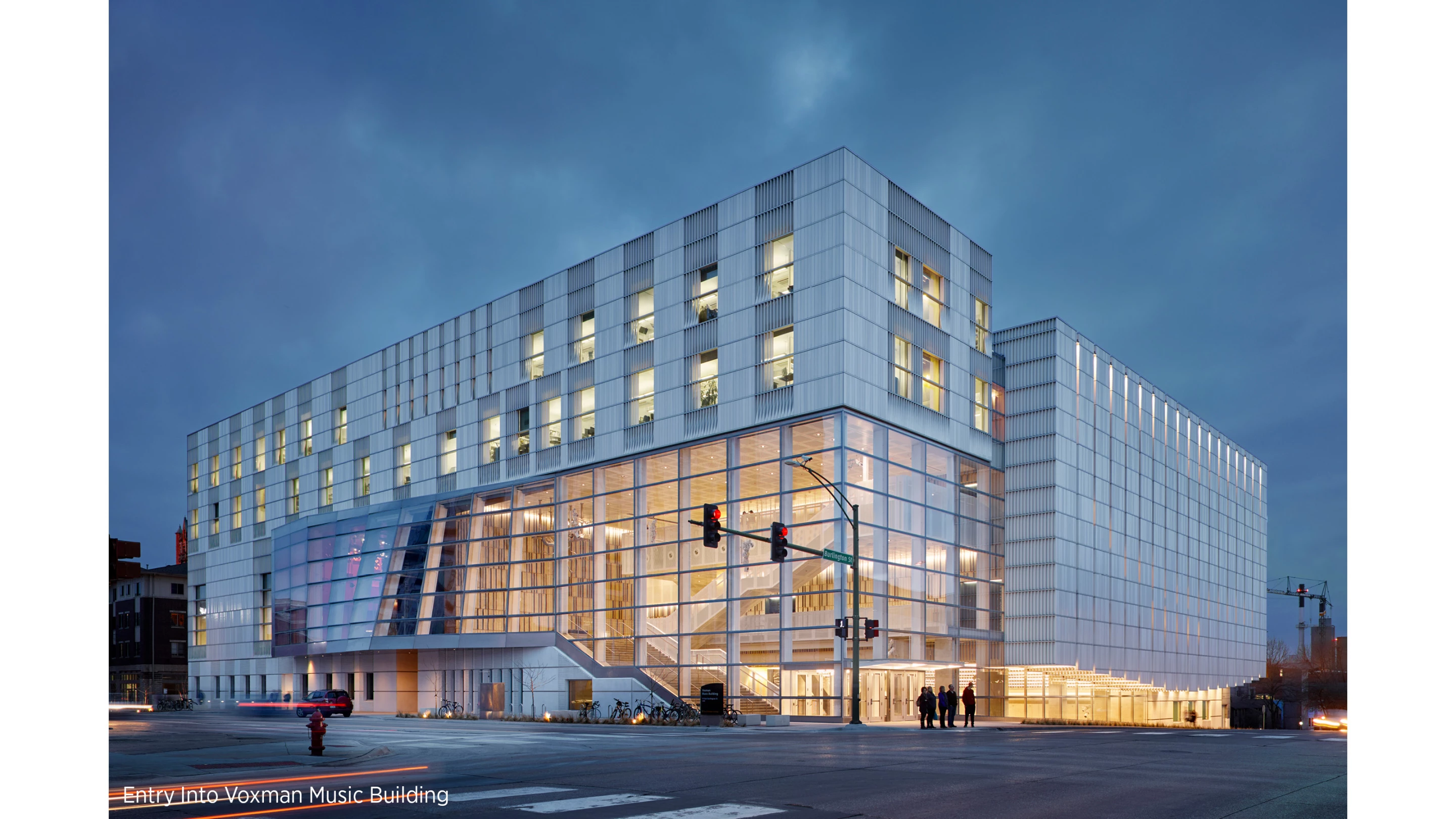
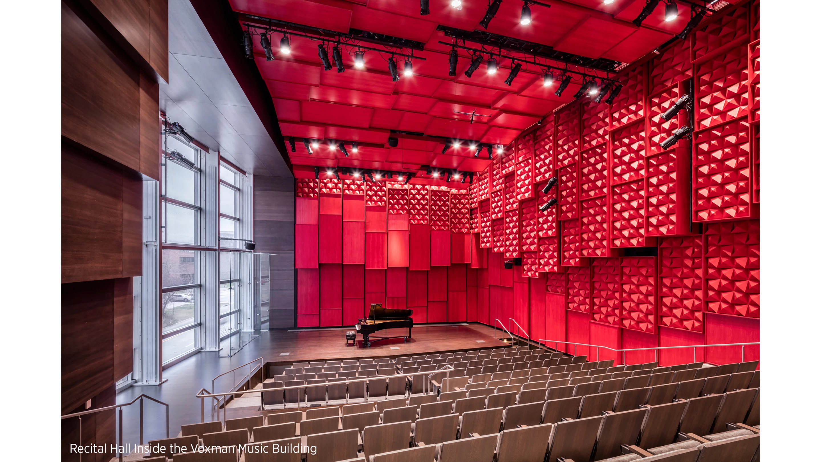
Back in 2008, severe flooding damaged the University of Iowa School of Music, leaving its students with no place on campus for practice and performances. The Voxman Music Building, by LMN Architects, creates a brand-new, six-story building.
It includes a 700-seat concert hall, a 200-seat recital hall, and supporting spaces like rehearsal rooms. Extensive glazing enables views of the surrounding neighborhood and a fourth-floor terrace frames the wider city and landscape. The interior decor is enlivened by vibrant additions, like deep red acoustical paneling in the recital hall and colorful acoustic reflectors in the rehearsal spaces.
Source: AIA


