Architecture

Duplex renovation puts playful spin on family living

Duplex renovation puts playful spin on family living
Atelier Chabot is arranged around an open and light-filled living area that contains a slide
View 8 Images
Atelier Chabot is arranged around an open and light-filled living area that contains a slide
1/8
Atelier Chabot is arranged around an open and light-filled living area that contains a slide
Atelier Chabot's open living area includes swings for the owner's children
2/8
Atelier Chabot's open living area includes swings for the owner's children
Atelier Chabot's living room includes a large sofa and a wood-burning stove
3/8
Atelier Chabot's living room includes a large sofa and a wood-burning stove
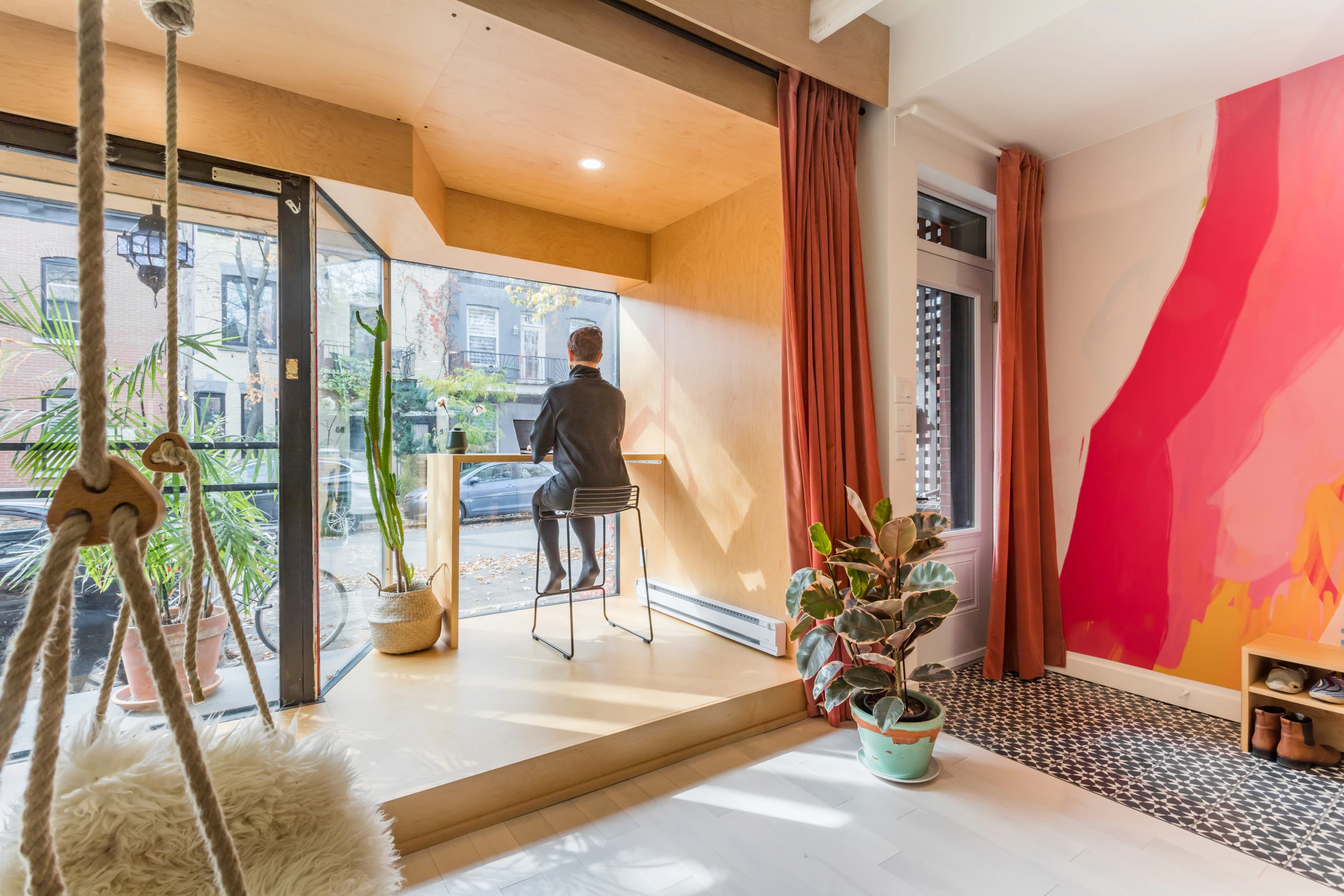
Atelier Chabot's main living area includes a small home office with a desk and stool seating
4/8
Atelier Chabot's main living area includes a small home office with a desk and stool seating
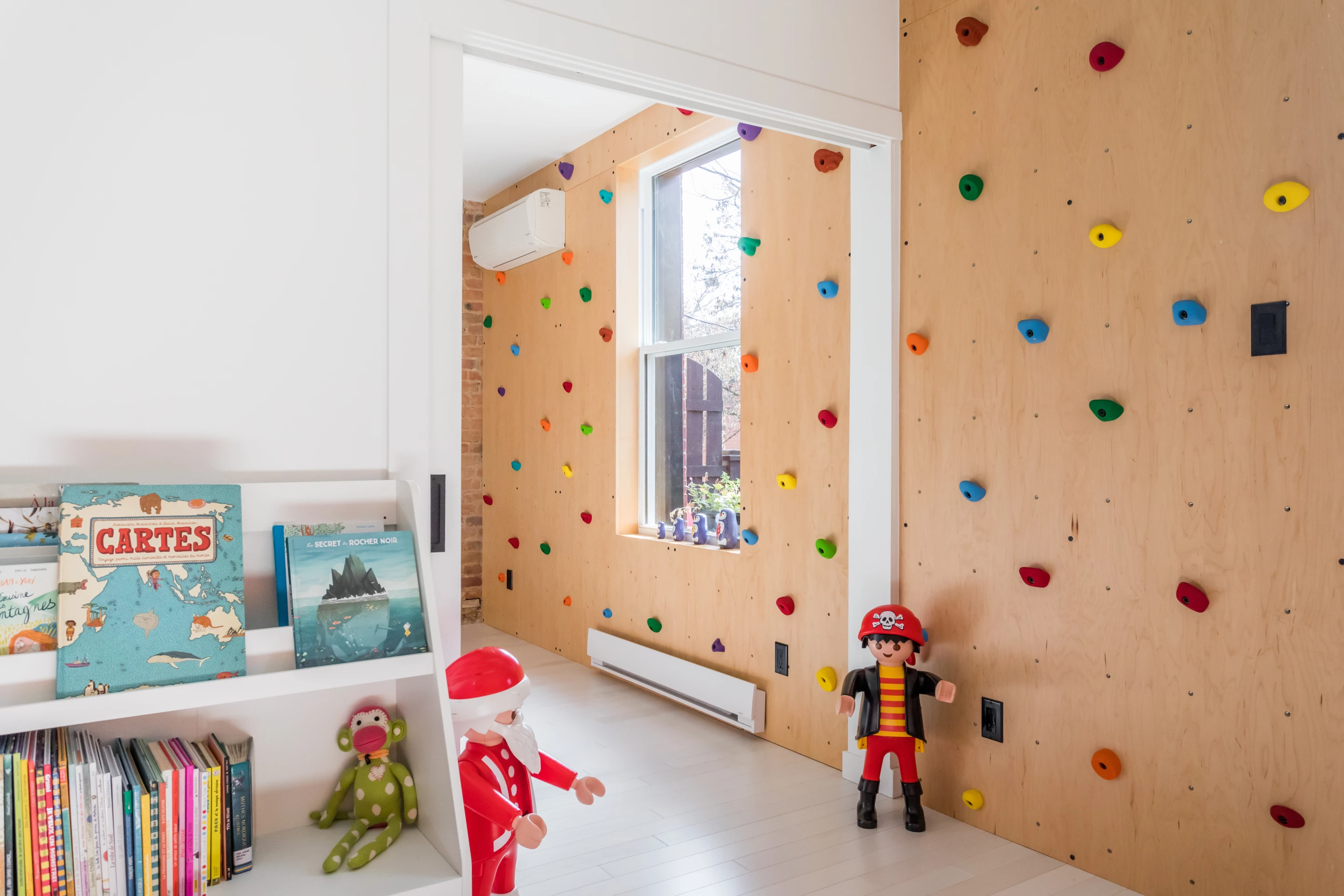
Atelier Chabot includes a children's bedroom with a neat climbing wall
5/8
Atelier Chabot includes a children's bedroom with a neat climbing wall
Atelier Chabot's master bedroom boasts an en-suite bathroom
6/8
Atelier Chabot's master bedroom boasts an en-suite bathroom
Atelier Chabot's slide is integrated into the kitchen counter
7/8
Atelier Chabot's slide is integrated into the kitchen counter
Atelier Chabot's upper floor includes a netted floor area for hanging out
8/8
Atelier Chabot's upper floor includes a netted floor area for hanging out
View gallery - 8 images

Commissioned to renovate a residence in Montreal, Canada, Indee Design decided on a lighthearted approach. The result, named Atelier Chabot, is described as a playhouse for kids and adults, and boasts a slide, climbing wall, and netted area.

The idea for Atelier Chabot came about when the owners decided they wanted to change the lives of their family and were trying to decide whether to take a trip around the world by sea or to purchase a home. In the end, the house won out.

The property was originally arranged as a duplex, so was relatively confined and lacking in natural light. Indee Design therefore focused first on opening up the interior by arranging it around a large open light-filled living area.

The studio removed unnecessary walls and added skylights and open space between the two floors, which was then filled with a netted floor hangout area. Additionally, a long slide is integrated into the kitchen counter, offering a more fun way of coming down for dinner. Some swings were installed in the open living area too.

Atelier Chabot's upper floor includes a netted floor area for hanging out

"The duplex was transformed into a house where space is experienced differently than in a standard house," explained the firm. "Communication between each room varies due to the original, playful, and unexpected elements placed strategically throughout the house, addressing the adults as much as the children. A rock-climbing wall decorates the children's bedroom, and a slide connects the catamaran net to the kitchen as an alternative to the stairs. Indee Design selected noble local materials such as maple wood, and the curtains add a theatrical touch, while emphasizing the playful spirit of the space."

Other notable additions to the home include a master bedroom with an en-suite bathroom and a cozy living room area complete with wood-burning stove.

Of course, Atelier Chabot is not the only playful interior we've seen over the years. The Union House, SkyHouse and La Maison du Bonheur are all excellent examples.

Source: Indee Design

View gallery - 8 images
3 comments
3 comments
lalo9797
A ten foot drop from the top of the slide onto the hard edge of a kitchen counter? And a hardwood surface at the base of the climbing wall? Sure, looks fun on paper. But not so fun when you unexpectedly find yourself waiting for your five year-old to come out of Radiology before speaking with the orthopedic surgeon.
JonSmith60606
Agreed cjboffoli looks good on paper. In real life doesn't seem very practical or livable. This is a showpiece not a livable home.
Treon Verdery
I think the slide could possibly work if it was a 3/4 circle, 90-364dg with the open side next to the wall, and optically transparent above 200dg. The 199-344dg area would be the main, transparent or opaque polymer sliding surface. With a 3/4 circle the adults and kids using the slide wouldn't slip off. The floating lounging mesh could be circular, and made of some light buff, white if available, smooth washable surface kevlar/nomex weave, which is microthin, but thick enough to attach a carabiner to and climb up to from the first floor . Possibly something like a high optical transparency very soft vinyl, silicone or UV resistant urethane transparent tube that looks much smaller diameter than aquarium air tubing with white or buff kevlar/nomex yarn inside it could be the weave tubing of the floating circular mesh. As a young child, my favorite things about gymnastics were the low elevation walkable or runnable balance beams, and mounting and dismounting the horse, and maybe, some possibly just imagined utilization of a springboard, and also tuck-and-roll, making the body rounded, and rolling forward, possibly multiple integer lengths. I think that first floor, wide / - \ base low elevation balance beams could connect the living room, kitchen, and bedrooms, and any media or craft or play rooms together, making fun balance beam walking or running something the children and adults could enjoy. The wide base, low elevation of the balance beams reduce tripping hazard. It could also be that just utilizing balance beam width shapes similar to iridescent, instant outdoor crosswalk slightly thick aluminum appliques could replace actual low tallness balance beams, where the actual physical sensation of walking barefoot on the balance beam width applique is pleasant.