Good Thinking

Size does matter: Authagraph World Map turns the Earth into a rectangle using tetrahedrons

Size does matter: Authagraph World Map turns the Earth into a rectangle using tetrahedrons
The Authagraph World Map: not much use for navigation, but a very clever way of projecting the globe onto a flat surface without size distortion
View 12 Images
The Boggs Eumorphic projection chops up something similar to the Mollweide projection in order to keep North upward as well as having correct proportions
1/12
The Boggs Eumorphic projection chops up something similar to the Mollweide projection in order to keep North upward as well as having correct proportions
The Mollweide projection abandons the idea of a rectangular map in order to try to keep proportions correct
2/12
The Mollweide projection abandons the idea of a rectangular map in order to try to keep proportions correct
The Gall-Peters projection attempts to squash the areas closer to the poles in order to correct some of the distortion in the Mercator projection
3/12
The Gall-Peters projection attempts to squash the areas closer to the poles in order to correct some of the distortion in the Mercator projection
The Authagraph World Map: not much use for navigation, but a very clever way of projecting the globe onto a flat surface without size distortion
4/12
The Authagraph World Map: not much use for navigation, but a very clever way of projecting the globe onto a flat surface without size distortion
The Authograph World Map: looks weird, but all proportions are very close to correct and it fits in a neat 4:3 rectangle
5/12
The Authograph World Map: looks weird, but all proportions are very close to correct and it fits in a neat 4:3 rectangle
The Authagraph World Map: once the tetrahedrons are laid out, you can choose any way you like to cut a map out.
6/12
The Authagraph World Map: once the tetrahedrons are laid out, you can choose any way you like to cut a map out.
The Authagraph World Map: from sphere to inflated tetrahedron to tetrahedron to fold-out flat triangle
7/12
The Authagraph World Map: from sphere to inflated tetrahedron to tetrahedron to fold-out flat triangle
The Authagraph World Map: different cutouts can give different perspectives on the world
8/12
The Authagraph World Map: different cutouts can give different perspectives on the world
The Authagraph World Map: how the projection is built
9/12
The Authagraph World Map: how the projection is built
The Mercator Projection: the most common world map you'll see
10/12
The Mercator Projection: the most common world map you'll see
Greenland: massive on a Mercator world map, but here's its true size between Africa and South America
11/12
Greenland: massive on a Mercator world map, but here's its true size between Africa and South America
Canada may look enormous on a traditional map, but here's its true size next to Australia
12/12
Canada may look enormous on a traditional map, but here's its true size next to Australia
View gallery - 12 images

Most common world maps are highly size distorted, with any land masses located toward the poles tending to look much bigger than they really are, which, in some ways, makes this weird-looking projection a lot more accurate. How it's made is a fascinating process – now, what is it actually useful for?

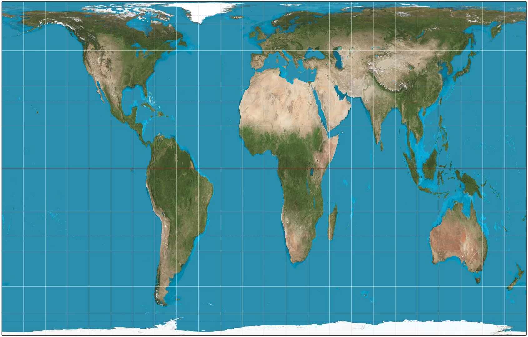
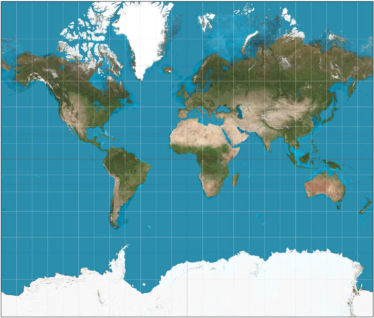
Creating 2-D maps of the entire Earth is a hard job. It's a sphere, and trying to nicely unwrap it into a neat rectangle leads to varying degrees of distortion. The map you're familiar with, that pretty much everyone has a copy of somewhere, is called the Mercator Projection, which was first presented by cartographer Gerardus Mercator in 1569.

The Mercator Projection: the most common world map you'll see

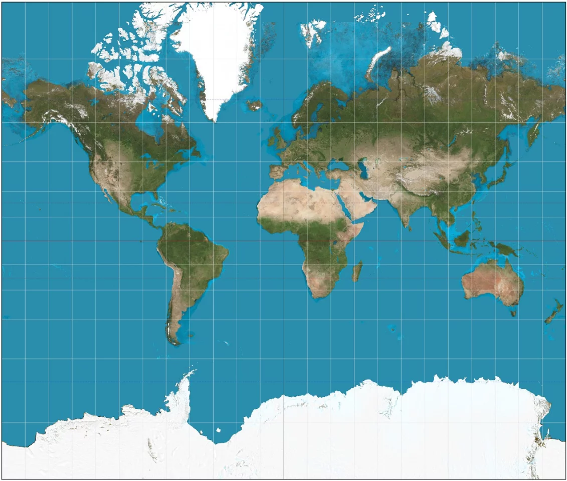
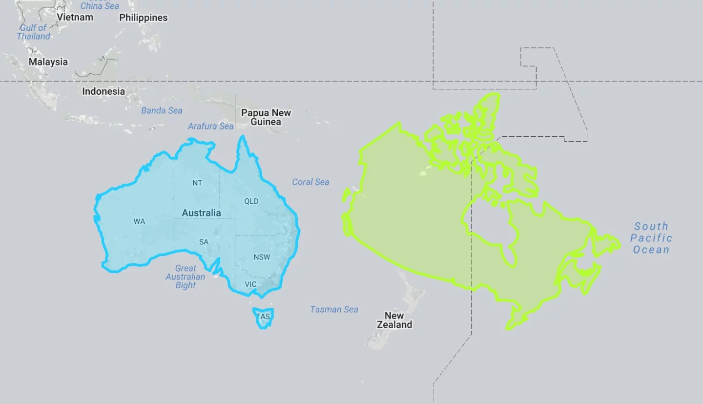
It works well for nautical navigation, but it also massively distorts the size and shape of land masses, particularly near the poles. Take Canada as an example – it looks absolutely enormous, but if you remove the cylindrical distortion, you find it's not actually that much bigger than Australia (if you don't consider an extra 2.3 million km2 (888,000 mi2) much):

Canada may look enormous on a traditional map, but here's its true size next to Australia

Another example: Greenland looks massive, but here it is in between Africa and South America with the size distortion removed. You can play around with this stuff yourself at TheTrueSize.

Greenland: massive on a Mercator world map, but here's its true size between Africa and South America

There are other projections of the globe that seek to represent the size of land masses more fairly; take the Gall-Peters projection, which tries to even things up by vertically compressing the areas near the poles:

The Gall-Peters projection attempts to squash the areas closer to the poles in order to correct some of the distortion in the Mercator projection

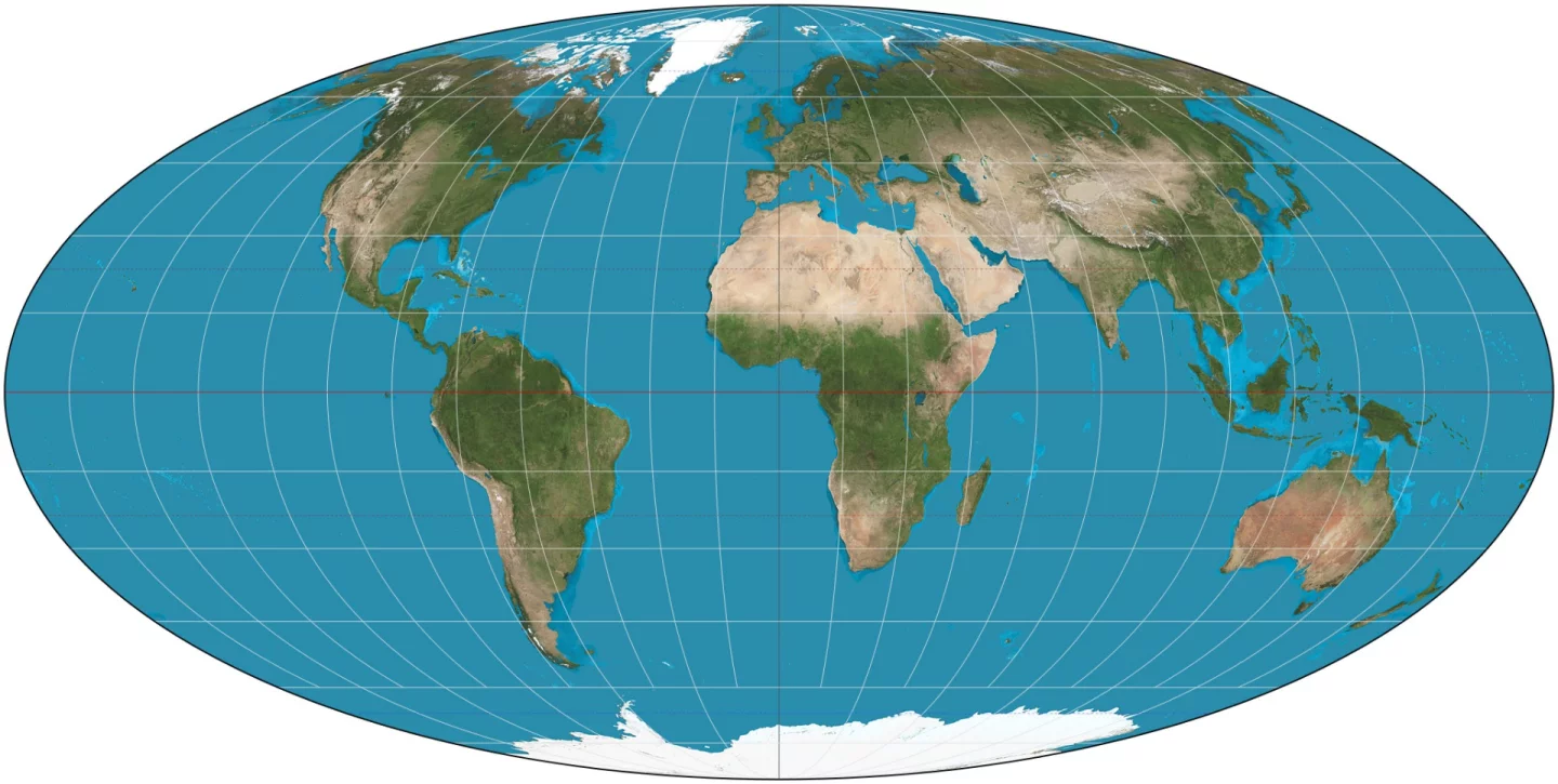
Or the Mollweide projection, which throws out the idea of fitting everything onto a nice neat rectangle, and bends continents around in order to try to represent land mass as accurately as possible:

The Mollweide projection abandons the idea of a rectangular map in order to try to keep proportions correct

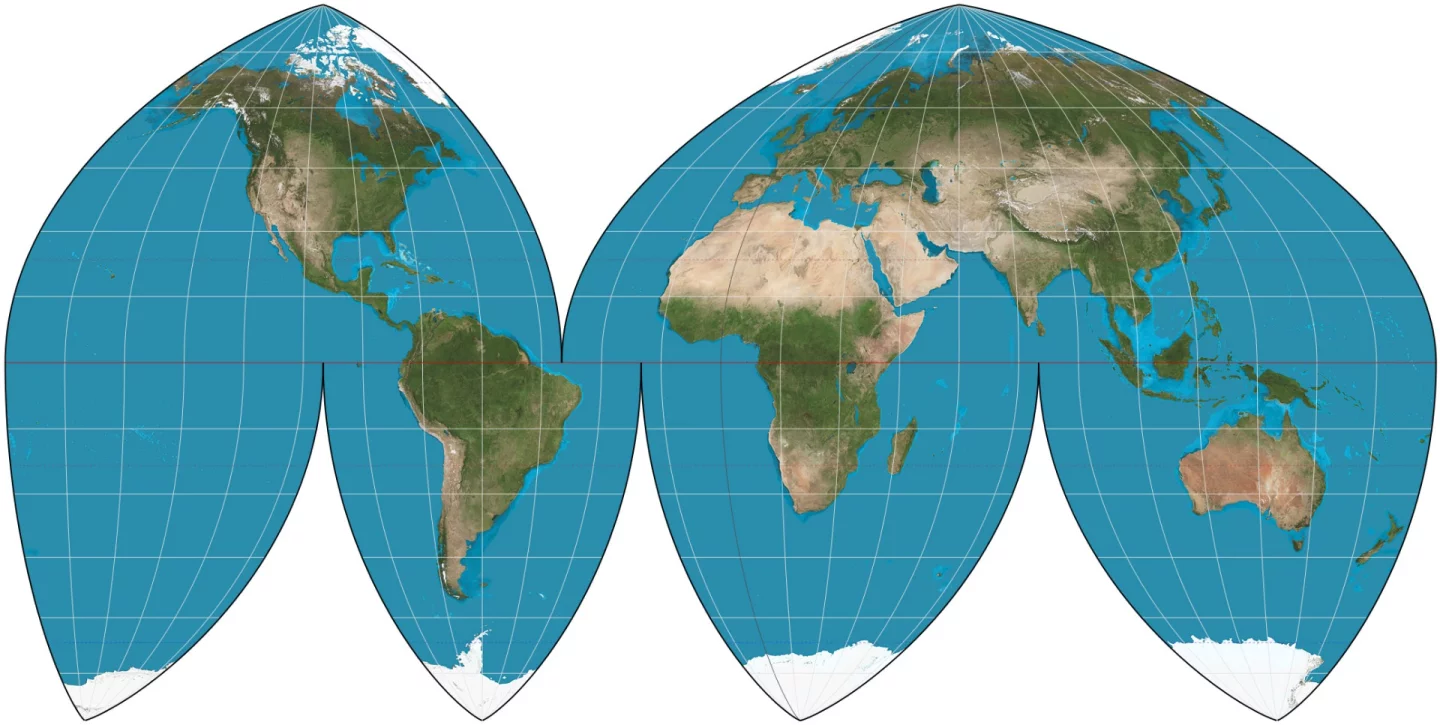
Or the Boggs eumorphic projection, which takes something like the Mollweide idea and slices it up to try to undo some of that bending and show both the correct shape and land mass size, sacrificing any usable navigation abilities in the ocean areas:

The Boggs Eumorphic projection chops up something similar to the Mollweide projection in order to keep North upward as well as having correct proportions

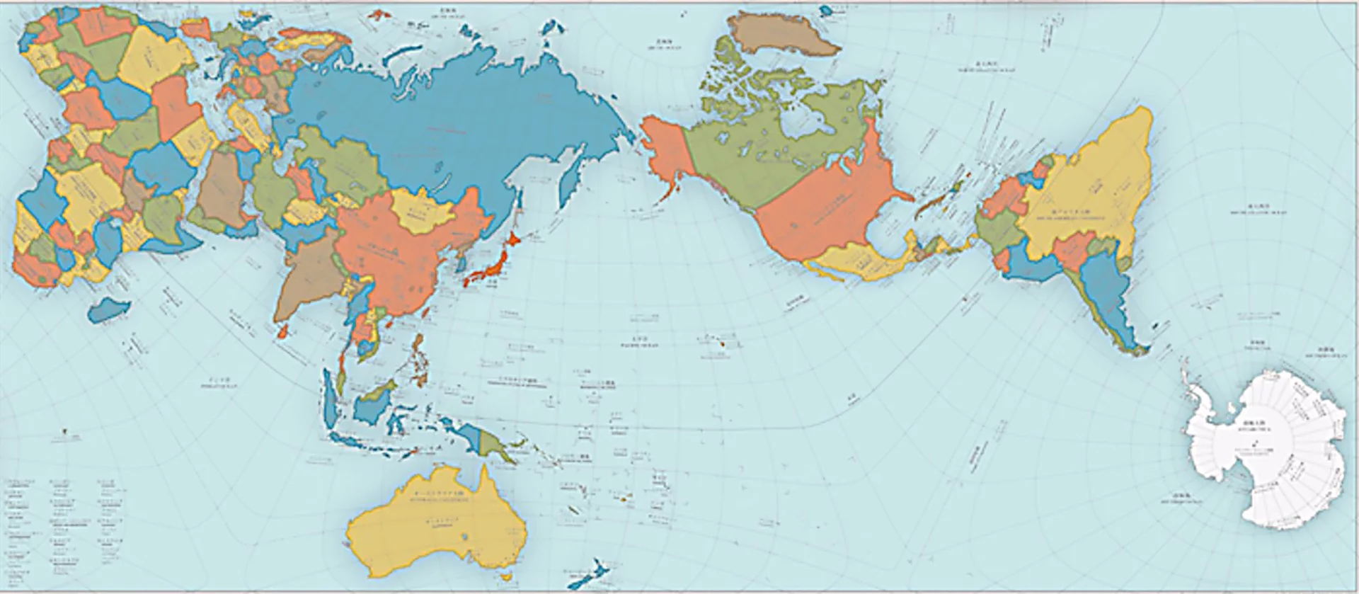
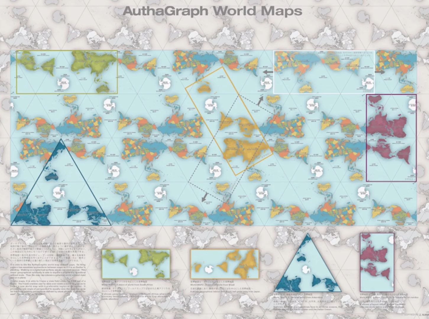
There are many more, and now another has joined the list. Winner of the Japan Institute of Design Promotion's Good Design Award for 2016, meet the Authagraph World Map:

The Authograph World Map: looks weird, but all proportions are very close to correct and it fits in a neat 4:3 rectangle

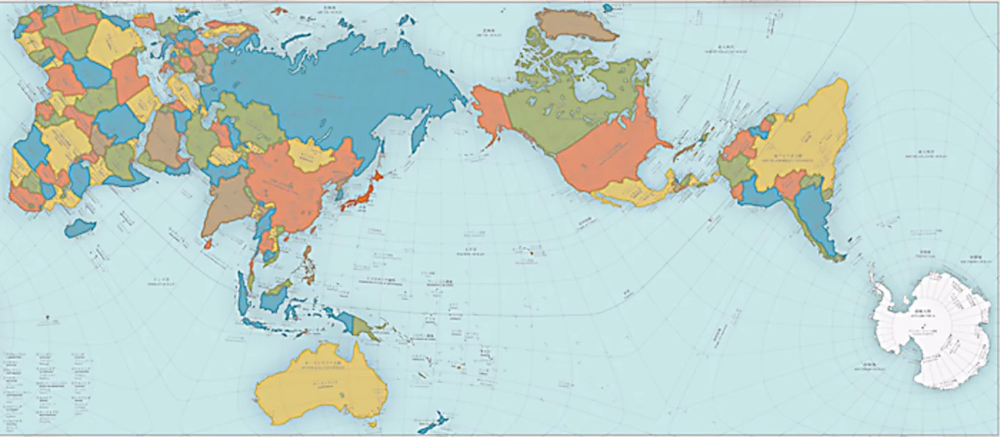
Clearly, nobody is using this thing to plot a course. Lines of longitude and latitude bend, twist and curl, and figuring out which way's north is a challenge in some spots. But in terms of representing the size and shape of land masses, it's actually very accurate.

Created by Hajime Narukawa of the Keio University Graduate School of Media and Governance, the Authagraph map fits perfectly into a nice rectangular shape with a neat 3:4 aspect ratio thanks to its ingenious method of construction.

The Authagraph World Map: how the projection is built
The Authagraph World Map: how the projection is built

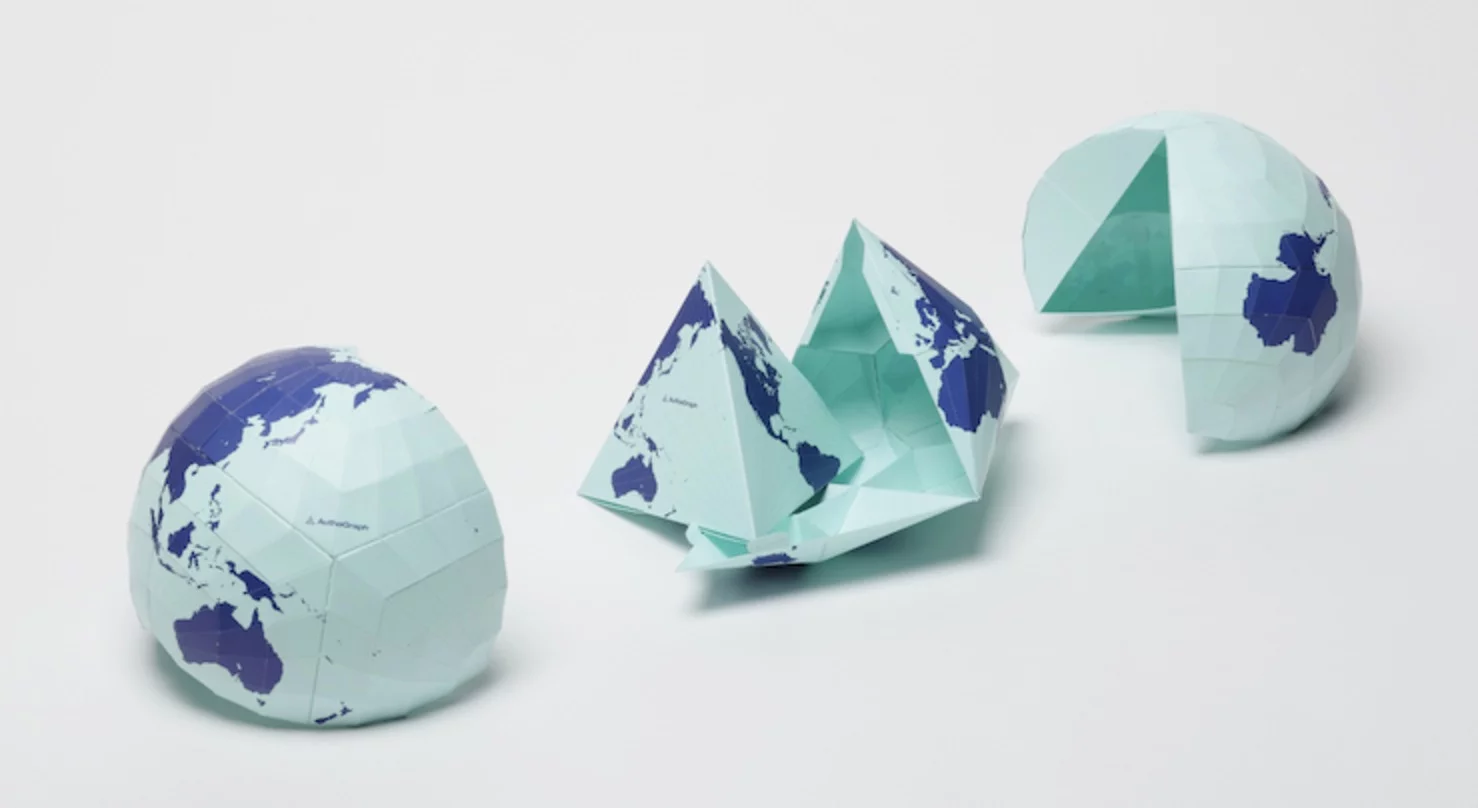
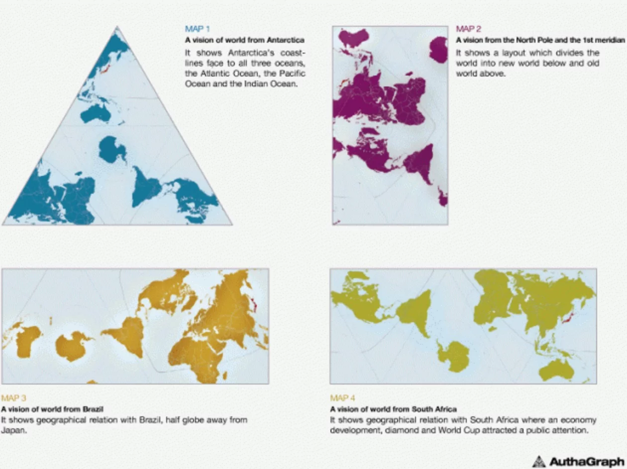
First, the sphere is divided into some 96 regions and then these regions are mapped onto an inflated tetrahedron shape. The inflated tetrahedron is flattened into a regular tetrahedron, then the tetrahedron is cut out and flattened into a big triangle and lined up with a whole bunch of other ones. From there, you can choose where to cut your map out from, depending on what you need to highlight and whether you're comfortable cutting land masses in half.

The Authagraph World Map: once the tetrahedrons are laid out, you can choose any way you like to cut a map out.

It's not officially yet an equal-area map in the eyes of the cartography community, which is rightly picky about such things, but with an increased number of subdivisions it could attain that rating.

Now, to figure out what it's useful for!

Source: Authagraph via Good Design Awards

View gallery - 12 images
8 comments
8 comments
Timelord
R. Buckminster Fuller's Dymaxion projection achieved essentially the same goals about 70 years ago. https://en.wikipedia.org/wiki/Dymaxion_map
Chizzy
It just a modern dymaxion. i'd rather have a watterman butterfly. xkcd.com/977/
ljaques
What does it matter? It seems that kids are graduating from school without knowing where their state or country is on the map or globe anyway. <sigh> Given my druthers, I would prefer whichever map suited my use (driving, flying, boating). The US and Oregon road atlases suit me right now.
StephanHaak
There is no need for this; Since we know that Polaris can be seen from the Southern Hemisphere we know the Earth is flat.
DerekR
I'm surprised you'd leave out Buckminster Fuller's Dymaxion projection. Better than any of these IMO. http://www.genekeyes.com/FULLER/BF-7-Internet.html Or,as some argue, even better, the Cahill-Keyes projection: http://www.genekeyes.com/MENUS/C-K-linklist.html
Reason
Still the wrong way 'up' ;)
http://www.transpacificproject.com/wp-content/uploads/2011/06/SouthUpMap1.jpg
... and Stephan no we can't see Polaris!
Bob Stuart
Very interesting, but you'd never guess about South America and Africa drifting apart from these shapes.
alang
Please amend your article to take into account the fact that this map is merely a rip-off of Bucky Fuller’s Dymaxion World Map. That the Japanese gave this one an award (for originality?) shows that they need to get out into the REAL WORLD a bit more. Come on, give credit where it is due, and expose this intellectual dishonesty (some may call it theft). Good Design Awards need to do some fact checking before jumping to their decisions.