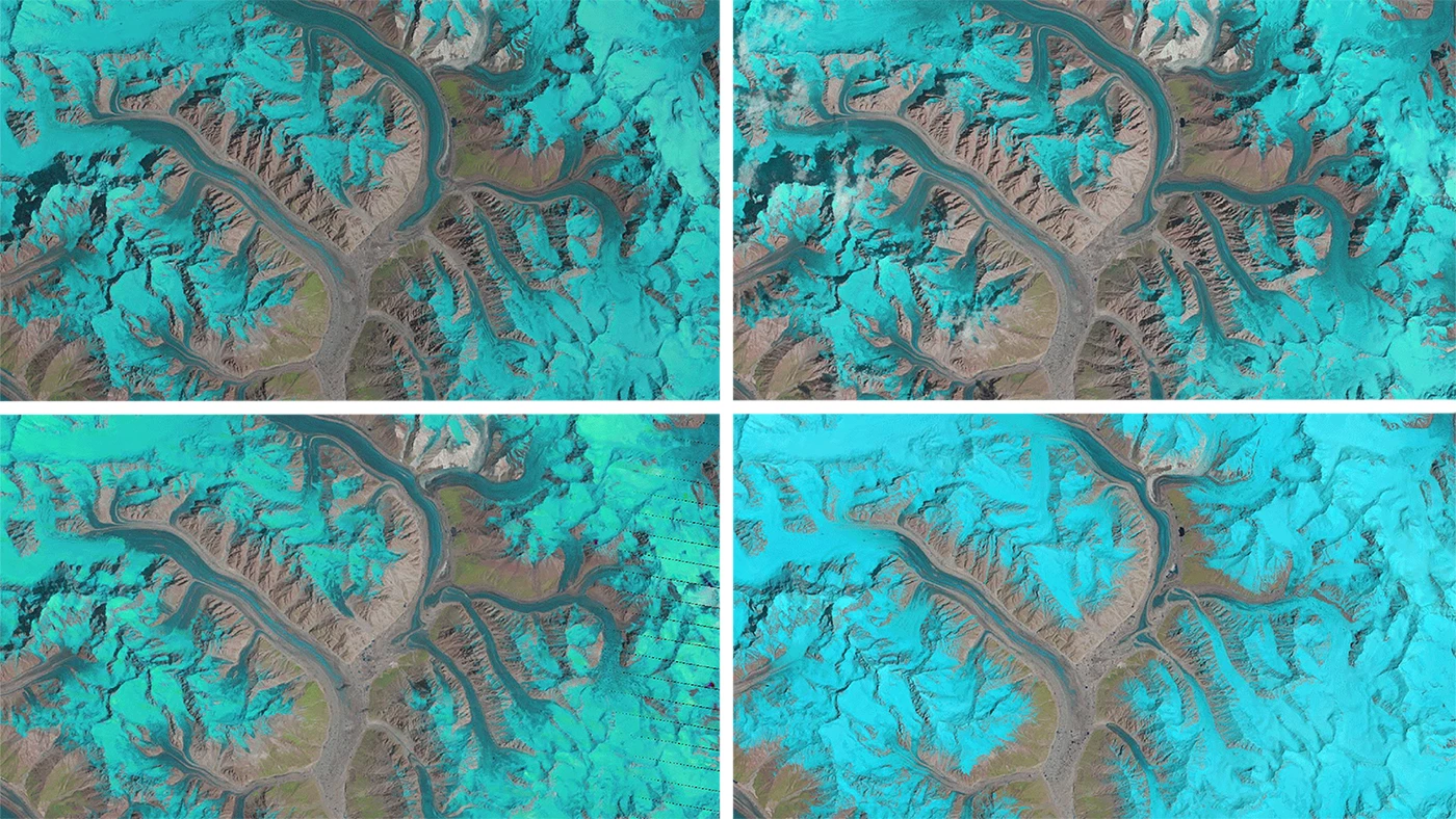
A researcher at Switzerland'sUniversity of Zurich has combined 25 years worth of satellite imageryto show the complex behavior of glaciers in a single second. Theeffort made use of data collected by NASA's Landsat satellites, focusing on the Karakoram mountain range in Asia.
The animations were created byglaciologist Dr. Frank Paul, and form part of the ESA's Climate ChangeInitiative, which is combining datasets to build the best possiblepicture of glacier movement. The GIFs were made by combining betweenseven and 15 false-color images taken by three different Landsatsatellites between the years 1990 and 2015. The glaciers can be seenin light blues to cyan, with water in dark blue, vegetation in green, bareground in brown and clouds in white.
The animations focus on four regions –Panmah, Skamri-Sarpo Laggo, Baltoro and Shaksgam – and show themovement of the glaciers with a level of clarity that ground-basedcameras simply can't provide. Rather than focusing on any singleglacier front, the satellite imagery provides a look at the bigpicture, and by using Landsat imagery, allows us to see the changesover a long period of time.
With the movement sped up some 800million times, the tiny movements of the glacier can be easily seen,showing that they're not retreating, but surging or advancing,flowing into one another. They're much easier to process than side-by-side images, where the human eye can struggle to easily pick out differences.
The images are certainly impressive,and do a good job of conveying both the scale and complexity of thechanges. That said (and as Dr. Paul points out), given access to thedata, such animations are easy to create.
"I like the idea of applying an'old-school' and very simple file format, along with freely availablesoftware, to do something that is difficult to achieve with otherformats or commercial software," says Dr Paul. "But mostimportantly anybody can create these animations. Everything requiredto do it – both images and software – is freely available, so Irecommend trying this at home."
You can check out the animation of the Panmah glacier here, and the Baltoro glacier here.
The work was published in the journalThe Cryosphere.
Sources: ESA


