You'll hear a lot of snarky comments about Samsung's "throw everything against the wall and see what sticks" approach to consumer tech products. And perhaps rightfully so. But the flip side to that strategy is that we get to see the latest innovations not just once a year, but all year-round. Join Gizmag, as we review the latest tablet evolution to shoot out of Samsung's fire hose, the Galaxy Tab S 8.4.
When we were at Samsung's launch event for the Tab S, I heard a lot of talk about the Tab S' screen. And there's a good reason for that: its Super AMOLED display is outstanding. But if you asked me what the Tab S' killer feature is, I'd actually go with its light and thin build. It's insane just how feathery and slender this thing is.
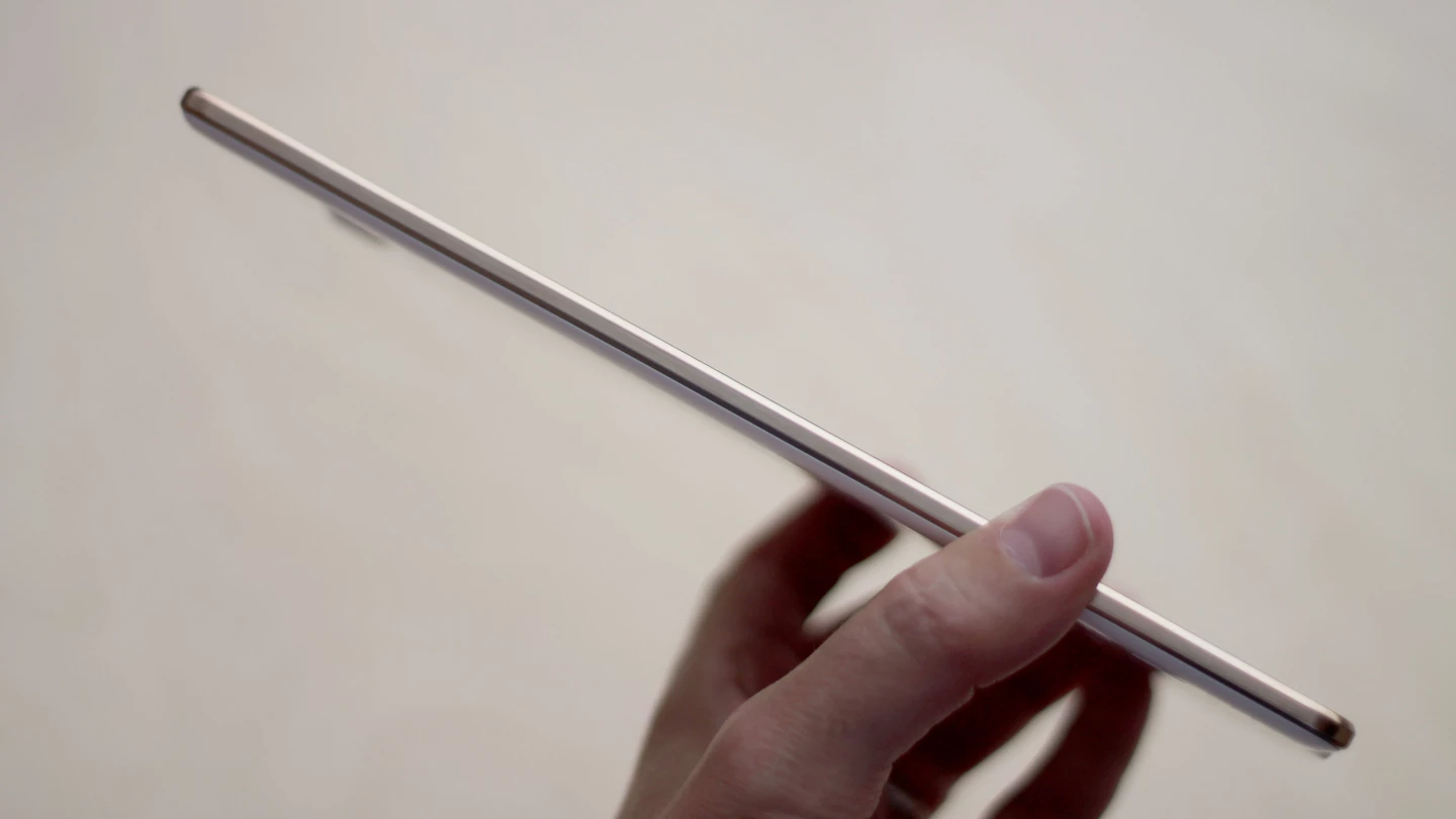
The best metaphor I can use to describe holding the Tab S 8.4 is a piece of cardboard. That doesn't sound very flattering for a US$400 tech product, does it? Well, it actually is. Imagine holding a tablet that has a stunning display, long battery life and zippy performance – but feels almost like a piece of cardboard in your hand. We've seen lots of airy tablets in the last year, but the 294 g (10.4 oz) Tab S takes it to a new extreme. It's almost mind-boggling that there's so much advanced technology in such a light and thin package.
This makes the Tab S 8.4 outstanding for reading. Ditto for watching video (more on that in a minute) and perusing magazines. You can get lost in whatever it is you're doing, and your arm won't tire a bit.

Then there's the screen. The Tab S series (there's also a 10.5-in version) marks the first time we've seen high-resolution Super AMOLED displays in tablets. AMOLED screens have a bit of a love-or-hate reputation, with their larger-than-life colors, but they have a few indisputable advantages.
First, their blacks are "true black," so rather than seeing black pixels that are illuminated by a backlight, AMOLED screens don't fire up any pixels at all for black portions of the display. It's a deeper black than other screens can give you. AMOLED screens also typically have a higher contrast, greater range of colors and wider viewing angles.
So what happens when you put all of this on a ridiculously sharp tablet? Well, in some places, it makes for one hell of an eye candy show. In other spots, well, it isn't as big of a difference as Samsung's presentation suggested.
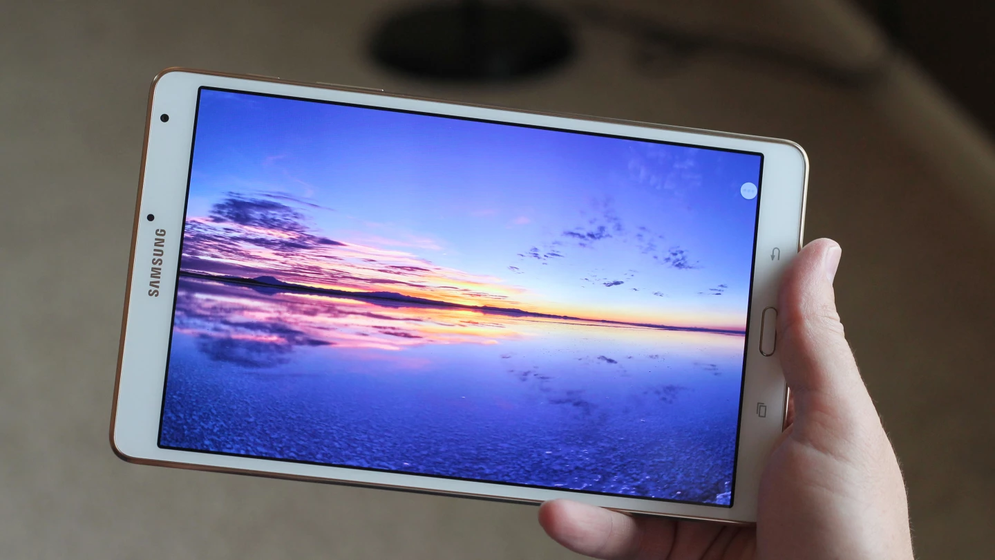
The places where the AMOLED display does shine are videos and still images. Samsung includes a sample video with the Tab S that shows various nature shots, and it looks stunning. Part of that it is because the video file plays in the tablet's full 2,560 x 1,600 resolution, as opposed to the standard 1080p or 720p options. But it also has to do with the deeper colors, rich contrast and true blacks that the AMOLED screen gives you. Even if you never buy this tablet, do yourself a favor and try to watch that video on an in-store demo model.
Standard full HD videos played through Netflix and YouTube look great too. They don't have quite the mind-blowing resolution of the Samsung showcase clip, but they do still provide a nice upgrade from streaming those services on other HD tablets – including the latest iPads.
In other places, like your home screen and other apps, the difference isn't as noticeable. The screen still looks terrific there, but compared to Samsung's last tablet with this same screen size and resolution, the Galaxy Tab Pro 8.4, I didn't notice much of a difference. In these "regular" apps, both tablets look great, with no obvious advantage for the Tab S.
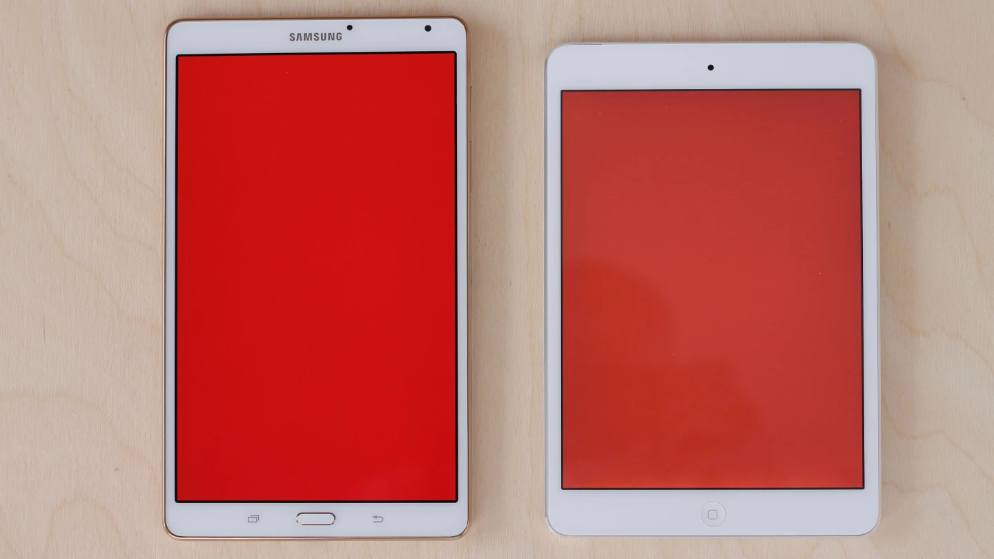
As for the screen size of the Galaxy Tab S 8.4, we're looking at a mini-tablet, rather than a full-sized affair. It gives you about 6 percent more screen area than the iPad mini (see the comparison shot above) and 30 percent less than the iPad Air. Customer tastes will vary, but I love this 8-in range for tablets. 7-in slates are usually too cramped for me, and 10-inchers can sometimes sacrifice portability. 8-inchers like the Tab S 8.4 make this Goldilocks very happy.
In terms of software, you get Android 4.4 with Samsung's TouchWiz UI layered on top, which should be familiar to anyone who's used any recent Galaxy device. There are, however, a few cool new features in store this time.

SideSync 3.0 is a nice bonus – but only if you also happen to own a Galaxy S5. If you do, it lets you easily sync the two devices over Wi-Fi, so you can actually control the phone from your tablet. Yes, you'll actually see the GS5's screen on the Tab S' screen (like you see above), and it will run apps and respond to your touches, just as it would on the phone.
That might sound like yet another gimmicky Samsung feature that nobody really needs, but it can come in handy. The biggest perk is that, when you're at home, it lets you leave your phone sitting on a charger. Just tote your Tab S around the house with you and take care of your tablet and phone business – be it calls, text messages or anything else – on the Tab S. Then when you're ready to leave, your 100 percent juiced-up phone will be waiting for you.
If you don't already own a Galaxy S5, I wouldn't recommend buying one just to use SideSync 3.0 with the Tab S. But the phone/tablet syncing is a nice bonus if the GS5 is already your handset of choice. And while the screen sharing portion of SideSync also works with the Galaxy S4 and Galaxy Note 3, the call forwarding feature (essential for leaving your phone on the charger) only works with the GS5.
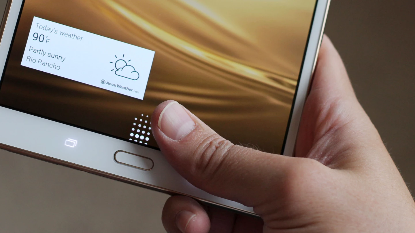
Another nice feature (or, in this case, combination of features) is the marriage of the Tab S' fingerprint sensor to user accounts. The Tab S not only lets you create separate user accounts for each person who's going to be sharing the tablet, but you can also authenticate each login with a swipe of the finger. Anyone who doesn't have your passcode or fingerprint will be locked out.
It's an easy and convenient way for each friend or family member to log in, where they'll each find their own home screen, apps, photos and data. Tablets are very personal devices, so this approach won't work for everyone. But if you live in a home that doesn't mind sharing, this setup can potentially save you some money.
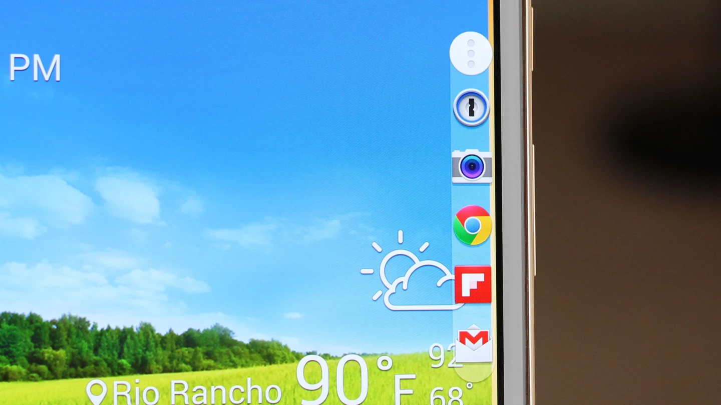
Another nice bonus is Toolbox. It's a small, semi-transparent circle that hovers on the edge of your display. Tap it and you'll get a pop-out bar filled with five app shortcuts (of your choosing). Touch one of those icons and you'll jump straight into that app, no matter where you're coming from. You can also slide the trigger circle around to adjust where it lives. Combine Toolbox with Samsung's Multi Window (side-by-side multitasking), and you have a tablet that makes hopping from app-to-app a fast and easy process.
I do have one big annoyance with what's otherwise an outstanding tablet. Ever since the iPad mini launched, we've seen plenty of rival tablets with extremely narrow side bezels, like those we see on the Tab S. On the iPad, though, Apple put some code into iOS that rejects accidental touches around the edges of the screen. This was a brilliant idea by Apple, as it lets you grip the side of the tablet and (almost) never have your grip register as a touch.
The Tab S doesn't have that. So you're faced with a choice: grip it on the side, as you might an iPad mini, and end up registering all sorts of accidental screen touches (I run into this frequently when using the Tab S). Or you can hold it some other way, which I find to be less comfortable in hand.
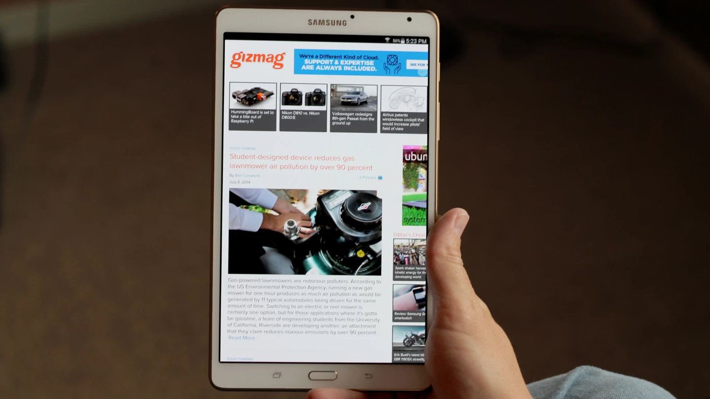
This is the kind of detail that might sound small, but can have a noticeable effect on your experience of using the tablet. And it's a detail that Apple nailed a year and a half ago (and continues to today) but Samsung has yet to cover. Maybe it's a patent issue and Samsung is afraid of getting taken to court yet again, or maybe it's simply a case of marketable good looks coming before customer experience. Either way, I think any tablet with skimpy bezels is going to be much better with this kind of edge touch rejection.
Battery life, on the other hand, is another bright spot. In our standard test, where we stream video with brightness set at 75 percent, the Tab S 8.4 chugged along for an impressive 9 hours and 3 minutes. That's in the same upper echelon that the two newest iPads scored in. Unless you're doing things like playing processor-intensive games for hours on end, with the brightness cranked all the way up, this should easily be an all-day machine.
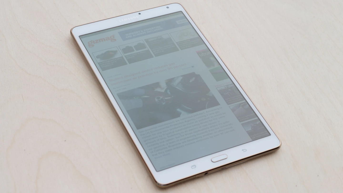
On a hardware level, the Galaxy Tab S is in a league of its own. No other series of tablets – iPad included – gives you such an outstanding combination of screen quality, lightness and thinness. On a software level, it has a few cool tricks up its sleeve as well. But there is that pesky lack of edge touch rejection, along with a tablet app library that still lags behind the App Store's. The Tab S 8.4 is an excellent tablet – one of the best around – and is most definitely worth a look. But for those reasons it isn't quite the no-brainer buy over the Retina iPad mini that it could have been.
Gizmag recommends the Galaxy Tab S 8.4 to anyone looking for a small-ish tablet with the best display and light/thin build around. The Galaxy Tab S 8.4 is available now, starting at US$400 for the 16 GB Wi-Fi only model.
Product page: Samsung


