Ever since HTC rebooted its smartphone lineup with 2013's One M7, the company has been making some of the best smartphones money can buy. But with an improving field of competitors, is the company's third "One" good enough? Join Gizmag, as we review the new HTC One M9.
We could almost write two reviews for the HTC One M9. Both honest, but coming from opposite directions:
Our first review would start off by saying that anyone who liked the last two HTC Ones will be getting a better phone this year. We'd praise HTC for its restraint. No gimmicks, no flash ... just a solid all-around phone that refines on one of the best phones of 2014.
The second review would be disappointed (maybe even baffled) that HTC isn't doing more to push its flagship lineup into the future. Where's the Quad HD display? Why isn't it ultra-light and thin like some of its rivals? Why is its display size stuck at 5 inches? And, most importantly, how many times is HTC going to recycle this same design?
So which review is this? Well, it's a little bit of both – but leaning a bit towards the latter. If you haven't used any of the big flagships that launched in the last six months or so, you might agree with the first review. But if you've spent time with phones like the Galaxy S6, iPhone 6 and Nexus 6 (lots of 6es of late), we think you'll also lean more towards the second review.
The One M9 is playing against a much improved field this year. And though HTC improved on last year's One M8 in a few key areas, the M9 feels more like 2014 Flagship: Redux than it does 2015 Flagship.

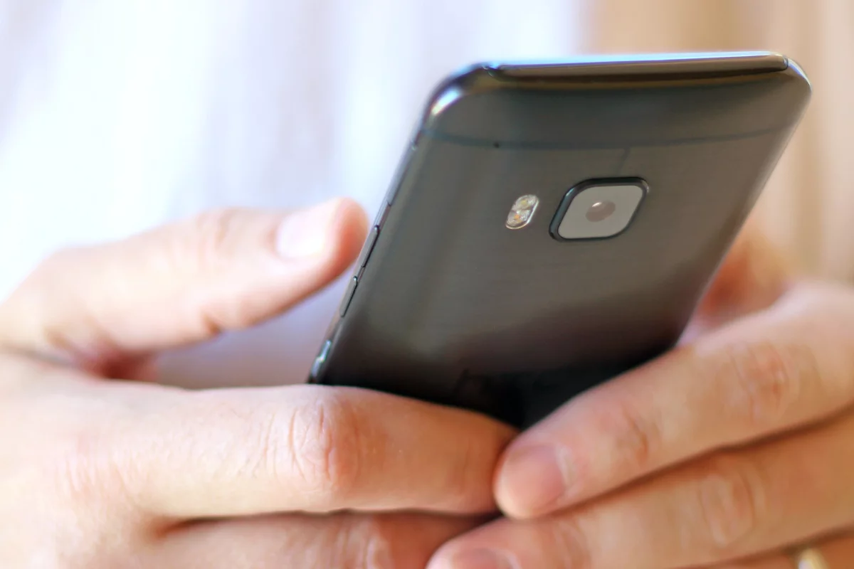
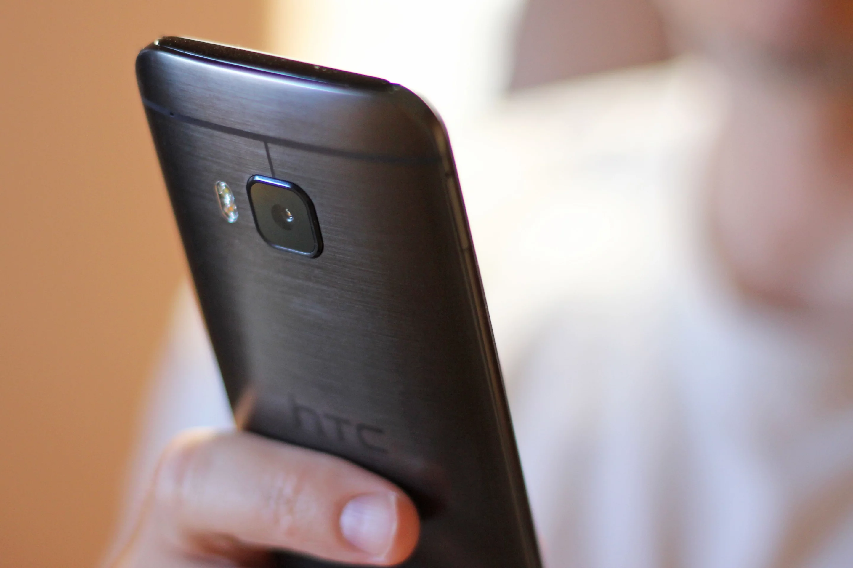
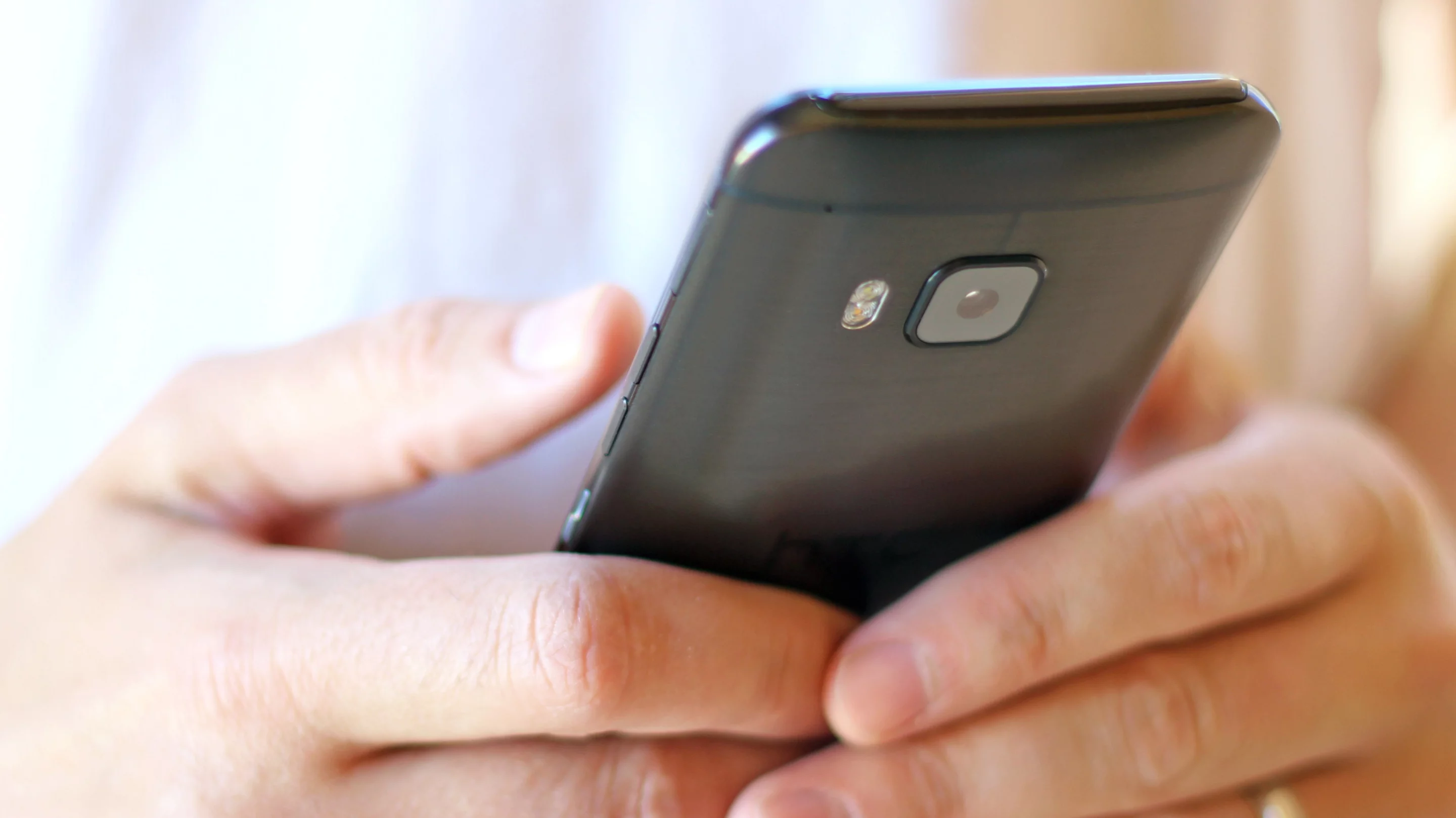
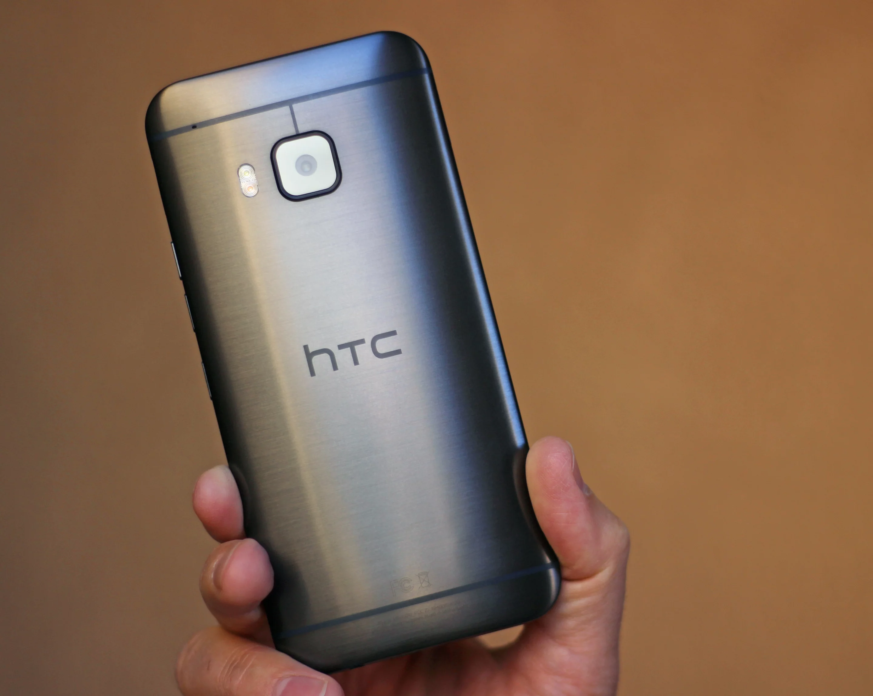
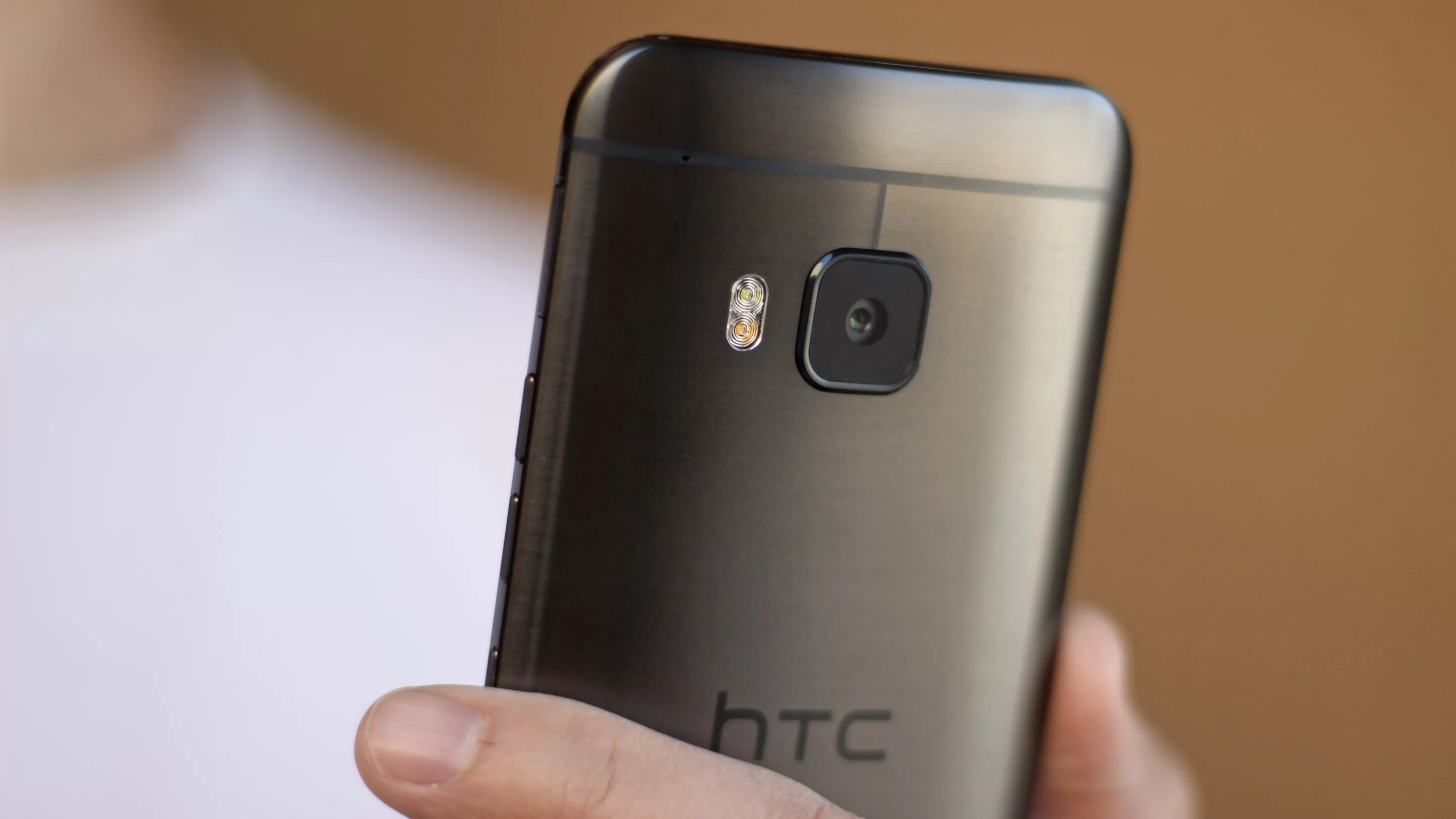
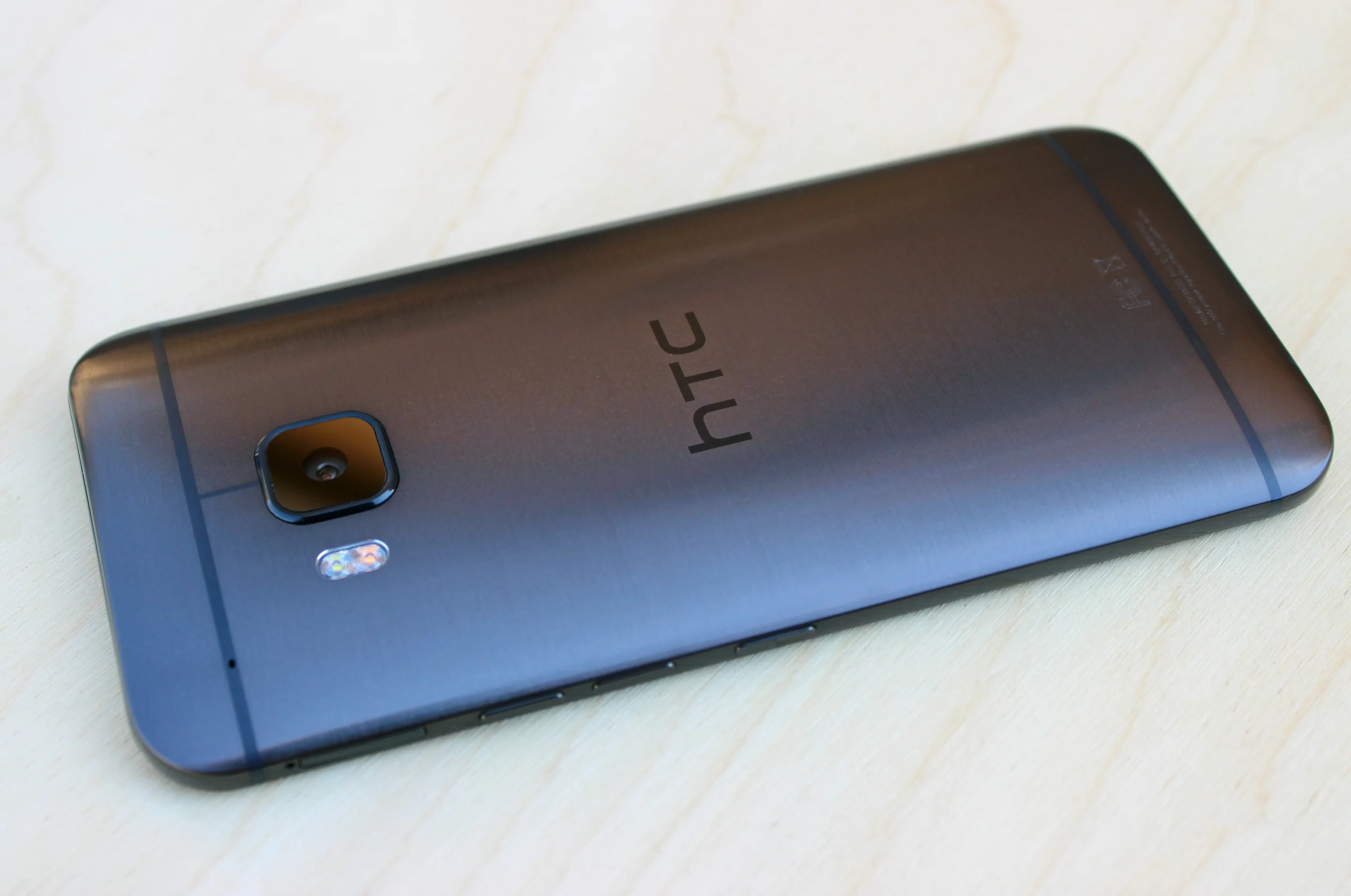
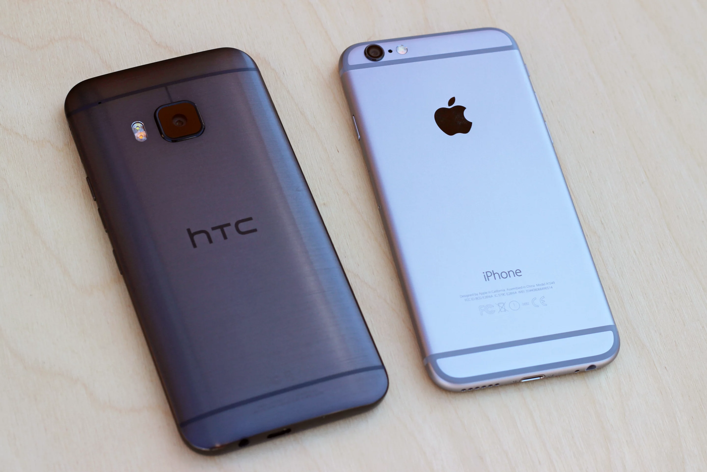
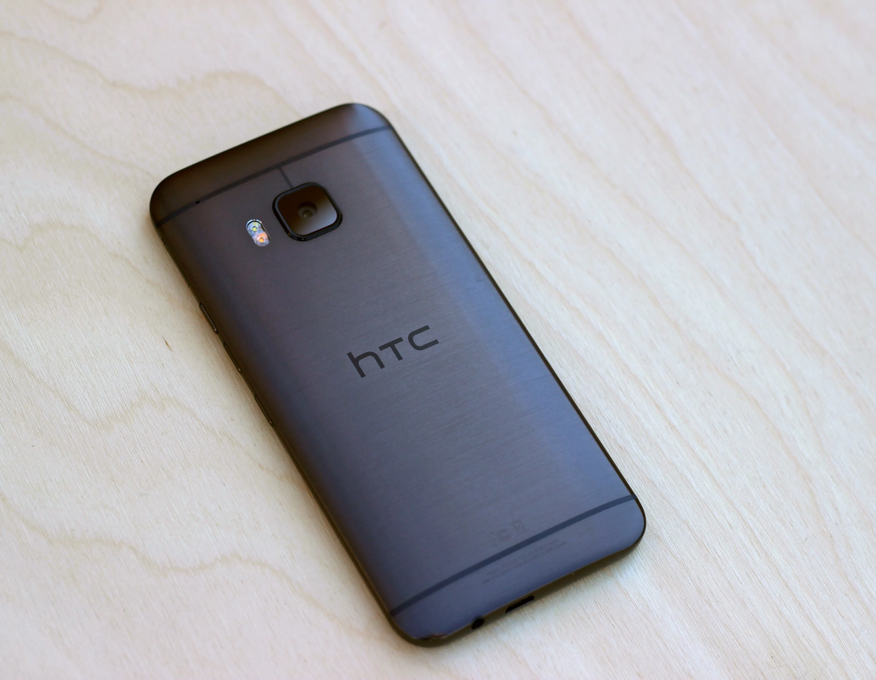
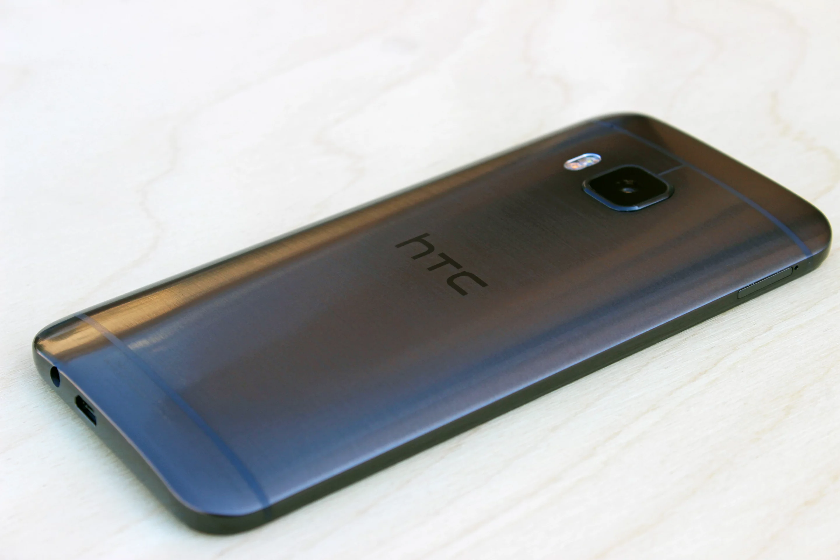
This is still one of the nicest-looking smartphones around, and only Apple's and Samsung's latest flagships soar to these design heights. The One's aluminum unibody with rounded back and cyclops camera peering down at you just look right. A phone's looks are a subjective thing, but our opinion is that HTC's two-year-old design still looks outstanding.
The company made some subtle changes this year – like a two-toned finish that adds a gold color around the edges of the silver model. Unfortunately our review unit is the darker gun metal variant, where "two-toned" translates to black and gray (yay). It still looks sharp, but for a bigger wow factor, we'd recommend going with the silver model.

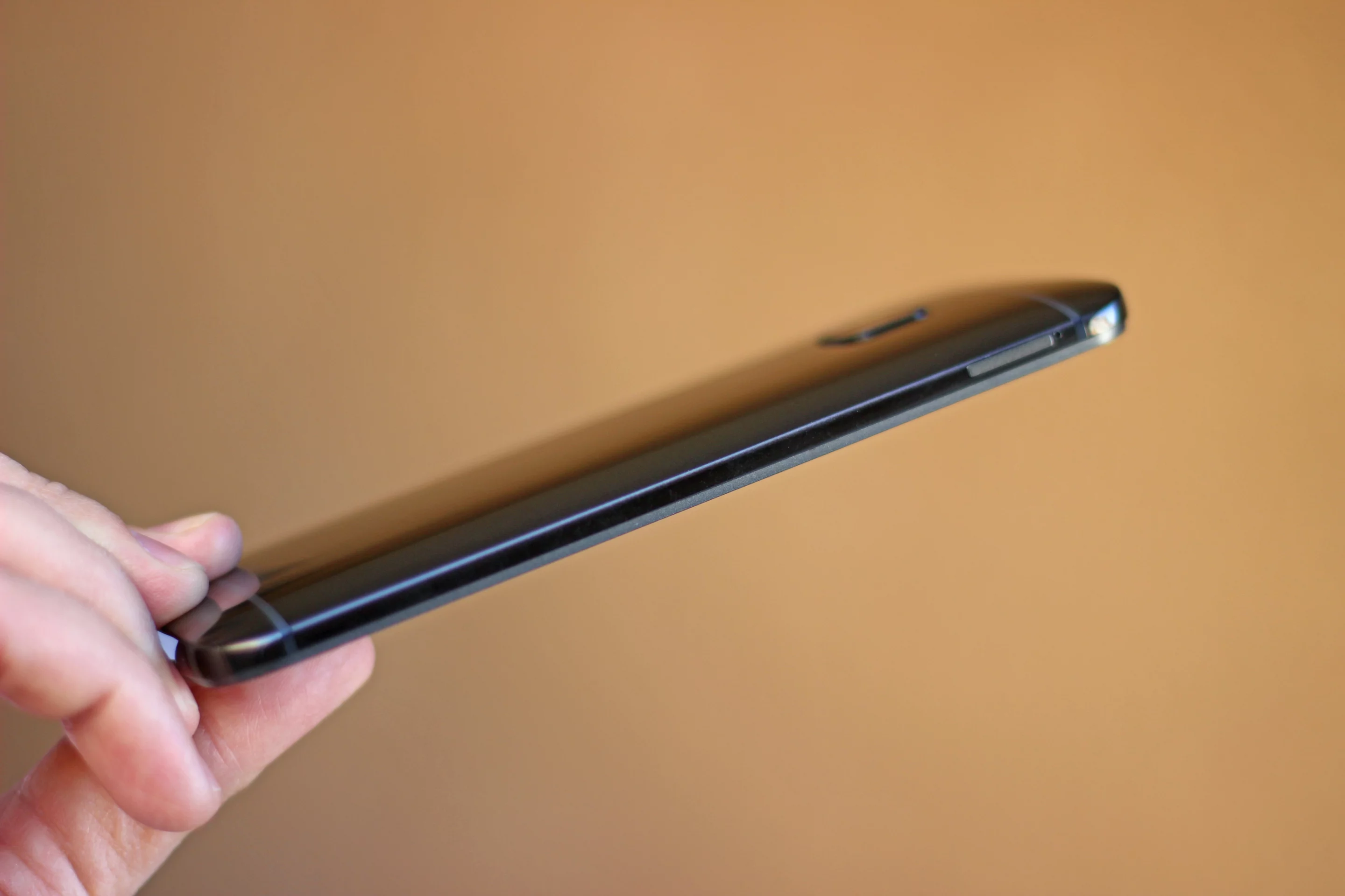
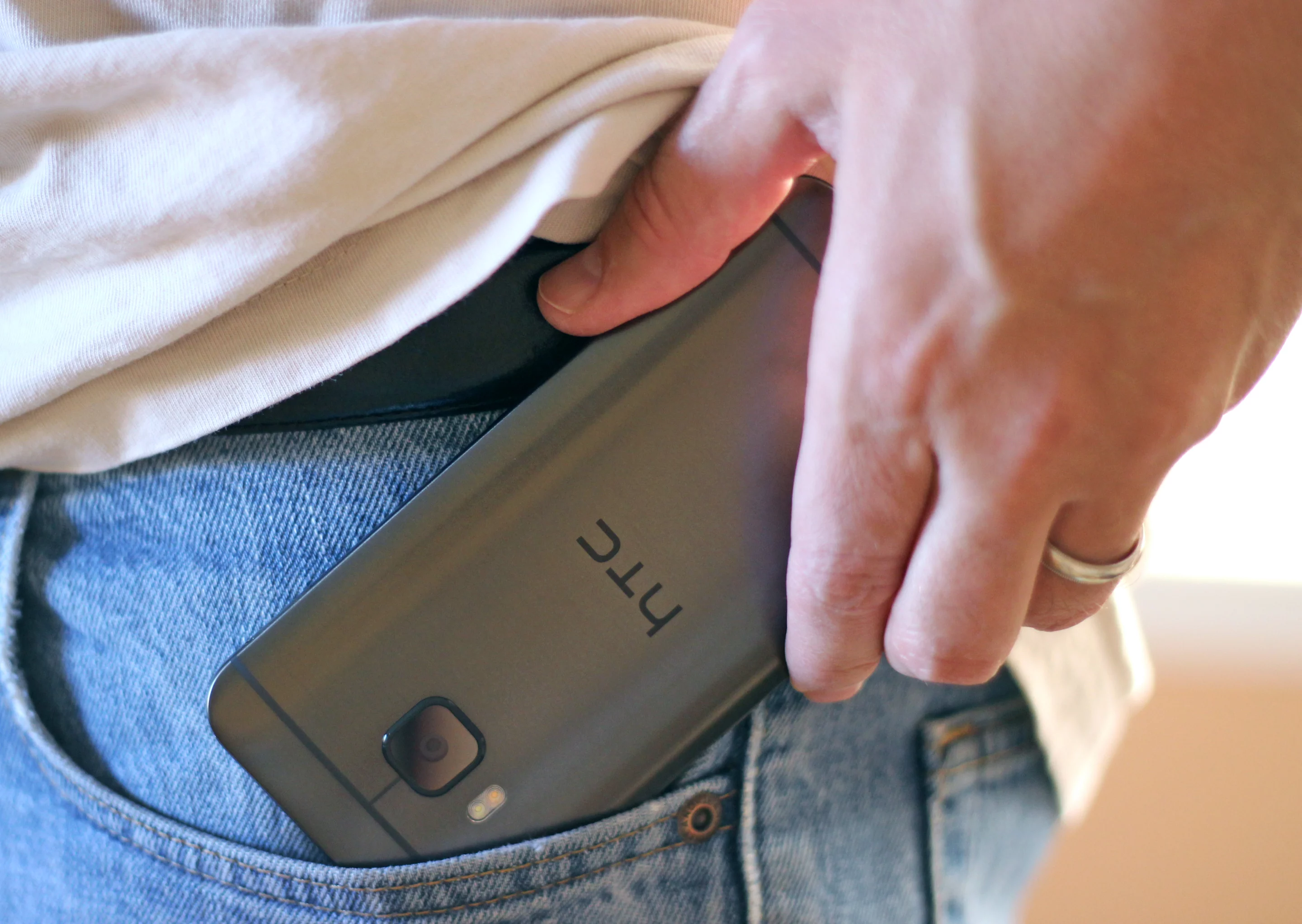
The M9 is a bit shorter and narrower than last year's model, with thinner edges (the phone is technically thicker, but that's measured by the thickest point of its rounded back, not its sides). It feels pretty good in my hand and is on the small side for a flagship (at least by today's standards). It also slips into pockets much easier than the phablets that are becoming more and more prevalent.
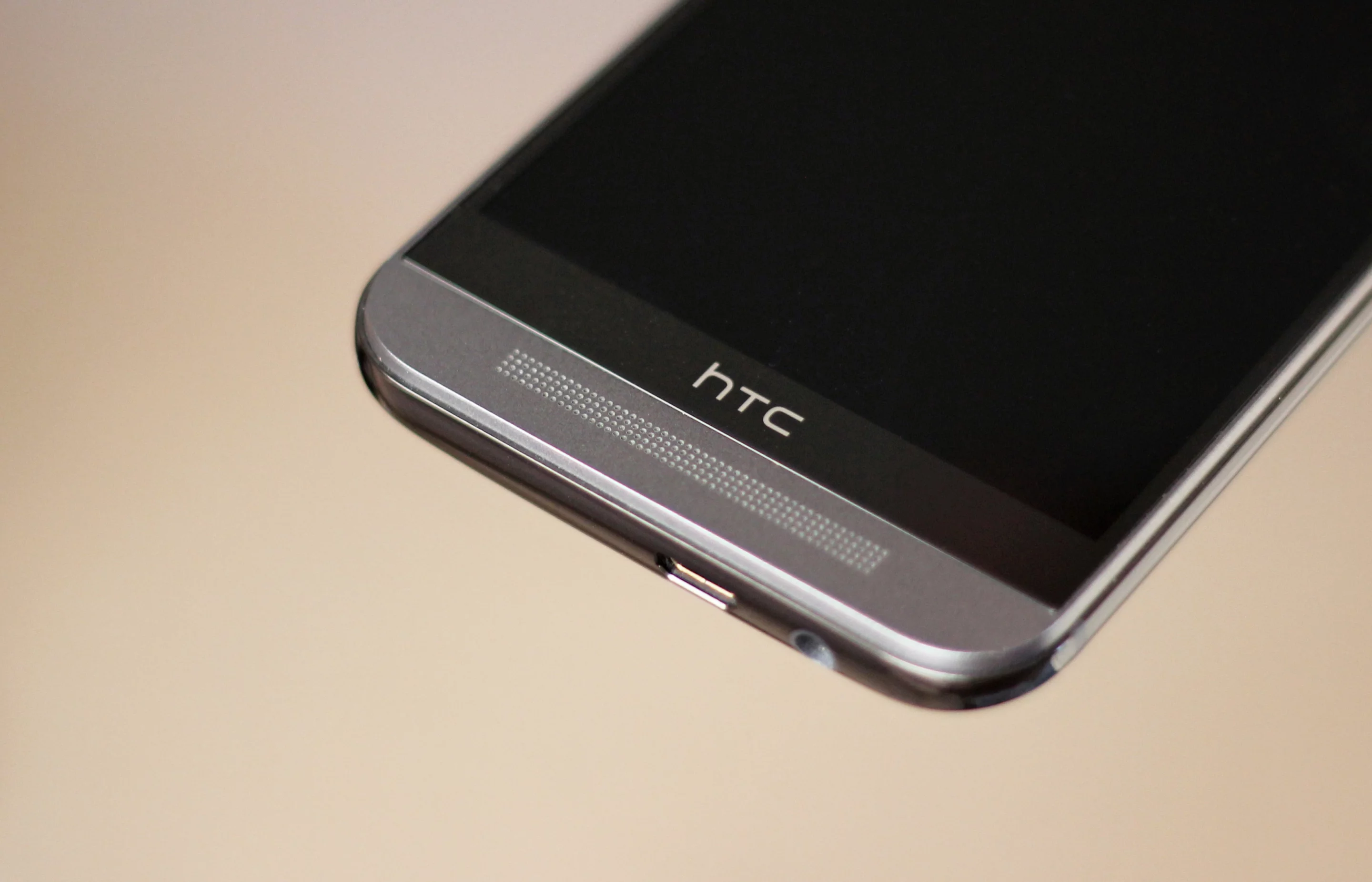
It isn't quite as comfortable to hold in one hand as something like the smaller iPhone 6, and feels noticeably heavier than Apple's and Samsung's flagships (it's 22 percent heavier than the iPhone 6 and 14 percent heavier than the GS6). Its screen size to phone size ratio isn't the best, as there's quite a bit of space (including its speakers) above and below the screen.

Perhaps the best thing about the One M9's build, though, is that HTC has finally made a premium phone that you can use without a case. Every One M9 purchase includes the company's new "Uh Oh" warranty: if you break its screen or get some water damage, HTC will replace your phone once during the first year of ownership. You can even swap it for a new one if you switch carriers.
And if you don't use that replacement during the first year, HTC will knock US$100 off of your next One purchase (just in time for the company's 2016 flagship, no doubt).

This has long been a conundrum with iPhones, older HTC Ones and other premium mobile devices. It's fine and dandy that they look like they belong in a museum, but the nicer they look, the more you feel the need to protect them. So you end up stuffing this gorgeous handset inside a thick layer of plastic. Kinda defeats the purpose of having a beautiful phone in the first place.
Uh Oh makes the One M9 the first premium smartphone that you can completely enjoy, free of "oh shit!" anxiety.

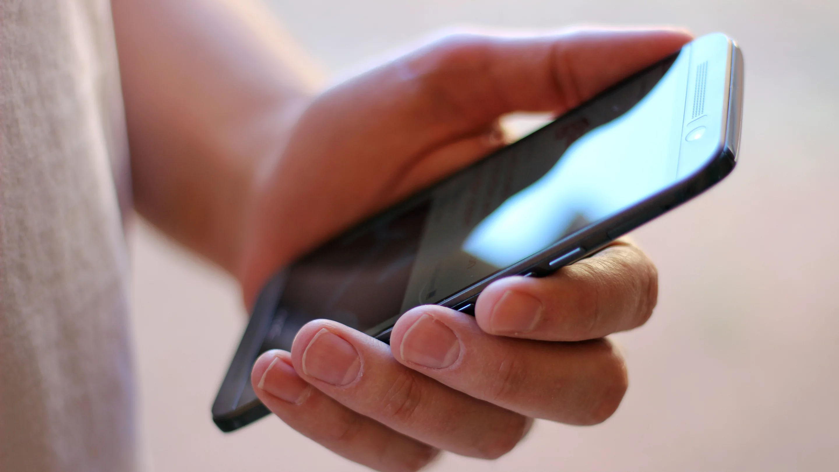
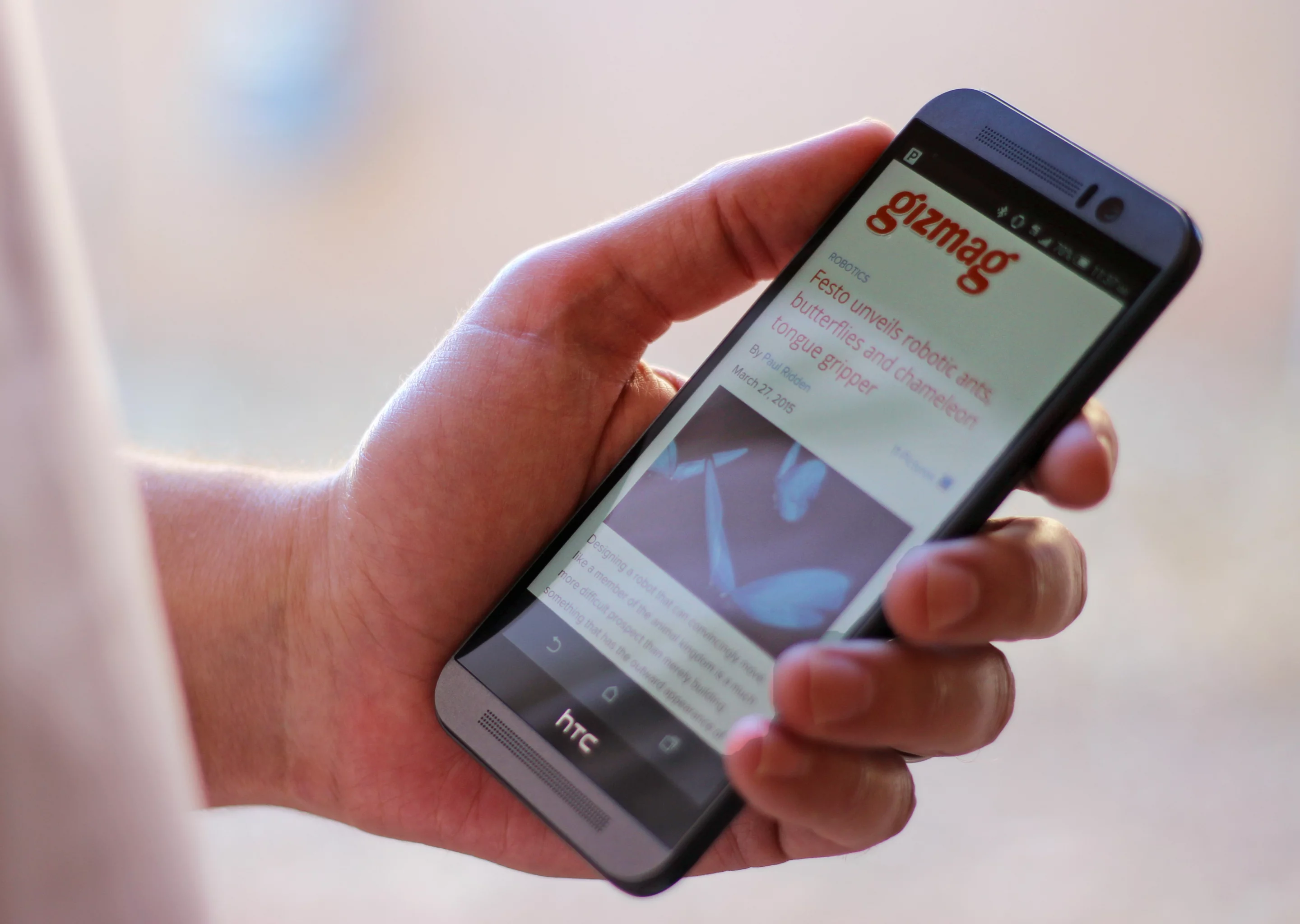
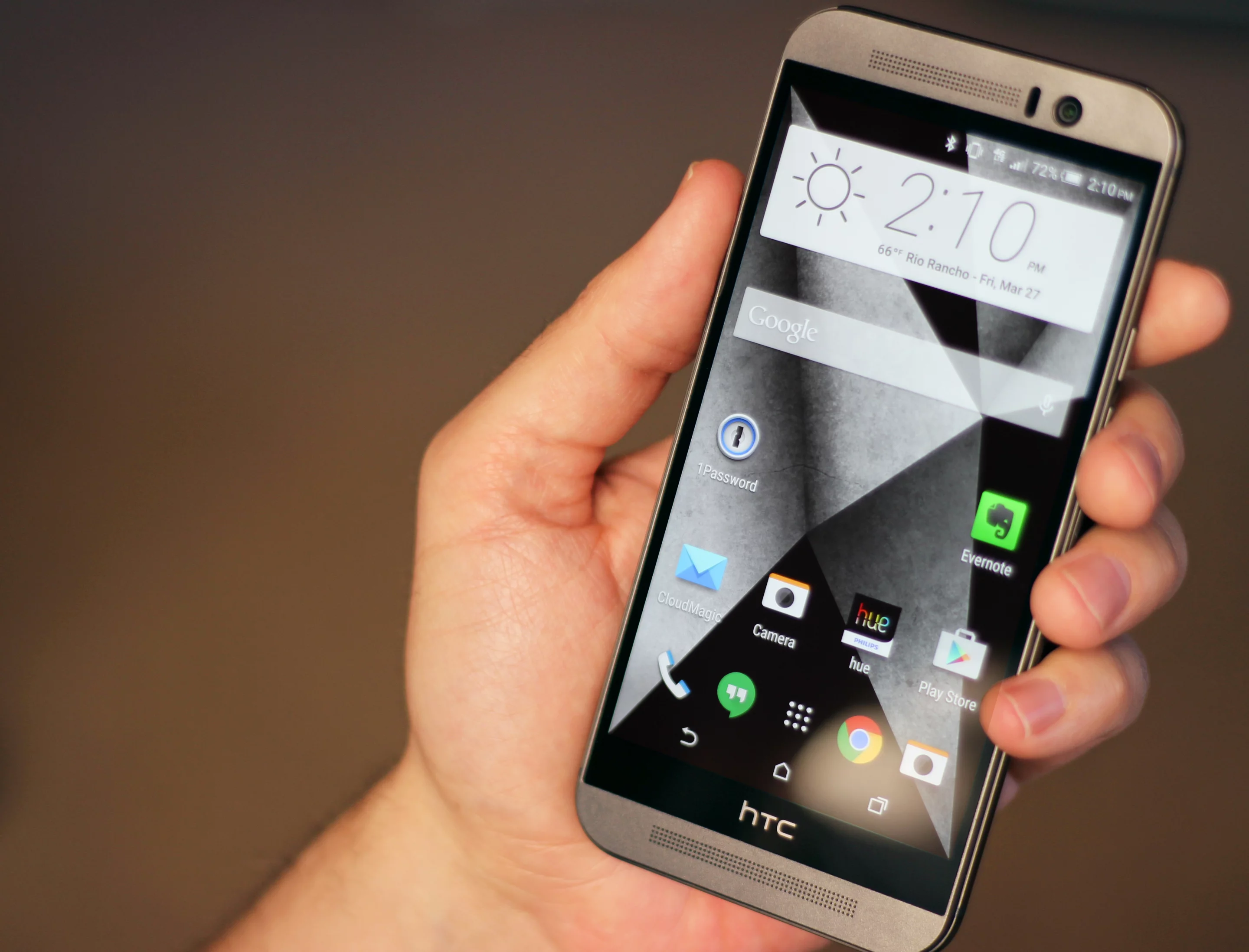
By today's Android flagship standards, the One M9's screen is a bit disappointing. It's smaller and not as razor-sharp as many of its rivals' displays (it's stuck in 1,920 x 1,080, while rivals are moving to 2,560 x 1,440). Don't get us wrong: 5 inches with 1080p resolution is hardly a mid-ranged panel – and HTC's display has good contrast, brightness and color balance. But it just doesn't look like the screen you'd expect from a big 2015 flagship.
If you're like us, and have spent many hours with the Quad HD displays on phones like the Nexus 6, Galaxy Note 4 and LG G3, then the One's screen is going to look a little last-gen.
... and if you plop the One down next to the 577 pixels per inch screen on the Galaxy S6, Samsung's phone pops in ways that the One M9's 441 PPI display can't dream of.
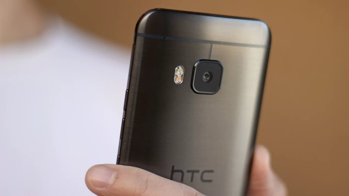
The One M9's camera can go from lock screen to snapped shot in as little as 3.5 seconds (that's very good, even though the Galaxy S6 can beat it). Its high-resolution 20 MP sensor takes sharp images, even after zooming or cropping (within limits, of course). It has Optical Image Stabilization, so you don't need to worry about keeping your hands stone still. And though it loses the UltraPixel camera's terrific low-light performance, it's still solid enough in that department.

Performance is great on the M9, as it zips through Android Lollipop without any hesitation. Some phones from 2014, that were otherwise very fast, would get a little laggy when you pulled up the multitasking switcher. But the M9 hops from app-to-app in no time at all. This isn't unique to the One, though, as the GS6 and LG G Flex 2 both have similar (if not better) seamless performance. The Nexus 6 is in that conversation too.
The HTC One M9 does sometimes get a little warm. We aren't talking about melt-your-fingers-off stuff here, but the aluminum backside will heat up if you use it for a while (especially when its brightness is cranked up). It reminds us of the heat issue in Apple's 3rd-generation iPad a few years ago: noticeable, but nothing that has to ruin your experience.
The One M9 has a higher-capacity battery than last year's One M8, and has good battery life. In our stress test, where we stream video over Wi-Fi with brightness at 75 percent, it actually dropped faster than the One M8 did (the M8 dropped 11 percent per hour in last year's test, but the M9 dropped 18 percent per hour).
We suspect that's tied more to the new model's increased brightness than anything else ("75 percent brightness" is going to be brighter than it was last year), but you might want to take that into account when choosing a brightness level for the M9.
During regular use its uptimes are good, but not noticeably better than those on the M8.

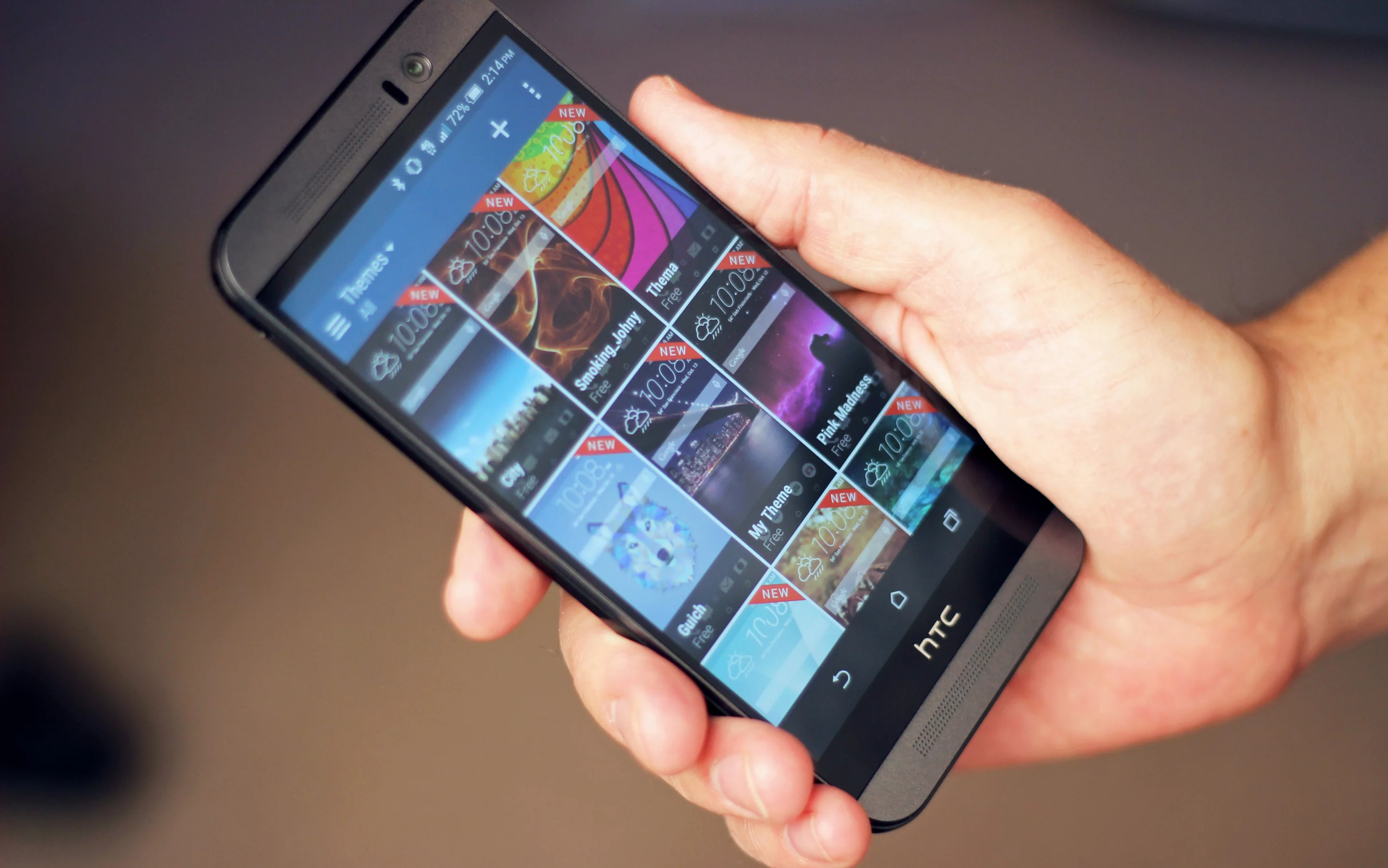
On other fronts, the One M9 still has one of the more subtle and sophisticated Android UIs, with the updated HTC Sense 7. HTC added some theming options this year, which let you give your phone's UI a makeover; it's even releasing tools to let M9 owners create and share their own themes. These go far beyond wallpaper, letting you mix and match things like icons, fonts, sounds and overall color themes. Some people root or jailbreak their phones just to do this stuff, but HTC built it right into the M9.
And of course the One still has the best speakers that you'll find on any smartphone. It's not just that the BoomSound speakers are facing forwards; they're also loud and (for a smartphone) very crisp. They're great for watching video without headphones.

The One M9 isn’t by any means a bad phone: despite our disappointment, it's still quite good. But it also isn't keeping up with other flagships. This is the first HTC One M-series flagship that we wouldn't put in the conversation for "best phone you can buy" at the time of its launch.
Our impression is that HTC's mission going in was to fix the few flaws that the One M8 had. And it did that very well, with a better camera and subtle refinements all around.
But there's one big problem with that: the ideal smartphone isn't something that just stands still. It's a moving target. Last year's "almost perfect" might only be "really good" (or worse) this year. Instead of looking ahead, the One M9 skates to where the puck was a year or two ago.
A slightly bigger Quad HD display, along with a lighter and thinner build, would have made all the difference. That certainly would have made it look a lot better next to Samsung's new flagships (and the top phones from late 2014).

If you don't care about cutting-edge pixel counts, ultra-light and thin builds, bigger screens or novel new features – and you just want a solid all-around phone with a sharp-looking design – then the understated One M9 is still worth a look. Just do yourself a favor, and look at some of its rivals as well. We can't help but think HTC made a big mistake by taking baby steps forward just as Samsung, Apple, Google and others slammed their feet on the gas.
The HTC One M9 launches with US carriers on April 10, for around $650 full retail and $200 on-contract. An unlocked version is available to order now from HTC's website below.
Product page: HTC

