If you're shopping for a smartwatch, but don't want to pay the US$350 and up (in some cases, way up) prices Apple wants for its Watch, then Pebble Time and the Moto 360 are two great alternatives. Join Gizmag, as we compare their features and specs.
Size

The Moto 360 is a bigger watch all around, measuring 12 percent taller, 21 percent wider and 21 percent thicker.
The Moto 360 may still be the most striking smartwatch around, with its big, round display and minimal bezels, but it does also make a sizable impression on your wrist.
Build

The standard Pebble Time has a plastic casing, though it does have steel on its bezels. Pebble will also be selling a more expensive version with an all-steel body.
All versions of the Moto 360 have all-stainless steel bodies.
Swappable bands

Pebble Time's default band is a cheap-feeling silicone affair, but you can swap it for a standard 22 mm one. You can do the same with the Moto 360, though both its default leather bands and more expensive steel variants are nice enough that you may not feel the need.
Colors

Pebble is selling Time in three color options, and there are three casing colors for the Moto as well (though you can also mix and match bands if you customize your order from Motorola's Moto Maker site).
UI navigation

The Moto 360 handles more like a smartphone, using a touchscreen, but Pebble has a non-touch display with four physical buttons on its sides (up, down, select and back).
The Moto 360 also has a button (its crown on the right side), which doubles as a home (short-press) and settings (long-press) shortcut.
Display size

The Moto 360 has a huge display. Pebble Time's screen is only 42 percent as big.
Display resolution
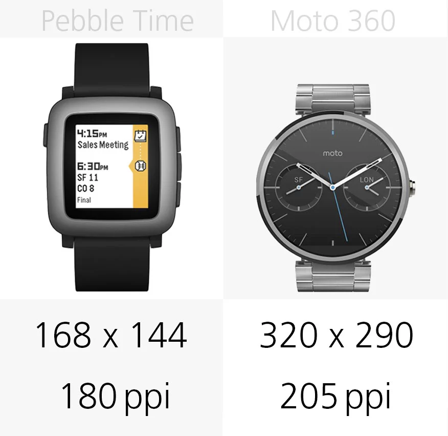
Neither watch is breaking any pixel density records, but the Moto's is 14 percent sharper.
Display type

Pebble Time uses an e-paper screen, which has a similar effect to the e-ink screens you'll see on Kindle readers (though it's a completely different technology, they look similar).
This gives Pebble the advantage in direct sunlight – it also has Kindle-like levels of glare (meaning very little) – but it also means content looks a bit more rudimentary than it does on the Moto.
Battery

This is a huge advantage for Pebble Time, as it can last close to a week on a single charge.
The Moto 360 has the sketchiest battery life of all the Android Wear watches (though software updates have tempered the situation to some degree). It only lasts a day, and if you want to make it that far without problems, you'll want to leave its ambient display setting (which leaves the clock face on more often) turned off.
iPhone compatibility
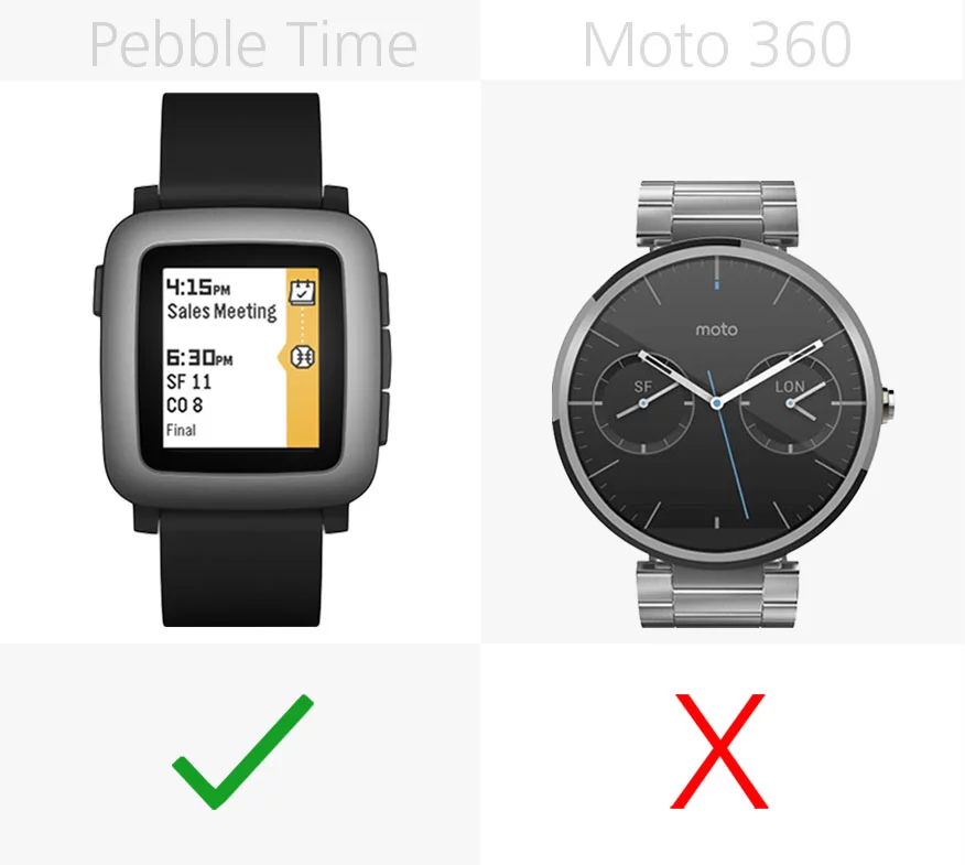
Your smartwatch won't do much for you without a paired smartphone, and another big advantage for Pebble Time is that it plays nicely with iPhones.
Android compatibility
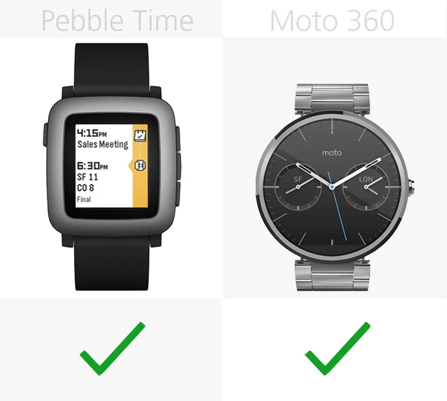
Both watches play nicely with Android phones, as long as it's something remotely recent (running Android 4.0 or higher for Pebble, and Android 4.3+ for the Moto).
Voice control

Time is the first Pebble with a microphone, letting you quick-reply to messages and dictate notes with your voice.
The Moto 360, however, has much more comprehensive voice control. It lets you not only reply, but also compose fresh messages and emails, create reminders, set alarms and timers, search Google, launch third-party apps and services and do just about anything else Google Now lets you do on your other devices.
Reminders

This is a big strike against Pebble Time. We consider setting and receiving reminders to be one of the fundamental purposes of a smartwatch, but you can't do that on Pebble Time (at least not natively).
Android Wear, and therefore the Moto 360, has excellent two-way reminders support built-in.
Fitness apps

Pebble Time also doesn't have automatic, native, always-on fitness tracking – requiring third-party apps to fit that bill. And some of those third-party apps can only track if they're used as your main clock face. To make matters worse, Pebble's store doesn't do a good job of explaining which ones have this requirement and which don't.
The Moto 360 will start tracking your steps from the moment you put it on (in addition to more nuanced third-party fitness app options).
Water resistance

Pebble lists Time's water resistance at up to 30 m (98 ft), while the Moto has a more scaled-down IP67 rating (it can soak in 1 m/3.3 ft of water for 30 minutes).
Software

The most interesting thing about the latest version of Pebble OS is its timeline UI, which lets you scroll through calendar events from the main clock face. We didn't find it to be revolutionary, though if you rely heavily on your phone's calendar app, it could come in very handy.
Android Wear is less about timelines and more about context – be it time, location or recent interests. Like the Google Now service it's based on, it anticipates upcoming events and trips beforehand, sitting just a couple swipes away.
Release

We're likely getting close to a 2nd-generation Moto 360, as this model has been around since last September. Pebble Time is just now launching through retail.
Starting price

If you own an Android phone, it's hard to recommend Pebble Time over the Moto 360. Not only does the Moto do more, with a higher-end casing and default band, but it (currently) starts at $50 cheaper. Unless multi-day battery life or a smaller build is your highest priority, that's a big win for the Moto 360, no matter how you slice it.
For iPhone owners, however, the Moto isn't an option. We still think most people are better off paying an extra $150-200 for the entry-level Apple Watch instead of Pebble Time, but Pebble's latest is the second-best iPhone-friendly smartwatch.
For more, you can read Gizmag's full reviews of Pebble Time and the Moto 360.


