The world has changed greatly for Apple in the past few years. As of their earnings statement released Monday, three quarters of all income comes from the iPhone and iPad and the number of users of iOS is already at least four times that of Mac users. After the under-the-hood tweaks and rationalizations of previous operating system update Snow Leopard, the mission for Mac OS X Lion was clear - make the Mac OS comfortable and familiar to the new Apple mobile user audience without putting off established Mac veterans. Can they pull it off?
Installation
So how do you install? You hop on a bus to the Apple Store, buy the Lion upgrade box, get home, take out the enclosed discs and... No you don't. Never again. You log in to the Mac App Store, pay your US$29 and start downloading. Some hours later (it's a 3.74 GB download) you have an 'Install Mac OSX Lion' application in your Applications folder and on the Dock. Apple is pretty laid back about what you do with that installer and you can copy it to any qualifying machines in your household. As per usual there is no serial number or DRM of any kind.There are some interesting processes going when you double-click on the installer - Apple is creating an invisible partition on your main disk on the fly, installing a clean backup copy of Lion in that partition and then installing your new system Lion from there. It will migrate over all your applications and settings as in previous upgrades but will leave behind any applications that aren't compatible - which basically means apps that rely on Rosetta, Apple's PowerPC translator. From our experience and the reports coming in, the process seems to be robust and free from problems at this time.
The usual warnings apply however. This is the 'point-oh' release and there are bound to be glitches somewhere. Do not install on a 'mission critical' machine for the moment and in particular do not install on your music studio machine because, as seems to be the case with every single upgrade, third-party audio workstation plug-ins are breaking under Lion. Adobe has also reported that there are some issues with pretty well all of their applications including, surprise, surprise, Flash.
Scrolling/Gestures
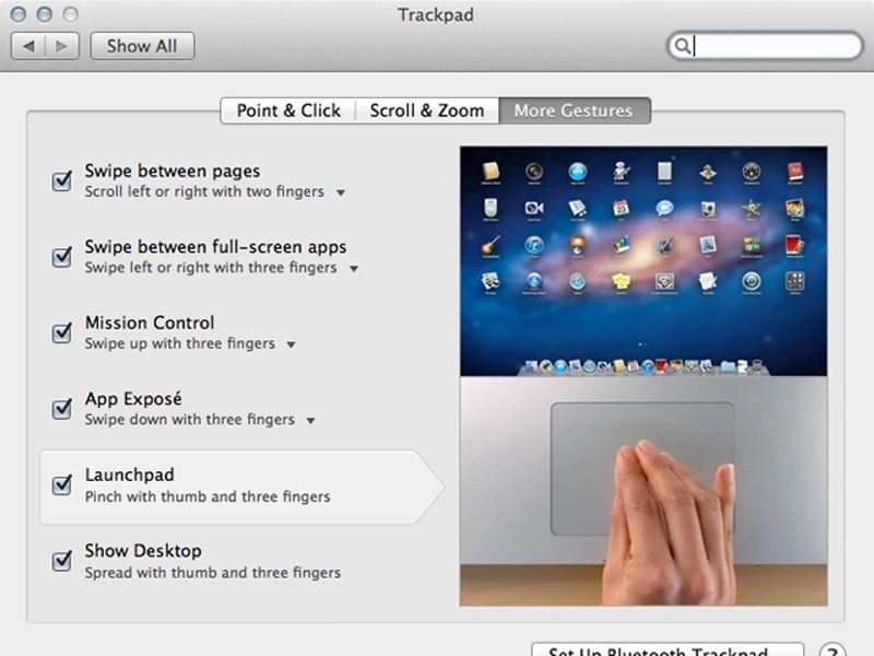
The iOS influence from the iPhone/iPad family hits you in the face, or at least in the fingers, from the get-go. Lion scrolls the other way. That's right - if you have a mouse with a scroll wheel, a touch pad or indeed the Apple touch-sensitive Magic Mouse, pages on your screen will now scroll in the opposite direction. How you feel about this depends very much on how used to using the iPhone or iPad you are. Like those devices, you are now grabbing the page itself and moving it up and down, rather than the window on the page. Shock two - no scrollbars - or rather scroll bars that only pop into existence when active or when you roll over the edge of the page. When a new window is opened that has hidden scrollable content the bars pop into existence just to let you know and then fade away into the background.Apple insists that within a few days you will be fully comfortable with this new behavior and won't want to go back. We tend to agree with them. However in the Lion System Preferences you have great control over these aspects of the interface plus the host of new tapping and swiping gestures that are now available and its possible to revert completely to the behavior of the good-old-days (two days ago).
Launchpad
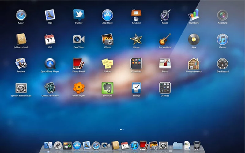
Many inexperienced Mac users apparently have problems finding their applications and if they are not permanently in the Dock will forget where they are. Launchpad is an attempt to mitigate this and is a straight copy of the home screen from iOS. Launched from the Dock or via a hot-key Launchpad displays on screen every launchable app in the applications folder. Just like on iOS you can arrange your apps and pull them together to create folders that can be named. You can also delete apps that you bought in the App Store. Just like on iOS it actually becomes quite a chore re-arranging your apps into a logical system if you have built up a reasonable collection. If you are a Mac veteran it becomes impossible since your applications folder will be full of all sorts of big apps, little apps, Applescript droplets and various bit and bobs that you just know you will use one day. Launchpad is one of those Apple things that works great for a new user for a couple of months and then is never seen again.
Full Screen
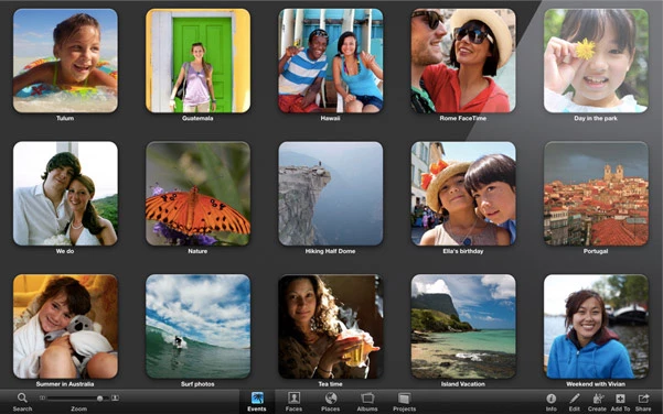
One of the surprising pleasures of the iPad is the fact that applications are always fullscreen. The device becomes the software and vice versa. Lion now brings this capability to the Mac for developers who wish to use the appropriate programming hooks. Most of the Apple apps now have this capability (check your updates) and it works great in apps like iPhoto, Garageband and the new Mail program - i.e. apps that already use a single multi-paned window. It makes little sense for apps that use multiple windows or where the content simply doesn't need the full width of the screen (looking at you Safari). On multiple monitors it only uses one screen and the others are left blank (or at least just showing the new ubiquitous grey linen background texture). It would be nice to see this developed a bit to allow an app per screen for example. The mode is invoked simply by clicking an icon on the top right of the window. In full screen mode mousing to the top of the screen will roll down the menu bar and it can exited from there.
Auto Save/Versions/Resume
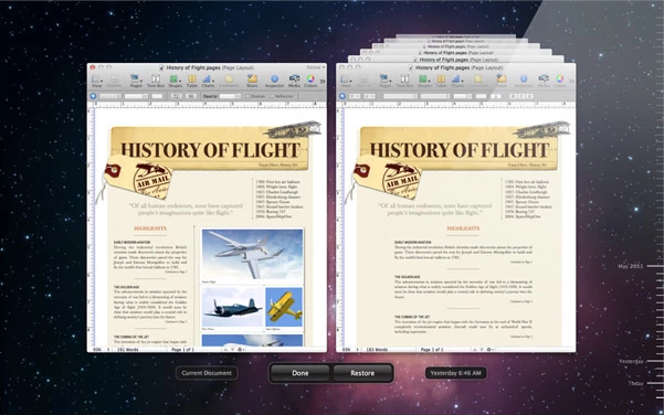
Have you ever lost work on your computer? Of course you have. Everybody has. After years and years of being told to keep backups and to keep hitting save while we work, stuff still gets lost or written over by a file we didn't mean to save, or by logging out and not saving open documents. Apple aims to make this a thing of the past by autosaving the changes to every document and then allowing you to browse back in time the different versions of that document, very much in the manner of the now-familiar Time Machine interface. If the software developer decides to use Apple's updated document model (and they would be crazy not to) the user will never again have to think about saving a document. In addition, when you quit an application the placement and content of all open windows is stored (including where the cursor was and any selections) and then re-stored when the app is launched the next time. In fact, after shutting down, the computer will restart with all open documents and applications as they were before. Very cool.
If this whole idea make you nervous you can still manually save a new version, create a duplicate or chose to lock a document. One suspects however that this new facility will be seen as a significant turning point in document management - once every developer has embraced it of course.
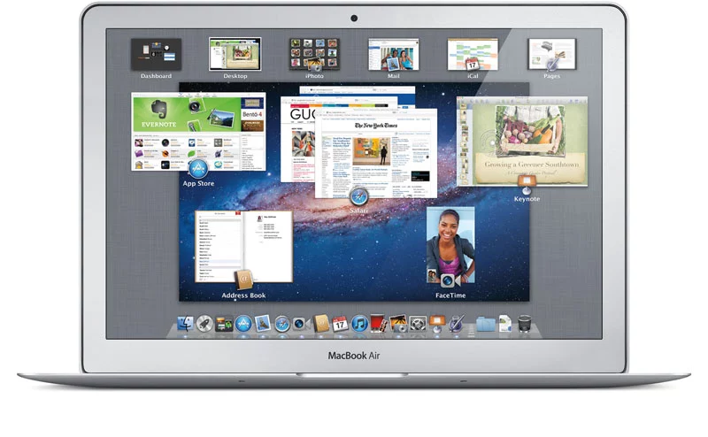
Mission Control
Mission Control is one of the few new headline features in Lion that doesn't seem directly influenced by its mobile iOS brother. Its purpose is to simplify and bring together Exposé, Spaces and Dashboard functionality since many people are apparently still not using these useful screen management functions. Invoking Mission Control (via the Dock, a Hot Key or touch panel gesture) makes the present desktop recede a little and get overlaid by a row of virtual Spaces desktops - including any full-screen apps and a separate Dashboard Widgets desktop - plus representations of all document windows in use together with icons of their parent application. From here you can quickly get to any window or virtual desktop. You can also drag windows into different desktops and create new ones. It's quicker and more easily understood than the previous arrangements so hopefully more users will be using it to zip between their open documents.
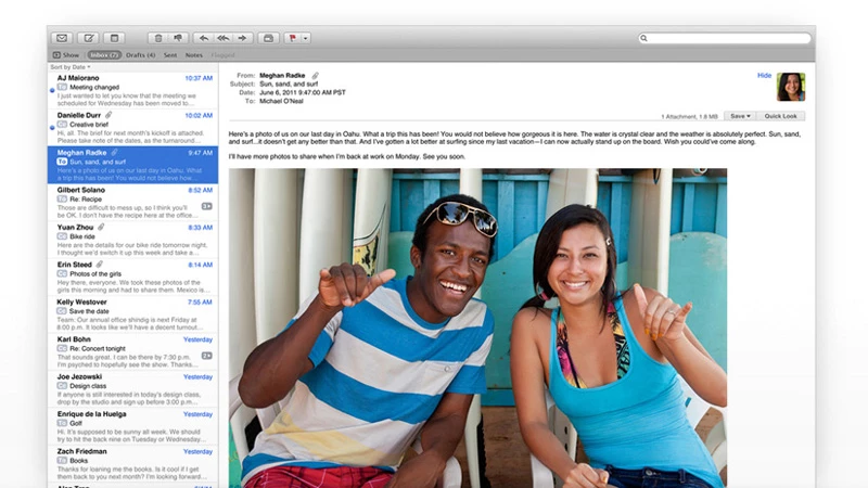
One application that most people spend a great deal of time in is Mail and it's received a lot of love from Apple in this update with a brand new layout. Messages are at long last to the right of the message list and not below. This makes so much more sense on widescreen monitors. The message list can show a preview of the message (up to five lines) and you can optionally show a sender's thumbnail image if they are in your Address Book file. The default viewing of messages is in a 'conversation' mode where every related message is shown and numbered making it very easy to follow an email thread. This mode also automatically hides all the redundant quoting though you can reveal it if really necessary (with a fun animation).
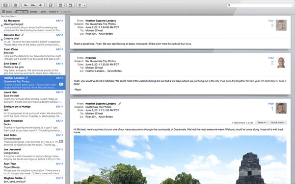
The familiar mailbox and folder sidebar is available but you can drag any of the item therein to a toolbar above the message window and close the sidebar to increase real-estate. There are a number of often-used commands in that toolbar plus text formatting controls when in email composing mode. Search has been greatly improved using Spotlight's new functionality with search items being quickly auto-suggested. Plus, after one search term has been defined, auto-suggestions for a second term come up making it much quicker to drill down to the message you are searching for. It's easier to use than describe and feels really slick. Fun feature - email flags can now be one of seven colors, not just red. The new Mail is a great improvement.
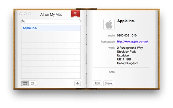
iCal/Address Book
The iCal and Address Book applications have also received attention in Lion but unfortunately this is one area where the iOS influence is unwelcome. Apple has maintained a deeply skeuomorphic design for both that is perfectly logical in the context of the iPhone/iPad but makes no sense at all on the non-touch vastness of a desktop monitor. They both work as expected with some additional features but the leather, cloth and torn paper appearance is taken to silly levels.
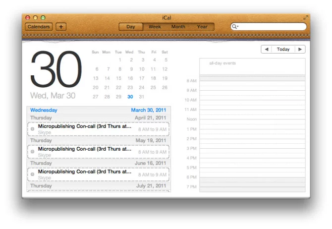
It would be nice if one day Apple provided us with the more powerful general purpose database and time-management tools that Address Book and iCal could become. Unfortunately it seems we are stuck with them as 'apps'. Address Book now has fields for Twitter and 'Profiles' (Facebook, LinkedIn etc.) and iCal does have the nice new feature of a yearly view where your busiest days are represented as red or amber 'hot spots' and your free days in white. Nice touch.
AirDrop
AirDrop is potentially a very useful little feature in a busy office environment. Click on the AirDrop folder in the Finder sidebar and every nearby Mac with Wi-Fi on will pop up. They don't even need to be on the same network. You drag a file onto the Mac you want to send it to and a dialogue asking for permission to receive it pops up on their desktop. Genius.
Security
Something that won't get a lot of press but has clearly been a priority for Apple is the greatly improved security of the operating system to protect against crashing and the malicious hacking of data. the 'sandboxing' (separation of the privileges of each process so that it cannot not be coerced into something else and crash the app) of the System itself has been going on since Leopard. Now it is available for use by developers and will in the future be mandatory for applications to be sold in the Mac App Store. FileVault now encrypts at high speed at the disc level rather than file level and can encrypt whole Time Machine back-ups which is a great improvement. Don't lose that password.Every Mac OS upgrade has its quirks and caveats but Lion 10.7 feels like it has moved the game along significantly. As always, it will take the developers time to fully embrace the new technologies available to them (er, Adobe?) but Apple has made great efforts with its own apps to show what is possible. It's only US$29 and a million people have already downloaded it in its one day since release. Now bring on iOS5 and iCloud so we can close this circle.


