For more than a year, Android enthusiasts waited for Google to unveil the next iteration of the mobile operating system to succeed Jelly Bean. It was widely thought (even within Google) to be called Key Lime Pie. Instead, a bizarre marketing partnership was struck that gave us Android 4.4 KitKat, officially unveiled on Halloween in the United States at the same time as the first device to run it – Google's new Nexus 5. I've spent the past two weeks poking around KitKat on a Nexus 5, taking in all the changes, improvements and at least a couple of steps backward. Here's my review:
A Whole New Look
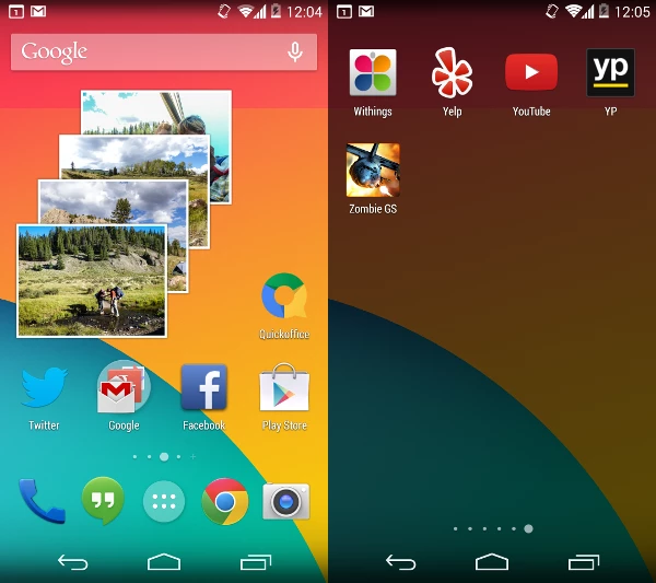
The moment you first see the new home screen in KitKat, the improvements are apparent. The fonts appear smaller and more slender, while several newly redesigned app icons have grown a bit in size.
The biggest visual change for most users, while still subtle, is likely to be the addition of a more fully transparent background to the top status bar, the on-screen buttons on the bottom of the home screen, and the app drawer.
The result is a user experience that seems a little more unified and grounded in the home screen(s) and is somehow warmer – it's kind of nice not to be launching apps from the black void of a background-less app drawer.

This line of thought also carries over to the revamped lock screen in KitKat, which now offers more complete control over media that's playing without having to go through the unlocking process, and also displays album art attractively in another nice visual touch.
Other small aesthetic tweaks can be found throughout KitKat, notably a new look for the clock app and the download manager, which now comes with an optional grid view.
Another change that might make sense from a holistic design perspective but needlessly removes some handy bits of functionality is the move to "de-blue" a number of icons throughout KitKat. For example, in the status bar, the Wi-Fi and cell network activity icons no longer turn blue to indicate the presence of data connectivity. Instead, they're always gray when present and there's no longer a means of checking your network data status at a glance. Previous actions like keyboard presses that may have previously resulted in blue highlights have also gone gray in KitKat.

A few other features are newly hidden in this update, which caused a little confusion for me. The widget drawer in KitKat has been divorced from the app drawer and is accessed by long-pressing on any blank area of a home screen, which will bring up Google settings, wallpapers and widgets.
There's also no immediately obvious way to add home screens. It has to be done by selecting and dragging an app, either from an existing home screen or the app drawer, to the right edge of the screen, which then either scrolls to the next screen to the right, or creates a new one. But what if you want to add a new home screen all the way to the left, you ask? No dice, and here's why:
Google Now Has A New Home

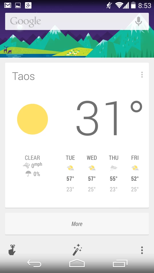
From the home screen, if you swipe left, you'll always eventually land on the Google Now screen displaying all your personalized cards and the search bar.
KitKat has baked Google Now, search and voice control deeper into Android than ever before. On the Nexus 5, once you're past your lock screen you can say "OK, Google" at any point to trigger Google Now's voice control and start barking out commands and searches.
If you've got a Moto X, which is just beginning to get the KitKat update as of this writing, you'll be able to activate voice control without even touching the device, so long as it's powered on.
As mentioned earlier, you can also adjust settings for Google Now, search and voice control by simply long-pressing on any home screen empty space.
While the left-most Google Now home screen can't be removed, KitKat does allow for management of any home screen replacements that you might install. You switch between them in the "Home" section of Settings.
Revamped Apps
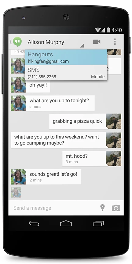
A number of native Android apps get new treatments in KitKat, starting with Hangouts, which has swallowed text messaging in the process. This is probably my least favorite "improvement" in Android 4.4 – combining SMS and Google Hangouts (which itself had already swallowed Google Talk and Chat in earlier versions) isn't intuitive at first and it can be confusing to know which method of communication you're actually using to contact someone.

Did you just SMS or IM your cousin about the movie that starts in five minutes? In Hangouts it's easy to confuse the two, leading to potential headaches. Combining these functions into one app isn't necessarily a bad idea, but it's not well-executed in the current iteration.
The next big change is seen in the phone app, which attempts to shift the focus away from the dialpad, encouraging you instead to search for contacts and businesses via both the web and locally on your device. The dialpad is still there, but it's just not the first thing you see, and when you click on its icon, it overlays itself over the search window instead of taking the full screen.
When you receive a call that isn't in your local contacts, Google now introduces its own form of caller ID by cross-checking the incoming call number with Google Places. So if the call is coming from an existing business, it's likely that you'll be able to see which one is calling you in KitKat, which is a nice little bonus.

The email app in KitKat has also been refreshed with nested folders and better navigation, and there's also a new app for Photos, which is actually kind of strange because it's basically the same as the old Gallery app, but with the updated KitKat look. What's strange is that the old Gallery app is also still here in 4.4, but the camera app has been broken out to stand on its own. So enjoy the extra place to browse your photos, I guess.
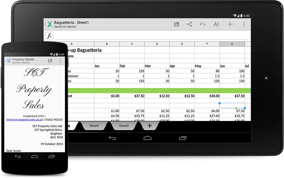
Other notable apps and app changes include the inclusion of Quickoffice, which is quite a nice little add as a native app. Android Device Manager provides the ability to find or wipe your device should it be lost, and you'll also find a full-screen "immersive mode" (like that already seen on lots of Samsung devices), a new emoji keyboard and printer support using Google cloud print for apps.

More Support
The new look and apps are the big news in KitKat, but there's also some added support for certain uses that don't make headlines on their own, starting with Bluetooth Message Access Profiles that are frequently used to connect a smartphone to the head unit of a vehicle.
Infrared blasting is also now supported to turn your phone into a remote control for certain devices like set-top boxes.
For fitness freaks, step counting is now built in to Android to allow your phone to act as a pedometer and interface with apps like Moves on the Nexus 5.
Finally, some new power-saving features allow KitKat to be less demanding on devices. On the Nexus 5, a special low-power mode can allow for up to 60 hours of continuous audio playback, and new location modes allow you to keep track of your whereabouts when you need it and without having to manually toggle GPS and network settings to save battery when you don't.
Final Thoughts
KitKat is an iterative update for the most part. It doesn't introduce anything revolutionary, but it is an interesting next step in the evolution of Android. The aesthetics of the mobile OS are much improved, and we get a glimpse at where Google is heading with integrating core services like search and Google Now.
Perhaps most impressive is that the improvements were made while also making Android leaner than its predecessors. KitKat is optimized to run on devices with as little as 512 MB of RAM to help facilitate expansion into emerging markets where flagship phones with top-of-the-line specs are less common.
With a point update as impressive as this, it shall be exciting to see what's in store for Android 5.0.


