Microsoft's Surface lineup is only two years old, but it's already been on quite the roller coaster ride. When the company first announced the tablet/laptop hybrid, reactions were cautious, but also unmistakably intrigued. But that buzz fizzled quickly, as the two 1st-gen models launched with some huge compromises. Less than a year after we saw an improved pair of 2nd-gen Surfaces, can the third time be a charm? Read on, as Gizmag reviews the Microsoft Surface Pro 3.
The big criticism that you might have heard about some older Surfaces, that they don't run full Windows, doesn't apply here. The Surface RT (1st-gen) and Surface 2 (2nd-gen) both ran Windows RT, which doesn't support traditional desktop apps. But the Surface Pro lineup runs full Windows 8.1 Pro. So all your old Windows desktop software – be it Photoshop, iTunes or Steam games – is fair game on this Pro 3.
With the older models, being able to run desktop apps made the Surface Pro powerful, but it also led to some big compromises. The Surface Pro and Pro 2 (pictured below, flanking the Pro 3) were chunky monkeys, making for unusually thick and heavy tablets. Transforming your tablet into a laptop is fine and dandy, but if that tablet weighs almost as much as two iPads, then it might not be worth the trouble.
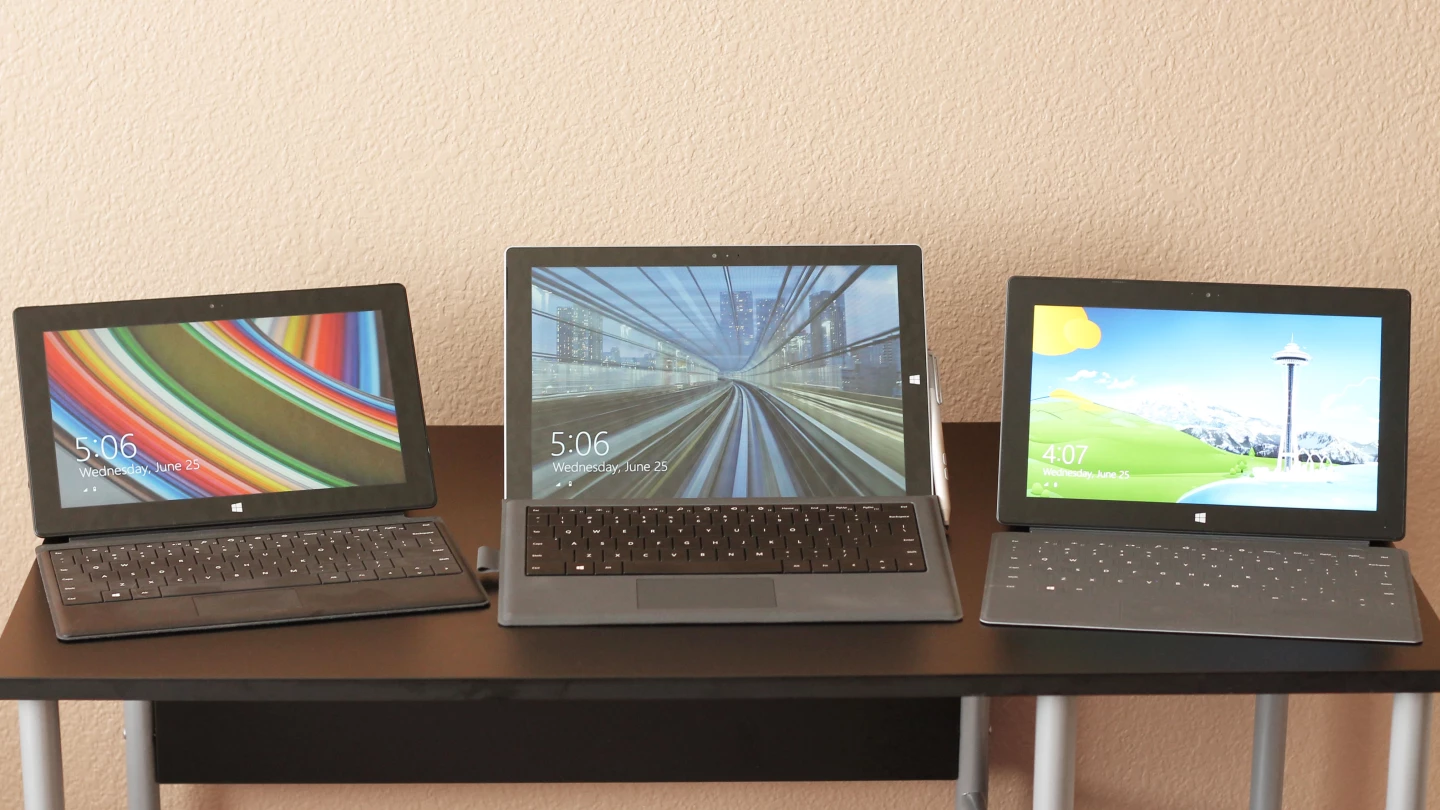
So how does Microsoft rebound with this 3rd-gen model? Well, for starters, the Windows RT line of Surfaces looks like it's dead and buried. And I say all the better. Because with the Surface Pro 3, we finally have a Surface that runs full Windows and makes for a serious iPad rival on the tablet end. It's a big-ass tablet, mind you, but it's very light and thin for its size. With that combination, there's no need for a Windows RT model that avoids desktop apps like the plague.
The Surface Pro 3 is a pleasure to use on just about every level. As a tablet, it's a bit like using a huge iPad Air. As a laptop, compromise goes out the window, with a bigger screen, more comfortable keyboard and improved kickstand. And the new version of its stylus ("Surface Pen") has a higher-end build, one-click OneNote integration and the best digital inking I've ever experienced. Microsoft's original vision for the Surface line is not only taking form – it's spreading its wings and taking flight.
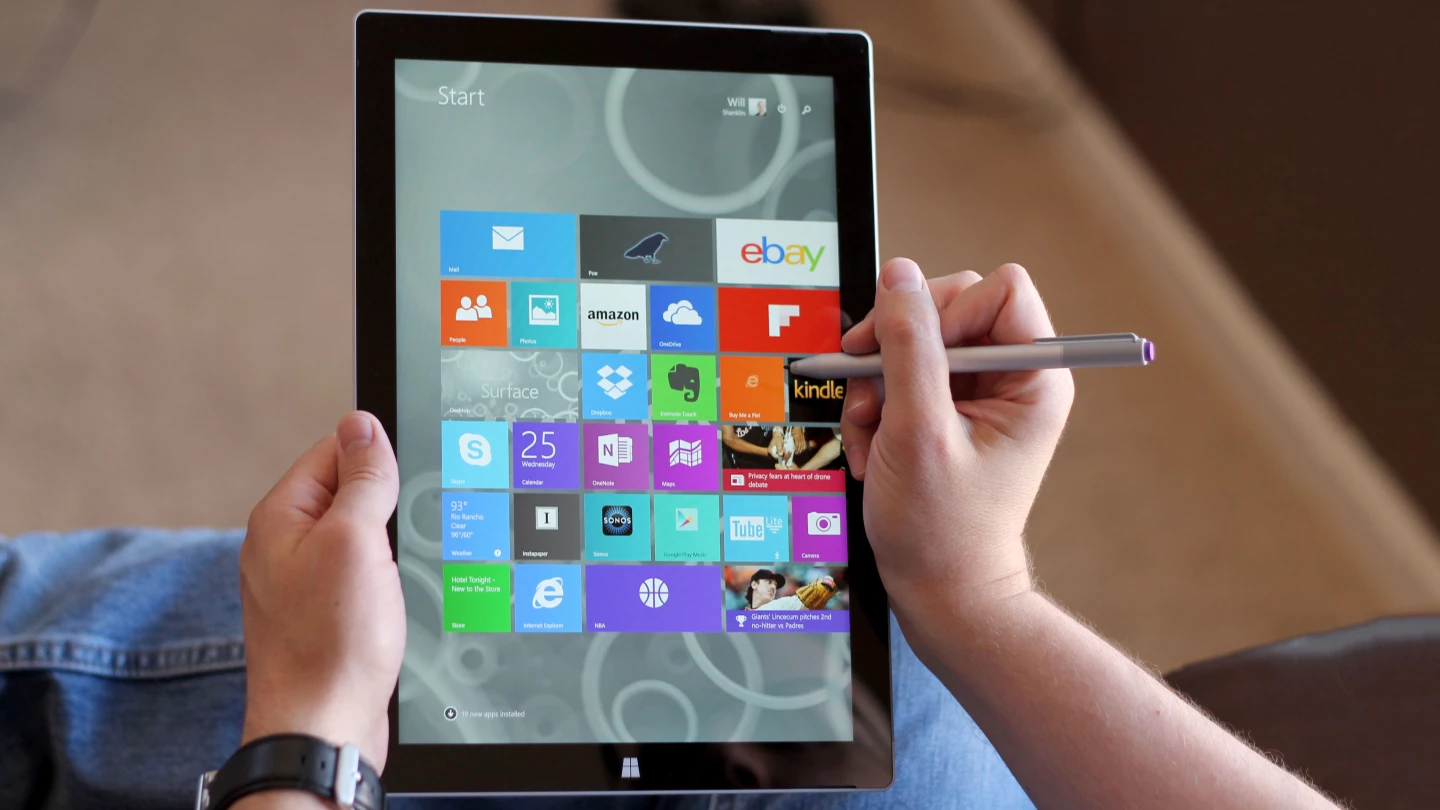
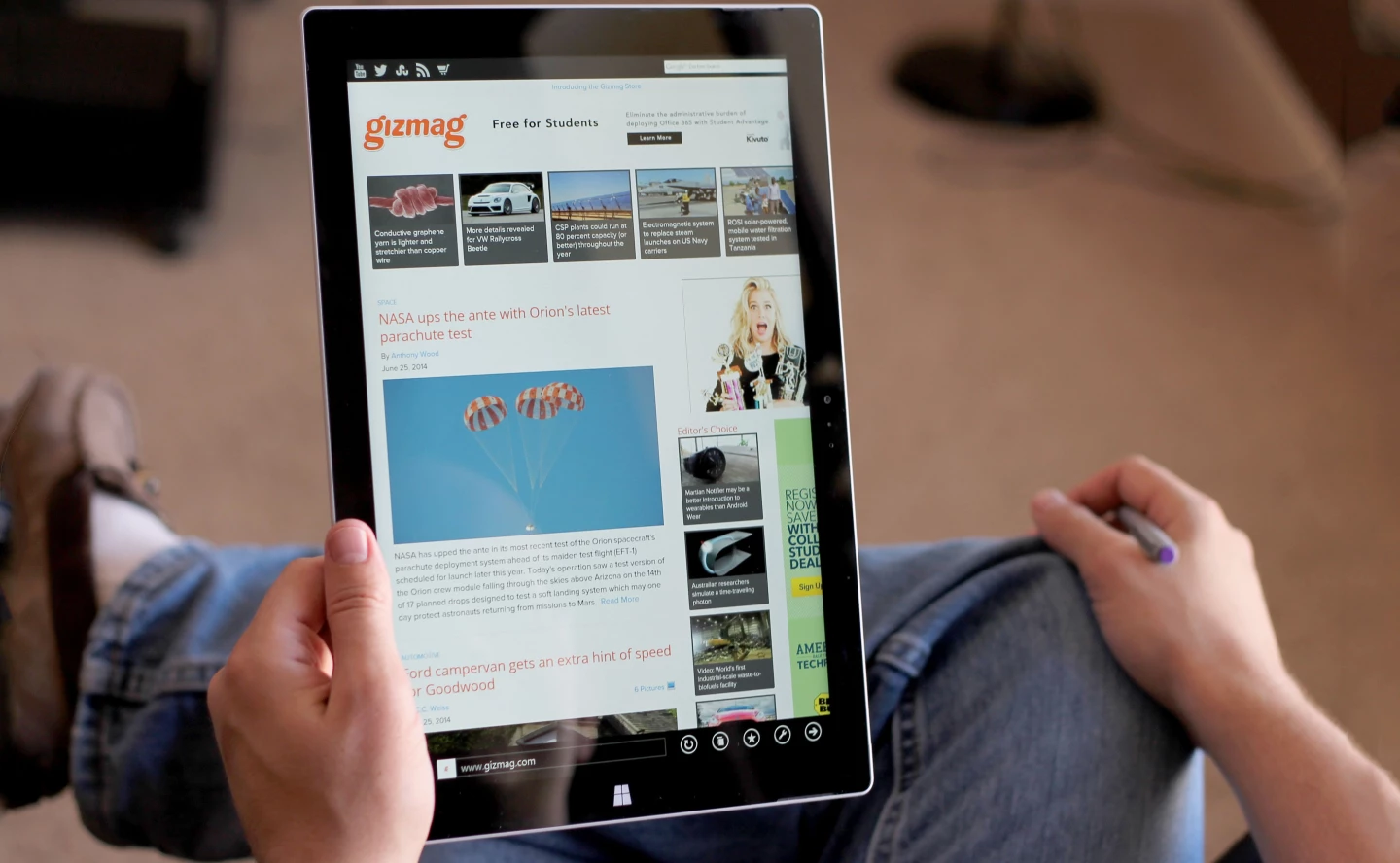
The screen jumps to 12 inches this time around, from the 10.6-in display in all of the older Surfaces. That's 38 percent more screen real estate in the new model. At first, this made for a strange tablet experience. It's so big, it's kinda like ripping the screen off of a MacBook Air and using it as a ginormous new tablet. But after getting used to it, I now appreciate the extra real estate. It's especially nice for web pages and image-rich apps like Flipboard.
The 12-in screen size works surprisingly well, but another big key is the Surface's new aspect ratio. Older Surfaces had an elongated 16:9 ratio, but the new model shifts to a less oblong 3:2. What this means is that the new model is finally usable in portrait mode. Of course you could use the older Surfaces upright, but I found them to be too ... vertical-looking. It was like holding a long scroll of parchment, or looking at a webpage through the silhouette of a tall building. Now it's a bit closer to the shape you'd get from an iPad's screen.
The biggest thing pushing the Surface Pro 3 in the "better tablet" direction, though, is that light and thin build. Despite having a much larger face, the Pro 3 is 12 percent lighter than the older Surface Pros. Just let that sink in for a second: this new model has a 23 percent larger face, but weighs 12 percent less. What that adds up to is a tablet that feels much better in hand. Sure, it might be the biggest damn tablet you've ever held, but having spent many hours with all three of the Surface Pros, there's no question that I'll take this huge face with a light and thin build over a standard-sized face with a chunky build.
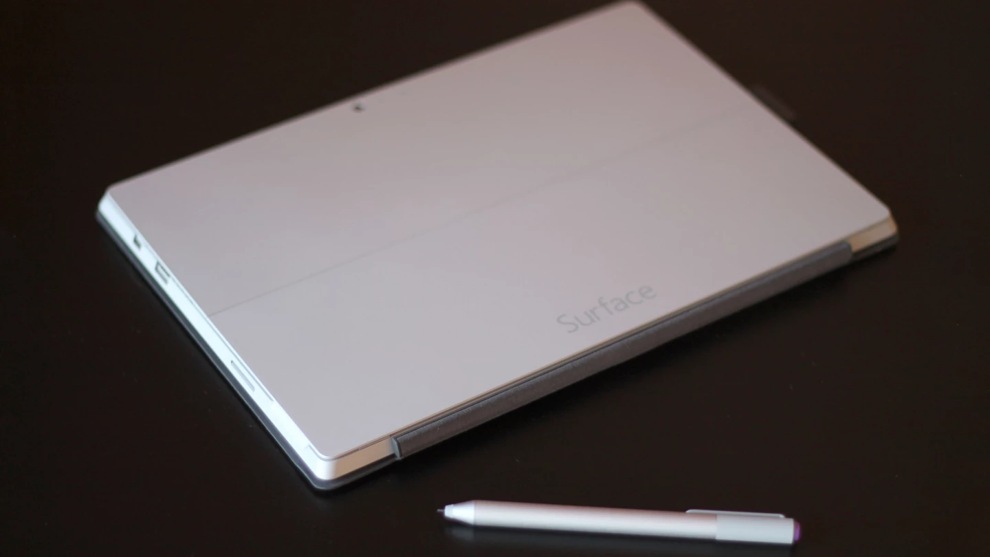
Speaking of build, we're still looking at the same magnesium exterior that we've seen in every previous Surface. I thought Surfaces always had this part down pat, with a metallic look that has a premium aura – but without looking like yet another MacBook or iPad clone. There is one big difference, though, as the new model is silver-colored, rather than black. Black is a slimming color, and now that we have a fit and trim Surface Pro (it's just 9.1 mm thick), I guess Microsoft decided it didn't need that optical illusion after all.
The new Surface's biggest weakness as a tablet is its app selection. Sure, you get years worth of Windows desktop apps, running the gamut from professional-level tools to hardcore games. But the Surface's selection of touch-first apps still trails far behind the iPad's App Store. I'm content with the Surface's buffet table, making do with a combination of Windows Store, desktop and web apps. But if you're looking for an iPad-like selection of touch-based apps in the Windows Store, well, you're going to be disappointed.
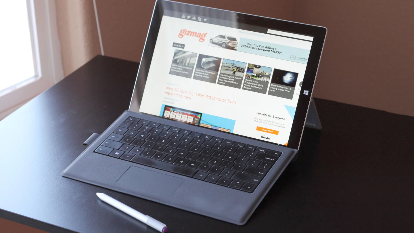
Okay, so the Surface Pro 3 is much improved as a tablet. But what about as a laptop? Well, I always thought laptop mode was where the older Surface Pros excelled, but the new model takes this to a new level. The biggest difference is, again, that screen size. At 10.6 inches, the older Surfaces were sized more like netbooks than full-blown laptops. But the Surface Pro 3's 12-in screen has it straddling the fence between the two MacBook Air screen sizes. The Pro 3's 12-in display might make for a big-ass tablet, but it's damn near ideal for a laptop.
Of course, like all Surfaces, laptop mode is only made possible by a snap-on Surface keyboard cover accessory (which is, as before, sold separately). This time Microsoft is making your decision very easy, though, by only offering one style of cover for the Pro 3. The "Type Cover for Surface Pro 3" is almost like the Type Cover 2 – only bigger. That includes those great moving (and backlit) keys with a snappy and responsive feel to them.
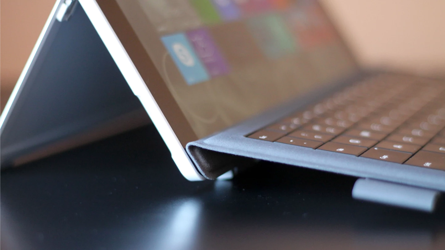
The new Type Cover does have one other difference from the last-gen Surface keyboard. Now the top of the keyboard, north of the keys, folds up against the bottom of the Surface. Before I used the Surface Pro 3, I'd seen pictures of this and wasn't sure how that would change things. But now I see that it makes for better lap typing. It creates just enough tension to slightly prop up the keyboard, allowing for a more natural angle and movement on your lap.
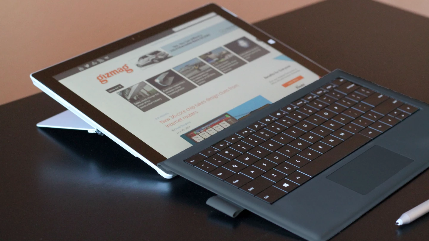
With the 2nd-gen Surfaces, Microsoft dramatically improved its integrated kickstands, giving them two positions instead of the one we saw in the 1st-gen models. With the Surface Pro 3, though, that kickstand now moves dynamically, letting you position it in any angle between 22 and 150 degrees. The range and type of movement is now a lot closer to what you'd get from a laptop's screen.
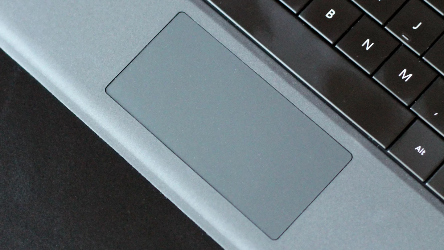
I never bothered much with the touchpad in the older Surface keyboards, and I still don't think the one on the new keyboard is anything special. But it is bigger, with a firmer-feeling surface, than the older touchpads. It isn't remotely in the same class as the spacious glass trackpads you'd find on MacBooks, but it is now a lot more usable as a mouse replacement.
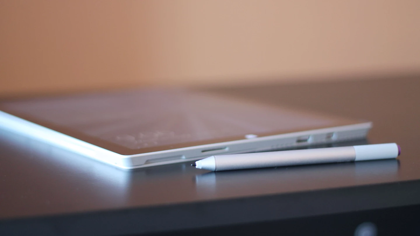
The Surface's best pointing tool, though, is still its bundled stylus, or "Surface Pen." And the new version is yet another big area of improvement in this third Surface Pro. For starters, the new Surface Pen ditches the plastic from the older pens in favor of an aluminum build. That's purely cosmetic and visceral, but it does, in hand, lend itself more to the premium feel that Microsoft has been going for all along. Picking up an old Surface Pen is like fiddling with a cheap mechanical pencil that you'd find in the school supply section of your local dollar store. The new model is more like something you'd find on a CEO's desk.
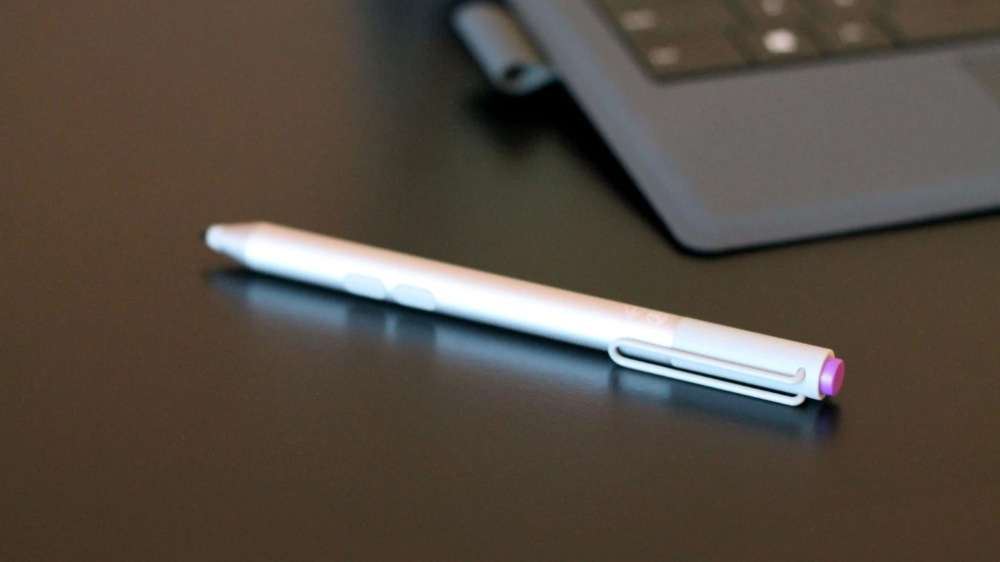
The pen's functionality isn't dramatically changed, but there are a few tricks up its sleeve this time. First, instead of having just one (right-click) button on its side, it now has two working buttons on the side and another on top. The second side button is for erasing in Microsoft's OneNote app, while the top button will open OneNote with one click – even if your Surface is asleep. I haven't traditionally been much of a OneNote user, but this tight integration has been reason enough to move some of my notes over from Evernote. Something tells me that's exactly what Microsoft had in mind here.
Evernote-killing tactics aside, the Surface's OneNote experience is terrific. With any mobile device, notes are one of the few things that you'll need to get to quickly. On most phones or tablets, you have to tap the power button, swipe on your lock screen, find the note app, open it and then tap out your note. That can end up turning into a 10-15 second process before you even start typing. On the Surface Pro 3, you just click the "cap" of the Surface Pen and bam: OneNote opens, ready for your note. If you're already using the Surface, it opens in less than a second. If your Surface is sleeping, then the process takes about three seconds. Either way, it's quick enough that you won't get the chance to forget your thought before you start scratching it down.
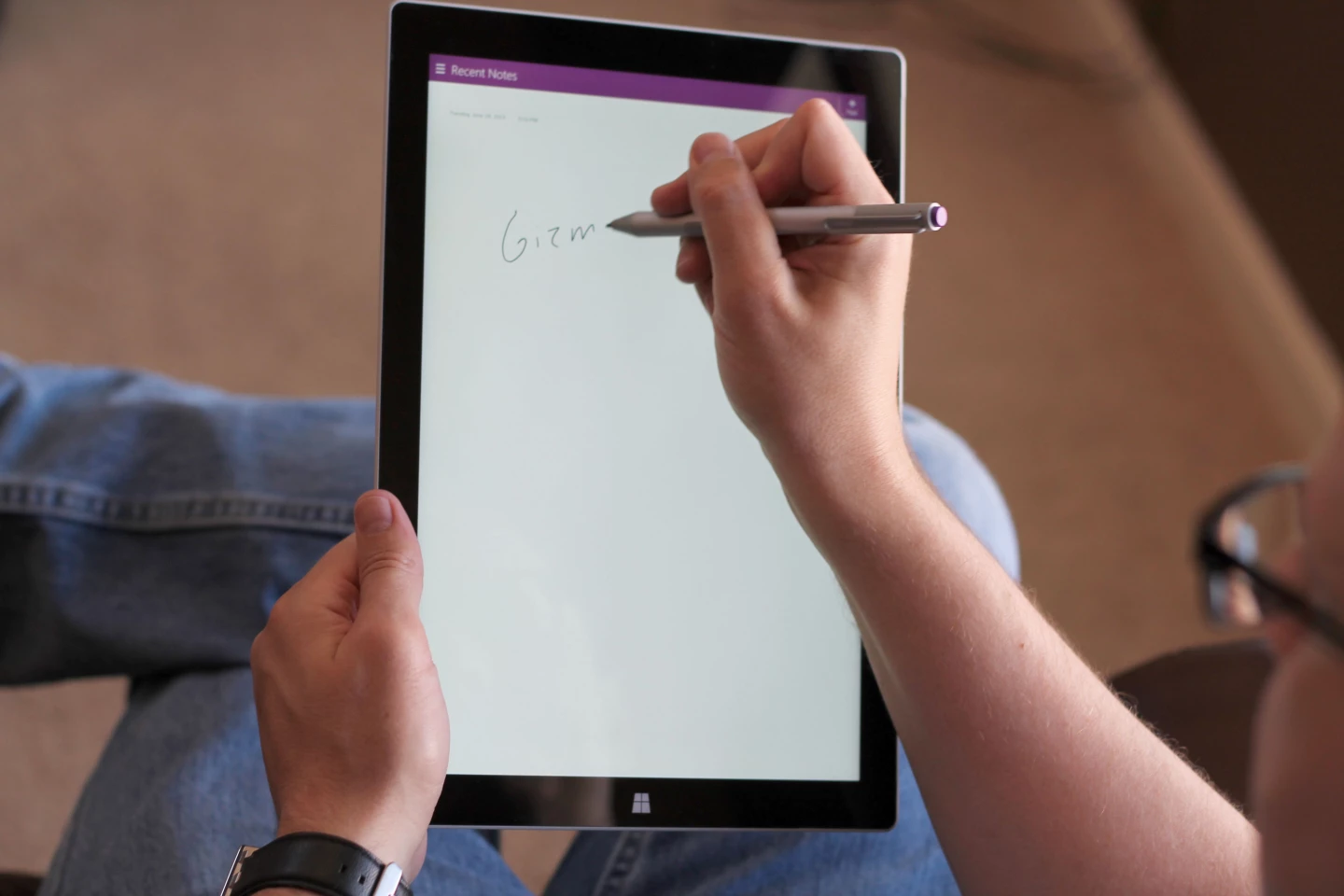
Once you're in OneNote, the digital penmanship is outstanding. I'm not sure if it's because Microsoft switched from Wacom to N-Trig for the underlying technology, or if it's something else going on in Windows, but the end result is the best digital ink experience I've seen on a tablet. It's so immediate and responsive, it's easy to forget that you aren't sketching with ink on paper. If developers get serious about the Surface Pro 3's pen capabilities, I can see this quickly becoming a go-to device for professional artists. It's that good.
Elsewhere the new Surface Pen works like it did on the older Surfaces. It gives you a precision that your fat fingers can't possibly provide, while still giving you some of the tactile intimacy that touchscreens are famous for. It's great for selecting text, working in Photoshop or controlling the cursor in desktop apps.
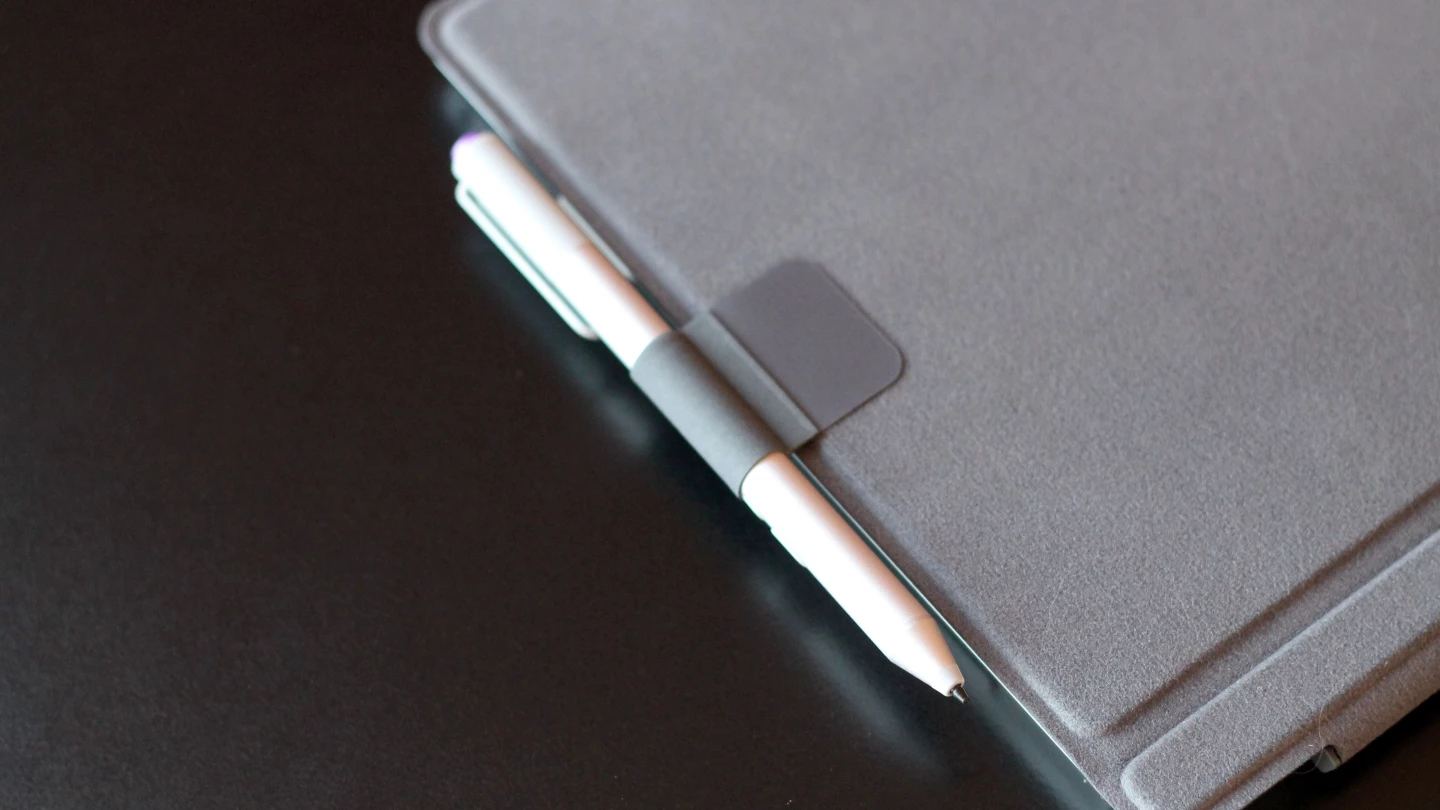
There's still no slot in which you can stash the Surface Pen when you aren't using it – and with a heavier aluminum pen this time, that's no surprise. But you can conveniently snap the pen (magnetically) onto the right side of the Surface, where the charging port is. The only time that doesn't work is when you're using the Surface and charging it at the same time: then you'll have to find somewhere else to stash the pen. The Type Cover does include a small attachable loop that you can slide the pen into (above), and it's a solid enough option (apart from having to jiggle the pen a bit to get it in or out).
Speaking of charging, the Surface Pro 3 is logging much better battery life than I had expected. There's usually enough juice for me to get through a full workday – and considering I often have it up and running for 12 hours or more, with at least a couple of those hours spent in Photoshop, that's no small feat. And in our standard battery test, where we stream video with brightness set at 75 percent, it lasted 6 hours and 26 minutes. For a "real" PC that runs full Windows, that's excellent. It's also 101 percent longer than the Surface Pro 2 lasted in the same test. This terrific battery life was the biggest thing that surprised me about the Pro 3.
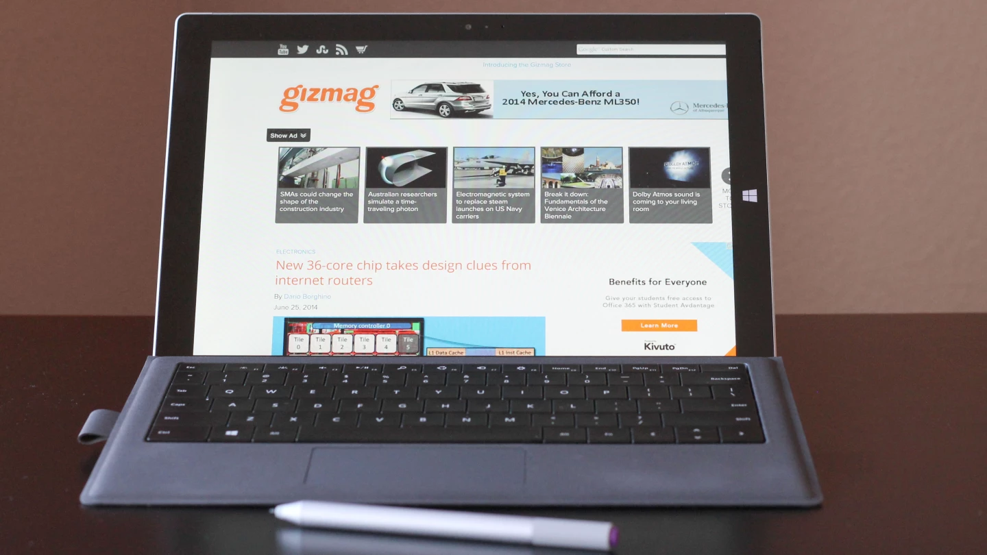
When Microsoft unveiled the first Surface (just two years ago), Steve Ballmer and Co. laid it on thick with the catchphrase "no compromises." Who thought of this? Someone in marketing that wanted to frame the device's biggest weakness as a strength? It's a little baffling, because the first Surfaces were all about compromises. That didn't make them terrible machines, but any time you splice two separate product categories together, of course you're going to have some big sacrifices.
We weren't as hard on the older Surface Pros as some critics were. I thought they each marked important evolutions in an emerging product category, and were solid choices at the time for many customers. But the Surface Pro 3 is the brand's real coming out party. This is one bad-ass machine that cuts way down on the compromise.
The Surface Pro 3 isn't a "no compromises" machine either, but it's a hell of a lot closer. It makes for a huge tablet, but it's also very light and thin for its size (and it's remarkably light and thin for a full-fledged Windows PC). Its touch-based app selection is still playing catchup to other platforms, but you also have desktop and web apps to help fill that hole. And laptop mode is where it requires the least compromise, with a great screen size and resolution, an improved keyboard and touchpad, and that terrific stylus.
The Surface (and Windows 8 as a whole) got off to a rocky start, but I think Microsoft is going to start converting some true believers. The Surface Pro 3 can serve as both tablet and laptop for more people than ever. Apart from the always bizarre transition from OS X to Windows, I haven't had any problem switching from a Retina MacBook Pro to the Surface Pro 3 for this review. And I like the new Surface enough that I might actually stick with it as my main work and play machine.
Gizmag highly recommends the Surface Pro 3 to anyone looking for the best evidence yet that the same device can not only be both laptop and tablet, it can kick some serious ass while doing it.
From now until late August, the Surface Pro 3 starts at US$1,130 ($1,000 for the 128 GB Core i5 Surface plus an extra $130 for the Type Cover). After that, you'll be able to buy a 64 GB Surface with a Core i3 processor starting at $930 for Surface and keyboard. That's hardly pocket change, but at least you'll know that the Surface is giving you more bang for your buck than ever before.
Product page: Microsoft


