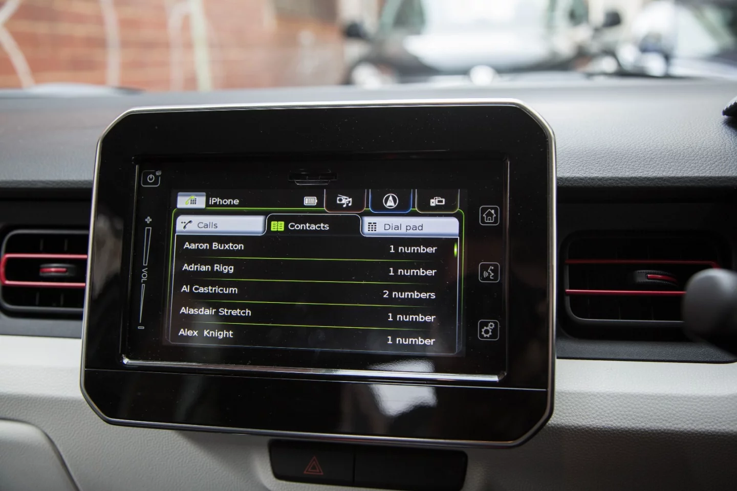
We demand a lot from new cars – not only do they need to provide a comfortable and economic way to get from A to B, they need to tell us where to go, let us make phone calls on the fly, stream our favorite music and, crucially, they can't be distracting while doing all of this. That's no mean feat. So how does Suzuki's onboard infotainment system stack up?
The hardware

Like a number of much more expensive, luxury brands, Suzuki has run with a touchscreen tacked onto the dashboard. This can come across as a bit lazy compared to some of the neatly integrated screens out there, but if it's good enough for Mercedes ...
The screen is bordered in black and finished in a glossy looking plastic, but glare isn't an issue, and it doesn't accumulate fingerprints nearly as readily as some of the other screens we've encountered. We had no issue with brightness on a sunny day, and the screen dims appropriately when the lights switch on.
The software

Lots of car manufacturers give their software an exciting catchy name – think MMI, iDrive or COMAND – but Suzuki hasn't bothered. It would seem the designers were too busy perfecting the software, because it's actually very good.
Your home screen is broken up into four different sections for audio, navigation, phone and CarPlay. There is a haptic home button to the right-hand side of the screen, and a volume slider to the left, but most of the dirty work takes place on the 7-inch slab in the middle of the dashboard.
One of the great criticisms of touchscreen-interfaces in cars is the lack of physical feedback. Buttons don't move around, and they provide a positive click when you press them. Menus on a screen do move, so drivers are often forced to take their eyes off the road to work out what they need to press, and then more time again to confirm they've actually prodded the right thing.
Suzuki gets around this issue by making its menus logical, and making the things you touch regularly nice and big. That way, even if you hit a bump in the road, a wavering finger won't lead you down the wrong path. This is no substitute for a cleverly designed secondary physical controller like the rotary iDrive clicker you get in BMWs, or even better, a heads-up display. The latter are still largely the domain of the luxury car market, but they are trickling into other segments – Mazda does one in its compact cars –and having crucial information at eye-level makes a huge difference when you're trying to focus on the road. Still, there's a cost attached to any wishlist, and the Suzuki system does a solid job at a price.
The inbuilt navigation is easy to use, with blocky graphics and a simple menu layout, but we'd be defaulting to Apple or Google Maps when possible, if for the live traffic updates alone.
Getting connected

Phone connection can be handled through Bluetooth or, if you're a iPhone user, via USB with Apple CarPlay. Bluetooth setup was quick and easy with my iPhone 6S Plus, and the system automatically connected to the phone without fail. Well, unless my Bluetooth was switched off in some sort of desperate attempt to save battery, but there isn't much Suzuki can do about that.
Wireless music streaming is reliable, with no dropouts or crackling, and the on-screen interface made it easy to flick through your library on the fly. Although you could use the AUX plug, streaming was much easier, and lets you control the music through the steering wheel or screen.
Apple CarPlay works as advertised – which is to say very, very well. Apple Maps still can't match Google when it comes to clear directions and on-the-fly rerouting, but being able to control your phone, music and notifications through a familiar interface is worth its weight in gold on the road. It's good to see CarPlay finding its way into more cars, because it's simply a smarter way to use your iPhone than any third-party has managed to develop. Android Auto is the same, offering a clean interface that will be familiar to any, well, Android user.
Talk to me, baby

Voice control has been a favorite for marketers since it launched in the early 2000s, but we're yet to use a totally foolproof system. Ford has arguably the best system on the market, but even SYNC3 can struggle with full address inputs and the like. It also has a remarkable knack for mixing up the names in your phonebook.
Suzuki can't match the Ford SYNC system for voice inputs, but it works passably more than 50 percent of the time. Basic commands like "change radio station" and "call Dad" worked well, but trying to input a full address into the nav quickly devolved into frothy-mouthed swearing. For the sake of your own sanity, use the screen to put your address in before leaving.
The wrap

All up, Suzuki has done a great job with its infotainment system. It's not the prettiest out there, but what it lacks in flair, it makes up for in sheer usability. Sometimes, keeping it simple is the best plan of action.
To see the cars in which this screen actually resides, check out our Vitara Turbo and Ignis reviews.


