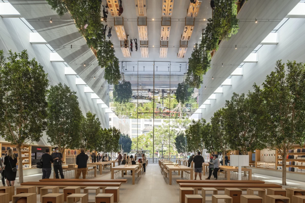
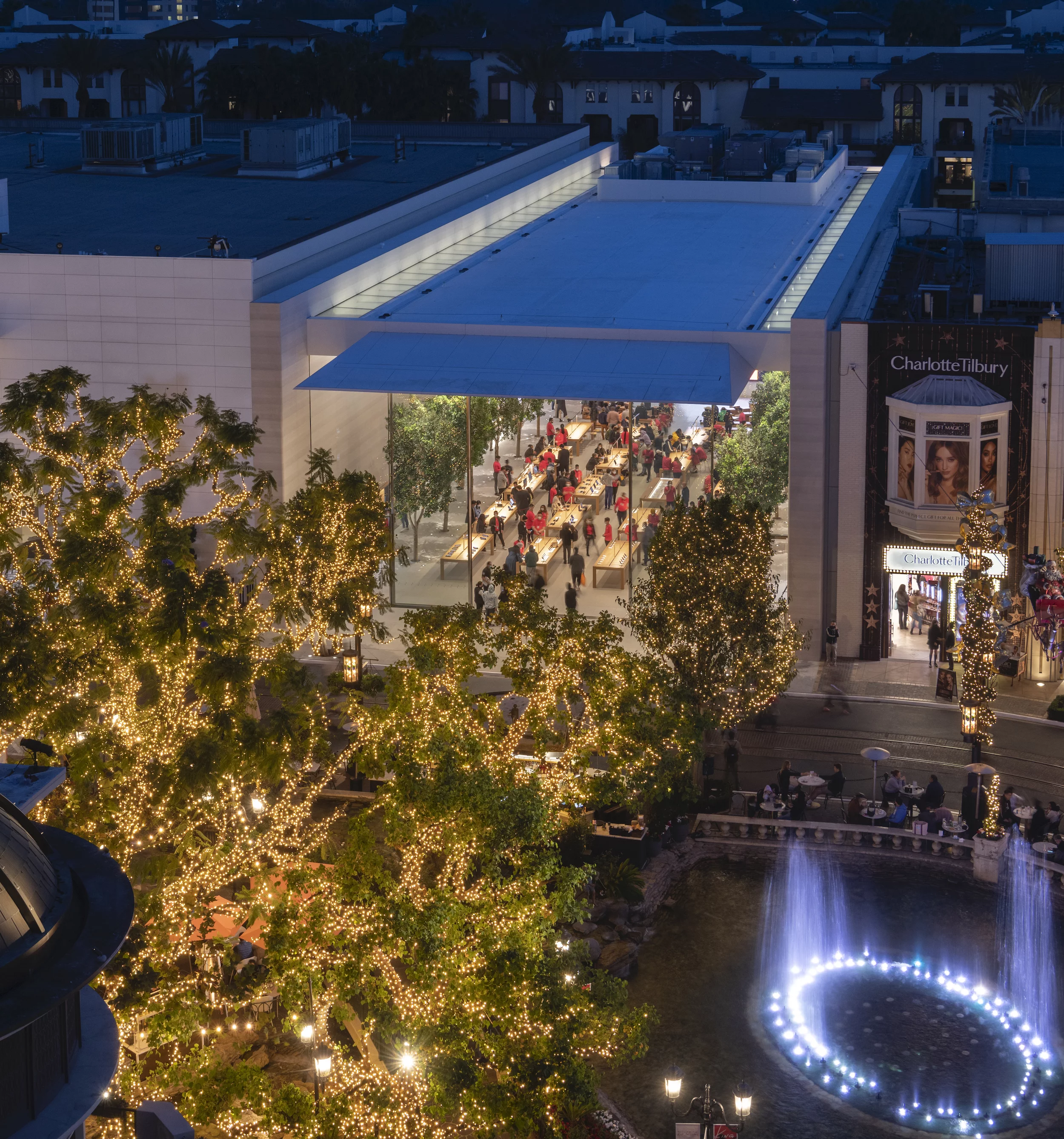
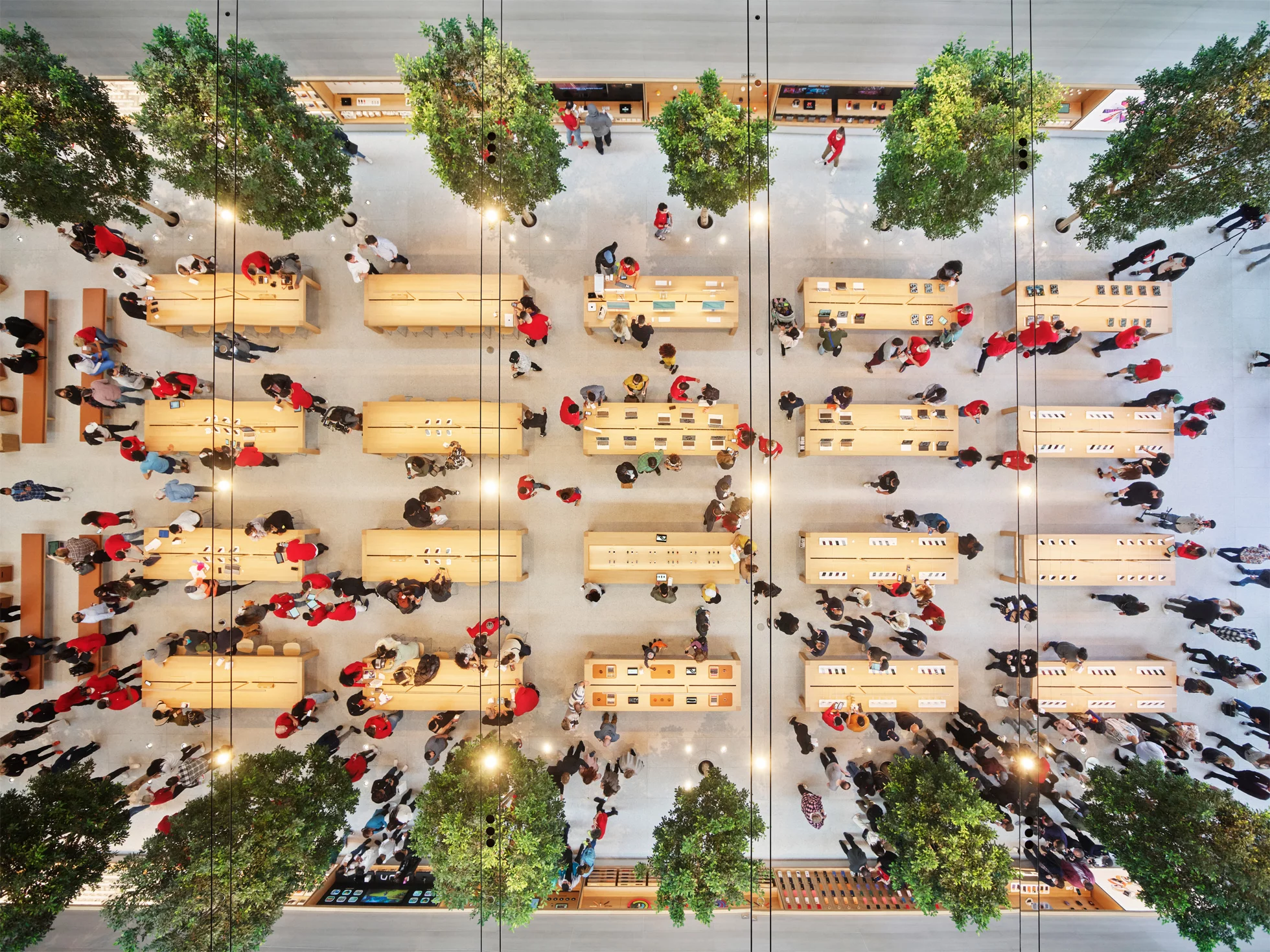
Apple and Foster + Partners' longstanding collaboration continues with the completion and opening of their latest Apple Store. Located in The Grove shopping complex in Los Angeles, California, customers enter through huge glass doors to a tree-lined retail space with a mirrored ceiling.
Apple The Grove (also referred to as Apple At The Grove by Foster + Partners) was created by Foster + Partners, but Apple's own design teams are credited with significant input, and it doubles the available space of the previous Apple Store in the area.
The rectangular building is enclosed by glazed facades on all sides, and its main entrance is made up of two 10 x 31.5 ft (3 x 9.6 m) sliding doors, which are opened up to the outside for most of the year to naturally ventilate the space. Skylights also help increase daylight inside and reduce the use of electric lights.
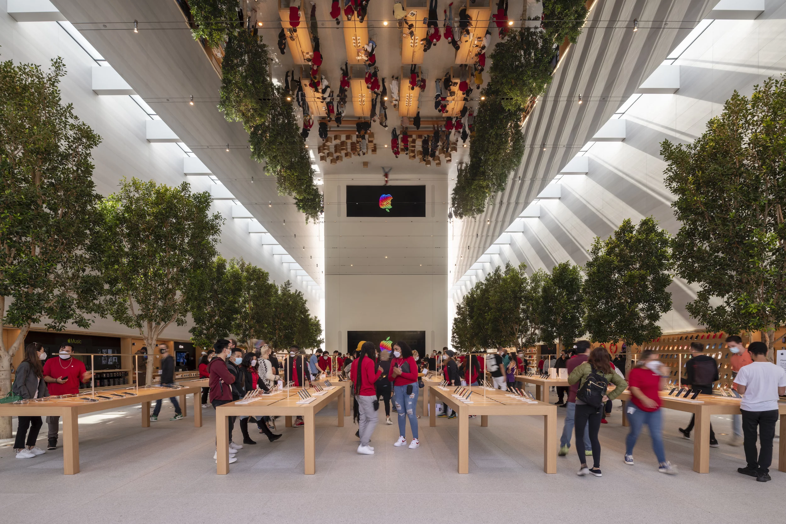
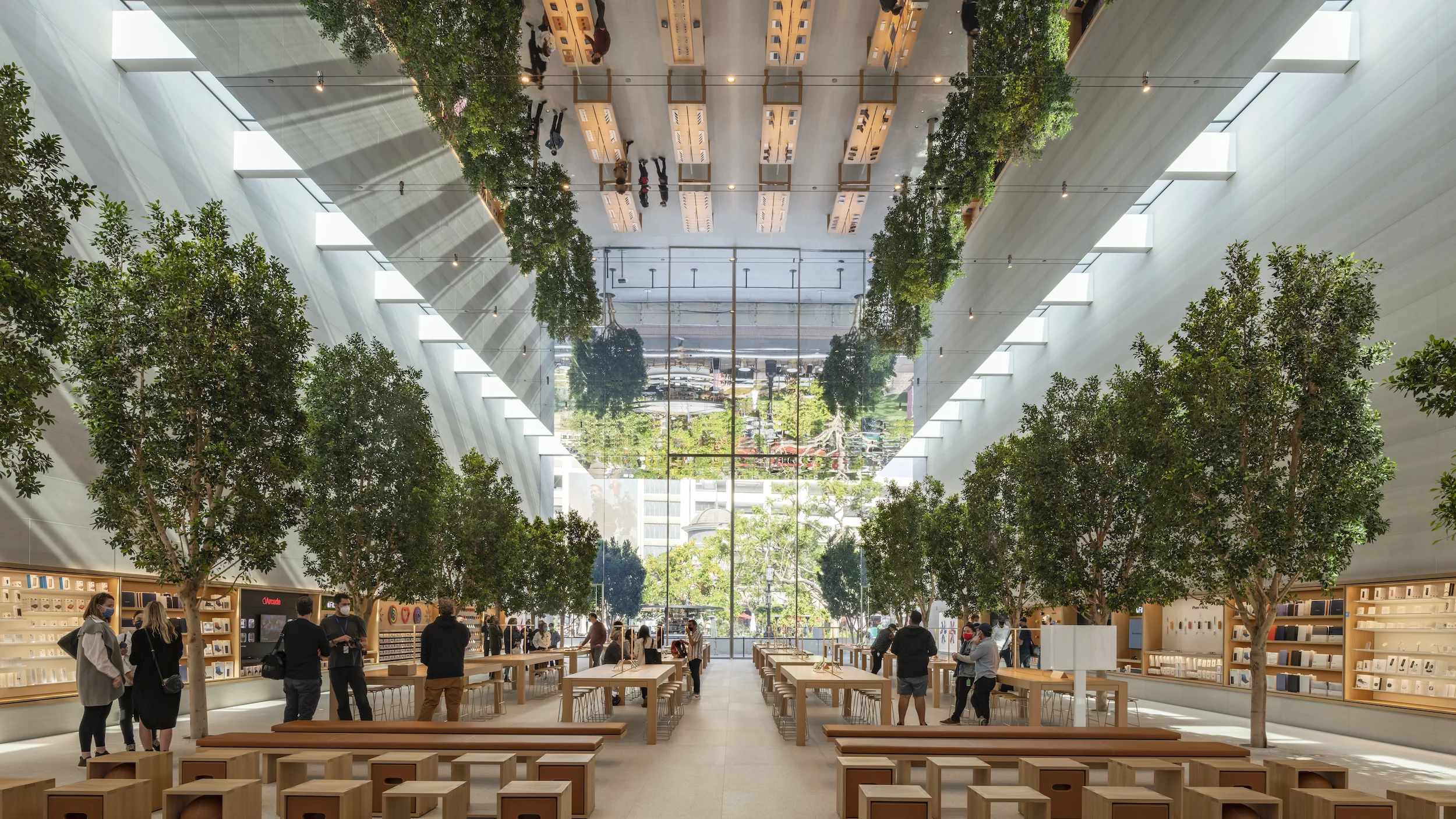
Ficus trees outside the store continue inside – there are a total of 16 trees inside in all – to give it the feeling of an actual grove, and the mirrored ceiling, which is made from a type of stretched mirrored fabric, runs the length of the store. Though hardly a new idea, the effect of the mirrored ceiling is certainly striking.

"The initial vision was to create the most pleasant and stimulating environment for everyone, by drawing the trees from The Grove through the store onto West 3rd Street, an exceptionally spacious and light-filled volume to experience the incredible array of Apple products," says Foster + Partners' Stefan Behling. "It brings together the special light, the trees, the spirit of the film and entertainment industry and the art of illusion, all within the soaring volume of the store, amplified by the mirrored ceiling. The store is quintessentially Apple, marrying the outdoor lifestyle with the creativity and innovative spirit that is intrinsic to the way they work."
The store's interior is arranged on one floor and its overall layout will be familiar to those who have visited other Apple Stores. It includes the usual lines of product displays on plain wooden tables, as well as shelves of products, seating areas, and areas for customer support. There's also the so-called Forum, which hosts workshops for creative types, as well as two secondary entrances.
Apple The Grove is just the latest of dozens of Foster + Partners and Apple architectural collaborations over the years, which include the NYC cube store and the Apple Tower Theatre elsewhere in Los Angeles.
Source: Foster + Partners

