


![Ryoji Ikeda :: datamatics [prototype-ver.2.0]](https://assets.newatlas.com/dims4/default/7405a3b/2147483647/strip/true/crop/723x517+0+0/resize/723x517!/format/webp/quality/85/?url=https%3A%2F%2Fnewatlas-brightspot.s3.amazonaws.com%2Farchive%2Fart-data-visualization-18.png)
![Ryoji Ikeda :: datamatics [prototype-ver.2.0]](https://assets.newatlas.com/dims4/default/3d8f5b8/2147483647/strip/true/crop/693x520+0+0/resize/693x520!/format/webp/quality/85/?url=https%3A%2F%2Fnewatlas-brightspot.s3.amazonaws.com%2Farchive%2Fart-data-visualization-19.png)
![Ryoji Ikeda :: datamatics [prototype-ver.2.0]](https://assets.newatlas.com/dims4/default/9bdc2e1/2147483647/strip/true/crop/710x514+0+0/resize/710x514!/format/webp/quality/85/?url=https%3A%2F%2Fnewatlas-brightspot.s3.amazonaws.com%2Farchive%2Fart-data-visualization-20.png)


Having previously examined the fields of "datamoshing", ASCII art, BioArt, Minecraft Art, Internet Art and Robot Art, this latest instalment in our series looking at the impact of digital technologies on the art world focuses on the ways artists are taking the torrent of big data that is being produced and transforming it into works of art.
We've previously examined the fields of "datamoshing", ASCII art, BioArt, Minecraft Art, Internet Art and Robot Art. In this instalment we look at the ways artists are taking the torrent of big data that is produced and transforming it into art.
In the age of big data a new aesthetic trend has begun to emerge in the art world. With a constant torrent of raw data being created, a collection of artists has been transforming these numbers into abstract aesthetic forms. Sometimes the work functions as a commentary on the world we live in, and other times the data is pushed into such a surreal form it becomes an experience unto itself.
The simplest iteration of data as art comes in the field of data visualization. Infographics, pie charts and histograms are all ways people have compiled data into visual forms, helping us understand and contextualize often difficult to grasp information. But the line between straightforward information conveyance and art is frequently blurred by many artists who create beautiful and compelling forms of data visualization.

Fernanda Viégas and Martin Wattenberg have pioneered the art of data visualization by creating expressive and beautiful works that transcend the mere function of conveying information. One of their most impressive works is a real-time wind map of the United States. Collating data from the National Digital Forecast Database, this swirling impressionistic work takes the wind patterns constantly flowing around the country and presents them as a dense yet delicate moving artwork.
An earlier project from Viegas and Wattenberg was Flickr Flow. The work tracked 12 months of photographs of the Boston Common posted on Flickr, and then plotted the different colors identified in each photograph on a wheel. Think of the wheel as a clock, with summer at the top and the following 12 months playing out clockwise. This gorgeous abstract work manages to take a range of data and convey a fascinating temporal flow, showing us how the colors of our environment can change over the course of a year.

Another influential figure in the data art field has been Aaron Koblin, who created the Data Arts Team at Google in 2008. One of his early works was simply titled Flight Patterns, which took 24 hours of flight data and turned it into a stunning 60 second video showing the flow of air traffic across the United States.
One of the most outspoken advocates in the arena of information as art is David McCandless, a data journalist based in London. McCandless founded the influential blog Information Is Beautiful, and published a book with the same name in 2009. His website is filled with evocative visual representations of data.
"I'm interested in how designed information can help us understand the world, cut through BS & fake news, and reveal the hidden connections, patterns and stories underneath," McCandless writes on his site. "Or failing that, it can just look cool!"
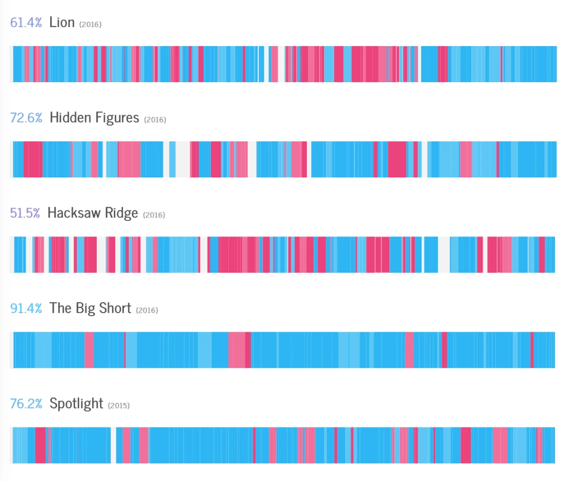
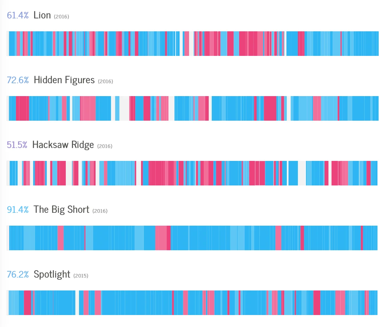
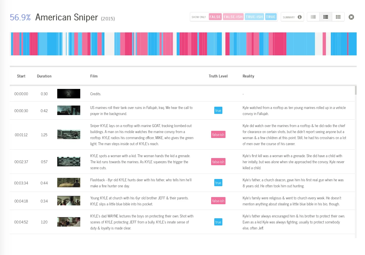
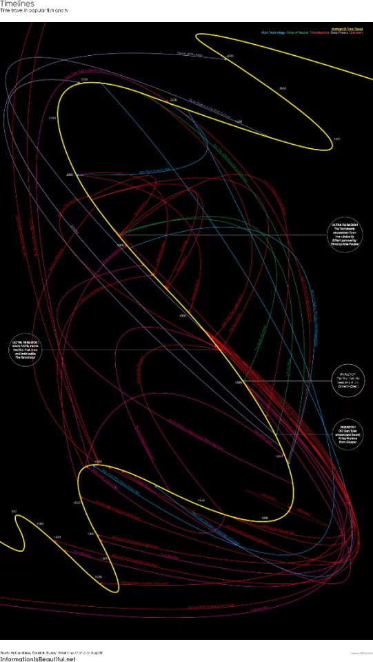
The Information Is Beautiful team has created some exciting work (I hesitate to use the reductive term "info-graphics," as these pieces are so much more than that). From the absorbing Timelines, a piece that maps popular time travel narratives along a single curved chronology, to Based on a True True Story (seen above), which maps the truth of Hollywood narratives along a linear color-coded bar.
Many of McCandless' pieces are html-based and very interactive. Based on a True True Story, for example, offers complete scene-by-scene breakdowns of individual films, letting users effectively zoom in and out of the "truth timeline" to evaluate individual moments.
Google has been playing around with data visualization projects for quite sometime and it currently matches up data from its News Lab with designers around the world. These impressive interactive works take live Google data and convert it into navigable images.
Beautiful In English is a recent project that combines Google Translate data with design from a firm called Visual Cinnamon. The data is displayed across a series of engaging visualizations, including a look at the words most frequently translated into English.

Not all artists are interested in making this flood of data comprehensible. In fact, some intentionally create overwhelming mashes of information in an attempt to abstract the source material into new forms.
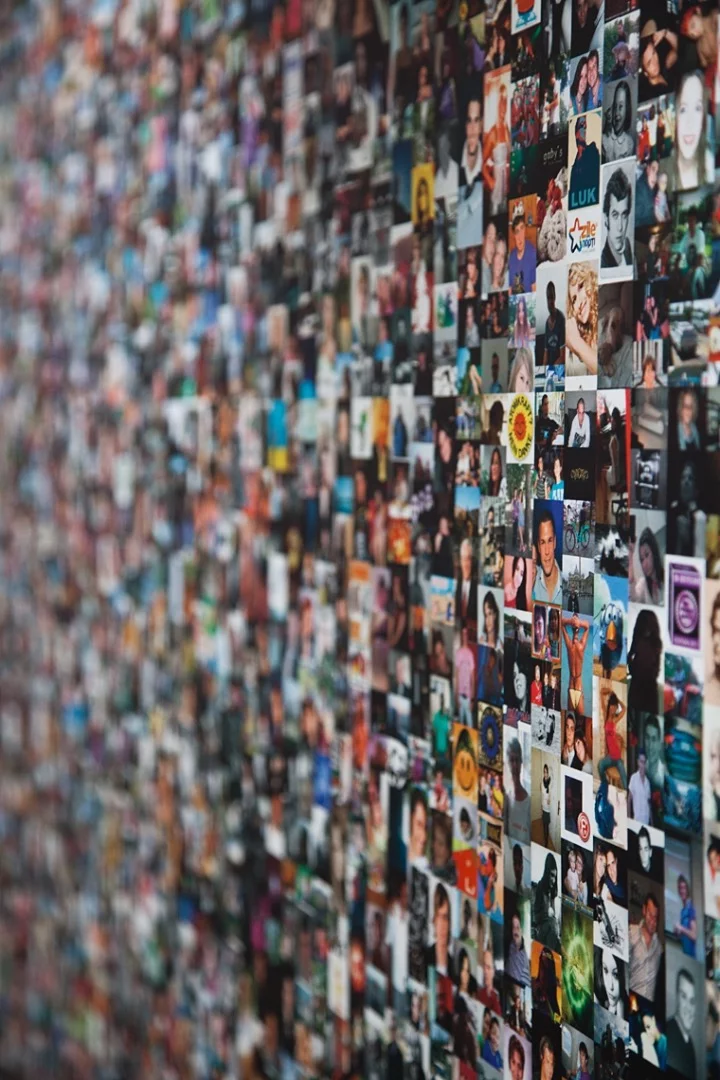
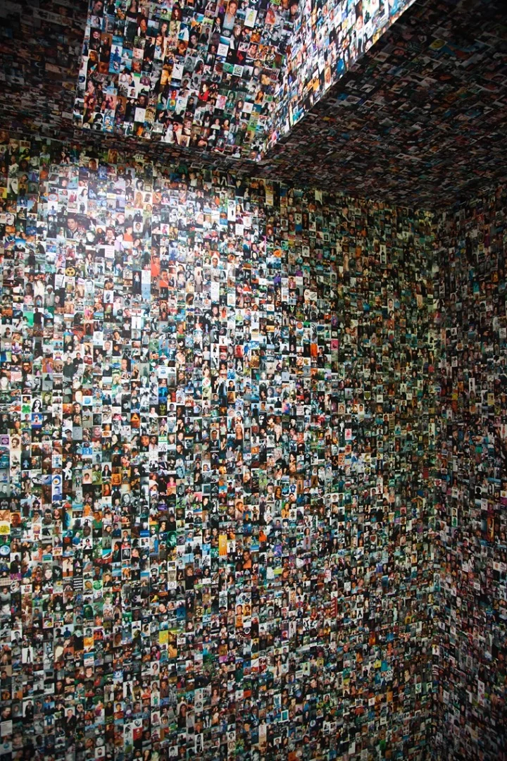
One of these projects is fbFaces from Jorn Roder and Jonathan Pirnay. The project used a custom-built Facebook crawler to snatch 100,000 profile images from the platform. These images were then compiled into a giant wallpaper that covered a room. The overall effect acts like a simulacrum for how we engage with the internet. From a distance its just an amalgam of white noise, and only when we hone in on the small details can we identify individual images.

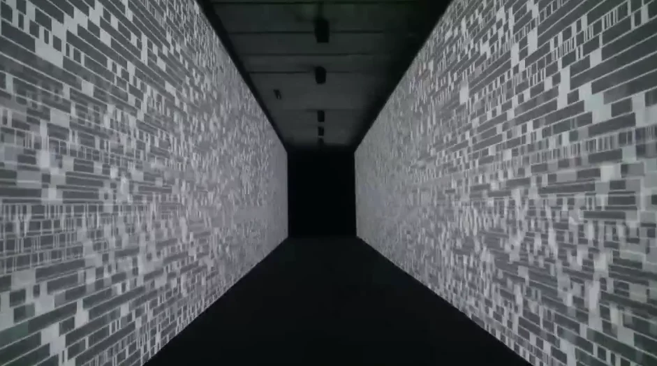
Ryoji Ikeda is another artist who harnesses big data into abstract outcomes. Ikeda's work often takes the form of abrasive and visceral performative pieces. One of his long running projects involving data is called Datametrics.
Datametrics started in 2006 as a concert piece where Ikeda took volumous amounts of code generated from software and hard drive errors. The data was sequenced into various 2D and 3D patterns and a soundtrack was constructed to reflect the chaos of the imagery.
Another iteration of the project came in 2013 and was called data.path. The installation took the form of a long hallway with projections running along the walls. The image sequence took binary data and built a flow starting from simplicity and concluding in chaos.
Not all data artists working today create digital objects, some are fusing these new modes of data with analog outcomes. Nora Ligorano and Marshall Reese are a collaborative duo who recently created a woven data portrait called IAMI.
The project is a fiber optic tapestry that changes color based on data generated by a Fitbit. The work has three separate modes it can cycle through, from an overall color portrait generated from two to four weeks of Fitbit data, to a portrait the artists generated for a real-time display of a subject's activity.
We have barely scratched the surface of the wonderful world of data art. Take a look through our gallery for a closer look at some amazing ways artists have translated big data into beautiful pieces.


