Smartwatches

Samsung Gear S3 review: A whimper, when smartwatches need a bang

Samsung Gear S3 review: A whimper, when smartwatches need a bang
New Atlas reviews the Samsung Gear S3, a very solid smartwatch that doesn't improve in many ways over its predecessor
View 7 Images
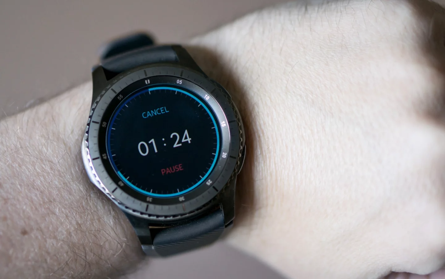
Continuing a concerning trend, timers are currently broken on the Gear S3: They won't notify you when completed
1/7
Continuing a concerning trend, timers are currently broken on the Gear S3: They won't notify you when completed
New Atlas reviews the Samsung Gear S3, a very solid smartwatch that doesn't improve in many ways over its predecessor
2/7
New Atlas reviews the Samsung Gear S3, a very solid smartwatch that doesn't improve in many ways over its predecessor
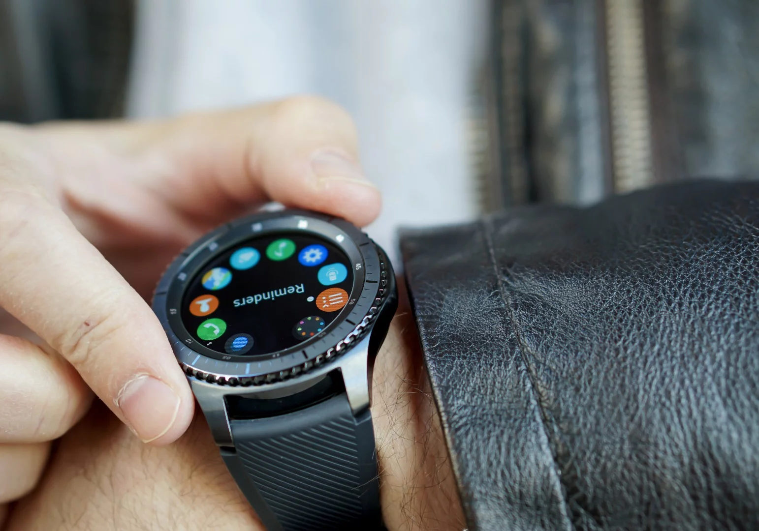
Reminders are finally fixed in the S3
3/7
Reminders are finally fixed in the S3
The Gear's rotating bezel is still its killer feature
4/7
The Gear's rotating bezel is still its killer feature
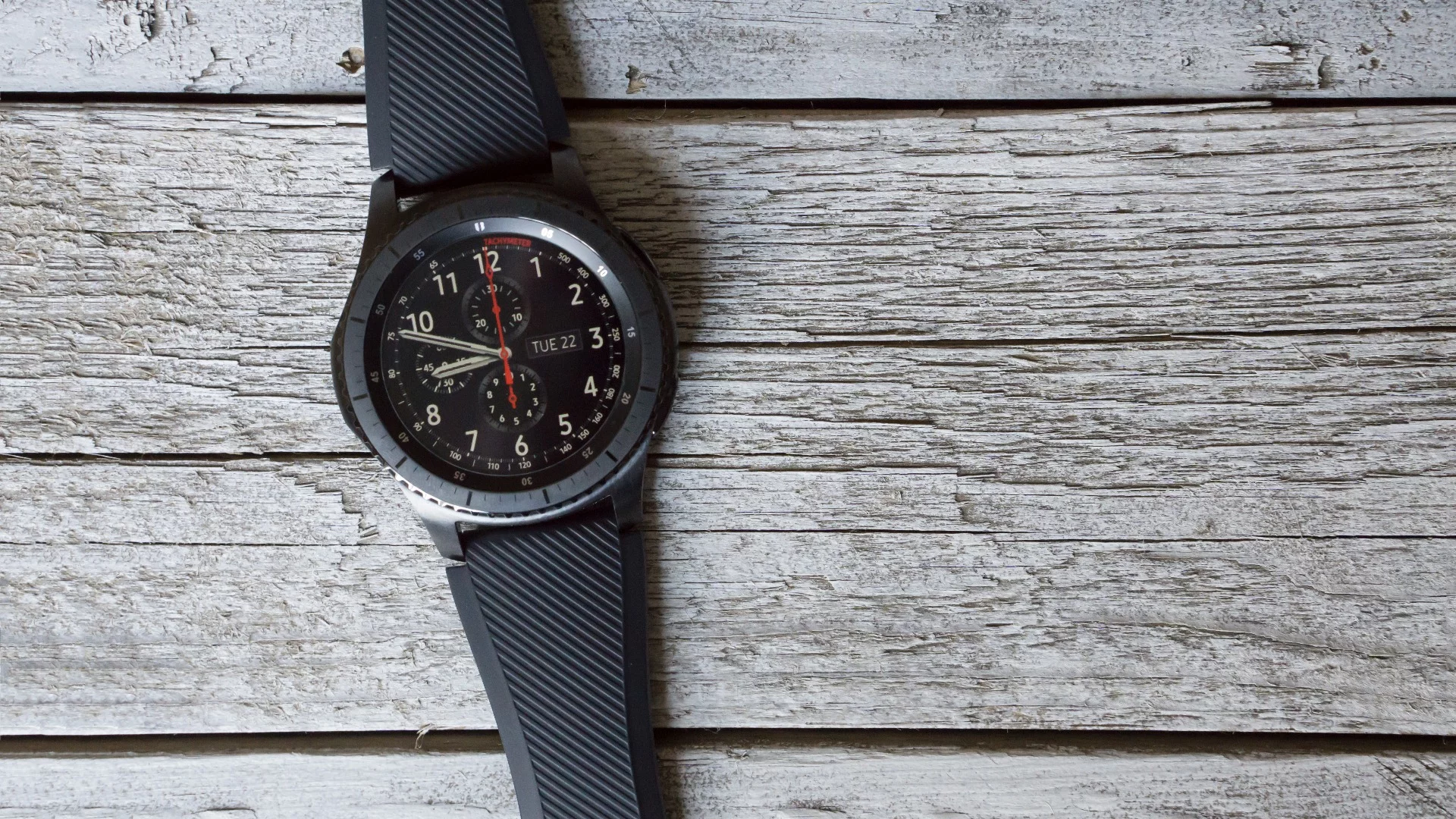
We like the look of this Frontier model, though the watch is large
5/7
We like the look of this Frontier model, though the watch is large
Pros and cons of the Samsung Gear S3
6/7
Pros and cons of the Samsung Gear S3
7/7
View gallery - 7 images

When a company has spent the last three years aggressively churning out smartwatches on a yearly or twice-yearly basis, trying to kickstart the "Next Big Thing," what does it do when demand sputters? If you're Samsung, the answer is apparently: not much. The Gear S3 is a solid smartwatch with an intuitive input system, but barely improves over its 2015 predecessor.

One of the most unsightly features of the earliest smartwatches was a tendency towards gargantuan sizes that announced to anyone in sight: "I'm a tech product." After a year or two, those sizes – thankfully – started shrinking down to better blend in with their timekeeping watch ancestors. The popular assumption was that smartwatches would continue in that trajectory towards inconspicuousness.

Not the Gear S3.

This is a big watch that appears to be aimed squarely at adult males. That isn't terribly surprising: Samsung likely looked at its buyer stats and saw that's mostly who was buying them anyway. But a casing that's taller, wider and thicker than last year's Gear S2 is an odd choice nonetheless – and one that won't likely be very appealing to many members of the fairer sex.

Fortunately it looks smart on my (manly?) wrist, and I'm a fan of the Frontier styling in the model you see pictured in this review. There's also a "Classic" variant with a cleaner, more traditional watch design (but the same huge size).

The Gear's rotating bezel is still its killer feature

The big draw is still Samsung's rotating bezel. It's similar to the Apple Watch's Digital Crown, but I prefer the Gear's approach. The physical gesture of twisting the watch-face to scroll between screens or through text feels intuitive.

The Tizen OS is still functional-but-underwhelming: Samsung products soar the highest when another company handles the software (see Android-running Galaxy phones and the Oculus-powered Gear VR). Samsung did finally remedy the big gripe we had about the Gear S2 – the inability to create reminders or calendar events – with a built-in app dedicated solely to that. With the S3, you can now use either voice control or onscreen tapping to quickly create (and later receive) a reminder.

Reminders are finally fixed in the S3

While Samsung is pitching this as a new addition, this was a glaring hole that shouldn't have taken an entire year to remedy: a quick update to the Gear S2 would have made more sense. Apple had Reminders on Day One for its Watch in early 2015; Google had it on Day One for Android Wear in mid-2014. Samsung leaves it out of its highly-marketed, $300, late-2015 wearable, and then calls it a new feature when it's finally fixed a year later.

Unfortunately, as Samsung giveth, so it taketh away. Another basic smartwatch task, setting a timer, has fallen off a cliff. Ask the Gear S3's built-in voice assistant to set a timer and, the first time, it will (annoyingly) tell you to download a separate app for this on your paired phone. Okay, fine. After doing that, I successfully set a timer and go about my business – only to later realize that the watch didn't notify me when it completed.

After several repetitions and a search through app and notification settings to make sure everything was kosher, it's clear that the Gear S3 simply won't notify you when a timer expires, rendering the feature useless.
Continuing a concerning trend, timers are currently broken on the Gear S3: They won't notify you when completed
Continuing a concerning trend, timers are currently broken on the Gear S3: They won't notify you when completed

Pair this with the no-reminders Gear S2 and, much more dramatically, the flammable Galaxy Note 7 and we have to wonder: Is Samsung dedicating too many resources to feature lists that make for slick, big-budget advertisements, and not enough to the core, day-to-day user experience? Are a wide enough variety of Samsung testers using these products in different ways that different customers would use them? After a long-term pattern of seeing Samsung tech that's heavy on attention-seeking gimmicks and light on a basic respect for a seamless, all-bases-covered user experience, this is becoming a legitimate – if not major – concern.

We can only hope this one won't take a year to fix.

Battery life is good enough: With light use, the Gear S3 only drops about 2 percent per hour, even with the always-on display setting activated.

Its screen has a minor drop in pixel density from last year's model, but you wouldn't know it: As is usually the case with high-end Samsung products, the display quality looks great in real-world use.

The S3 will eventually support Samsung Pay, including at standard credit card readers, but support for that isn't yet available to test (at least not when paired with a non-Samsung phone).
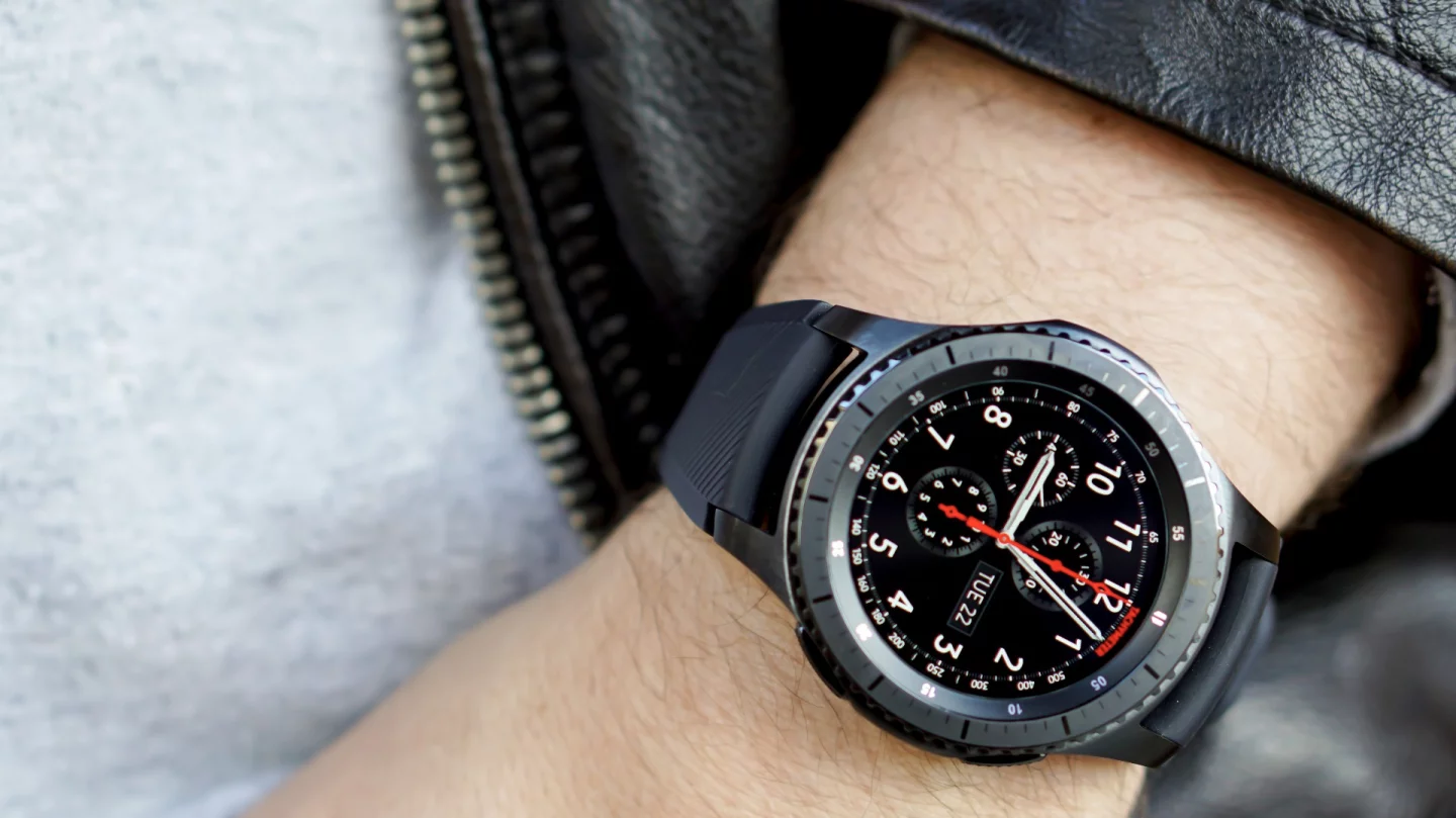
We like the look of this Frontier model, though the watch is large

Smartwatches aren't the must-have products some people thought they would be right now, and the Gear S3 doesn't do anything to change that.

If you own an Android phone, it's probably your best bet right now – especially with Google and its partners pausing Android Wear product launches. But with barely noticeable changes from the still-available Gear S2, a questionable growth spurt and yet another basic-task fumble, it's far from an essential purchase for yourself or a loved one this holiday season.
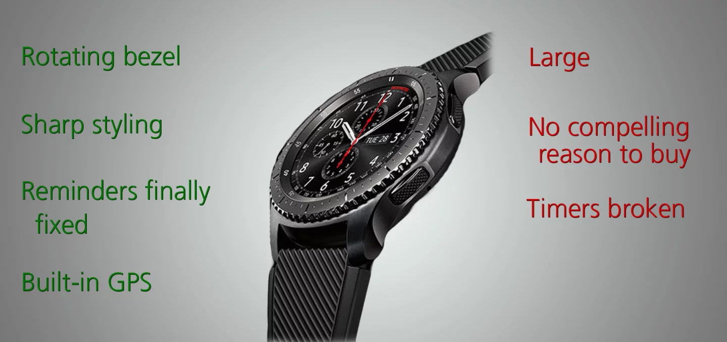
Pros and cons of the Samsung Gear S3

The Gear S3, including both the Frontier model pictured here and the Classic model, are available now for $350. In addition to this Bluetooth-only model, there's also a standalone LTE cellular variant sold by wireless carriers.

Product page: Samsung

  • Buy Samsung Gear S3 Frontier on Amazon
  • Buy Samsung Gear S3 Classic on Amazon
View gallery - 7 images
10 comments
10 comments
MiguelRamirez
Best smart watch up to date.yes it's not perfect but it's a wonderful device.
ChrisStanton
Having owned a Gear S2 for a year, I've come to regard it as a Casio watch for the 21st century and whilst Samsung blatantly copy Apple in many products the one area it doesn't is in software updates. Apple release updates for old products, Samsung want you to buy new products. Like a Casio watch the Gear S2 is ok, no useful apps to speak of, all the watch faces are basically the same. Wil I buy another smartwatch - unlikley. Will I get another Samsung Galaxy phone (I have the S7 Edge) definitely No if they switch to the Tizen operating system - no apps.
GaleLast
I have always for some reason been a Samsung fan. If you see my house you would get that idea. Samsung has it's ups and downs. Like anyone else. I am getting the Frontier and can't wait. Maybe it's the open market Android has over it's competition. I do find updates are really not as quick as others. I have had a few issues with Samsung but they have always been good at repairs or replacing my devices. I hope the Frontier will handle my daily tasks.
DaveStern
Coming from Android Wear 1.5 on a 1.0 watch (zenwatch, which was great), this watch is excellent. Your critical comments are well taken, however from many who may switch from wear to tizen given google's delay in launch of wear 2.0, this watch offers a lot. Basics such as this is a great looking watch (frontier .. looks like a regular outdoor watch, not a tech toy) and the faces are excellent including smooth animation, feel of a mechanical watch in hand movement, complexities of shading on the face which change as you rotate your wrist, and the dots that show your click wheel movement which raise and lower as you turn the wheel all make for a great experience. Button use with the UI is excellent and the animations in changing apps is outstanding. I can see how it would be easy to overlook these if you are coming from a gear s2, however it's a different story coming from Wear.
BTW I did just try the timer and it (now?) does notify when time is up (sound). It should vibrate too but I'm sure that can be added (yes would impact battery life but for a timer, you really do want to know when time is up).
The apps such as WSJ, messaging, flipboard are all really good. Samsung Pay is so much better on the watch than the phone as you don't have to fumble for your phone (long button press is reliable and easy / responsive), and authentication, while secure with a pin, is easier at the POS than the phone. It also is easier at the POS as the form factor is smaller, rather than waving a large phone around. I would like an option for auto turn on of the payment function (MST and NFC when the app launches) to reduce payment from 2 clicks to one (with another button click cancelling the MST/NFC and staying in the Pay app).
So, for me, this is such a great (!) watch. Yes, please push Samsung as you are, but also know that others may see the situation more positively.
RoarLions
A whimper? Really? So they up the style factor to make it look even more like a regular, big boy, stylish watch. They add GPS, altimeter and barometer so that it more accurately tracks fitness. They increase the available Tizen app ecosystem to over 10,000 apps. In addition, Tizen is super efficient giving the watch a legit 3-4 DAYS battery life. The make it super tough with Gorilla Glass SR+ and give it IP68 and mil spec 810G ratings do it can survive almost any conditions.
And your big complaint is a lack of timer? How thorough was your review process? Because I found my timer in about 15 seconds.
Click your watch face. The timer will pop open allowing you start, stop, lap and countdown. It's available in virtually every stock watch face.
If your critique process can't find something so basic, it calls in to question your ability as an analyst.
SMD
TIMER WORKS FOR ME.
I just tested the exact timer you have in your picture and it works great. Buzzes non-stop (until you stop it) when it's done and even tells you how long it's been buzzing for. Seems odd what you experienced so perhaps it shouldn't be one of your main gripes as you may have just set it up wrong.
As for size, you say it's large. I say it's just right. It's definitely masculine. I actually thought it was gonna be giant after reading and seeing all these reviews. And then I tried one on and went, wow, it's not too large at all. It's not small but I think it's perfect. I'm an athletic built male at 5'11" 180lbs.
I don't mean to be critical because I do appreciate the review, but your reference to "whimper" is interesting because perhaps you are not a fan of smartwatches as a whole. There's a good chance this is the best smartwatch ever made to this date. Subtle improvements, outside and in from the successful S2 make this a refined product. As for smartwatches, it's debatable on how useful they are but as I've had one for over 2.5 years now I think they're great. Your criticism of smartwatches is valid though, however I'd ask you...if you complain about apps, what exactly are you looking for that other smartwatches have? Reviews these days often criticize Tizen as having few useful apps. Okay, well then tell us what you think is missing. What watch function are you looking for exactly? This watch pretty much covers everything that others cover as of late 2016.
My biggest gripe on it would be SVoice vs. Google Now. SVoice is not even close to being as good as Google Now, but I'll admit SVoice is 50% better than it was 2 years ago. Still could be a lot faster, but it's improving so I won't carry on like I would have a year ago with the S2.
I think the watch could have more customizable notification options allowing users to really refine that experience. Yes, there's a few, maybe 10 general options, but at it's core a smart watch is a wearable notifier, so I think there should be not 10 but like 30 options so users can really customize HOW they'd like their notifications to arrive, how it's displayed, for how long, and how they interact with them when they do arrive.
Battery life on my Gear S3 so far has been great. I do use always on feature as the past 2.5 years the one thing I've not liked is having to do the wrist flip several times to get it to just show me the time. Ugh. After a full 14 hour day yesterday with Always on enabled, I went to bed with 55% left. And that's playing/tinkering with the watch more than I will in 2 weeks or two months. That's how these watches are used. A lot at the beginning as users figure them out, their usage becomes more "normal" and thus they get better battery life. So I'd say 2 full days is to be expected with the always on enabled. And at that rate I'd probably say the 3-4 days estimate is probably accurate with the always on feature off. I'm enabling GPS today so we'll see how that affects its life.
Size is perfect for me. So glad you can now answer calls on this now after Samsung had that feature in older watches, then got rid of it in last years watches outside of their 3G version. Speakerphone is excellent. The ambient light sensor works great BUT I think they could improve it still. This sensor to me, is REALLY important. At night you don't want a watch that's blasting super bright, and then there's a huge different between that and daytime shade and daytime full sun. And yet, from what I can tell (more testing to be done) it seems Samsung's ambient light sensor adjusts for full sun, and that's it. And it only gets as dark as the level you've set it in your display settings. The trouble with that is...let's say you set it to 7 out of 10 brightness (default level). That's pretty bright. Works great in the shade during the day but come nighttime, it's too bright in my opinion. There should be OPTIONS for how this sensor works. Like you set it to be a certain minimum level during the day and then get brighter in full sun...and then a different minimal level after sunset when it's darker and you may want your watch not to shine brighter than is necessary. I'd imagine this would help battery life as well.
These, to me, are real world thoughts as a long time smartwatch user.
CraigGruneberg
I'm glad you hit on the size issue. Wish they'd do some market research to learn what customers want. Size does matter and going larger bucks the trend in tech. On the "yawn scale" this watch warrants a 9. Take a look at the Pebble Round for something to copy Samsung!
Uber_Poppy
Will, please read the reviews that have been entered regarding your recent review of the Samsung S3, you have much to learn and these other readers could keep you informed. The only viable comment you made is that the Samsung S3 is a large watch. I've been using this watch for about 3 weeks now and quite frankly rarely if ever take the phone out of my pocket it is truly where wearable technology should be.
Utlending
Gear S was the ultimate Smart Watch, update with better battery and charger, A rectangular watch to display text make more sense than a round one, although it seems that people are not able to understand digital indication, but need pointers like in an old watch to tell time, round watches with strap holders are not round but rectangular. Make the step counter and all the so called activity function a function that can be totally turned off, it uses battery and is not a function one would use in a device for time/date indications and communication. Make it in 2 sizes for people that think it is too large, one need to be able to read more than 4 letters.
Tanstar
The "won't likely be very appealing to many members of the fairer sex" comment shows you don't get it. As a man, I don't want a unisex watch. I want a watch made for men. My wife doesn't want a unisex watch. She wants a watch made for a woman. Samsung made this to appeal to men, because more men are interested in the form factor. Also, a smaller watch means a smaller screen. I think they are plenty small enough already!