Last week Microsoft announced the general release of its Sway digital storytelling app. Sway, which is part of Microsoft Office and designed for creating presentations, is in many ways an alternative to PowerPoint. But what is the difference and what can it do?
Sway was first announced in October last year and has been available in "preview" status since then. Its general release means it is available to the public and to Office 365 for business and education customers worldwide.
The software is available as a downloadable app for Windows 10, iPhone and iPad, or as part of Office Online. A version for Windows Phone (now Windows 10 Mobile) is also said to be in the works. The app fits perfectly into Microsoft's recent "cloud first, mobile first" approach: designed for use across phones, tablets, laptops, PCs and other devices.
The purpose of Sway is to convey concepts quickly, easily and clearly. Unlike PowerPoint, it is primarily for presenting ideas onscreen rather than to an audience. Tutorials, topic introductions and interactive reports are the sort of things to which it lends itself. Sway presentations are backed up to the cloud, and can be easily shared or embedded in websites.

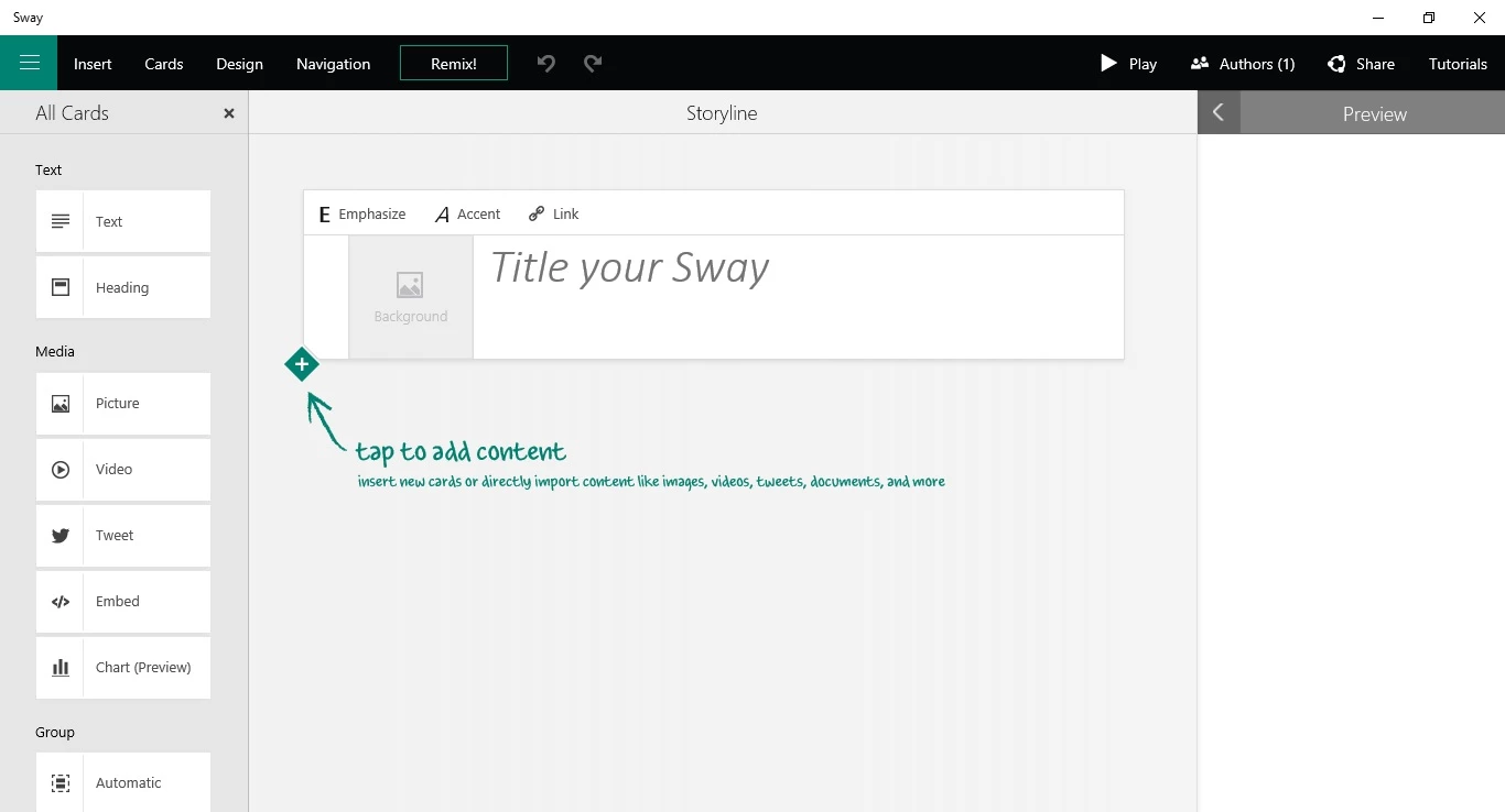
The Sway interface is based around a storyline, into which users add a series of cards. These cards are then filled with content, with different cards available for different types of content, and which can be grouped together into sections. Content intended to be the user's narrative can be easily added, removed, edited or reordered. This flexibility should allow stories created in Sway to be much more free-flowing that presentations created in PowerPoint.
An overall theme of a Sway can be selected by the user and some additional design tinkering can be done, but otherwise Sway's built-in design engine chooses how your Sway will look and users have little control over the formatting of individual elements. This may sound limiting, but, by minimizing the amount of tinkering that users can do, the app is kept simple and is optimized for creating presentations quickly.
The design engine of Sway does a pretty good job of making its presentations look coherent and optimizes the design for viewing across different devices (we used the Windows 10 app for the purposes of this article, which is virtually indistinguishable from the web version). For informal presentations this should be more than adequate, but Sway isn't for users who need to stick to brand guidelines.
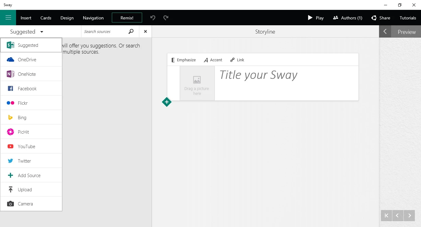
Unlike PowerPoint, there's no option for creating content in Sway itself. It must be uploaded into the software as it's intended to be used or it can be pulled in directly from a variety of different sources from within Sway. This helps to simplify the creation process, too, and minimizes the amount the time spent on producing a Sway. Current sources include YouTube, Facebook and Flickr.
Using the online version of Sway, there's an option to import an existing Word, PowerPoint or PDF document from which a new Sway can be created. This means a Sway presentation drafted in Word or a PowerPoint presentation can be converted to a Sway story, with headings, text and media automatically broken up into relevant cards and sections.

Users can choose whether a Sway should be viewed via vertical or horizontal scrolling or in a presentation mode, as would be the case with PowerPoint. This provides some flexibility for how a Sway will be used, such as embedded on a website or as an on-stage presentation tool. Although, as mentioned earlier, PowerPoint is still the better option for the latter.
Once a Sway is completed, it is possible to play it in the desired non-editing viewing mode and to share it. Sways can be shared via the user's Docs.com public gallery, via social media, as a link or as a piece of embeddable media. Sways can also be shared for co-authoring and collaboration.
Once it's clear what Sway is actually for, it becomes an interesting product, although perhaps not one that will be used quite as much as its Office siblings. There's a bit of a learning curve involved to get familiarized with the interface, but loading the example Sway presentations created by Microsoft should help with this and, indeed, they show just what is possible.
Below is an introductory video to Microsoft Sway.
Product page: Sway


