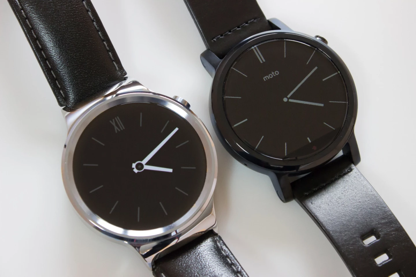
Comparing the Huawei Watch to the Moto 360 is kinda like comparing two Windows PCs that have identical specs but different cases. Let's take a quick look at two of the best smartwatches you can buy today, that happen to also have a lot in common.
That PC metaphor only goes so far, though, because it's probably safe to say you care more about the looks of something you wear than something that sits on your desk. In fact Google's entire approach to Android Wear assumes that looks are enough to make one wearable product different from the next.
We won't try to tell you which one of these two styles you'll prefer, but we can zero in on the few – but key – other differences between the two.
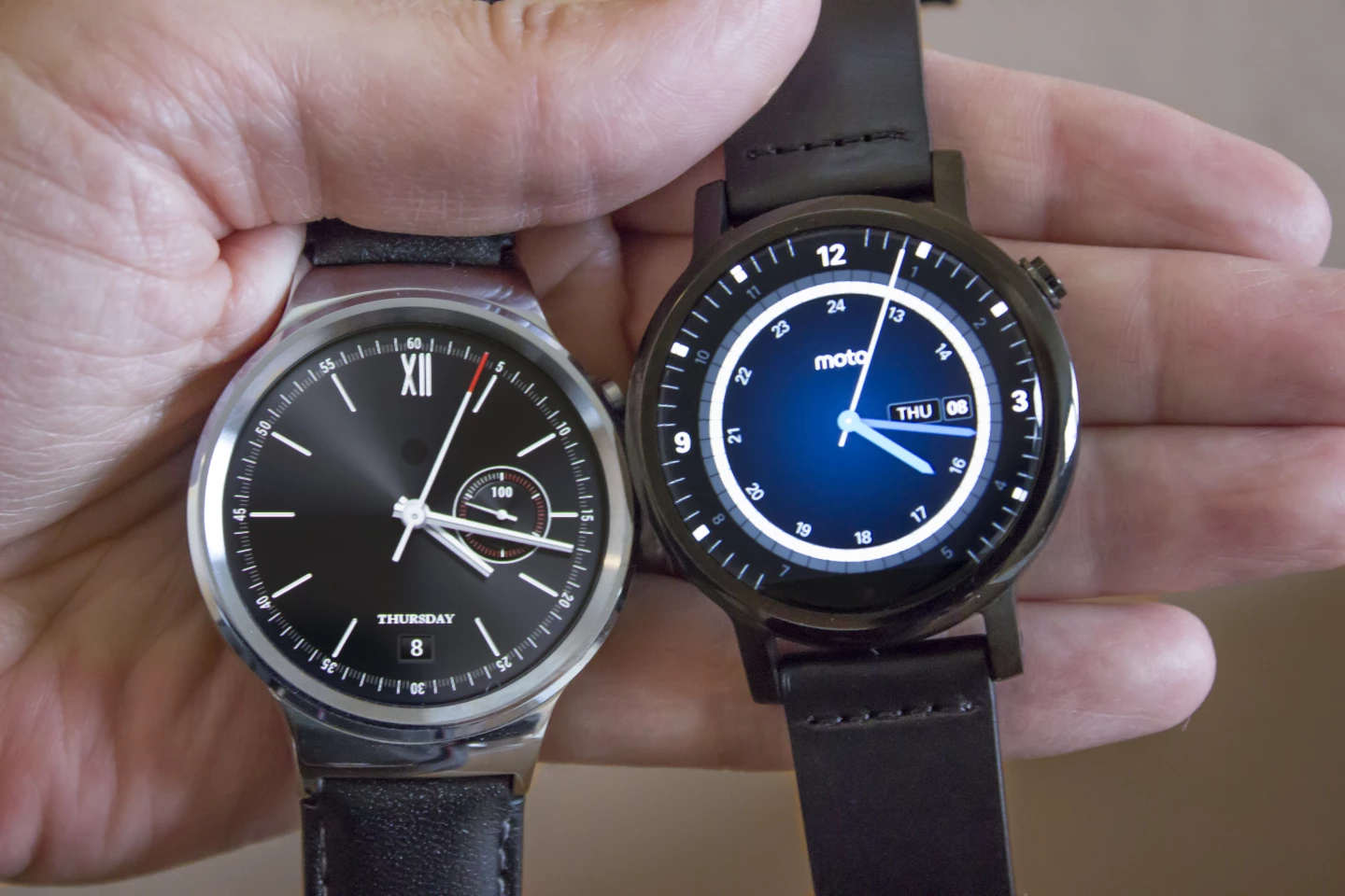
Both Huawei and Motorola sell their watches in several different styles, but we're handling the entry-level versions. This is the US$349 leather band Huawei Watch and the $299 42 mm (black) leather band version of the 2nd-gen Moto 360.
Other models of the Huawei Watch go as high as $799 (that one is gold-plated) and there are styles of the Moto 360 that climb up to $450.
Both of our smartwatches have stainless steel bodies, and can come close to passing for regular timepieces. Looking at the smartwatch landscape as a whole, that's one of the biggest reasons to consider these two: the Huawei Watch and Moto 360 are less like wrist computers and more like pieces of jewelry that happen to have some hidden smarts inside.
... or at least that's the goal – we think the Huawei Watch pulls this off a little better than the Moto does.
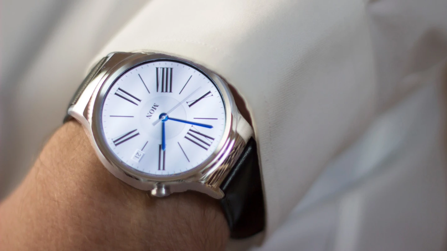
The two watches' bodies are the same 42 mm diameter, though Motorola also sells a (fairly huge-looking) 46 mm model. On my adult male wrist, this 42 mm size of watch is just about ideal. The bigger Moto is probably better for men with larger than average wrists.
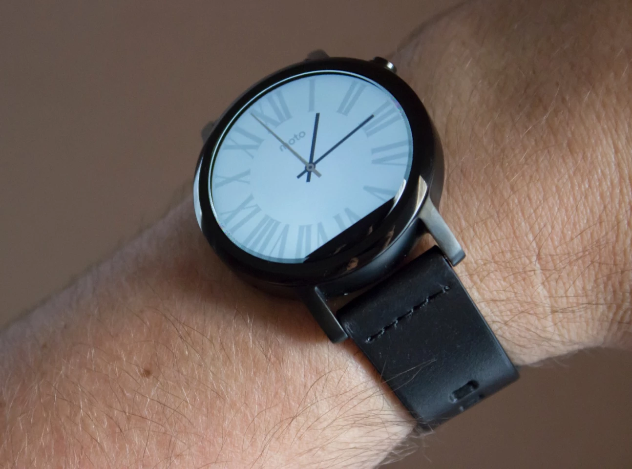
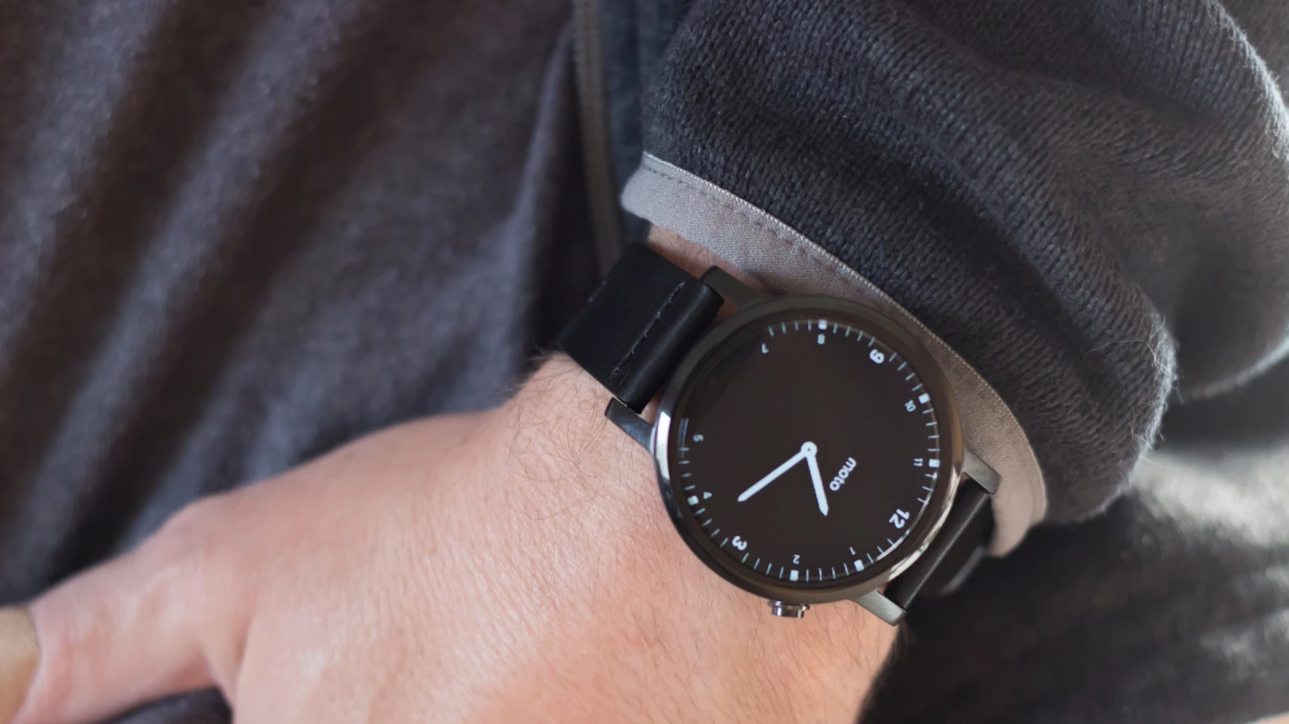
The Moto 360's display has that same "flat tire" shape we saw in the 1st-generation model. Though that cut-off point at the bottom looks fine when you're flipping through Android Wear cards (they have horizontal lines to match the horizontal bottom of the screen), it's a little strange to look down at your wrist and see a clock face with a chunk bitten off of it:
In our regular use (brightness set to 80 percent, regular notifications coming in, using the occasional voice control), the Huawei Watch has slightly longer battery life: it only dropped 3-4 percent per hour compared to 4-5 percent per hour for the Moto 360.
Those results were with their always-on clock face settings turned on, so you can use either watch all day long without having a dead-looking black screen on your wrist when you aren't actively looking at it (like with the Apple Watch).
We haven't put either smartwatch through any extreme torture tests, but the Huawei Watch's screen is covered in sapphire, compared to Gorilla Glass 3 for the Moto 360.
Corning released a promo video a while back showing Gorilla Glass holding more pressure before breaking than sapphire (after going through a 45-minute tumble test that weakened both materials), but on smartwatches you should be more concerned with scratches than with brute force. And when it comes to scratches, sapphire is the better choice.
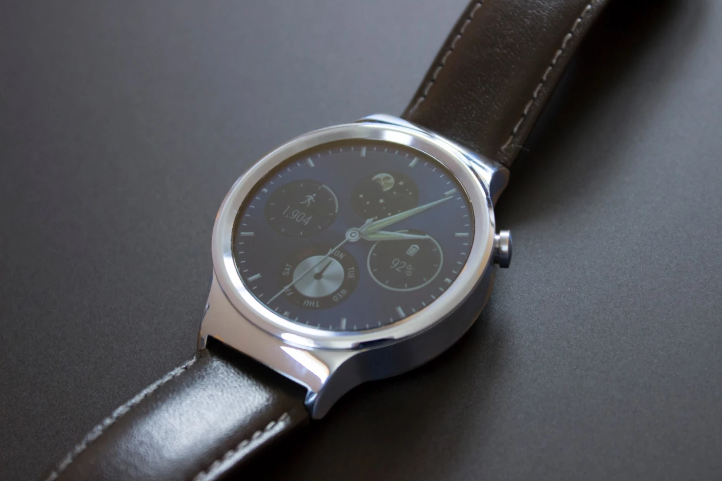
Much of your decision here comes down to style, and we invite you to browse our image gallery for more shots of our two review units. We think the Huawei Watch is the better all-around product, for its combination of looks, slightly longer battery life and sapphire-covered, fully round display.
... but if you don't mind (or maybe even prefer) the Moto 360's prong-like lugs and flat tire screen, you can save $50 on a watch that still looks pretty good and has virtually identical software and performance.
For a deeper dive on each watch, you can check out Gizmag's individual reviews of the Huawei Watch and 2nd-gen Moto 360.


