As Microsoft continues development of its new desktop operating system, it recently released a new build of Windows 10 for members of the Windows Insider program. We previously showed you how to become a Windows 10 Technical Preview tester and looked at some of its features. Now we move on and take a look at the new features in the latest build of Windows 10.
Installing Windows 10 build 9879
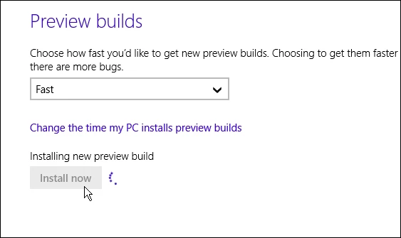
If you're testing out Windows 10 Technical Preview you can get the new build by heading to PC Settings > Update and Recovery > Preview Builds. From there, make sure the setting for how quick you see new builds is set to Fast. If it’s set to Slow you won’t see it, but you can change it to Fast, exit out of Update & Recovery and go back in and download it.
This is a full new build and will be installed as an in-place upgrade. This means you won’t need to go through all the trouble of initial setup and downloading all of your apps again. But keep in mind that this build still takes a good amount of time to download and install.
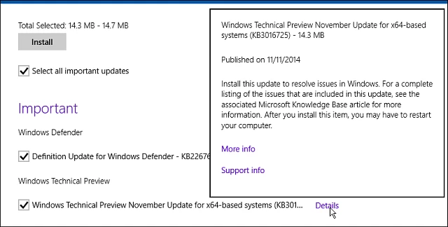
After the new build is installed, make sure to go into Windows Update and install the Windows Technical Preview November Update (KB3016725) to help save you from some performance issues right off the bat.
New Windows 10 features
The new build of Windows 10 offers some noteworthy changes and features. The company says several of these changes were directly influenced by Windows Insider program user feedback. I've been testing it out since it was released, and here's a look at some of the new things that should be coming to the final product.
Hide Task View and Search icons from taskbar
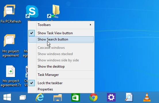
The ability to remove the Search and Task View icons from the taskbar is said to be the number one feature asked for based on user feedback. To remove the icons, right-click on one of the icons and uncheck the one you want gone or uncheck them both for a cleaner area on the taskbar next to the Start menu. You can still search via the Start menu and use Task View with the keyboard shortcut Alt+Tab.
Support for MKV video files
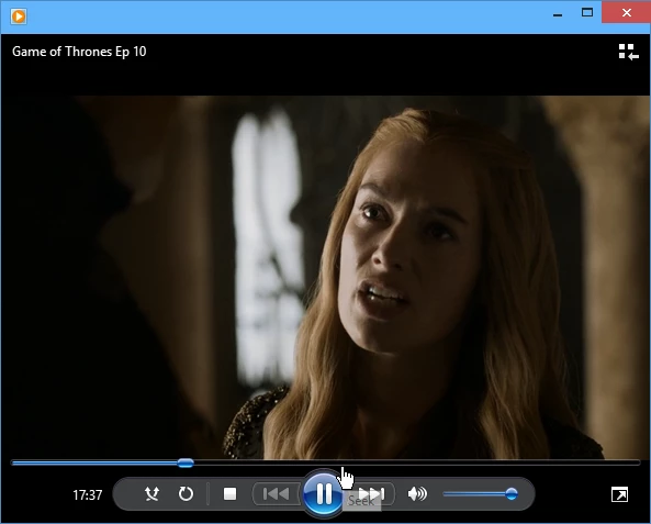
While you could play MKV video files in the last version of the Windows 10 Technical Preview, build 9860, this file type is now officially supported. Windows Media Player, as well as other modern and desktop apps, have native MKV support and MKV files and their metadata will display as thumbnails in File Explorer. It also supports the ability to stream your MKV videos to the big screen via DLNA devices using Windows' "Play To" wireless technology.
OneDrive changes
OneDrive now uses selective sync, which allows you to choose which files are synced to your PC and the cloud. Also, the OneDrive modern app is not available in this build and is more than likely being dumped as it was confusing to a lot of users. Now all of your OneDrive data management is done through File Explorer. While Microsoft touts the changes to OneDrive as improvements, not everyone is happy about these changes - namely Windows 8 power users.
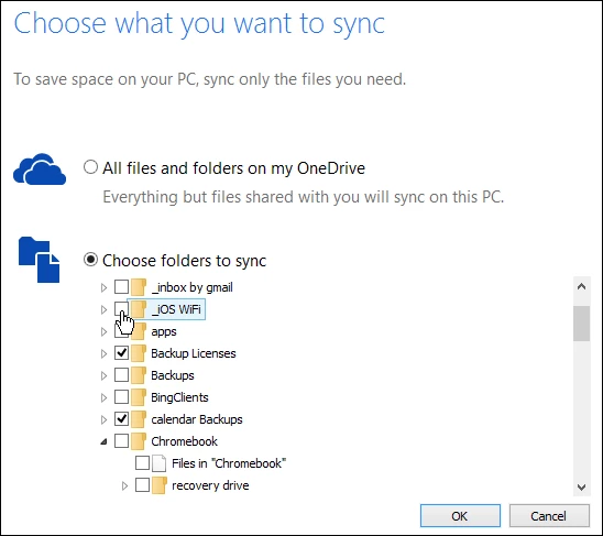
The way the service works in this build is much like it does in Windows 7 and OS X. However, Windows 8 users have a better experience since all of the files in OneDrive are visible on your computer as thumbnails or placeholders. That means you can see everything that's in your OneDrive from your computer's file system, even though the files aren't technically on the computer.
With OneDrive on this build, you need to use the selective sync feature, which can be tedious for power users with gigabytes of files stored in OneDrive. But to be fair, this is still a "beta" build of Windows 10 and Microsoft says it is working on new features for OneDrive to improve the way the service works across all platforms.
For more details on the OneDrive controversy or to vent your own frustrations head to the Windows 10 UserVoice site
Other noteworthy new features
There are a number of other features available in this build of Windows 10 that are worth mentioning:
Snap Assist: Allows you to snap apps across your monitor easier, which will be a major benefit if you have a dual-monitor setup and bounce between the modern and desktop environments.
Modern app dialog boxes: Previously, full screen modern apps would provide full-screen notifications, but now they are presented as smaller, more efficient dialog boxes.
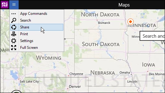
New title bar menu: When running modern apps on the desktop in the the previous build, users complained that it was hard to find the charms and full screen buttons. Microsoft replaced the "three dots" button with a mobile-like “hamburger-style” icon (three lines), which should help make the menu options more noticeable.
File Explorer improvements: You can now pin your favorite folders to the Home section. There are also new icons, including one that shows content in a populated folder. Below is a screenshot of the new look. To see this new folder icon style, you need to have View set to Medium icons or higher.

The journey continues
The Technical Preview of Windows 10 seems to be coming a long nicely (with the exception of the OneDrive debate). The first build concentrated on the company's return to the desktop environment, and it showed off several features many wished were in Windows 8. In this latest build, Microsoft has refined and enhanced the desktop environment even more. We'll be covering this journey from each new build, and up to the final product when it's released to everyone sometime next year.


