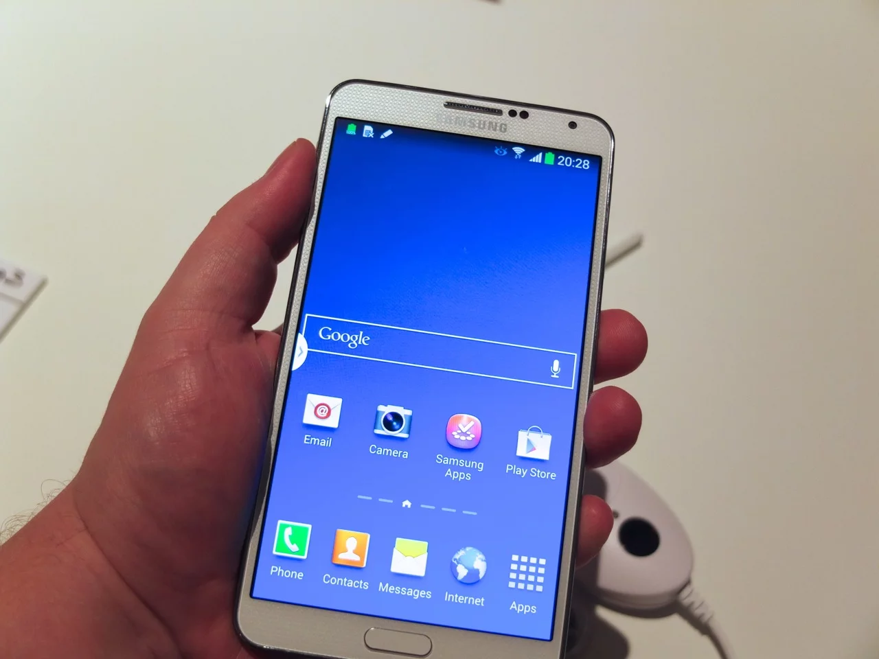
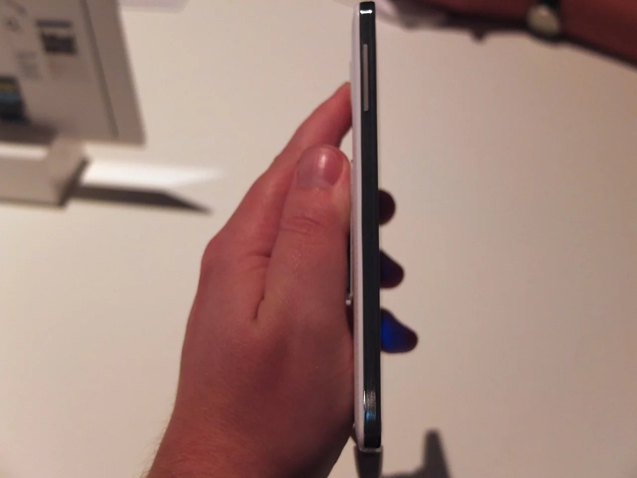
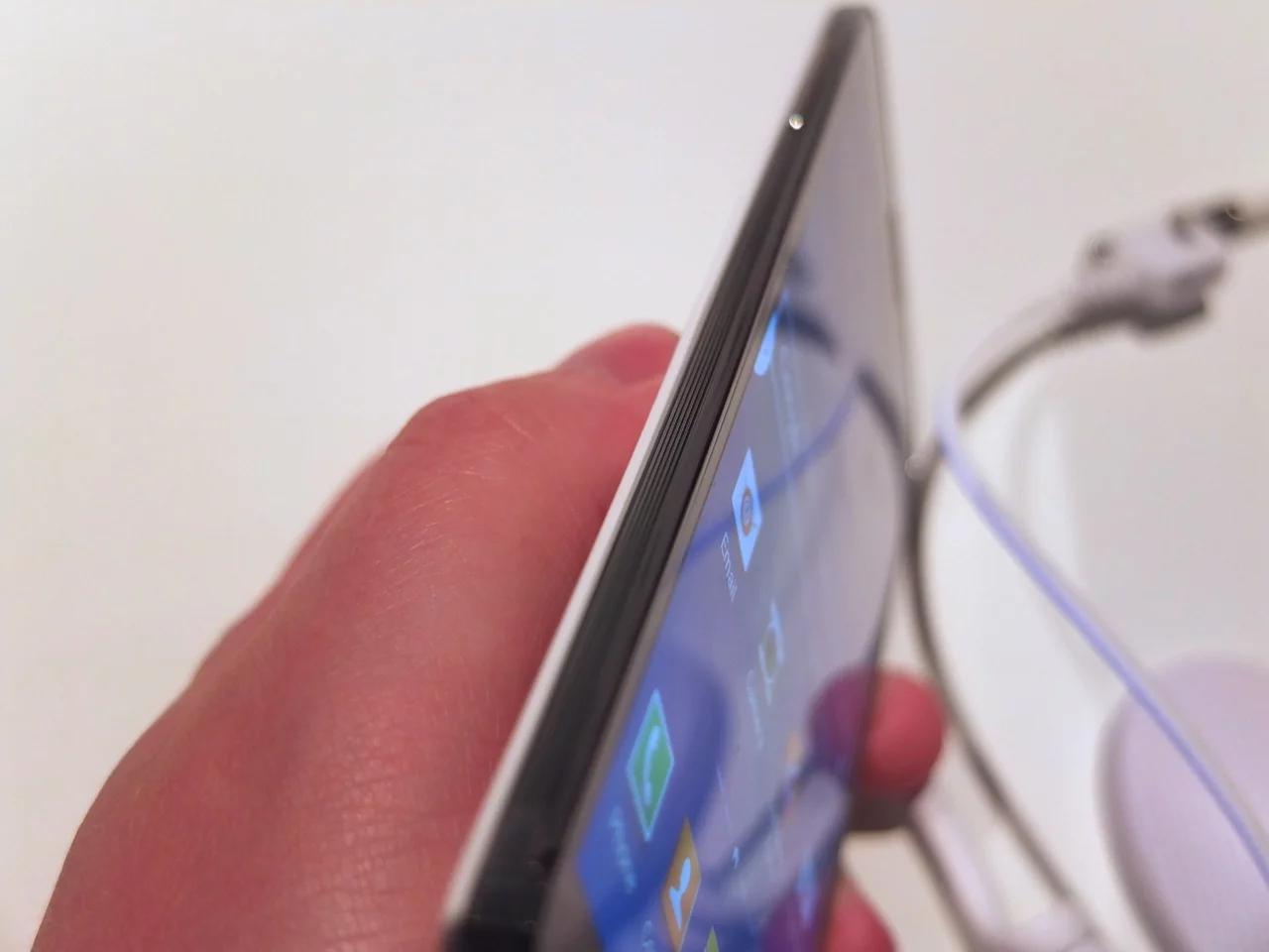
IFA! After a packed-to-the-rafters Samsung Unpacked event, Gizmag wasted no time (or as little time as was reasonable given the free bar) in trying out both Samsung's new Galaxy Gear Smartwatch and the Galaxy Note 3. Read on to find out our first impressions of the new hardware.
Samsung Galaxy Gear
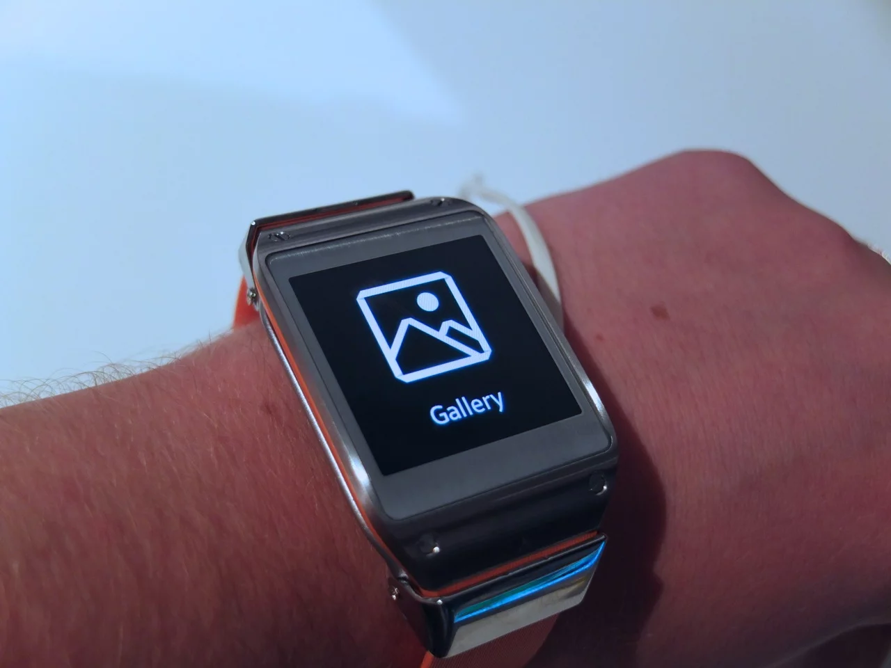
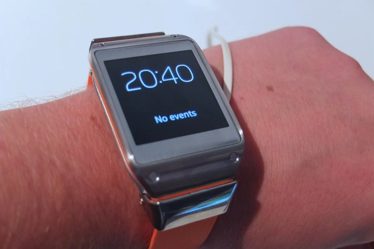
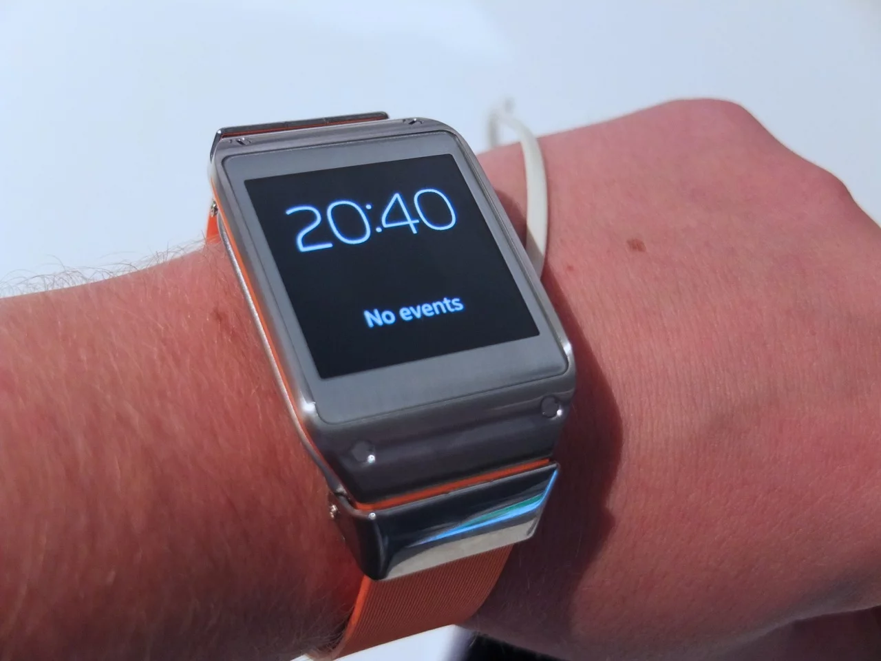
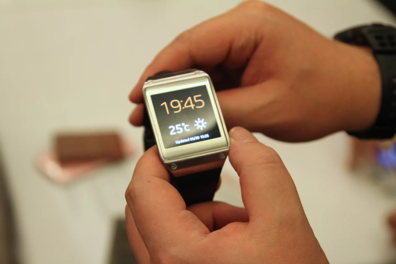
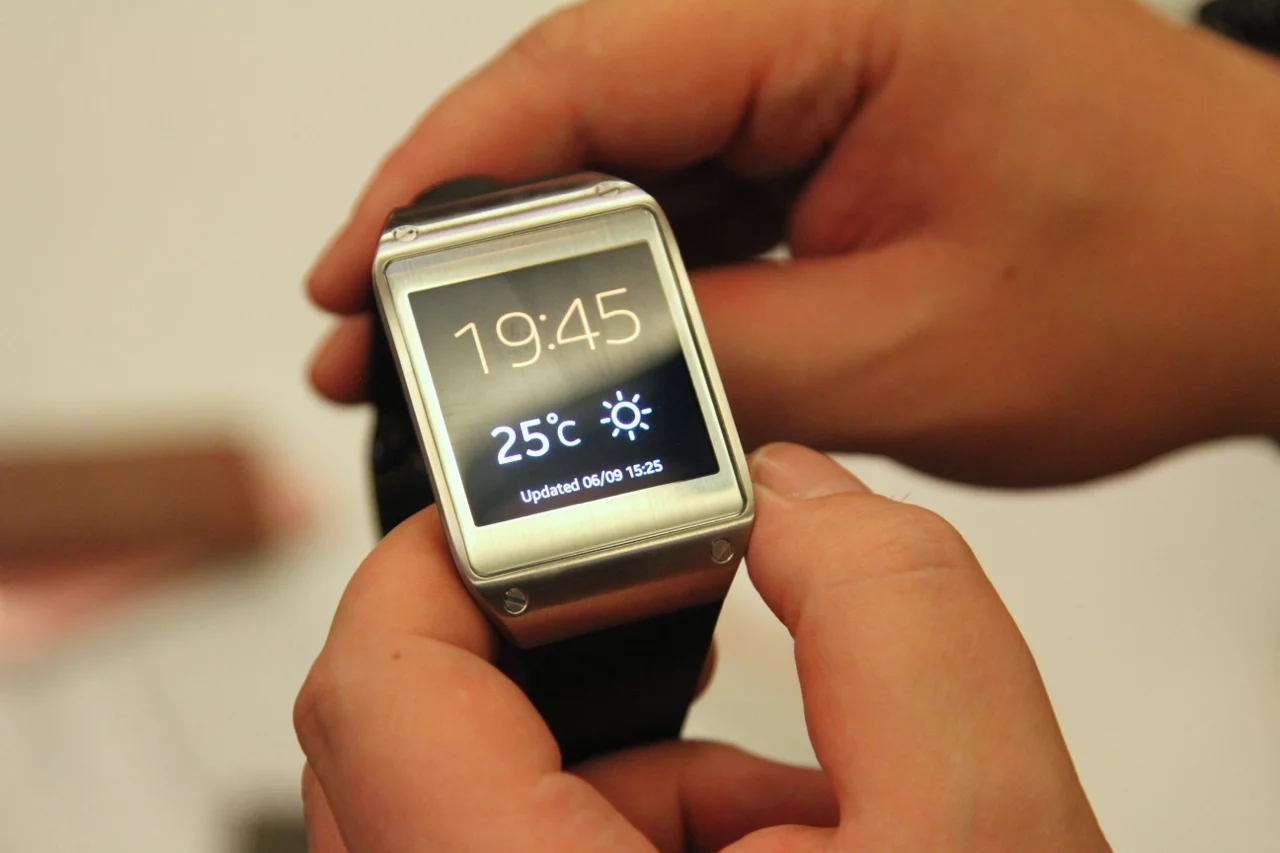
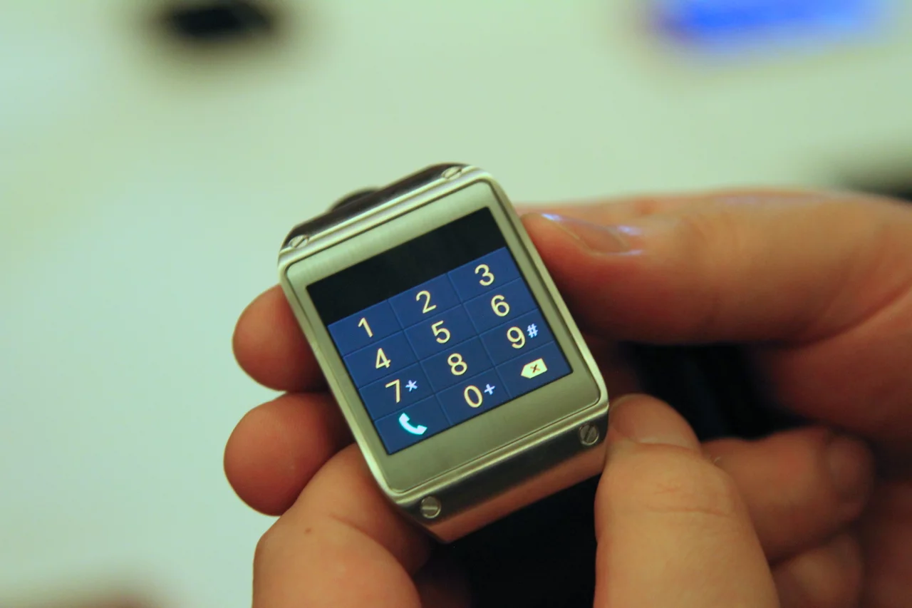
As you'll no doubt have realized if you've read our coverage of the Galaxy Gear announcement, Samsung's inaugural smartwatch packs a lot of functionality into a device to be worn on the wrist. It's impressive, then, that though the Galaxy Gear is by no means a small watch, it doesn't feel all that chunky wrapped around your wrist.
Opinions in the room varied on the comfort of the strap, some observers we spoke to saying it could have had a little more give, Gizmag found it perfectly comfortable (for the few minutes we got to wear it).
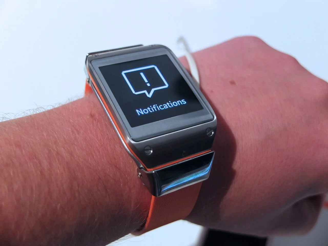
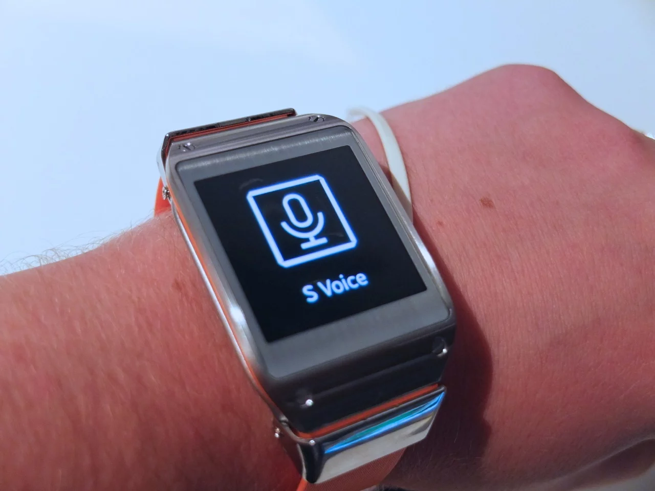
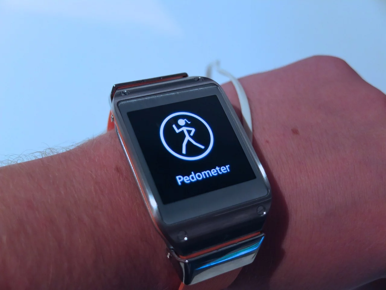
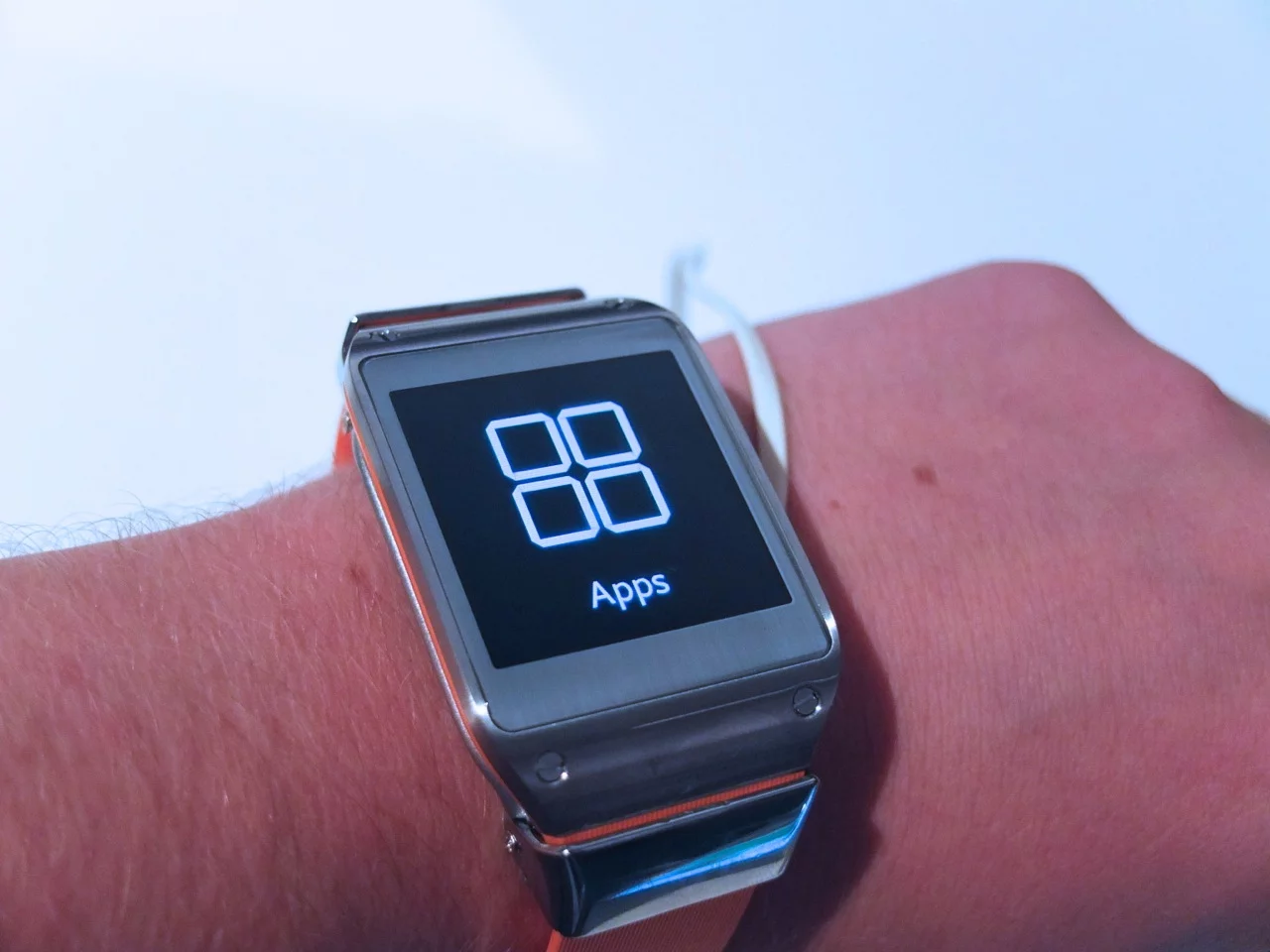
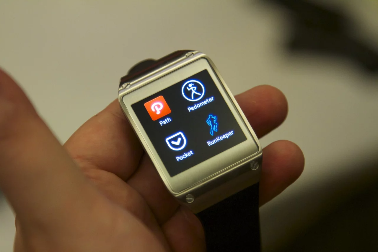
And though Samsung may be among the first of the major players to unveil smartphone-interfacing wrist-wear, the company may just have stolen a march on the competition so far as the UI is concerned. Though I was concerned that the finger-swipes to choose between the watch's various functions looked a little unwieldy when Samsung's Pranav Mistry showed them off on stage, in practice they were just as you'd hope, requiring only minimal flicks to move between apps.
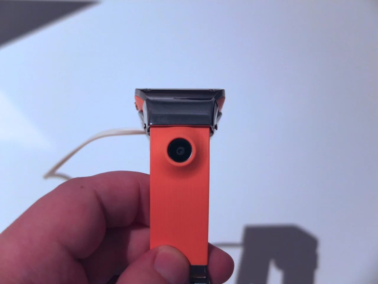
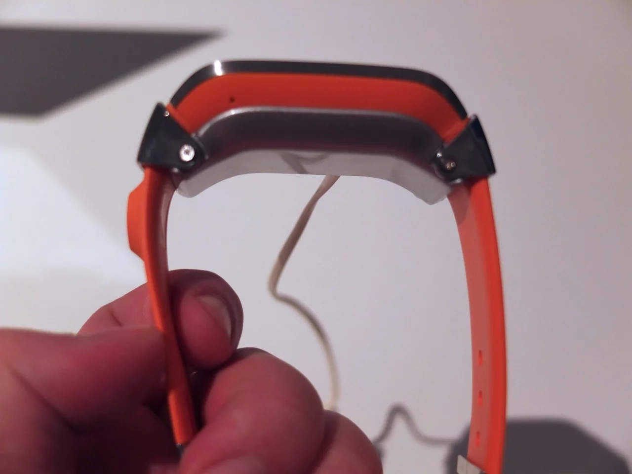
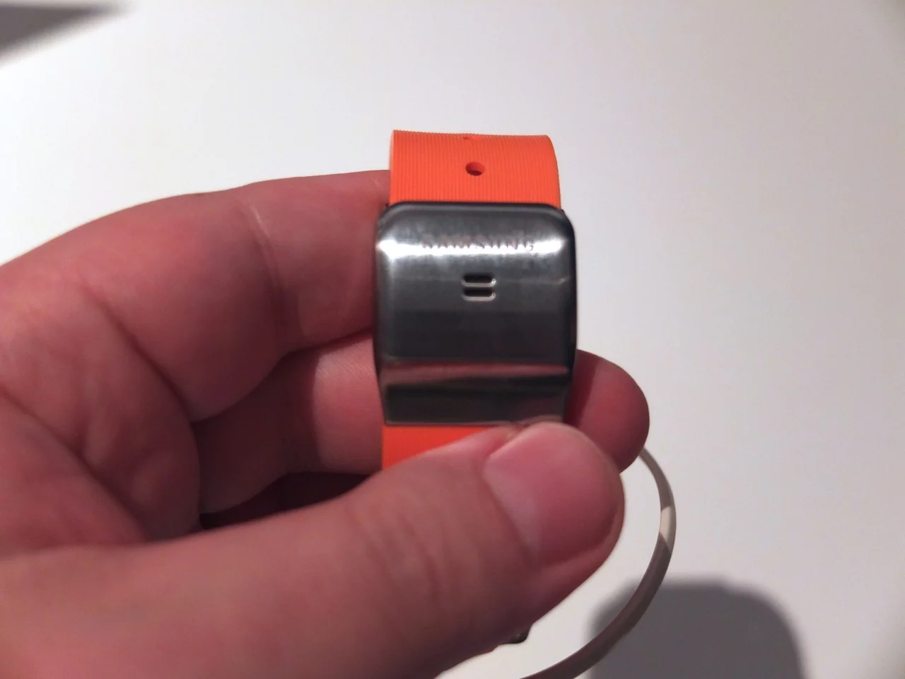
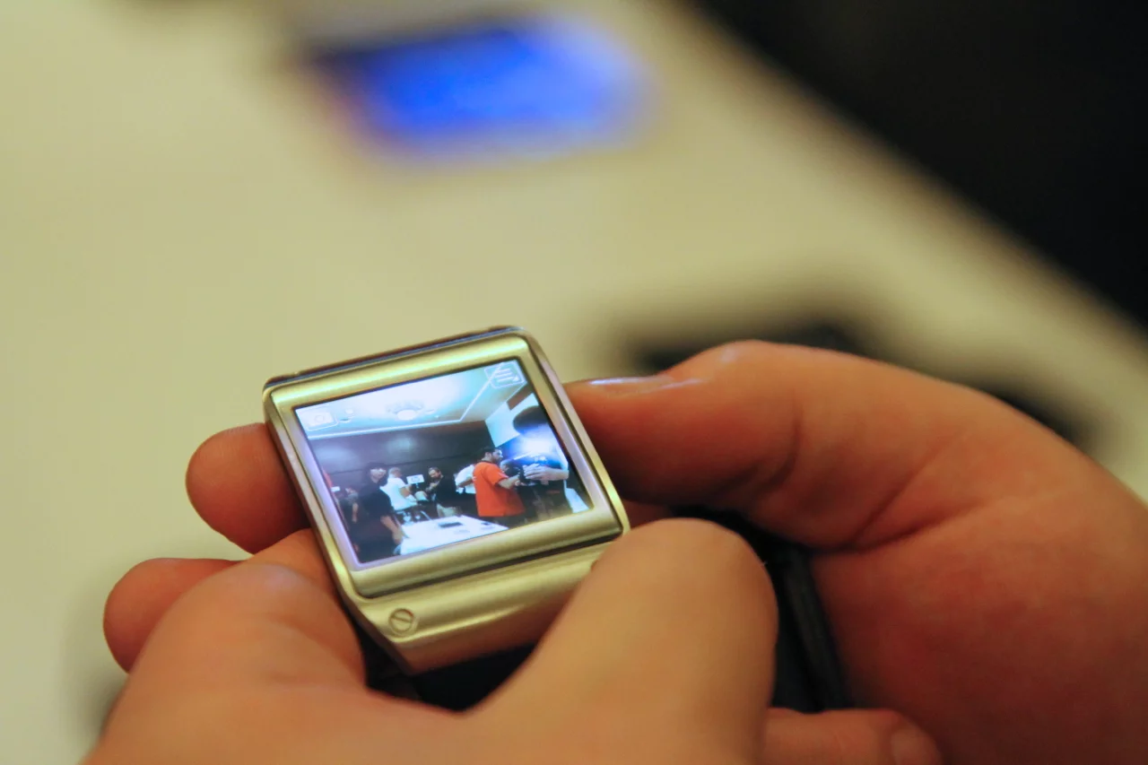
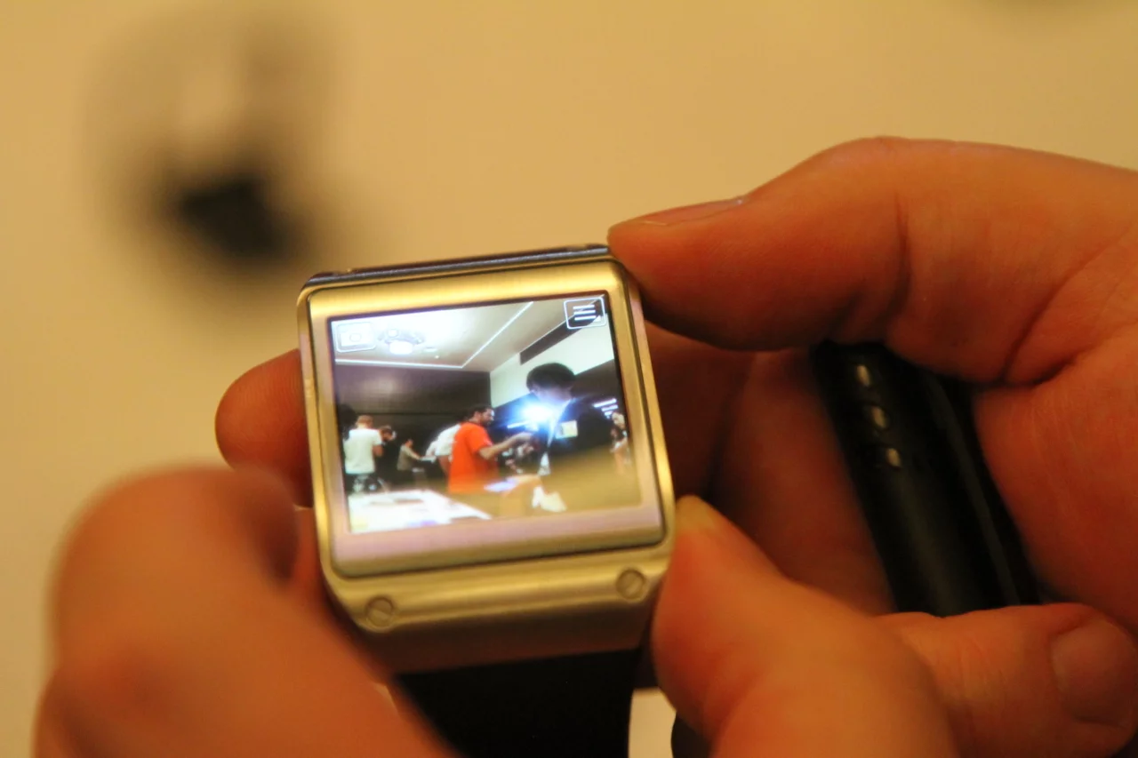
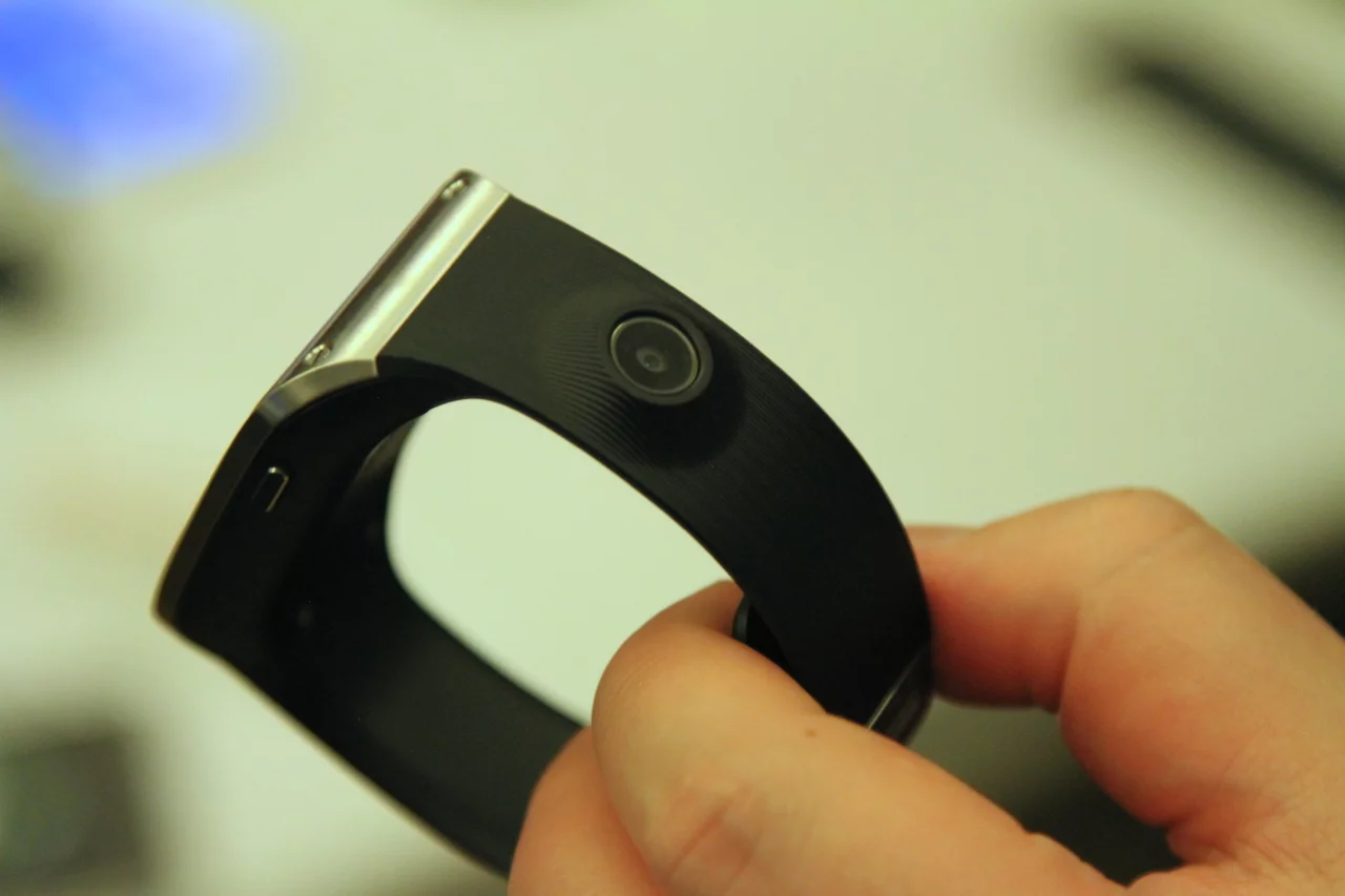
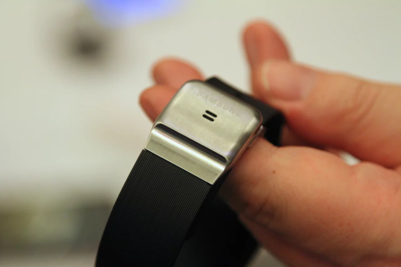
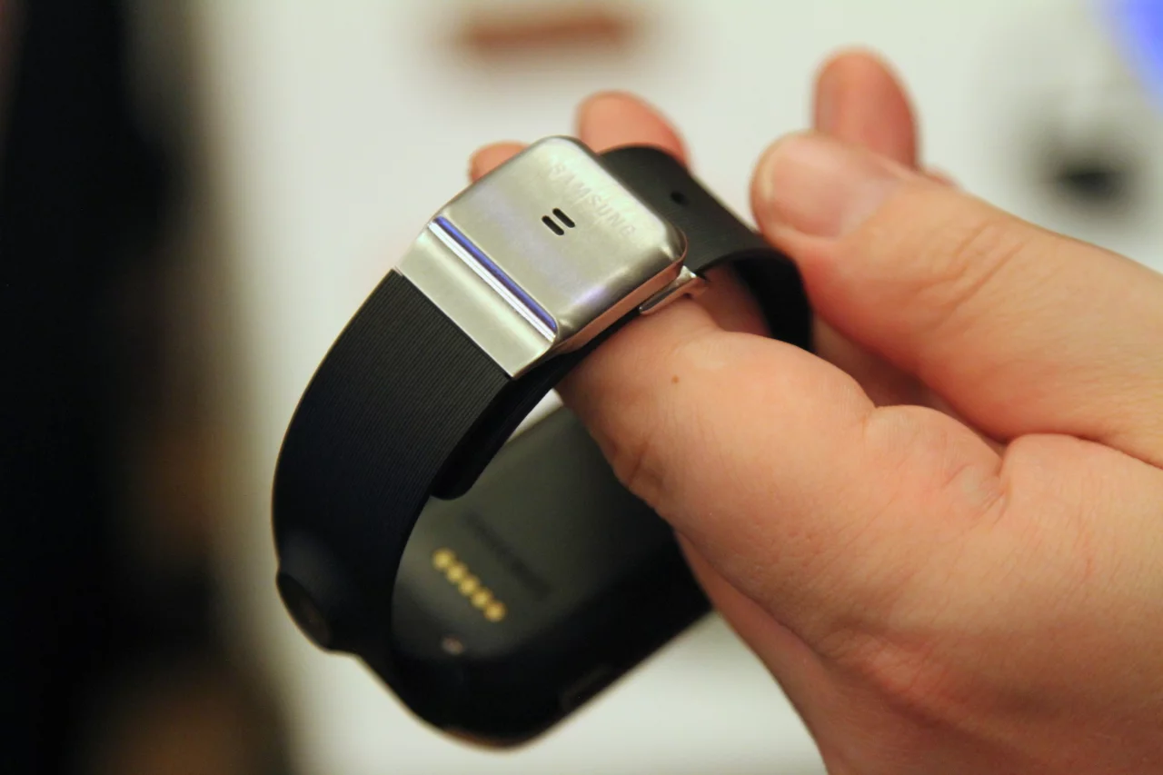
If the watch is in any way beautiful, it's down, in no small part, to the simple white-on-black iconography that indicate each of the watch's functions and the elegant sans serif fonts which tell the time. (It doesn't have to be a black background. It can also be set to match the colour of the strap.) Somehow inserting a camera lens into the strap lends a techy feel without looking too ostentatious, while the mic built into the buckle is positively Buck Rogers (and I mean that in a good way.)
I want one, and yet I don't want one. From first impressions there's little to fault, though time will tell if day to day use alongside a Samsung smartphone exposes any niggles in the usability, or how severe they turn out to be. But my niggling doubts are more to do with the idea of a smartwatch itself, a device on your wrist that makes your phone even harder to ignore. And, even accepting the 25-hour battery life, this is yet another gadget that tech companies are expecting us to remember to charge. (Convenient charging technology really needs to catch up.) For many, though, the hassle of one extra device will doubtless be compensated by a reduced need to fish in your pocket for your smartphone.
Samsung Galaxy Note 3
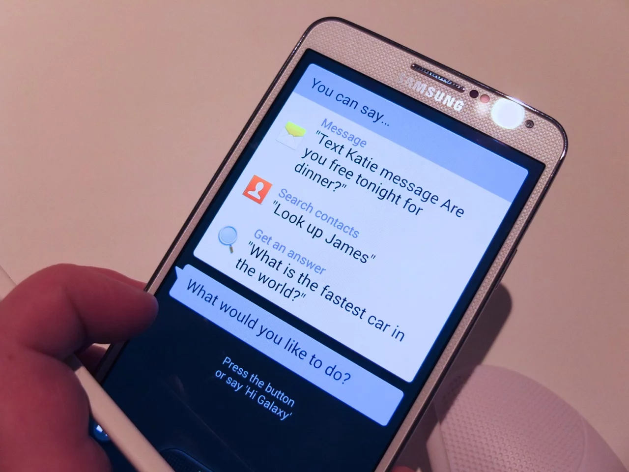
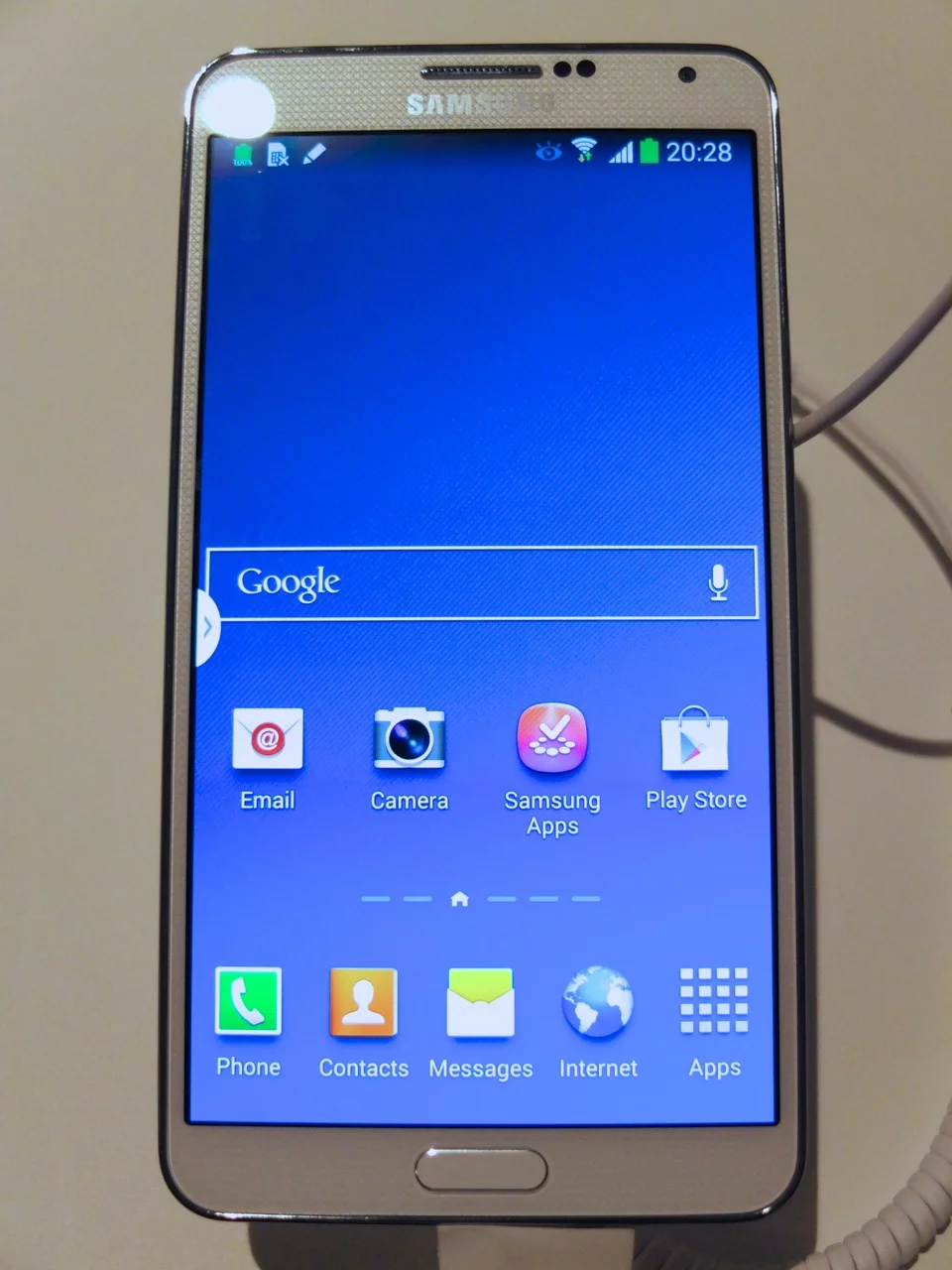
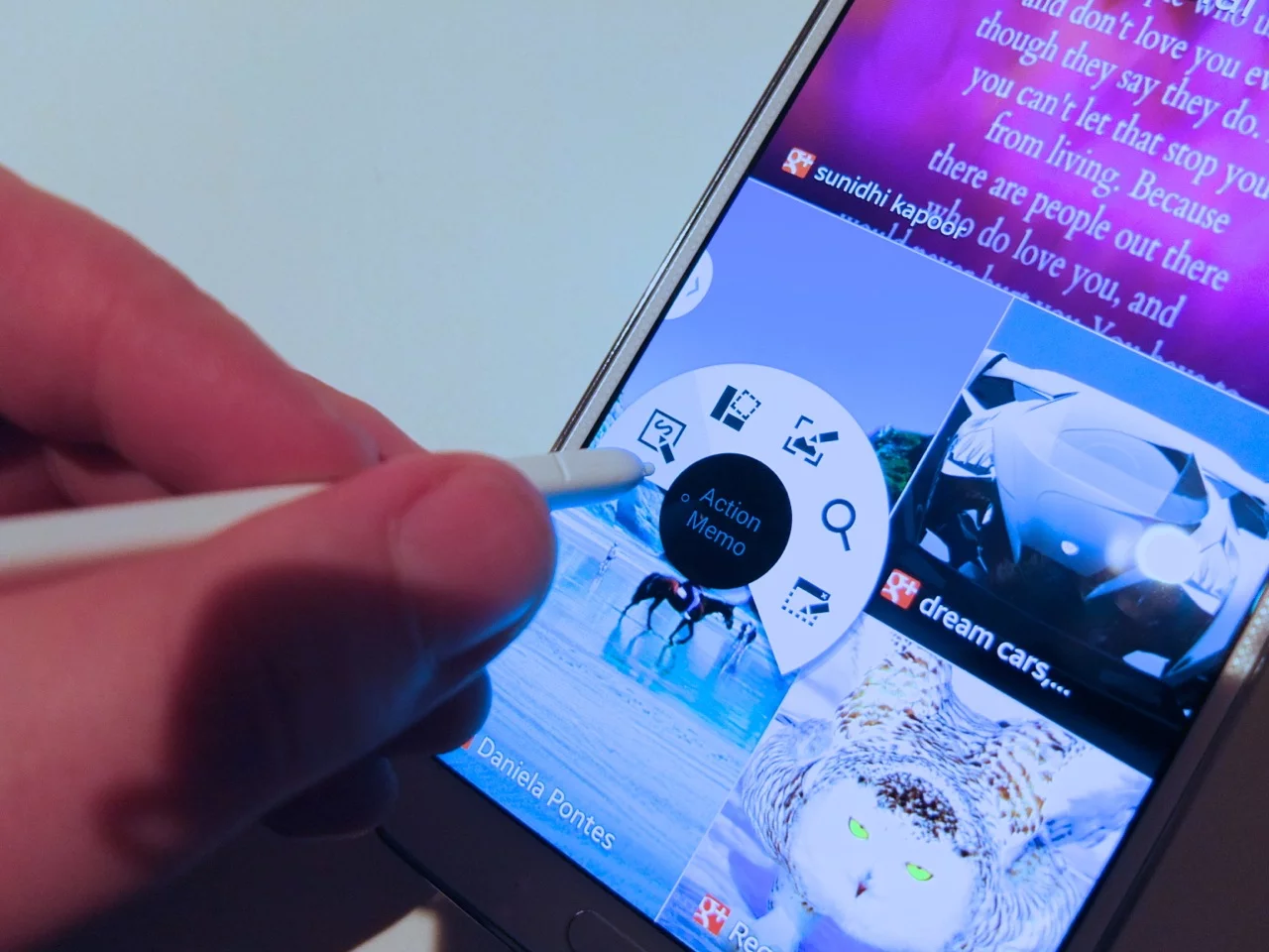
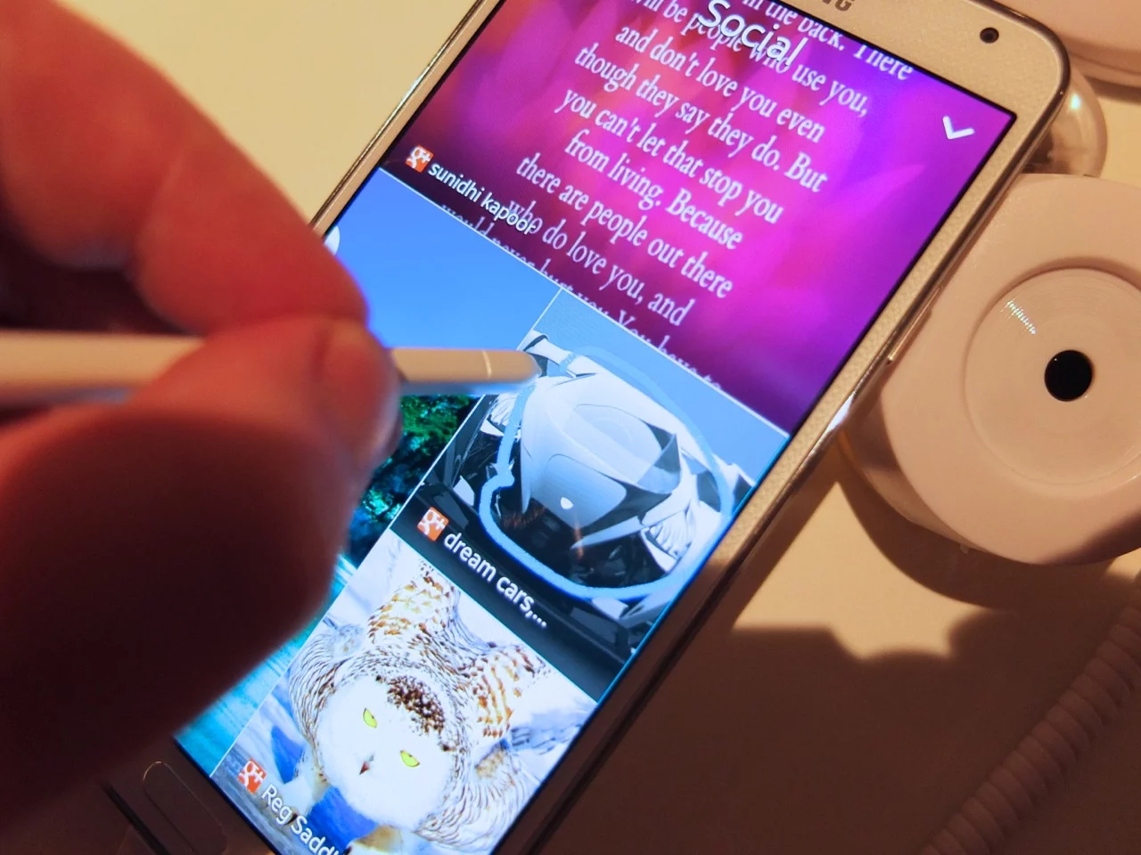
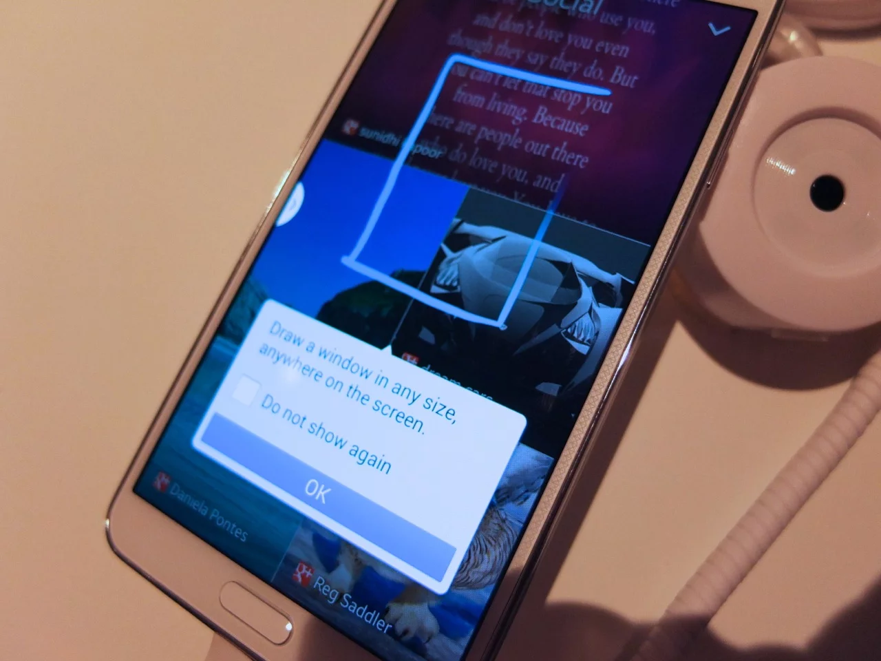
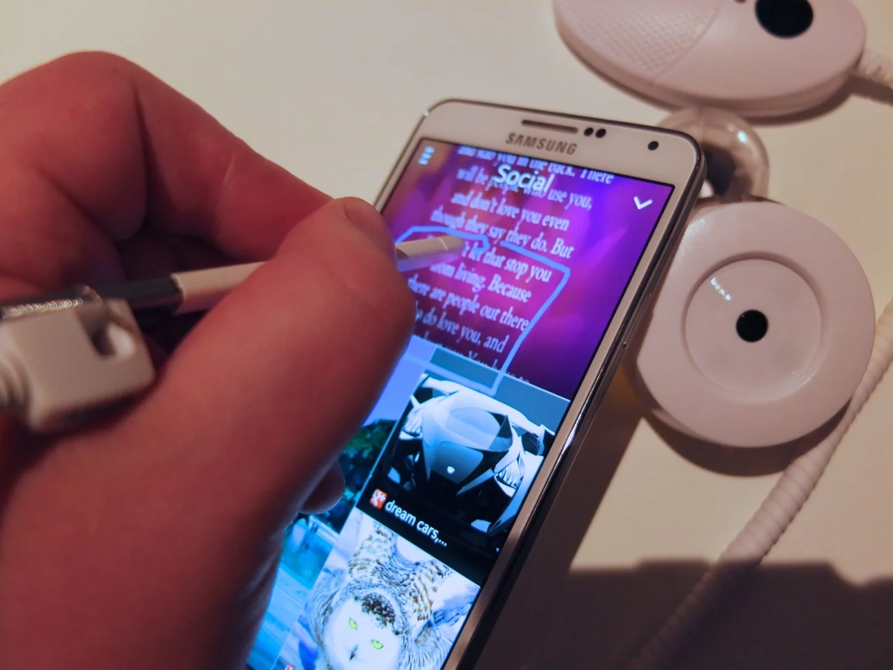
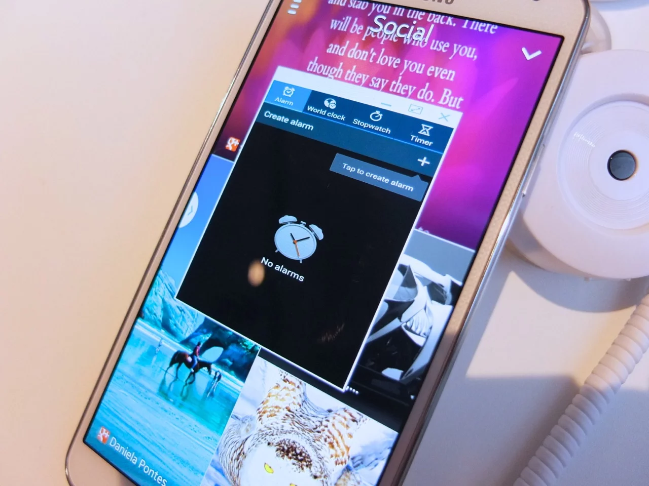
During the unveil presentation, much was made of the holy trinity behind the new UI: the dot, circle, box gestures that form the foundation of how users execute commands, cut content to be stored in a scrapbook, and launch simple apps which can be laid over other apps without having to navigate away from the screen.
Naturally, then, this was the first thing Gizmag tried when we got our hands on the Galaxy Note 3. The dot, effectively a single click of the S Pen's button to bring up a pop-up radial menu is simple enough, though the commands contained therein may take some learning, particularly to those new to Samsung phones.
From there you can select the command to draw a circle around any content you wish to store in the phone's scrapbook (which handily preserves a hyperlink back to the source). This works excellently, except there's the nagging question of why you have to execute a command before you can do it. If you could draw a circle around content to copy at any time, that would really be something.
Likewise the box gesture, which can be used to launch simple handy apps without having to navigate out of the main app you're in, requires that intermediate dot command to activate. As a long-time Apple user, there's just the nagging feeling that the powers that be at Cupertino wouldn't entertain such fiddliness. And though it's a very useful feature, the suggestion that the launched app compresses to fit the box you've drawn is only really true if you happen to draw an app-sized box.
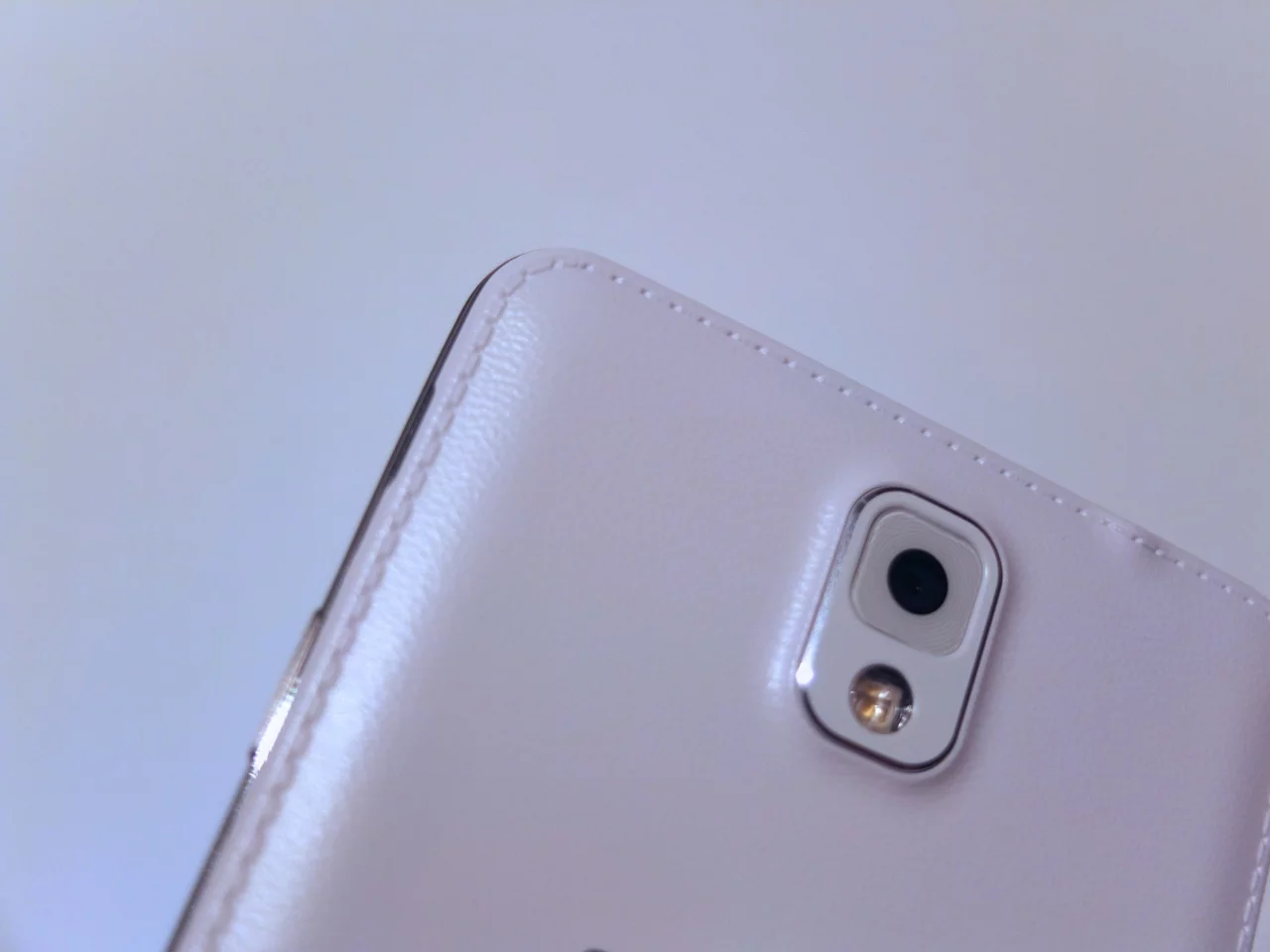
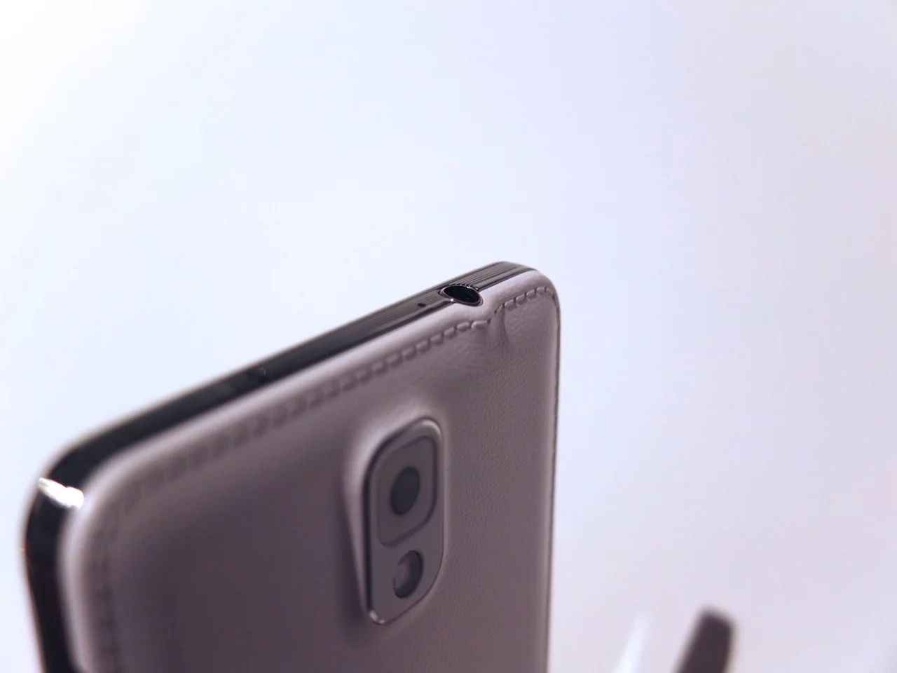
Probably the other most notable feature is the leather-like backing material. This is a bold move from Samsung, and sets the device apart from the competition. It certainly gives the device an air of the besuited professional person, but it does look a little odd where it bends and even creases out of shape around the headphone jack.
That'll do for now. We'll have more from Samsung at IFA throughout the rest of the week.

