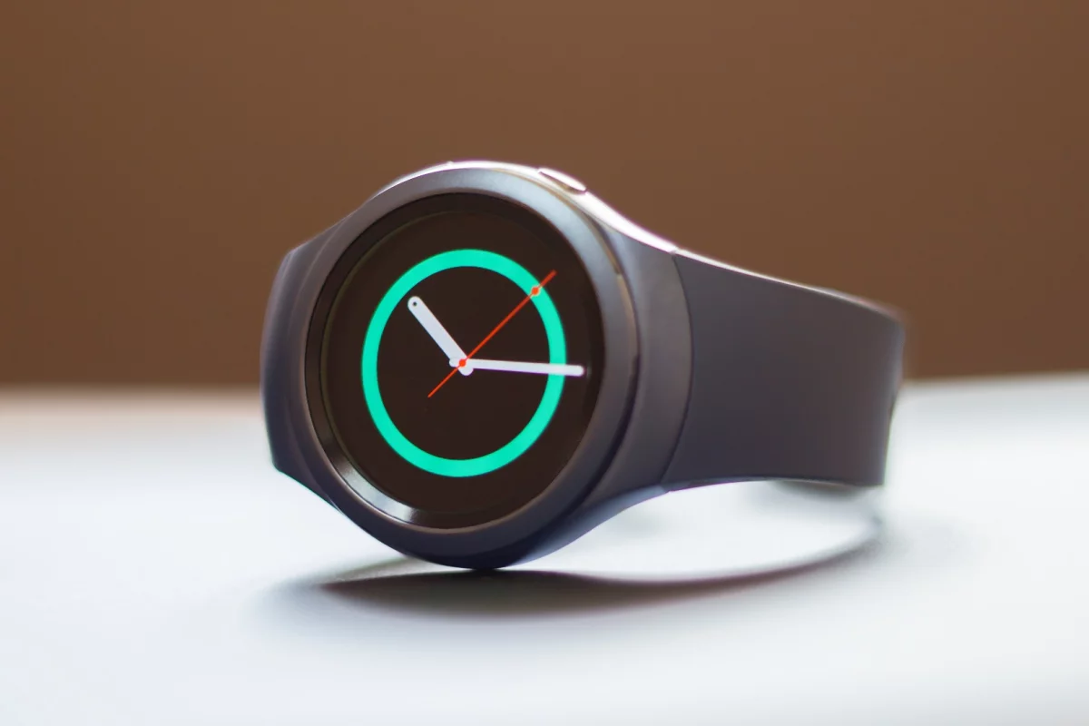
After Samsung blasted out five smartwatches in the span of a year, the company took more time with its latest watch, the Gear S2. Out of the box, it's already clear that the extra TLC paid off: this is easily Samsung's best watch to date.
Update: No need for initial impressions anymore, our full Gear S2 review is now live.
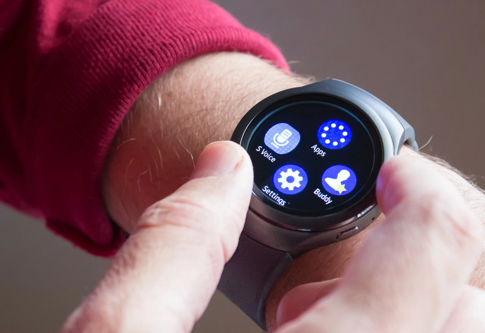
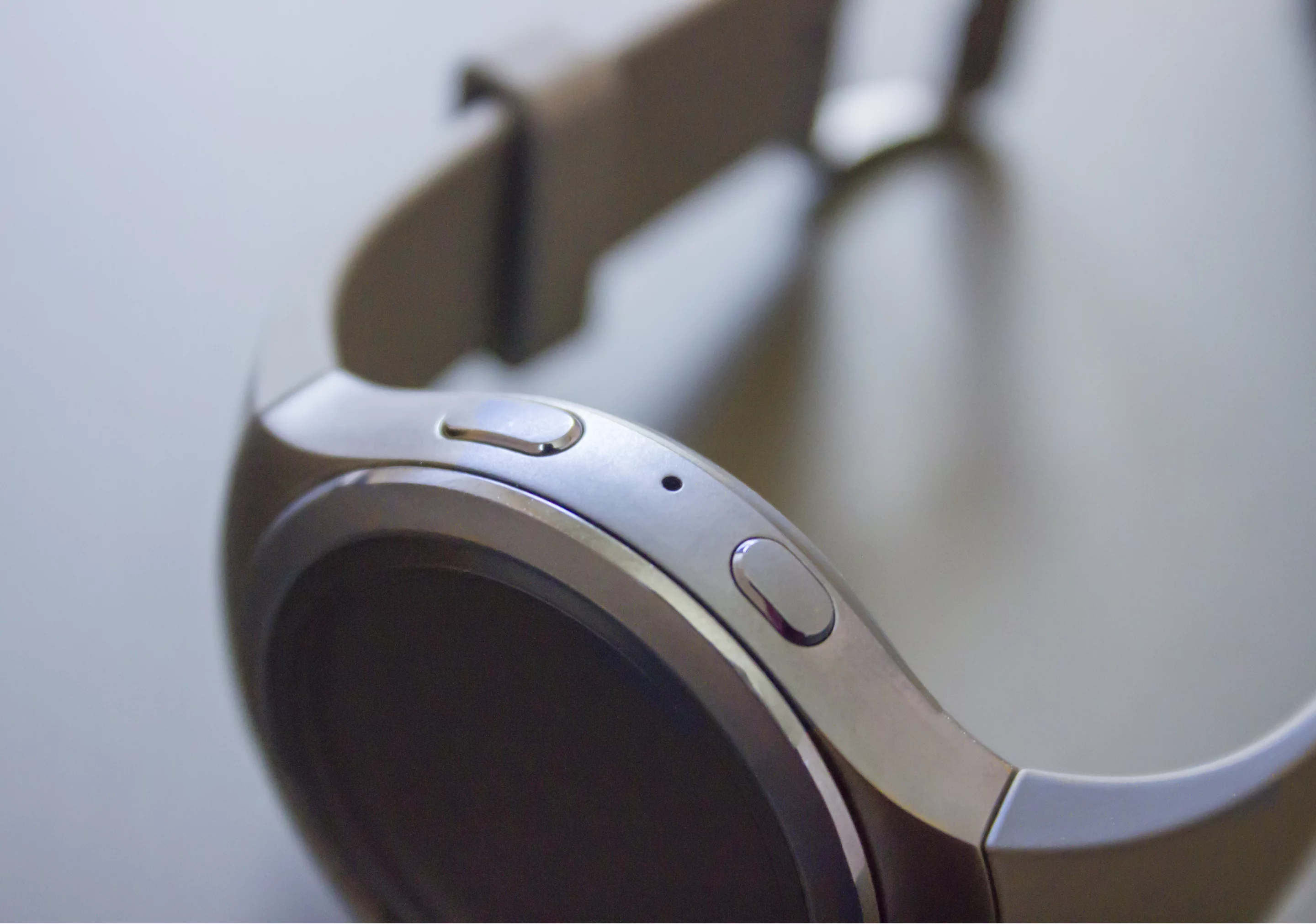
Possibly taking a cue from the Apple Watch's Digital Crown, the Gear S2 lets you navigate not only with its touchscreen, but also with a rotating bezel. More than on the Apple Watch, though, its entire OS looks like it was built with this new input method in mind. It's probably the most fun we've had navigating around smartwatch software.
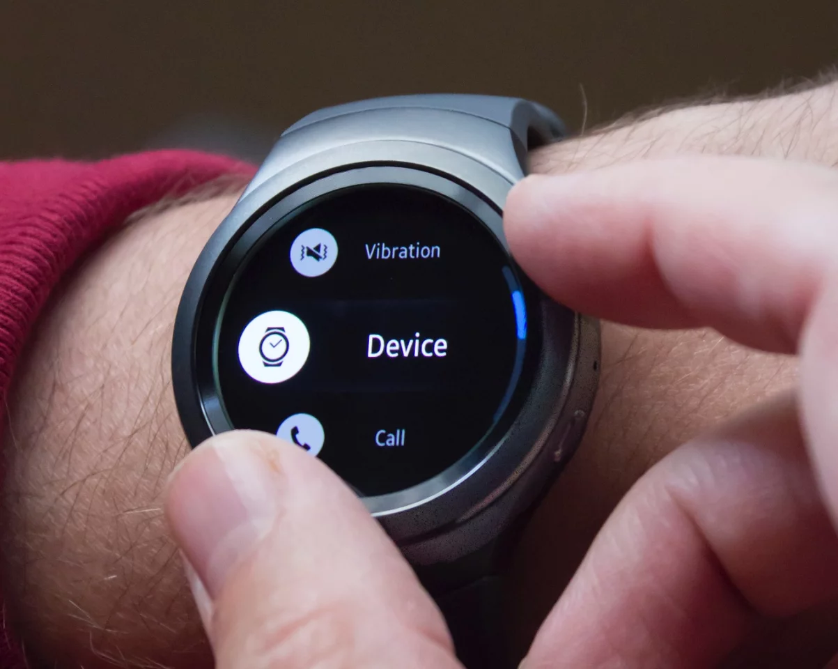
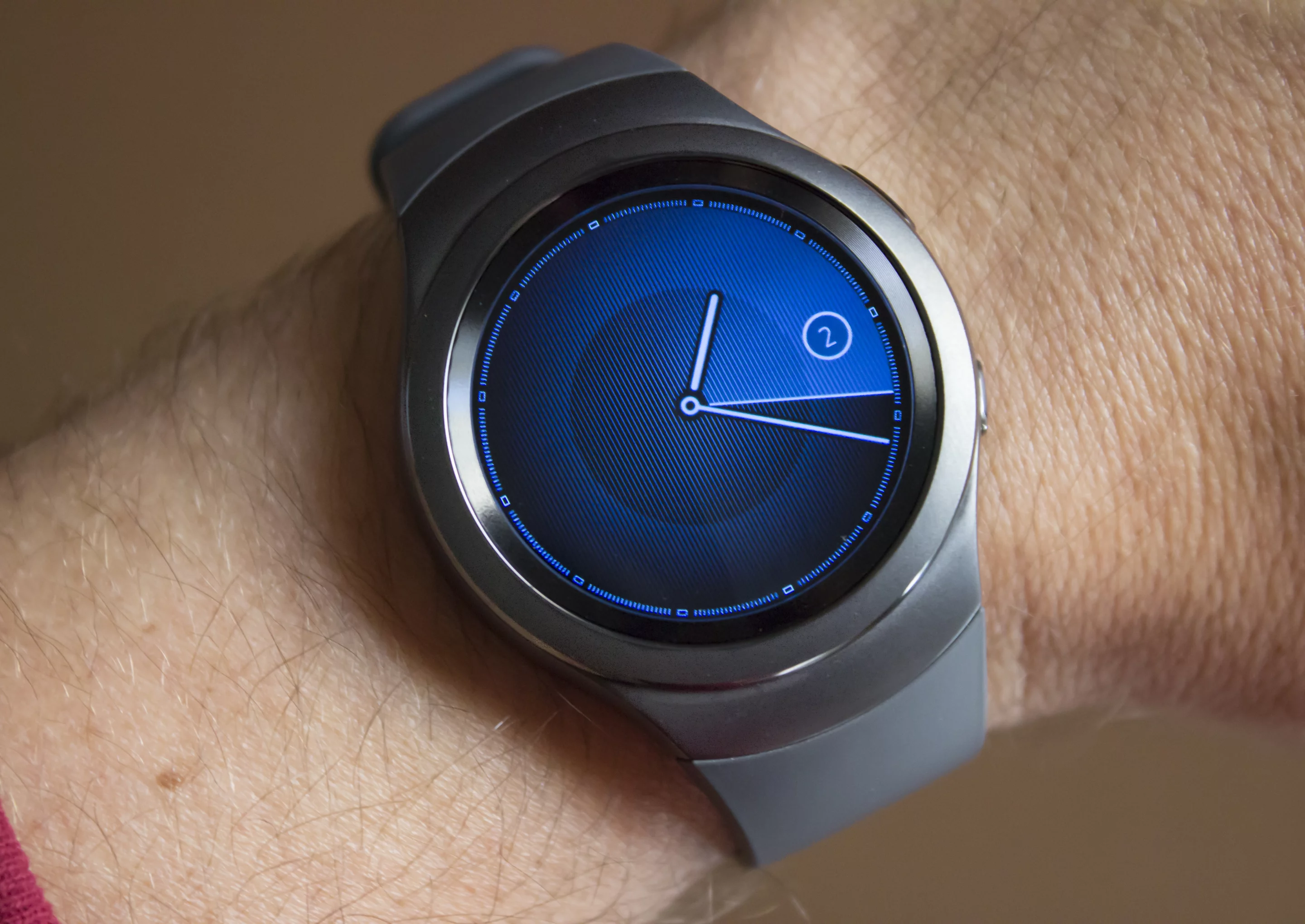
From the main clock face, each twist of the bezel scrolls you horizontally. Notifications sit on the left, widgets on the right (there are widgets for things like app shortcuts, fitness tracking, calendar and music controls). The bezel gives you a satisfying "click" with each rotation.
On a practical level, the rotating bezel lets you navigate around the watch without blocking the (relatively) small screen with your fingers. It also makes it easier to scroll through longer text or menus – if this were touch only, you'd have to drag your finger up on the screen over and over. With a rotating input like this one, the Apple Watch's Digital Crown or (if you want to go way back) the old iPod scroll wheels, it's more convenient to zip around software on a tiny screen.

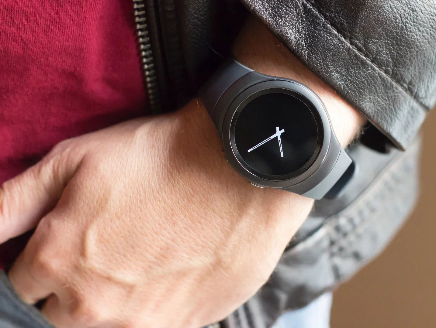
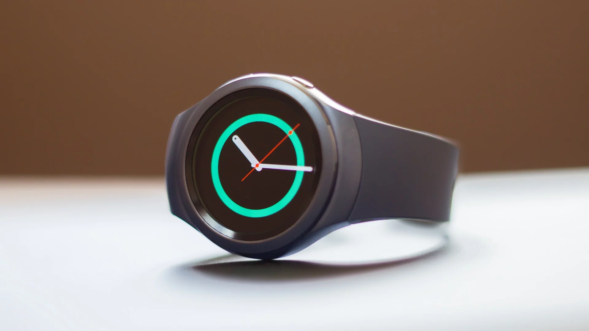
Speaking of screens, the Gear S2's 1.2-inch, 302 PPI display looks gorgeous. It's big enough to see what you need to see, but allows the watch to stay relatively small (its main body is the same width as the larger Apple Watch, the smaller 2nd-gen Moto 360 and the Huawei Watch).
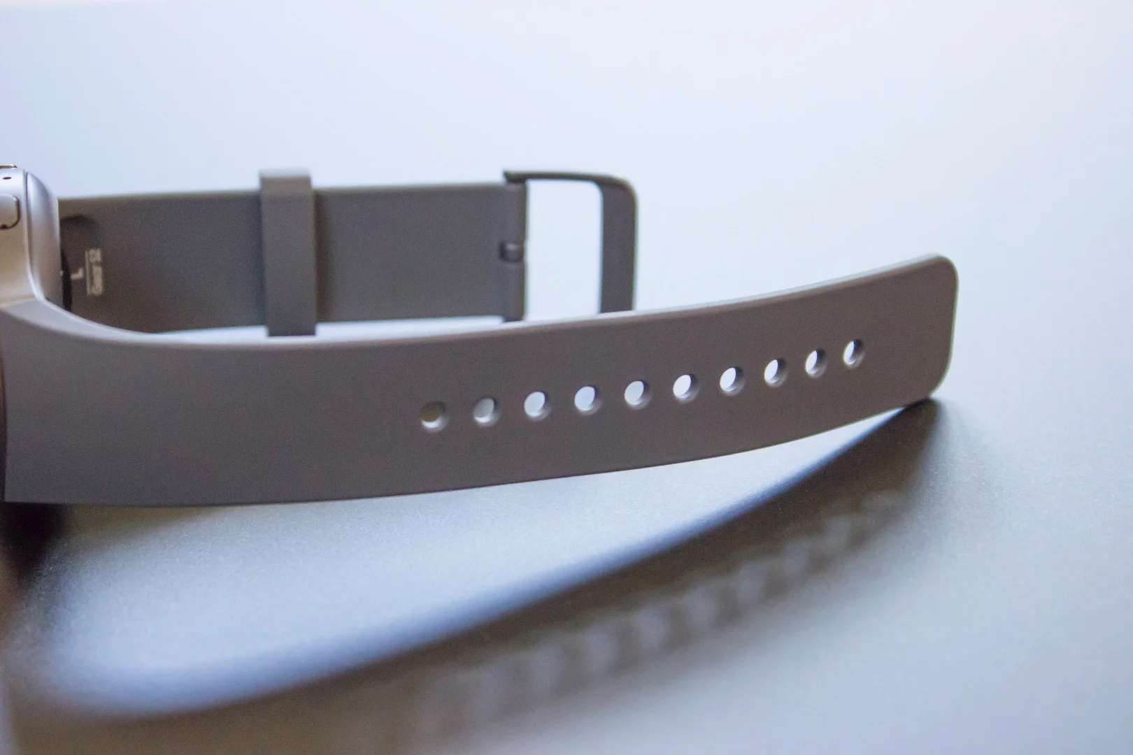
We're reviewing the standard Gear S2, which has a more modern, minimal design, and plastic (rubbery?) strap. You might say this is the equivalent of the Apple Watch Sport. Samsung also sells a Gear S2 Classic that looks a bit more like a traditional watch (and has a leather band), which costs US$50 more.
Like last year's Gear S, the Gear S2 has an onscreen keyboard, something that neither the Apple Watch or Android Wear watches offer. Typing on a tiny watch screen doesn't sound fun, but Samsung makes it work pretty well, with a phone-pad-like layout with three characters on each key (word recognition sorts out what you're trying to type). Samsung managed to take one of the best features of the Gear S, and make it work on a much smaller screen (and much smaller watch).

We haven't been able to set reminders so far – Samsung's voice control app (S Voice) errors out with a "Sorry, your request couldn't be processed. Please try again later" message. Hopefully this is something that will be remedied with an update, as we find reminders to be one of the handiest features to have on a smartwatch.
We'll have much more to say in our full review, including battery life impressions (Samsung estimates an impressive 2-3 days), a deeper dive into its Tizen software and thoughts on how it compares to its biggest rivals.
So far the Gear S2 looks like it provides a deeper experience than Android Wear watches, with some perks that the Apple Watch doesn't have. Stay tuned.

The Gear S2 is available starting today from Samsung, Amazon, Best Buy and Macy's. The model we're reviewing rings up for $300; the Classic version costs $350.
Product page: Samsung

