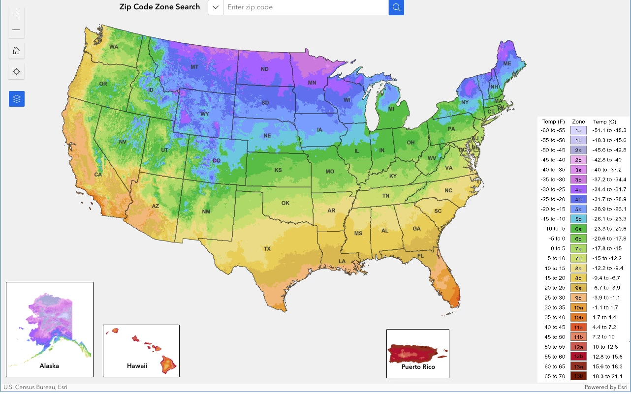
It’s taken more than a decade, but the US Department of Agriculture (USDA) has finally released an updated Plant Hardiness Zone Map that spans the nation and the territory of Puerto Rico in such detail that gardeners can now zoom right into their local areas.
This map is used by around 80 million growers to work out what plants have the best chance in the garden, with sellers such as nurseries adopting the zone code to help people find the right fits.
The update is well overdue, with many changes across 11 years. Aside from geographic information system (GIS) technological advancements, the 2023 map features data taken from a 30-year period between 1991 and 2020. For around half of the country, it reveals a warmer environment compared to the previous data points from 1976 to 2005.
"Overall, the 2023 map is about 2.5 degrees warmer than the 2012 map across the conterminous United States," said lead author Christopher Daly, director of the PRISM Climate Group. "This translated into about half of the country shifting to a warmer 5-degree half zone, and half remaining in the same half zone. The central plains and Midwest generally warmed the most, with the southwestern US warming very little."
The interactive map, developed by PRISM Climate Group at Oregon State University and the Agricultural Research Service, is the most accurate and detailed the USDA has ever released.
Gathering data from 13,412 weather stations, almost twice as many as in 2012 (7,983), the USDA used 30-year averages (1991-2020) to find the lowest annual winter temperatures at as many locations as possible.
Low temperatures during winter are a ‘tipping point’ guide for gardeners, showing that this is the critical point at which a plant needs to have a likely chance of enduring.
"The addition of many new stations and more sophisticated mapping techniques using the latest PRISM technology led to a more accurate and detailed Plant Hardiness Zone Map but also produced localized changes that are not climate-related," said Daly.
There are 13 zones on the new US map, each with a 10 °F range. The zones have been divvied up further, with each one split in two, for a more precise 5 °F range. So plants marked ‘a’ will have a 5 °F warmer range than ones labeled ‘b’ within the same number zone.
Essentially, each zone details the lowest to highest cold a plant can withstand. Gardeners then use these zones to choose plants based on a temperature spectrum. For example, if a plant suits zones three to seven, it can survive some cold but not extreme periods of low temperatures. This also means that such a plant would need some chill time but would not fare well in the desert.
However, the USDA insists that if your hardiness zone has changed, you do not need to start removing plants that fall outside of the parameters; anything that has grown well, will most likely continue to thrive. It also points out that microclimates can alter the temperature brackets further, so in these areas it suggests using the map as an informed guide rather than a rule.
Some 80 million American green thumbs use the Plant Hardiness Map. In addition, the USDA Risk Management Agency follows it to set crop insurance standards, and scientists also incorporate it into research when investigating areas such as the spread of introduced species and insects.
Source: Oregon State University