Astronomers at Johns Hopkins University have created an interactive map of the universe, charting the positions and colors of 200,000 galaxies stretching from here to the very edge of the observable universe.
The Sloan Digital Sky Survey (SDSS) has been scanning the cosmos almost every night for over 20 years. The telescope images different portions of the sky over time to build up a comprehensive atlas at different scales, including 4 million stars in our own Milky Way, galaxies within our Local Group, and others billions of light-years away.
A new map zooms out to an incredible scale. Two Johns Hopkins astronomers, Brice Ménard and Nikita Shtarkman, assembled SDSS data to create a dense visualization of one wedge of the universe.
If there was a You Are Here marker, it would be down at the pointy end of this cosmic pizza slice. From there, the map radiates outwards into space and time, from the present in our local area right back to 13.7 billion light-years away – i.e., 13.7 billion years ago. And this 10-degree-thick wedge is just one segment of a circle around us, which itself is just a small part of a gigantic sphere that would constitute the observable universe.
The map depicts 200,000 tiny dots that each represent an entire galaxy, containing billions of stars, planets and other objects. The colors of these dots aren’t just for decoration either – they indicate the identity and characteristics of the galaxies, and at this scale there are two clear patterns of blue to red transitions.
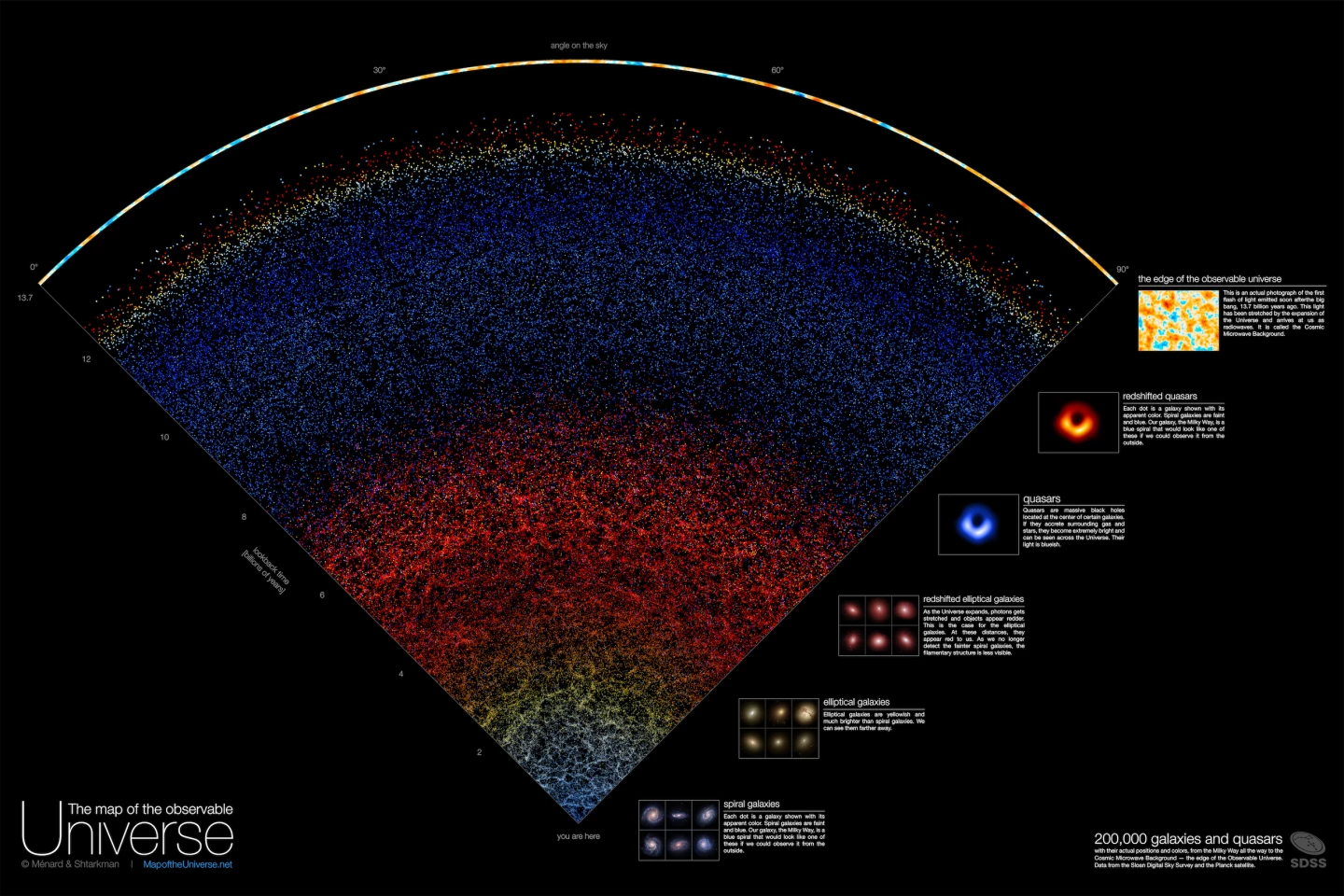
Starting from the bottom, the pale blue dots are spiral galaxies located within about 2 billion light-years of Earth. Beyond that the dots start to turn yellow, as elliptical galaxies dominate the map – these are brighter and can be seen from farther away.
Between about 4 and 8 billion light-years away, the map turns red. These are still elliptical galaxies, but their lightwaves have been “redshifted,” or stretched towards the red end of the spectrum by the expansion of the universe. After that, the map becomes blue again – these are quasars, galaxies with very active supermassive black holes at their center that give off blue light.
Towards the wider part of the map, the dots turn red again, as redshifted quasars become basically the only thing still visible at this immense distance. And then, after a billion light-years of almost total darkness, we reach the edge of the observable universe. This splotchy pattern is an image of light emitted soon after the Big Bang itself – the Cosmic Microwave Background. While there is technically more universe past this border, we can’t see it because there hasn’t been enough time for the light from that far away to reach us.
With this map, the team set out to create a visualization of the cosmos that can be read, understood and appreciated by people who aren’t scientists.
“Growing up I was very inspired by astronomy pictures, stars, nebulae and galaxies, and now it's our time to create a new type of picture to inspire people,” said Ménard, a professor at Johns Hopkins. “Astrophysicists around the world have been analyzing this data for years, leading to thousands of scientific papers and discoveries. But nobody took the time to create a map that is beautiful, scientifically accurate, and accessible to people who are not scientists. Our goal here is to show everybody what the universe really looks like.”
The map is available online. The team describes the work in the video below.
Source: Johns Hopkins University