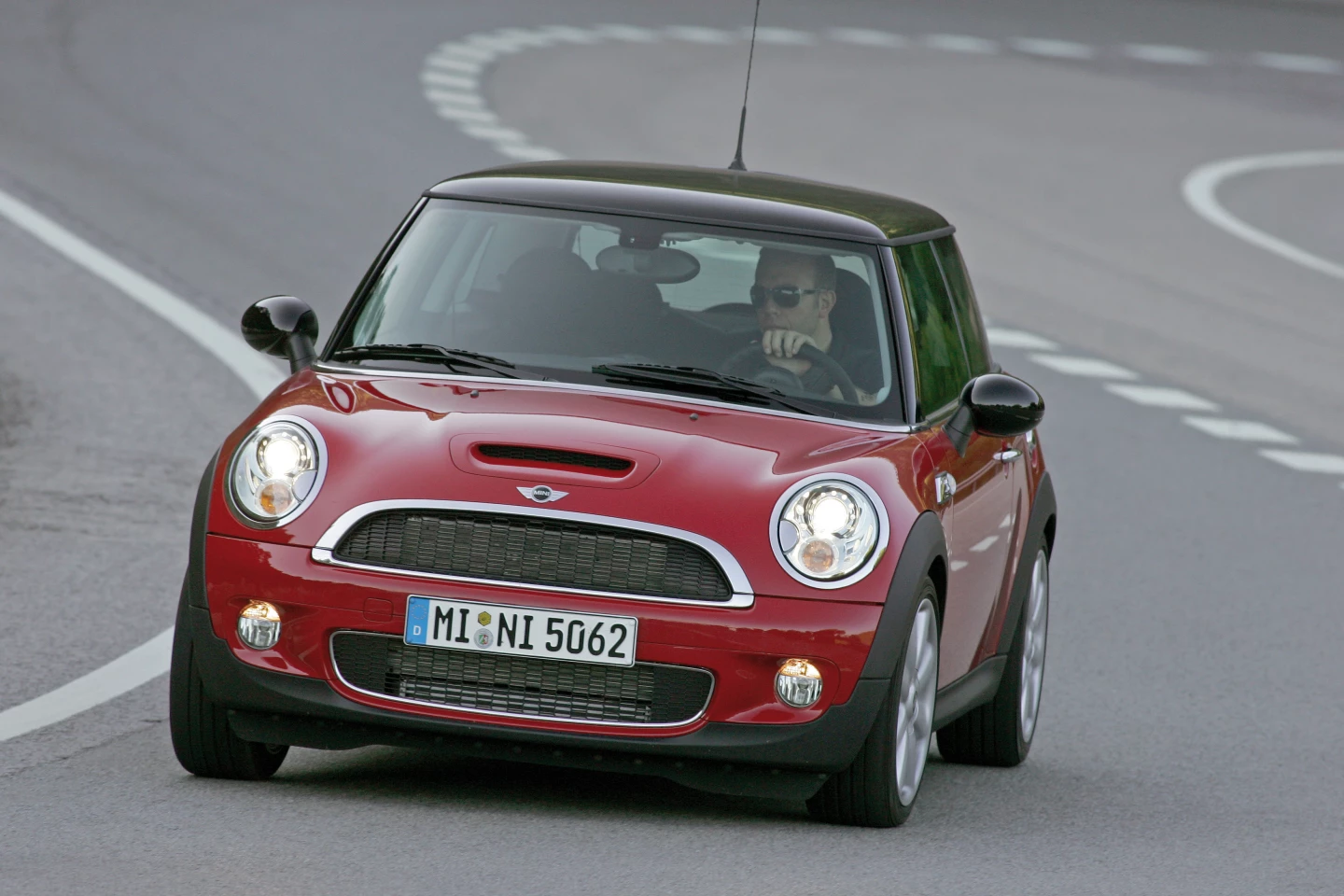
Automotive design legend Frank Stephenson's work has always drawn heavily from nature. He's the man responsible for the bulldog-squat Mini Cooper, and every street car McLaren has produced from the P1 up to the 720S, with their athletic, skin-stretched-over-sinewy-muscle feel. This is no accident – he's constantly studying the animal kingdom and the human body to see how evolution has solved a problem, steadfast in his belief that natural selection not only provides the most efficient designs, but also the most beautiful.
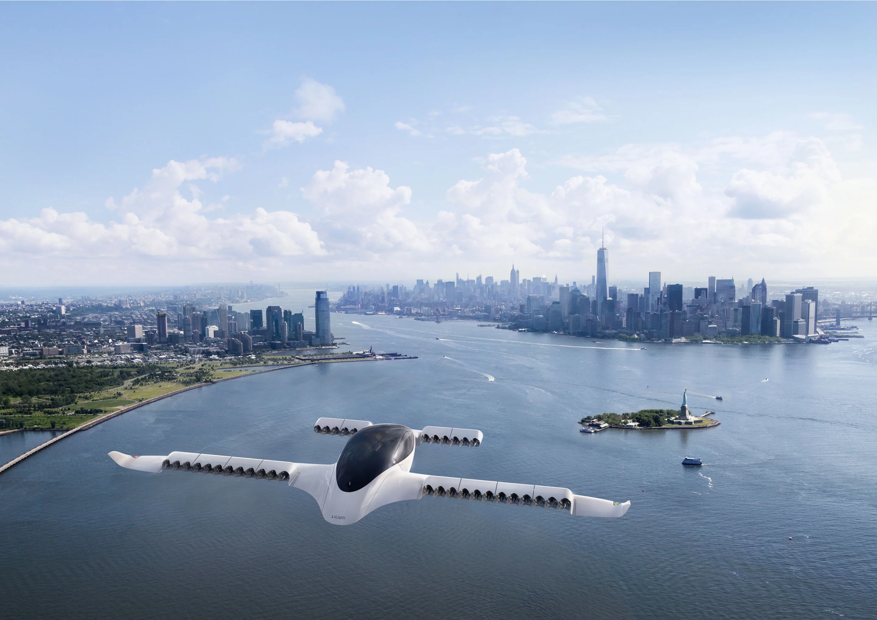
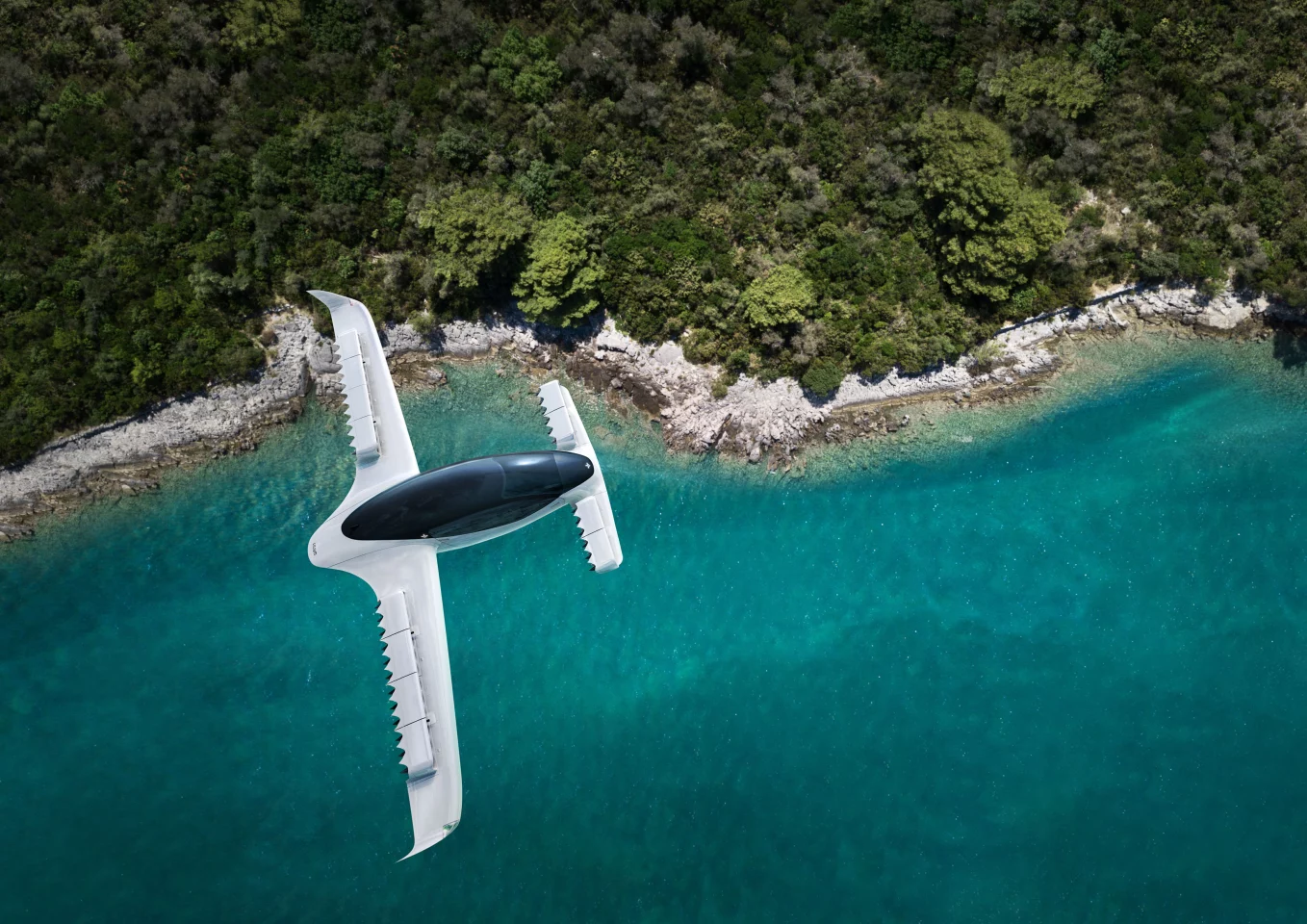
It's an ethos he's carrying over into his latest work, having stepped away from the automotive world and taken on a position as Creative Director at Lilium, whose flying taxi concepts are among the most eye-catching designs in the eVTOL world to date.
In a Skype interview discussing the release of Chasing Perfect, a documentary about his extraordinary life and work, Stephenson spoke about biomimicry, the Lilium project, and why he wanted to put nipples on the Mini's mirrors. We'll let Frank take it from here in his own words.
On biomimicry:
Biomimicry, which is the science of how nature approaches the design of organisms, is absolutely mind-blowing. To most people it might seem like you're inventing something, which is completely wrong, because nature's done it and done it and done it, and it's a game of survival of the fittest. If it didn't work, the animals wouldn't survive.
So when you're designing something difficult, you can just go back and research how nature answers that problem. How to make lightweight furniture that supports more than it looks like it should support, maybe you look at bird wings. There are a lot of things in nature that have to be lightweight, strong and minimal. Nature doesn't overdo it, or underdo it.
In some senses it doesn't make sense to look anywhere else. It's perfectly functional, and it's beautiful. It's hard to find something that's not beautiful in nature. The closer you can keep things to nature, the more successful your design is likely to be overall.
So I always look for opportunities for biomimicry. Not a specific animal. I mean, the sailfish applied beautifully to the P1 because it's incredibly efficient at going fast, and at turning, and at looking great and being dramatically cool. It's everything we were hoping to achieve with the P1.
Loz: Another example of biomimicry from the film that stuck with me was the Lilium eVTOL as a combination of a hammerhead and a manta ray.
Again, when we're looking at flying shapes, if you're looking for something to inspire and educate, birds might not necessarily be the most efficient or aerodynamic creatures out there. They do fly well, they're not at all wrong for what they do, they're perfectly designed.
But what's much more efficient is a fish when it comes to moving through a medium. Hydrodynamics provide a lot more resistance. They have to find ways to overcome that resistance a lot more efficiently than a bird going through air. If you want something to perform super efficiently in terms of drag, I think the answer is under the sea. Birds do what they need to do, but I think if you had a flying sailfish, it would exceed the speed of a peregrine falcon.
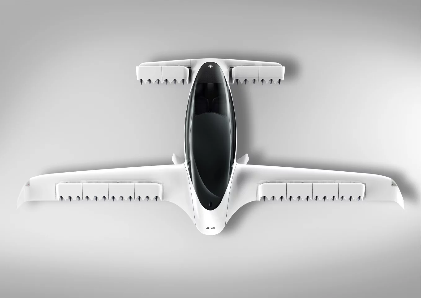
The hammerhead shark, well, I don't know if people would tend to look at that and call it beautiful. It's pretty intimidating when it's coming toward you! But it's got these wings in the head design that make it incredibly efficient in turning, and the way its head comes back to a neutral position. That's influenced aircraft and race car design – you've got designs out there with canards, wings at the very front of the vehicle. We need those, in the kind of vehicle we're designing, to keep the nose from dropping or dipping. The canards provide a bit of lift and keep it in shape.
And then you get the elegance, the flow of a manta ray. I swam with them once, I can hardly describe that feeling of watching something moving so naturally in the water. It's just perfect. Why not use that as the inspiration for the rear wing/rear fuselage structure? When you see it – and we've developed it a lot further than what people have seen up until now – it'll take your breath away. It feels natural, it's nothing you haven't seen before, it's just never been applied like that before.

You start to wonder why designers haven't really been involved in designing aircraft up until now. We've always had a tube with wings attached to it. Now we're starting to do integrated shapes. No animal just suddenly has something plonked on it, they always grow out of the torso, there's a flow to it. So the planes now, the ones that are getting the hands of designers onto them, you'll start to see shapes that are easier on the eye.
In the next year or two, there's going to be a lot of wind up and press coming out on these eVTOLs. It's all very much under the radar at the moment, no pun intended, because it's very important that these things are safe. So there's a lot of testing going on, there's a few different concepts, every company has its own idea how to do it best, and because it's early days, nobody really wants to put their cards on the table just yet. It's every man for himself.
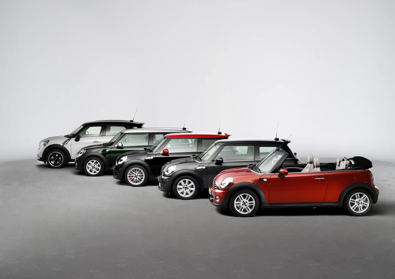
Loz: the other example is the New Mini. Until I'd seen Chasing Perfect, I'd never have thought that was a sexy or curvaceous car. I'd never have been thinking breasts and waistlines and thighs.
Yeah. It's not just designer speak, it's really how we think. We grow up with an appreciation of forms. And one of the most beautiful things that we know of has to be a well-shaped or well-toned body. If you can take inspiration from the human body, there's nothing wrong with that. It's as natural as could be. I think the way I've approached that is not in a pornographic way, or trying to be funny about it. It's taking shapes from the body that we all appreciate.
But there is an erotic sense, and I probably did go too far with the wing mirror – not as you see it today, but in the clay model of the car. I spent quite a while learning to draw a female breast that had a shape to it that could be evolved into the exterior mirrors on the car. Just because they're similar in shape, and it's a nice shape.
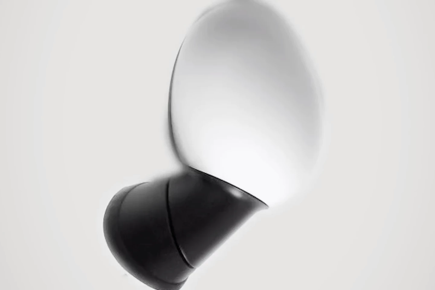
So I started to think about how I could make it even more efficient. And if you think about being in an oncoming car, coming towards the new Mini, which hadn't been done yet, and that Mini is going to turn left or right, well, that indicator that blinks is typically put down low in the bumper. I was thinking about that for a while, why does it have to be so low? The oncoming driver isn't looking down low, they're looking at the car.
So if you were to put the indicator in the mirror housing, facing the oncoming driver, that seemed to me to be the most intelligent position to put the blinker. So I put one in the mirror housing in that phase. And what it started to resemble was a nipple.
And then it became a bit too obvious what it was. And I didn't want to change it, even though that's what it looked like, because I felt there was a logical reason for it. And that became an issue between me and the marketing team. I tried to stand my ground, as long as I could, but they were laughing at some points, saying "c'mon Frank, you know what that is." And I was saying "I know, but it works, and it's much safer, and it doesn't look bad, does it?"
And they were like "no, of course it doesn't look bad, but you know what it looks like." So they won out in the end, and that's how design goes, compromises with the engineers and the marketing team and the finance team, they all want to have some input.
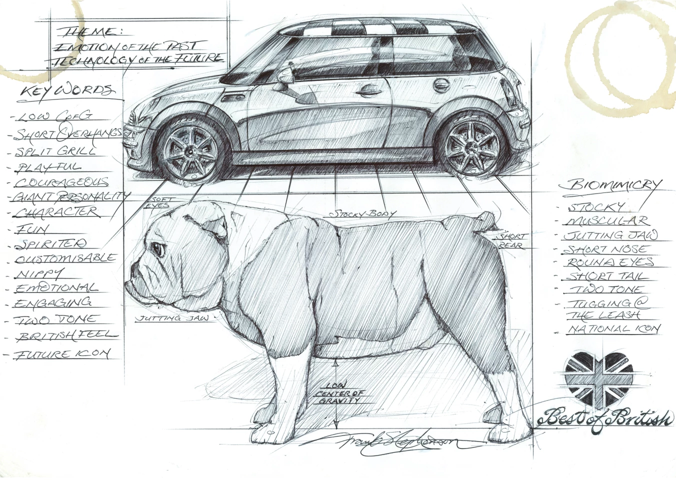
But the other inspiration for that car was the bulldog. An iconic British institution. The bulldog and Dennis the Menace. He's an American kid, about five, six years old, and you love him, but he's naughty. He's always getting into trouble. And he was very much the personality of the Mini. Him and the bulldog.
You love the bulldog, but you're not going to go up and slap one. The Mini had an element of respect to it. There were a lot of elements of stance the bulldog had that I felt applied perfectly to the Mini. You'll see it in that sketch I sent you. It's not the fastest animal, but it's full of energy. And it's cute, but not in a pretty sense, more in a lovable sense. Those were the kinds of vibes I wanted it to give off. I'm sure a lot of people have nailed the throttle on the Cooper or the Cooper S to get that feeling.
And it's the kind of car you want to throw around. If you had a bulldog, you'd want to pick it up and hug it, it's the same thing I feel for the Mini. It's huggable. I'm a huge dog lover, obviously, but the power of the bulldog and the Mini are threaded together perfectly. And I don't think anyone can deny if you look at the Mini, it's got that short, squat stance of the bulldog. That was a great piece of inspiration for me.
On how national character influences car design:
One of my first experiences when I went to work on the Ford Escort Cosworth in Cologne, Germany, was watching a team developing the new Sierra. The project was CDW-27, I remember it to this day.
What they were trying to do with the Sierra was to make it a "world car." They didn't want it to look like a European Ford, they wanted something they could sell everywhere. And in the sketch phase, it looked great. But when they finally followed through with it, that car was like milk. It was milk inside a white container with the word "milk" on it. It was as bland as bland could be.

So what was the mistake and the lesson to be learned there? Well, if you design something to please everybody all the time, it's not going to work. Design is about flavor and emotion. If you're trying to please 100 percent of the people, it dilutes it so much that it loses its character. Absence of character leads to very boring design.
So how do you remedy that? Well, you have to play whatever cards you can to give it identity and character. One of the biggest ones is national character. We love to travel to Italy. Every country has its own character. It's why you come home with all these crappy souvenirs, it's because you were inspired at that moment by the flavor of that country, and the culture, and the food you were eating.
If you drop the cultural aspect, you're losing one strong element you can use to your benefit to add to the emotional side of that design. How strange would it look if Italy produced a Cadillac? Actually, that's a bad example. Pininfarina did a Cadillac once called the Allante, which didn't come out too bad.
But an American car in Italy stands out, and vice versa. Because people appreciate the arts and cultures of those countries. Diversity is a good thing, it offers choice. You appreciate that identity the car has.
So every country has to play up its strengths. You get these jaw-dropping, gorgeous cars out of Italy. You get the wackiness of the French car designs. You get the sci-fi feel of the Japanese car designs with all the gizmos and technology. Or you get the seriousness and quality of the German cars. The overkill of the American cars, with a lot of comfort and a lot for your money.
You've got to play it up, otherwise you end up with a kind of communist arrangement where everyone dresses the same, has the same look, earns the same money, you can't tell one from the other. Design is all about emotion, so we use whatever ingredient we can to take advantage of that.
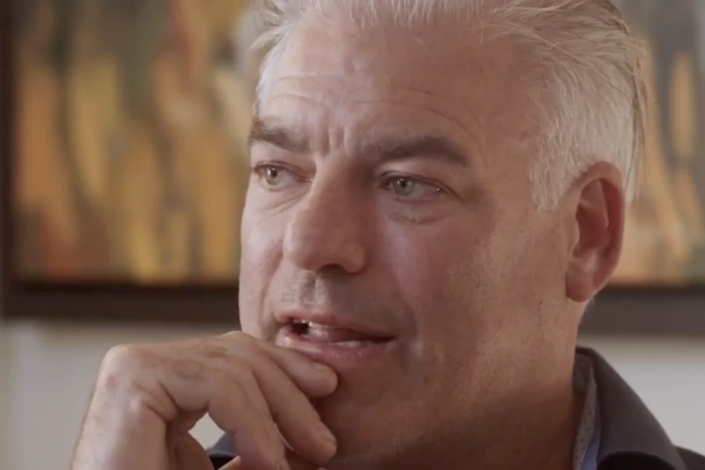
On Chasing Perfect, the Lionsgate documentary about his life and his approach to work:
I think, taking my own discomfort out of the equation, that I'd see it as a great tool for creative people. Anyone who's not creative might find it a bit over the top. Why is this guy trying to kill himself to be the best? It doesn't make any sense, just enjoy life! But for anyone who's creative, or in a creative industry, or wondering if they should study to be a creative person or a designer ... to those kind of people, or to companies that might have a problem with stimulating innovation, I think it serves a purpose.
I wouldn't necessarily call it educational, but maybe it'll wake people up. I've got so many kind letters from people saying that they're showing this to people at work, teachers wanting their classes to watch this, or parents who've grabbed their kids to watch it together.
I'm happy that it's not just "he was born, and he did this, and he did that." I would've hated that. The fact that Helena Coen, the masterful young director, was able to steer me to key in on my motivations, my feelings, my inspirations, my mental approach. It makes me feel good inside if it can convince and inspire people. That's the job I hope it'll do. Inspiring you to aim for the top and be the best you can be.
Nothing in life that's fulfilling is easy. You have to work your tail off constantly, and it never stops. I'm sitting here thinking about how I have to go and do something even better today. It's tiring, but that's what life's all about, not sitting back on your laurels and thinking you've done enough. You can't take your foot off the gas, ever. And I wouldn't choose it any other way.
Don't miss part one of this interview, in which Stephenson talks us through his perspective on current and classic car designs, and some of the machines that have influenced his tastes the most. Chasing Perfect is available now on "iTunes, Amazon Player, Vimeo and all other major platforms." Check out a trailer below.


